Graphic design may be used in various contexts, from generating films for social media to designing invites for a forthcoming event. The realm of creation has many components, from font matching and size to alignment and white space.
When you’re just starting as a graphic designer, or even if you’re not one, it’s always helpful to have some pointers on how to get the most out of your talents. Use the following design tips to learn how to design graphics and start your creative journey.
Graphic Design Tips for Non-Designers and Beginners
Looking at graphic design ideas and exploring some tips for beginners may be pretty helpful in developing your talents and gaining a better grasp of the field. You can check this email template builder to see how you can enhance your email newsletter. In this post, we’ve compiled some advice on how to make a graphic design better for non-designers and newbies alike.
1. Limit Your Typefaces
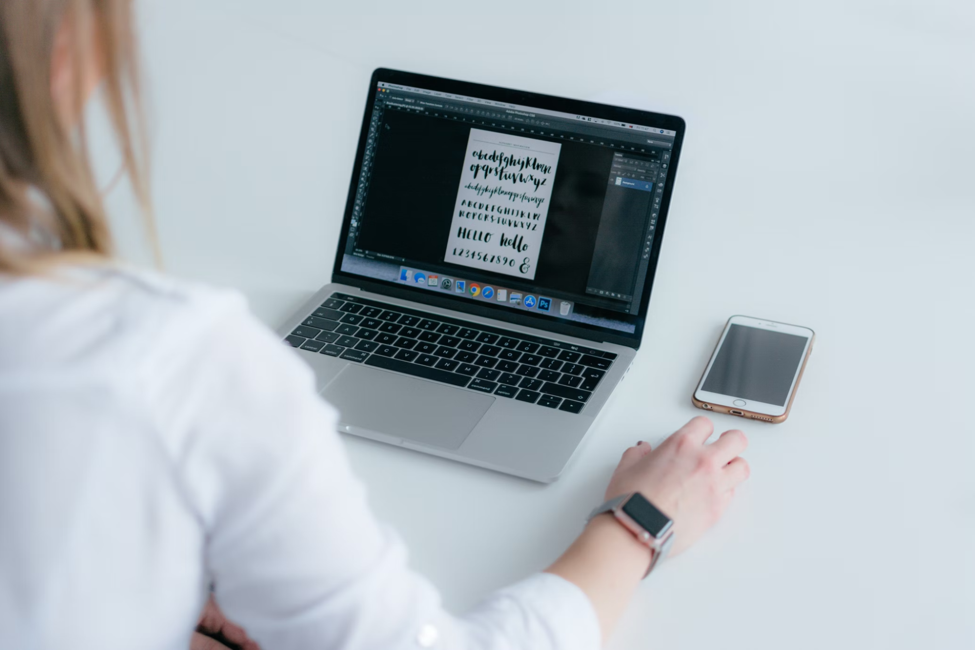
The design aims to catch someone’s eye and convey the message you’re attempting to transmit. Stick to the rules of typography and arrange your image appropriately. Use legible typefaces for headers, subtitles, and body text to create a simple graphic design without clutters. Maintain a basic font collection to help the eye scan various fonts. For instance, consider a geometric sans serif typeface with a clean and contemporary look.
2. Don’t Be Scared of Scale

Scale type, shapes, or other compositional elements must be emphasized proportionally. To make this strategy even more effective, use colors and fonts that work well together and stand out even when enlarged.
3. Respect the Space of Other Elements

Overlaying text on a picture may be customized to your liking. Using letter spacing, you may fill in space, align text, or compress words that take up too much space. You can create a “box effect” by changing the line height and space between characters. The letter-spacing shouldn’t be reduced so much that it becomes unreadable or increased so much that the letters become disjointed from one another.
4. Use a Small Color Scheme
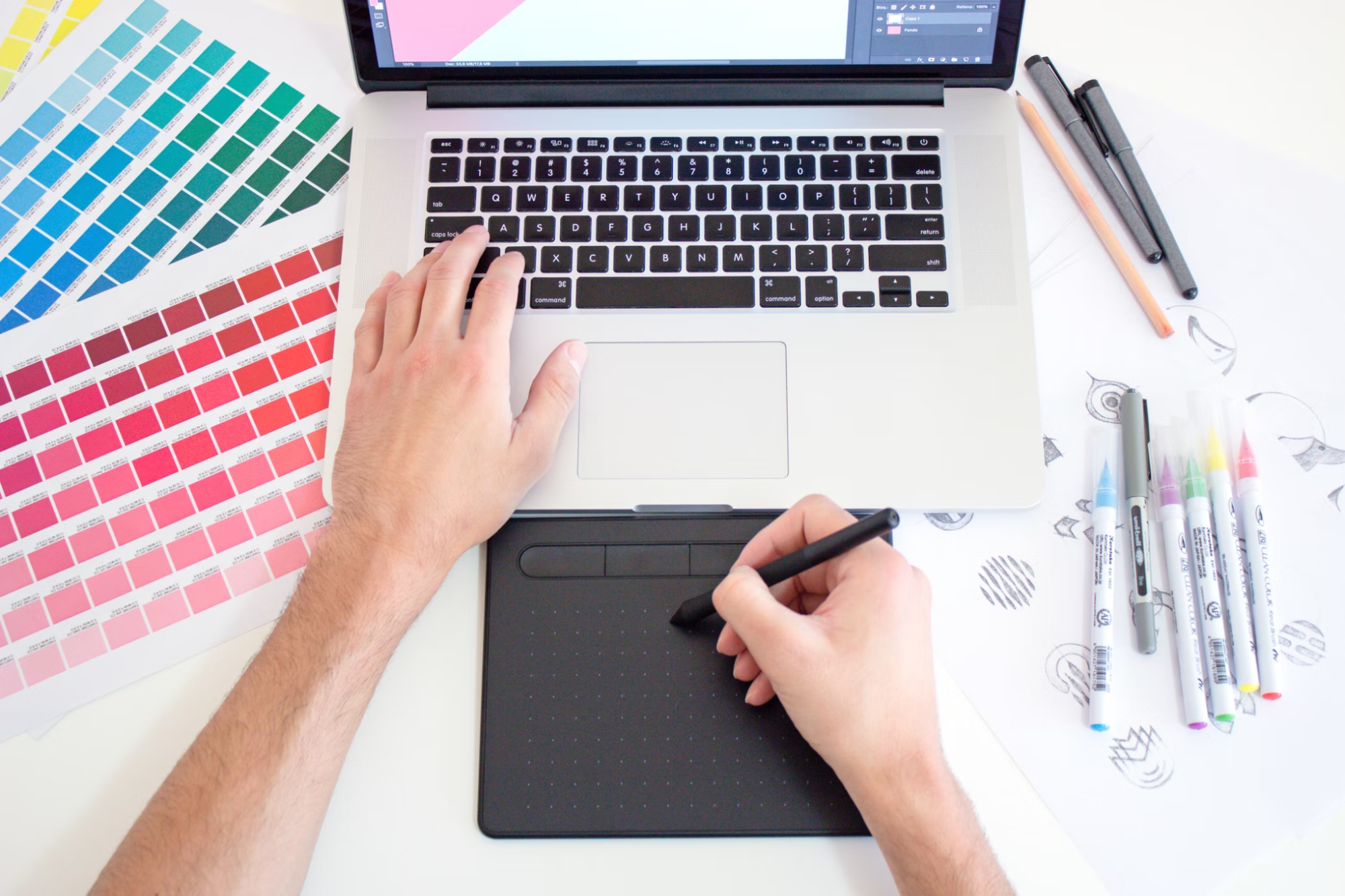
A color scheme with a few primary and secondary colors that contrast and complement each other is the ideal choice. Consistency is achieved by varying the brightness of the same color. Finer fonts will need more contrast to stand up against a colorful backdrop.
Final Thoughts
Once you’ve read this article and learned how to design graphics, it’s time to start. You’ll be on your way to enhancing your internet presence, one graphic at a time, with some practice and dedication to creating with simplicity. To get cool designed material, think outside the box, defy convention, and push the boundaries of your design abilities by coming up with fresh, original concepts.
