A checkerboard floor can feel like a visual drumbeat beneath your feet: orderly, rhythmic, and instantly familiar. For decades the classic black-and-white grid has been shorthand for kitchens and diners, but its strong geometry and timeless contrast make it far more adaptable than the stereotype suggests.Used thoughtfully, checkerboard patterns can anchor a moody bathroom, punctuate a minimalist living room, define a home office, or enliven a sunlit entryway. Variations in scale, color, material and layout – from large-format tiles to soft-hued ceramics, diagonal installs to mixed materials – let the motif shift from bold focal point to subtle backdrop.
This article explores how to move the checkerboard out of the kitchen and into the rest of the home. You’ll find ideas for pairing pattern with texture and color, strategies for balancing visual weight, and practical tips for making the look feel contemporary, cozy, or unexpectedly elegant in spaces you might not have considered.
Scale and Contrast: Selecting Tile Size and Color pairings for Small and Large Rooms
Think of checkerboard as a scale-and-contrast tool rather than a single pattern: larger squares read as bold fields of color and actually simplify a small space visually, while tiny checks create texture and intimacy but can feel busy.In practice,aim for tile sizes that relate to the room’s footprint-larger than you might expect in small rooms to reduce the visual clutter of grout lines,and progressively bolder as the room grows. Use grout to tune contrast: match grout to the lighter tile in tighter spaces to calm the pattern, or choose a mid-tone grout in large, dramatic rooms to add depth without fracturing the floor.
- Small rooms – 6″-12″ squares, soft contrast (cream + pale gray)
- Medium rooms - 8″-16″ squares, medium contrast (charcoal + warm white)
- Large rooms – 12″-24″ squares, high contrast (black + white)
Beyond size, color pairings set mood: high-contrast black and white reads formal and graphic, while muted pairings (slate/ivory, navy/stone) feel modern and lived-in; tonal checkers (two shades of the same hue) are a clever way to get pattern without the punch of extreme contrast. Consider the room’s vertical elements-walls, cabinetry, rugs-and let the floor either anchor them with a strong checkerboard or play second fiddle with low-contrast tones.
- Use borders – frame the pattern with a single-row band to define zones.
- Scale with furniture – large furniture benefits from larger checks; delicate pieces suit smaller tiles.
| Room Size | Suggested Tile | Contrast |
|---|---|---|
| Cozy (under 100 sq ft) | 6″-12″ squares | Low-Medium |
| Everyday (100-250 sq ft) | 8″-16″ squares | Medium |
| Grand (250+ sq ft) | 12″-24″ squares | High |

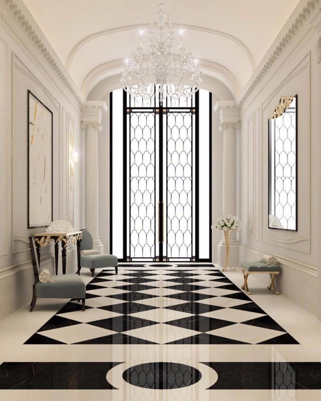
Room-by-Room Applications: Tailoring checkerboard to Entryways, bathrooms, and Living Areas
Make first impressions and tiny rooms sing. in entryways, let the checkerboard act as a confident welcome mat: choose larger squares for a bold foyer or small-scale tiles for a compact vestibule. In bathrooms, think of checkerboard as a framing device-use it on floors to anchor the vanity or as a shower threshold.Quick styling moves:
- Scale: large tiles read modern, petite tiles feel vintage.
- Material mix: glossy ceramic for splash zones, matte porcelain near wood cabinetry.
- Grout strategy: contrasting grout sharpens geometry; tone-on-tone softens it.
Let checkerboard whisper, not shout, in living spaces. In living rooms and dens, temper the pattern with soft textiles and layered lighting so the floor supports conversation rather than dominates it. Consider diagonal layouts or partial rugs to break up rigidity and create subconscious motion through the room. Practical pairings and effects:
- Rugs: place an area rug to create a focal couch-and-coffee arrangement.
- Palette: muted neutrals or desaturated tones reduce visual tension.
- transitions: use a checkerboard border or inlay to bridge rooms with differing flooring.
| Pattern Use | Effect |
|---|---|
| Full-floor checkerboard | Dramatic, cohesive statement |
| Partial field or inlay | Subtle accent that defines zones |

Materials, Finishes and Underfoot Comfort: Porcelain, Vinyl and Wood Options with Practical Care Tips
Choose a surface that sings in pattern and performs in practice: porcelain gives you crisp checkerboard contrast with near-ceramic hardness and stain resistance, perfect for high-traffic foyers and baths; luxury vinyl offers warm, forgiving underfoot comfort and quieter acoustics while mimicking tile or wood; engineered wood warms the scheme, adding texture and age with refinishing potential. Consider finish and installation for comfort-matte glazes hide scuffs, a cushioned underlay softens vinyl, and micro-beveled edges on wood lend a vintage checkerboard charm. Quick reference:
- Porcelain: cool, durable, slip-rated options
- Vinyl: quiet, warm, water-pleasant
- Wood: tactile, repairable, hygroscopic – control humidity
Maintenance should support the look-gentle, routine care preserves the high-contrast drama without fuss. Simple rules: sweep or vacuum grit away, mop with pH-neutral cleaner for porcelain and vinyl, and use a damp (not wet) cloth plus manufacturer-approved oil or finish cleaner for wood. For at-a-glance guidance, this mini-table helps pick the right balance of longevity and comfort:
| material | durability | Underfoot comfort |
|---|---|---|
| Porcelain | Very High – minimal upkeep | Firm, cool; use rugs for warmth |
| Vinyl | High – resilient to spills | Soft, quiet underfoot |
| Engineered Wood | Moderate – repairable finish | Warm, natural feel |
- Daily: dry sweep and spot-clean spills instantly.
- Weekly: gentle mop for hard surfaces; dry-wipe for wood.
- Seasonally: check grout, refinish or oil wood, inspect vinyl seams.
Layout, Borders and Furniture Placement: Tips to Create flow, Define Zones and Avoid Visual Overload
Think of the checkerboard as an invisible grid that gently persuades movement and organizes the room. Use a narrow tile border or a strip of plain tiles to create a subtle threshold between living areas – this creates defined zones without adding physical barriers. Small changes in scale (larger squares in a seating area, smaller ones in a hallway) help the eye read each zone clearly, while a single solid-color rug can act as an anchor so the pattern doesn’t compete with furniture. Quick tips:
- Bordering: Add a one- or two-tile band in a neutral shade to mark transitions.
- Scale play: Vary checker size to signal a change in use or to calm a busy layout.
- Anchoring: Use plain rugs or runner strips to settle the pattern under sofas or tables.
Place furniture to follow the checkerboard rhythm instead of fighting it – align sofa feet along grout lines, float a table over a centered square, or cantilever a console so the pattern peeks beneath and breathes. To avoid visual overload,limit competing patterns: choose upholsteries and cushions in solid hues or very subtle textures,and keep accessories clustered rather than scattered. Furniture rules of thumb:
- Align: Match key pieces to the grid for a tidy, intentional look.
- Buffer: Leave a plain-tile or rug buffer around heavily patterned zones.
- Scale: Pair bold checkers with low-profile, simple silhouettes to maintain balance.
Wrapping Up
Checkerboard floors have long outgrown their diner-era reputation - they’re a design device, not a dictate. By varying scale, color, material and context, the same simple grid can read lively or restrained, formal or playful, anchoring an entryway, defining a bath, or giving a home office an unexpected edge. Think in terms of balance: match bold pattern with calm textures, let rugs soften busy areas, and choose finishes that suit the room’s light and use. With a few considered choices and a bit of testing, checkerboard becomes a quietly confident tool - a geometric punctuation that frames furniture, guides movement, and adds character to places you might never have imagined. Pick a sample, live with it, and let the pattern find its place beyond the kitchen.