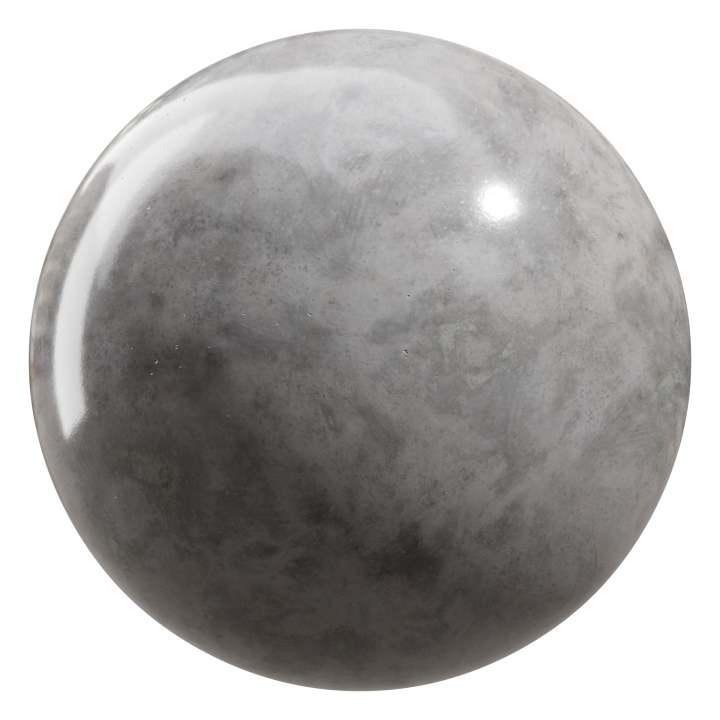
There is a particular kind of electricity that sparks when the smooth meets the rough: a satin countertop set against a slab of raw stone, a finely hemmed silk dress paired with a frayed denim jacket, a polished saxophone voice backed by the gravel of a street choir. Mixing polished and raw textures is less about perfection or imperfection and more about the conversation that starts between opposites-how each quality highlights, softens, or complicates the other.
Across disciplines-from interiors and fashion to food, music, and graphic design-this interplay reshapes how we perceive depth, value, and meaning. Polished surfaces draw the eye; raw textures invite touch. One suggests refinement, the other authenticity.Together they create tension and harmony, refinement and ruggedness in the same visual or sensory field, prompting us to notice details we might or else overlook.
in this article we’ll explore the magic behind thes juxtapositions: why they feel satisfying,how they can be composed thoughtfully,and where the delicate balance between contrast and cohesion lies. Expect a blend of practical ideas, sensory description, and cultural observation that will help you see texture not as a single choice but as a palette for playful and purposeful design.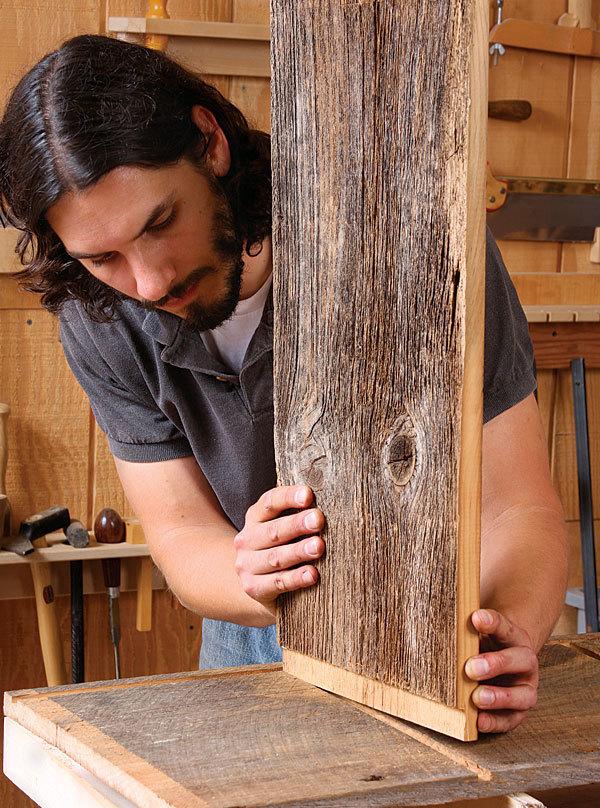
Create Anchors With Scale: Use Large Raw Textures Like Reclaimed Wood and Stone to Ground a Room and Add Polished Accents for Focused Shine
Think in terms of mass and memory: a wall of wide reclaimed planks, a single slab of honed stone, or an expanse of poured concrete becomes the visual foundation that everything else orbits.these oversized, tactile surfaces do the heavy lifting-they ground a room, set the mood and forgive fussiness-so the rest of your design can whisper instead of shout.Use one dominant texture and pair it with complementary tones; subtle variation in grain or veining will read as intentional rather than cluttered.Examples to consider:
- Full-height reclaimed wood wall – warmth and history
- Honed limestone slab - quiet, earthy weight
- Polished concrete floor – modern durability
Once the foundation is set, introduce polished accents to create moments of focused shine: a brass reading lamp, a lacquered console, or a mirror framed in slim steel can punctuate the room without overpowering it.Think of these elements as visual punctuation-placed deliberately at eye level or in the path of natural light to catch attention. Balance is key: juxtapose matte,rugged surfaces with reflective highlights to amplify depth,draw the gaze,and make every shiny piece feel like a purposeful breath of light against a rugged backdrop.

Layer Tactile contrast: Pair Smooth Metals and Glass With Coarse Linens and Natural Fibers to Invite Touch and Balance Light
When cool, polished surfaces meet earthy, tactile fabrics, a room feels both luminous and inviting. Let a mirror-bright tray or a thin-glass side table catch sunlight while a coarse linen runner and a handwoven basket soften the glare-the result is a intentional dialog between shine and shelter. These contrasts do more than look good: they direct how light behaves, where the eye settles, and where hands naturally reach, turning ordinary corners into sensory pauses that encourage touching and lingering.
- Metal + Linen: brass lamp on a raw hemp runner for warm glow without glare
- Glass + Wool: clear coffee table above a nubby rug to float brightness over texture
- Chrome + Jute: reflective accents beside natural baskets to balance cool with cozy
Start small: anchor a vignette with one polished object and layer a coarse textile beneath or behind it, then tweak scale and color until the composition feels balanced. Practical care keeps the contrast crisp-buff metals sparingly, spot-clean linens, and refresh natural fibers with sunlight and a gentle shake-so the interplay of polished and raw remains an intentional, tactile conversation rather than visual clutter.
Color and Finish pairings That Work: Match Warm Raw tones With Brushed Gold or Matte Black for Cohesive Contrast
Think of warm, raw materials as the quiet backbone of a room – sunbaked clay, unfinished oak, and oxidized iron that feel tactile and honest underfoot. Pair these with brushed gold to introduce a soft, reflective warmth that amplifies the raw tones without overpowering them, or dial the drama up with matte black for crisp silhouettes and graphic contrast. Small gestures-like a brushed-gold faucet against a textured terracotta sink or matte-black cabinet pulls on a reclaimed-wood island-create moments of pause that make the whole composition feel intentional and lived-in.
Use contrast strategically: let the raw texture anchor the palette while metallic or matte finishes draw the eye and define edges. Speedy pairing ideas to try in any scheme:
- Brushed gold + warm wood = vintage modern softness.
- Matte black + raw stone = contemporary industrial clarity.
- Mixed metals in small doses (lighting or hardware) = layered cohesion.
| Finish | Best With | Effect |
|---|---|---|
| Brushed Gold | Terracotta, Honeyed Oak | Soft glow |
| Matte Black | Concrete, Charred Wood | Sharp contrast |
| Antique brass | Raw Leather, Linen | Warm patina |

practical Care and Placement Tips: Protect Raw Materials Where Needed and Concentrate Polished Pieces in high Visibility Zones for Longevity
Think of raw textures as the shy, soulful half of your composition-beautiful but easily weathered. Keep them tucked away from direct sunlight and damp zones,and give them a buffer against abrasive surfaces:
- Line shelves and trays with soft fabrics or felt pads to prevent scuffs.
- Rotate and rest porous pieces seasonally to avoid prolonged exposure to wear.
- Use breathable covers for natural fibers and ceramics when not on display.
- Keep cleaning gentle-mild soaps and soft cloths rather than harsh chemicals.
These small protective rituals extend the life of raw materials while preserving their lived-in charm.
Polished items are your showstoppers-place them where light and view meet so they can do the storytelling for the room. Create focal clusters on mantels, console tables, or floating shelves and let them catch the eye with layered lighting:
- Elevate and spotlight with a narrow lamp or directional track light to enhance sheen without heat damage.
- Group in odd numbers for visual balance and to let contrasts with raw textures sing.
- Keep high-touch areas for durable pieces only; reserve delicate polished works for quieter corners.
Concentrated placement not only boosts longevity by minimizing handling, it also amplifies the dialogue between sleek surfaces and their raw counterparts.
To Conclude
Textures are shorthand for story: polish speaks of care and craft, rawness of origin and time. When you place them together, they don’t fight so much as converse – a glossy plane that reflects light and a rough edge that catches it, each making the other more legible. The trick is less about rules than about restraint: think in proportions, repeat a motif to tie contrasts together, and use scale and lighting to tune the dialogue.
If you leave this room with one intention, let it be curiosity. Start small – a countertop and a reclaimed wood shelf, a brass lamp against exposed brick – and watch how the pairing changes the mood. Over time you’ll learn which tensions settle into harmony and which need softening. Mixing polished and raw textures is not a design stunt but a way to make spaces feel both honest and considered - a quiet otherness that invites a second look.