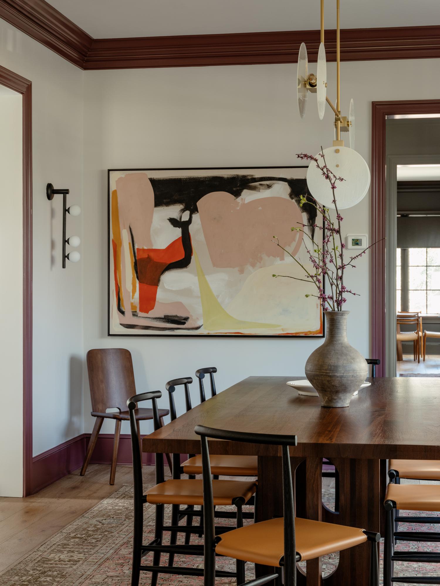
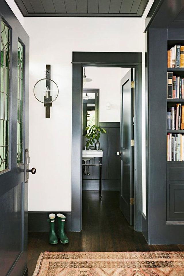
A coat of dark trim can feel like punctuation for a room – a decisive comma, a dramatic period, or the parentheses that quietly hold everything together. Where pale moldings have long whispered, inky frames and charcoal sills speak: they define edges, sharpen shadows, and invite the eye to read architecture with more intent. The result can be unexpectedly modern or quietly classic, depending less on trend and more on proportion, light, and the dialog between surface and finish.
This introduction explores why choosing dark trim is more than a stylistic flourish. From how it frames views and conceals wear to the way it contrasts with color and texture, dark trim changes perception as much as paint. If you’re weighing a bold move for your home – one that alters atmosphere without overhauling structure – it’s worth considering how a darker outline might redraw your spaces.
Why Dark Trim Changes Perception of Scale and Architecture
Dark trim acts like a visual anchor, carving out edges and turning flat façades into layered compositions. By deepening shadows and sharpening silhouettes, it compresses perceived distances-making broad walls feel more intimate and tall roofs appear more pronounced. Designers frequently enough use this trick to emphasize rhythm and proportion without altering structure: a thin dark line can read as a frame, a heavier band can read as a base. Small adjustments translate into big shifts in how the eye measures height, depth and balance, especially on homes with simple geometry.
The effect is practical as well as poetic: it clarifies architectural intent and guides sightlines toward focal points.consider how specific elements respond to darker accents:
- Window trim – reads as carved openings, increasing perceived depth
- Eave and rooflines – sharpen silhouette, elongating the profile
- porch and entry – anchors approach, tightening scale
| Element | perceived Change |
|---|---|
| Trim band | Frames, reduces bulk |
| Window casings | Adds depth |
| Roof edge | Looks taller |
Selecting the Right Dark Hue and Finish for your Lighting and Climate
Think of dark trim as a frame for light – it either absorbs the glow or plays off it. In dim rooms, choose a charcoal with warm undertones to add depth without feeling cold; in sunlit spaces, a true black or deep navy with a satin or semi-gloss finish will hold shape and resist showing dust. For interiors where mood matters (bedrooms, dining rooms), prefer matte or eggshell for a velvety, cozy look; in high-traffic zones, a tougher sheen keeps edges crisp. Simple rules: match undertones of your trim to the room’s predominant light (cool daylight favors cool greys/blues, warm evenings favor brownish blacks), and consider sample swatches on all walls at different times of day before committing.
Climate is an unseen decorator: coastal sun and salt demand UV-resistant pigments and finishes that won’t chalk, while humid regions benefit from smoother, wipeable coatings to fight mildew. Below are fast, practical pairings to guide choices - small tweaks (a satin rather of flat, a warm undertone rather than neutral) make a big visual difference and reduce maintenance headaches. Test, protect, and scale your trim decisions to the exposure and weather where you live.
- Low light: Deep charcoal + matte finish
- radiant, sunny rooms: True black/navy + satin or semi-gloss
- Coastal/hot climates: UV-stable dark with satin finish
- Humid environments: Mildew-resistant dark with semi-gloss
| Setting | Suggested Hue | Finish |
|---|---|---|
| North-facing living room | Warm charcoal | Matte |
| Sun-drenched kitchen | True black | Satin |
| coastal exterior | Deep navy | UV-resistant semi-gloss |
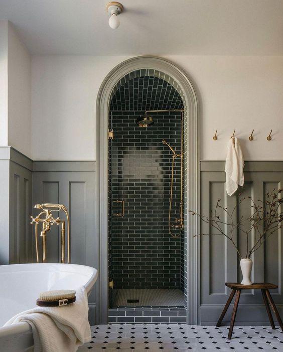
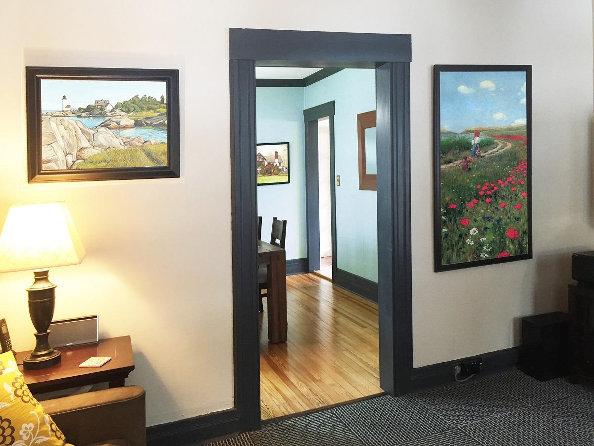
Pairing Dark Trim with Wall Colors, flooring and Hardware for Cohesive Contrast
Think of dark trim as the frame around a painting: it doesn’t have to shout to make the image sing. Use it to create either a crisp contrast – pairing charcoal or black trim with soft, light walls to make moldings pop – or a moody continuity by matching trim to deeper wall tones for a cocoon-like effect. When choosing paint,consider the amount of natural light and the undertone of the color; warm woods and honeyed floors pair beautifully with warmer greys and ivories,while cool stone or pale concrete floors favor slate,blue-greys or soft whites. Let the trim act as a visual anchor that holds a room’s palette together rather than fighting for attention.
- Soft white walls + light oak floors + matte black hardware – modern, airy contrast that reads crisp without harshness.
- Greige walls + walnut flooring + aged brass – warm, layered richness where trim ties the elements into a seamless whole.
- Deep navy walls + pale stone tile + satin nickel – high drama tempered by light flooring and cool metal accents.
Hardware and flooring are the punctuation marks that finish the sentence your trim starts. Matte black or oil-rubbed finishes will echo dark trim for a cohesive,contemporary look; warm metals like brass and copper introduce contrast and a touch of softness. For floors, think of scale and texture: wide-plank wood lends a calm, continuous flow, while patterned tile or textured stone can play off trim with intentional contrast.Always test samples together – the same dark trim can feel grounding or overpowering depending on grain, sheen and the room’s lighting, so aim for a balance that supports your focal elements rather than competes with them.
| Wall Color | Flooring | Hardware |
|---|---|---|
| Muted Pearl | Light Ash Oak | Matte black |
| Warm Greige | Walnut Planks | Aged Brass |
| Stormy Navy | Pale Stone Tile | Satin Nickel |
Application techniques, Preparation and Maintenance Tips to Keep Dark Trim Looking Crisp
Start by treating dark trim like jewellery – clean, sand and prime are non-negotiable. For best adhesion, degrease with a mild solvent, scuff with fine-grit sandpaper and follow with a high-adhesion primer designed for the substrate. When applying paint, favor thin, even coats over one thick one: use a high-quality angled sash brush for cutting in, a short-nap roller for smooth surfaces, or a HVLP sprayer for ultra-crisp edges. A few practical points to remember:
- Temperature: paint between 50-85°F for proper film formation
- Wet-edge: maintain a wet edge to avoid lap marks
- Feathering: feather strokes outward to blend into adjacent surfaces
- Multiple coats: allow full dry time between coats for depth and durability
These steps help dark trim read as intentional design, not an afterthought.
Keeping that dark finish crisp means a light maintenance routine and smart touch-ups: wipe down with a microfiber cloth and mild soap every few months, inspect joints and corners seasonally, and keep a small pot of custom-mixed paint for quick fixes. For stubborn grime,avoid bleach or abrasive pads-use a non-alkaline cleaner instead. Use wax or a clear protective topcoat sparingly on high-contact areas to reduce wear. A simple maintenance cadence can be summarized below:
| Frequency | Action |
|---|---|
| Monthly | light dusting and spot-clean |
| Annually | Inspect caulk, seams and touch up chips |
| Every 3-5 years | Recoat high-wear trim or touch up primer/paint |
- Quick fixes: sand tiny nicks, prime bare spots, and apply a thin coat
- Prevention: avoid boots, ladders and furniture scraping against trim during projects
Follow these routines and your dark trim will stay striking and sharp for years.
When to Embrace dark Trim Boldly and When to Soften the Look with Accents and Lighting
there are moments when the power of dark trim should be celebrated-rooms that drink plenty of daylight, spaces with crisp architectural lines, or exteriors craving a modern silhouette warrant a bold hand. Go dark when you wont to frame vistas, emphasize geometry, or create an elegant contrast against pale walls; the result is a curated, gallery-like feel that reads intentional rather than heavy. consider these quick triggers for a confident move:
- Expansive windows and high ceilings – natural light softens the darkness.
- minimalist or modern schemes - dark trim sharpens clean lines.
- Exterior facades with neutral siding – trim becomes the focal punctuation.
- Durable, low-maintenance areas – darker finishes disguise wear and scuffs.
Conversely, if the goal is warmth, intimacy, or harmony with eclectic decor, soften the look with thoughtful accents and lighting rather than abandoning dark trim altogether. Use warm metals, layered lighting, and textiles to counterbalance intensity; place darker trim on secondary elements (door frames, built-ins) while keeping broader surfaces lighter. Try these subtle tactics for balance:
- Introduce warm metallic hardware or soft brass to break up contrast.
- Layer ambient and accent lighting to reduce visual heaviness at night.
- Incorporate mid-toned woods or painted accents to bridge dark and light.
- Test sample boards in different light throughout the day before committing.
Key Takeaways
Think of dark trim as the punctuation mark your rooms have been waiting for – it doesn’t shout, but it defines, frames and clarifies. Whether you choose a whisper of charcoal around a window or a full-bleed black doorframe, the effect is a quiet rebalancing: architecture feels sharper, colors read truer, and ordinary details take on purpose. Start small, observe how shadows sculpt the space, and let the contrast guide your next choice. If you’re ready for a subtle act of design courage, dark trim might be the understated bold move that brings everything into focus.