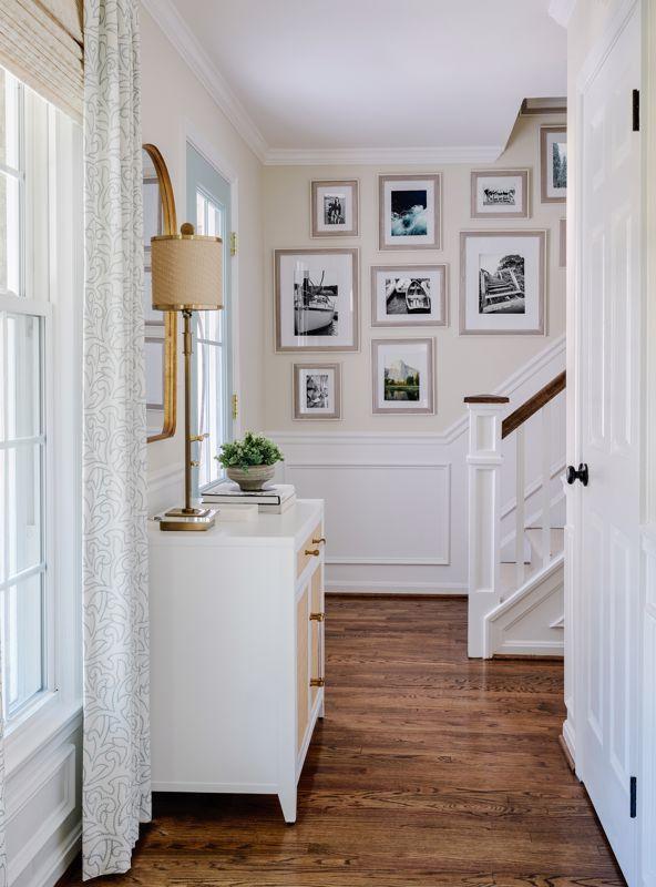
A hallway is a passage and a promise: a brief corridor that links rooms but also offers a unique opportunity to make a first – and lasting – impression. Turning that narrow, frequently enough overlooked space into a gallery-style hallway doesn’t require professional training or a large budget; it asks only for thoughtful choices about scale, rhythm, and lighting. With the right approach, a row of walls can become a curated stage for art, memories, and design details that guide the eye and set the tone for the rest of the home.
This article will walk you through practical steps and creative considerations for crafting a gallery-style hallway. You’ll learn how to measure and plan your layout, select and arrange artwork, choose frames and finishes, and use lighting and color to enhance cohesion and focus. Whether you want a formal exhibition vibe, a cozy family-photo corridor, or an eclectic mix that tells a story, the principles we cover will help you create a balanced, intentional display.read on for clear, adaptable techniques that balance aesthetics with everyday life – from spacing and hanging height to mixing mediums and maintaining flow – so your hallway becomes a destination rather than just a thoroughfare.
Curate a Cohesive Collection and Frame Strategy to Create Visual Rhythm
Think of your hallway as a single exhibition where each piece contributes to a continuous story: choose a unifying color palette or subject matter, then vary scale and composition to keep the eye moving. Consider small clusters that act as punctuation between larger anchor works; a triptych or a standout painting can become a visual chorus that repeats down the corridor. Speedy checklist to guide your edits:
- Anchor pieces every 6-10 feet to establish rhythm
- Tonal cohesion through mat or frame colors to link disparate styles
- Mix scales and orientations to avoid monotony
- Leave intentional negative space to let each work breathe
A deliberate framing strategy turns varied artwork into a harmonious procession: repeat a frame finish sparingly to create cadence, or alternate two complementary styles for a conversational beat. Align frames by a common baseline or by their centers to maintain a steady pace along the wall, and use consistent spacing-typically 2-4 inches between frames for a tight rhythm, wider for a more relaxed gallery feel.Quick reference:
| Frame | Best use |
|---|---|
| Slim black | Modern cohesion, unifies color contrasts |
| Warm wood | Adds warmth, links traditional pieces |
| Float frame | Creates depth, highlights textiles or objects |
Plan Layout and Spacing with Purpose, Hanging at Eye level for Comfortable Viewing
Start by mapping the wall as if it were a gallery – measure the length and height, then sketch positions so each piece has breathing room. A simple rule to follow is to aim for the artwork’s visual center to sit roughly between 57 and 60 inches from the floor; that range keeps the view comfortably at eye level for moast people. Use painter’s tape or paper templates to test arrangements before you commit: move shapes around until the negative space feels intentional. For consistent groupings, keep the spacing uniform-small works with 2-3 inches between frames, medium works with 3-4 inches, and large pieces with 4-6 inches. Try these quick steps to avoid clutter:
- Measure, then mock: mark centers and baseline lines with low-tack tape.
- Maintain rhythm: equal gaps create a calm, gallery-like flow.
- Balance verticals: align centers when mixing heights to create cohesion.
Think of the hallway as a visual corridor: spacing controls pace, and pacing controls how long someone lingers. Leave wider margins near doorways and narrower ones in tighter stretches so the arrangement complements traffic flow rather than competes with it. If you want a quick reference while arranging, follow this compact guide for spacing vs. scale:
| Artwork Size | Recommended gap | Viewing Distance |
|---|---|---|
| Small (under 12″) | 2-3 in | 2-4 ft |
| Medium (12″-24″) | 3-4 in | 4-6 ft |
| Large (24″+) | 4-6 in | 6+ ft |
Illuminate the Corridor with Layered Lighting and Focused LED Picture Lights
Think of your hallway as a narrow gallery where light sculpts each piece and the path between them. Start with a soft, even layer of ambient light-dimmable recessed fixtures or a slim LED strip in a cove-to set a calm baseline. Add task lighting for wayfinding (low-glare wall sconces or subtle floor-level LEDs) so the route feels safe without overpowering the art. introduce accent lighting to bring out textures and colors: low-beam, focused leds highlight frames and sculptural pieces while keeping the rest of the corridor pleasantly understated.
Practical pairings breathe life into that layered plan; balance is everything. use a mix like:
- Slim recessed cans for ambient wash-place evenly to avoid hot spots.
- LED picture lights to give each artwork its moment without haloing the wall.
- Adjustable track heads for flexible accenting of rotating displays.
- Dimmers and matching color temperature (2700K-3000K) to keep tones consistent.
Aim for subtle contrasts rather than stark brightness-this keeps the focus on the art and creates a thoughtful, museum-like stroll through your home.
Choose Wall Color, Flooring and trim That Complement Rather Than Compete
Think of the hallway as a quiet stage where your artwork takes the spotlight: choose background tones that let pieces breathe rather than shout. Soft, low‑contrast paints – warm greige, muted sage, or chalky off‑white – create a calm backdrop, while matte or eggshell finishes prevent glare and keep focus on the frames. Keep flooring tones harmonious with the frames and rugs; a continuous, subtle floor treatment will guide the eye down the hall without fragmenting the display.Use trim deliberately as a framing device – a single shade lighter or darker than the wall, or a narrow band of crisp white, can define the wall plane without competing for attention.
- Neutral palette: lets artwork dictate the color story.
- Consistent undertones: match warm woods with warm paints, cool frames with cool greys.
- Subtle contrast: one stop of contrast between wall and trim is often enough.
- Texture over pattern: choose grain, weave or matte paint rather of busy patterns.
- Test in place: view samples under the hallway lighting at several times of day.
Before committing, live with samples: pin up paper swatches, lay a plank next to the baseboard, and place a frame against the painted sample to see the interaction under your hall lights. Pay attention to color temperature – cool LEDs can make warm paints look flat, while incandescent light will enrich warm hues – so test under real conditions. If you prefer a quick reference, use a tiny cheat‑sheet of finishes to compare; a consistent, pared‑back trio of wall, trim and floor choices will make every piece feel intentionally placed and gallery‑ready.
| Finish | Effect |
|---|---|
| Low‑sheen paint | Reduces reflection, focuses on art |
| Light oak floor | Adds warmth, unifies frames |
| Soft white trim | Provides crisp, subtle definition |
Incorporate Functional Furniture and Subtle Accents to Support the Gallery Experience
Let the objects you choose do double duty: a slender console becomes a stage for a rotating artwork,a low bench offers seating and storage for seasonal prints,and a sculptural chair reads like an exhibit piece while remaining inviting. Place furniture flush to the wall to preserve sightlines, and favor pieces with clean silhouettes so they don’t compete with frames.Consider these functional actors that quietly support the show:
- Floating console - slim display surface
- Storage bench – hidden compartments for portfolios
- Minimal stool – movable viewing perch
- Wall-mounted shelf – for curating small objects
Accents should whisper, not shout. Use muted metals, low-profile lighting, and a single runner to guide visitors down the corridor without interrupting the view. A compact table summarizes accent strategies for quick reference:
| Accent | Effect |
|---|---|
| Warm LED strip | Subtle texture highlight |
| Neutral runner | Directional flow |
| Matte frames | Low-glare focus |
- Keep color contrasts minimal to prioritize artwork.
- Introduce one signature accent (a sculptural lamp or plant) to anchor the sequence.
Insights and Conclusions
A gallery-style hallway is less about following strict rules and more about creating a quiet, curated passage that reflects how you move through your home. Start with a clear plan, choose pieces and proportions that feel balanced, and allow room for change as your collection and tastes evolve. With consistent lighting, thoughtful spacing, and a few well-chosen anchors, an ordinary corridor can become a cohesive visual narrative. Take your time, test arrangements, and let the space quietly tell your story as you walk through it.