A room can whisper in ivory and oak, then suddenly sing when a single chair arrives in cobalt. That’s the quiet magic of accent colors: small, intentional notes that guide the eye, shape the mood, and make a space-or an outfit, a website, a brand-feel intentional rather than incidental.
But accent colors have a talent for multiplying. One throw pillow becomes three. A “tiny pop” of yellow turns into a wall, a rug, and a lamp. Somewhere between tasteful punctuation and visual noise lies the real question: when does an accent stop being an accent?
In this article, we’ll explore what accent colors are meant to do, why they’re so easy to overuse, and how to find the sweet spot where contrast feels alive-without tipping into chaos. whether you love bold statements or prefer a restrained palette,the goal is the same: enough color to create energy,not so much that it steals the story.
Choosing an Accent Color That Serves the Room’s Mood and Function
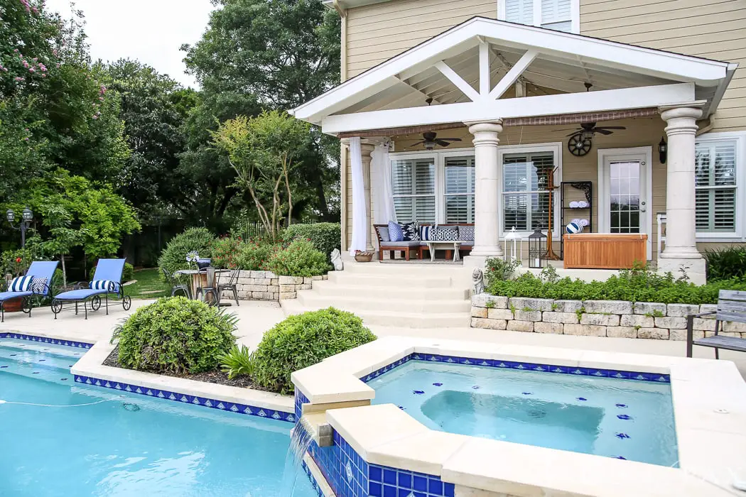
An accent color isn’t just a “pop”-it’s a mood cue and a wayfinding tool. In a focused workspace, a sharp, cool note can definitely help the room feel crisp and edited; in a loungey living room, a warmer hue can make everything seem softer, slower, more inviting. The trick is letting the room’s primary job decide how loud the accent should be: a bedroom wants a whisper, a playroom can handle a shout, and a kitchen thrives on something that looks clean even when life gets messy.
- For calm: choose accents with a dusty or muted undertone (sage, clay, misty blue) and keep them on textiles and art.
- For energy: go brighter (cobalt, marigold, coral) but confine it to a few repeatable shapes-stools, vases, frames.
- For function: use the accent to “label” zones (reading chair, snack bar, entry drop spot) so the room feels intuitive.
- For longevity: put the boldest version on replaceable items; let permanent surfaces stay a step quieter.
| Room mood | Accent behavior | Smart placement |
|---|---|---|
| Restful | Low-saturation, soft contrast | Throw, lampshade, bedside art |
| Social | Warm, inviting, medium contrast | Pillows, bar stools, centerpiece |
| Focused | Clean, cool, high clarity | Desk accessories, pinboard, rug edge |
Finding the Right Ratio Balancing Base Tones Accents and Negative Space
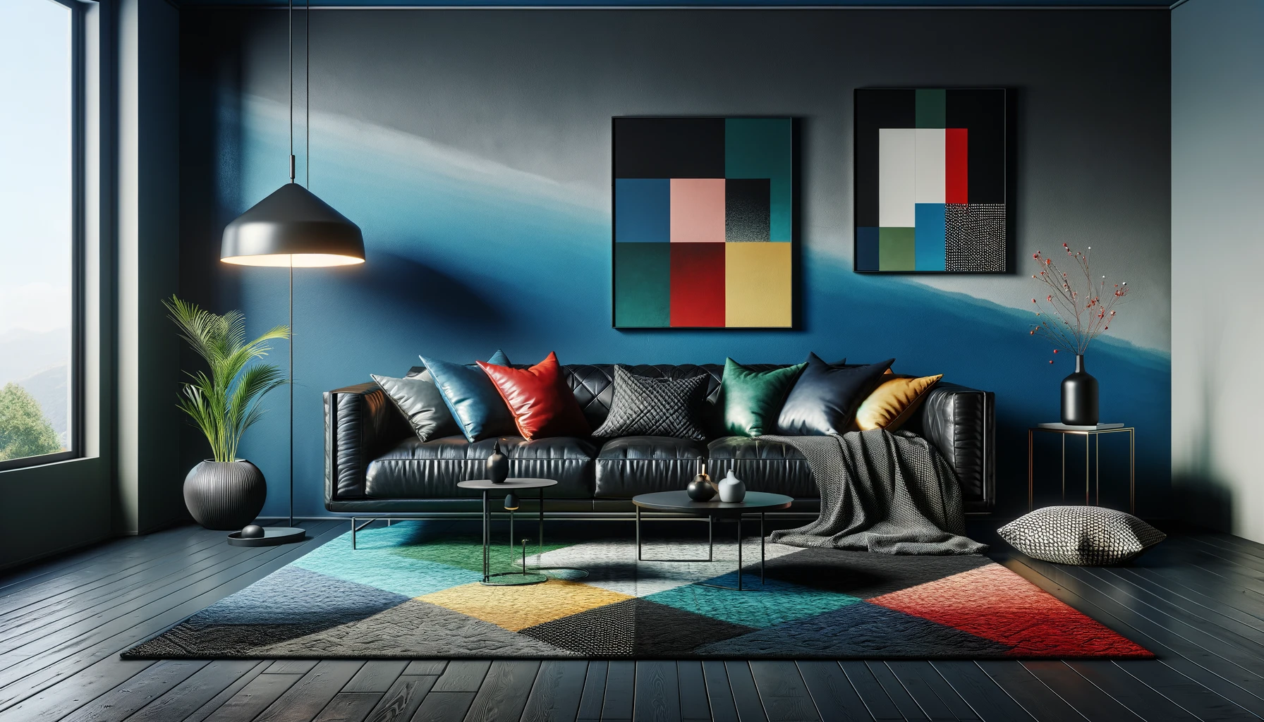
Think of your space like a well-composed photograph: the base tones set the exposure, accent colors provide the focal point, and negative space is the quiet that makes everything readable.When accents start competing with the foundation, the room loses its “resting place” for the eye. A reliable way to keep harmony is to decide what role each color plays before you add more. Base tones should do the heavy lifting across large surfaces, while accents should land like punctuation-deliberate, crisp, and spaced out. Keep the balance grounded by repeating accents in small, separated moments rather than clustering them into one loud block.
- Base tones: walls, large rugs, major upholstery-your visual “background music.”
- Accents: pillows, art, a single chair, ceramics-your “chorus,” not the whole song.
- Negative space: open wall, clear tabletops, breathing room between objects-your “pause” that makes the chorus hit.
| Room Mood | Base Tones | Accent Use | Negative Space |
|---|---|---|---|
| Calm & Airy | 70% | 10% | 20% |
| Balanced & Lived-In | 60% | 15% | 25% |
| Bold but Controlled | 55% | 20% | 25% |
If you’re unsure whether you’ve crossed the line, look for “color clutter”: too many saturated items at eye level, competing statement pieces, or accents that appear only once (the visual equivalent of an inside joke). A smarter approach is to limit yourself to a primary accent and a single supporting accent, then let materials-wood grain, brushed metal, linen texture-do the nuanced work. Create intentional repetition in different forms (one in art, one in textiles, one in a small object), and give each accent a rim of calm around it so it reads as curated, not chaotic.
- Rule of three: repeat an accent color in three separate zones to feel intentional.
- Scale check: if an accent covers more than a cushion, a vase, or a small artwork, treat it as a “base.”
- One loud note: choose a single high-saturation hue; keep the rest muted or textural.
- White space works: an empty corner or clear shelf can be as impactful as another decorative object.
Where Accent Colors Belong Walls textiles art and small Decor Moments
Accent color works best when it feels intentional-like a well-placed brushstroke, not a paint spill. On walls, a single saturated moment (a niche, the back of a bookcase, a slim stripe, or one boldly painted door) can do more than four competing “feature” surfaces. Think of walls as the stage: they can carry a dramatic hit, but they shouldn’t steal every scene. Textiles, on the other hand, are the easiest way to test-drive intensity because they’re flexible and tactile-swapping a throw pillow is far less committal than repainting. Good places to concentrate color without raising the room’s blood pressure include:
- Walls: one focal plane, architectural inset, or a single color-washed corner
- Textiles: pillows, throws, curtains, a patterned rug with one loud note
- Art: one statement piece that repeats the accent hue elsewhere, subtly
- Small décor: vases, trays, candles, lamp bases, books with punchy spines
Art and small décor are where accent colors can “spark” rather than “shout.” A framed print with a sharp coral streak can be echoed by one ceramic bowl, not ten. The trick is to repeat the accent just enough to look curated, and vary the scale so it doesn’t read like a checklist.If you’re not sure where your color belongs, use this fast placement map-keep the boldest saturation on the items you can move, and let permanent surfaces stay calmer.
| Accent Placement | Best For | Keep It from Feeling “Too Much” |
|---|---|---|
| Painted wall moment | Instant impact, architectural emphasis | Limit to one zone; repeat color in one small object |
| Textiles (pillows/throw) | seasonal swaps, low commitment | Mix solids with one pattern; vary textures, not shades |
| statement art | Color “anchor” with personality | Let art be the loudest; keep nearby décor quieter |
| Small décor cluster | Controlled pops on shelves and tables | Group in threes; leave negative space around it |
When Accents Become Noise Signs You’ve Crossed the Line and How to Reset
accent colors are meant to behave like a well-placed whisper, not a marching band.The moment they start competing for attention-each one trying to be the hero-you’ve slipped from “energized” into “visually loud.” If your eye can’t land anywhere without being yanked to another radiant detail, the palette has stopped guiding and started interrupting. Common tells show up fast in real rooms and real outfits: nothing feels intentional, contrast looks accidental, and the accents begin to read like clutter even when the space is spotless.
- The “every surface is highlighted” effect: trim, pillows, art, vases, and rugs all shouting in different hues.
- Too many equal-weight pops: accents are similar intensity, so nothing ranks first.
- Color echoes without rhythm: repeated bright notes appear randomly instead of in a pattern.
- Neutrals disappearing: your baseline is so busy it can’t act as a resting place.
Resetting doesn’t require repainting your life-just editing with purpose. Start by choosing one “lead” accent and letting the others become supporting characters through softer tints, fewer placements, or smaller scale. Pull back anything that feels like it’s trying to be both functional and decorative at full volume. A quick way to calm the scene is to create quiet zones (solid textiles, clear surfaces, simple frames), then reintroduce color with a rule you can remember at a glance.
| symptom | Fast Fix | Result |
|---|---|---|
| Three accent colors fighting | Pick one lead + one backup | Clear hierarchy |
| Accents everywhere | Remove 30% of “pops” | more breathing room |
| High saturation overload | Swap one item for a muted tone | Softer contrast |
| no place for the eye to rest | Add a solid neutral anchor | Instant calm |
- One room, one headline: let a single accent own the spotlight (the rest can harmonize).
- Scale matters: keep bold color on fewer, larger pieces or more, smaller pieces-avoid doing both.
- Repeat with intention: echo the lead color 2-3 times,then stop.
Smart Pairings That Never Fight Undertones Contrast and Finish Choices
Accent colors behave best when they’re treated like guests with a strict seating chart: they can be vibrant, but they can’t start arguments with your base palette. The quickest way to keep the peace is to match undertones-warm with warm, cool with cool-then use contrast to control how “loud” the accent feels. A cool emerald can look intentional against a crisp gray, yet slightly off-key next to a buttery beige. Likewise,a warm terracotta reads rich and grounded beside creamy whites,but can feel muddy against icy blues. Build your pairing around one clear “temperature,” then let contrast do the styling.
- Warm undertones (cream,tan,caramel): pair with rust,brass,olive,paprika,honey tones.
- Cool undertones (blue-gray, charcoal, stark white): pair with sapphire, mint, fuchsia, chrome, true black.
- Neutral-leaning bases (greige, taupe): choose one direction-either warm accents or cool accents-so the room doesn’t feel undecided.
finish is the quiet accomplice that determines whether an accent reads polished or pushy. High-gloss amplifies color and contrast,matte absorbs it,and metallics act like “visual punctuation”-small,brilliant,and best used sparingly. If you’re flirting with a bold accent, dial down the finish; if your accent is subtle, a shinier finish can make it noticeable without adding more saturation. The goal is controlled tension: enough contrast to define, not enough to compete.
| Base + Undertone | Accent Color | best Finish | Why It Works |
|---|---|---|---|
| Warm white (creamy) | Terracotta | Matte | Softens intensity; feels lived-in. |
| Cool gray (blue-leaning) | Emerald | Satin | Clean contrast without glare. |
| Greige (neutral) | Ink navy | eggshell | Reads tailored; keeps depth refined. |
| Charcoal (cool) | Brass | Brushed metallic | glow adds lift; texture prevents flashiness. |
- When contrast is high,choose lower sheen to avoid “billboard” energy.
- when contrast is low, increase sheen to make the accent visible without adding more color.
- when in doubt, keep the boldest finish on the smallest surface: hardware, trim detail, a single lamp base.
Seasonal Refreshes Without Overdoing It Easy Swaps That Keep Cohesion
Seasonal updates don’t need a full palette overhaul; the goal is to let your space hint at the weather, not cosplay it. Start by keeping your “anchor” colors untouched (the ones already living in your upholstery, rugs, or large art), then rotate smaller accents that share an undertone with what’s already there. If your base leans warm, choose seasonal shades with warmth baked in; if it’s cool, keep your refresh crisp and diluted rather than loud.A clean way to avoid “too much” is to limit new accent colors to one hero shade plus one supporting neutral, then distribute them in different textures so the room feels intentional instead of theme-y.
- Spring: swap in airy linen covers, pale glass vases, and one botanical color (sage, buttercream, misty lilac).
- Summer: trade heavy throws for cotton or gauze, and introduce sun-faded versions of your existing accents rather than new brights.
- Autumn: add warmth through texture first (bouclé, wool, matte ceramics) before reaching for burnt tones.
- Winter: keep the palette restrained; let sheen do the work (brass, smoked glass, glossy lacquer).
| Season | Easy swap | Accent color “cap” |
|---|---|---|
| Spring | Pillow covers + bud vase | 1 soft tint + 1 neutral |
| Summer | Table runner + lightweight throw | 1 washed tone + white |
| Autumn | Candle cluster + textured bowl | 1 earthy shade + tan |
| Winter | Metallic tray + deep-toned book stack | 1 deep shade + charcoal |
For cohesion, repeat the chosen accent in three small moments rather than one big statement-think a slim spine of color on a bookshelf, a single patterned cushion, and a subtle piece of art. This “echo” method keeps the room readable and prevents accent colors from shouting over your existing design. When you crave change but want restraint, swap finish before hue: matte to gloss, woven to smooth, opaque to translucent. It’s the quiet trick that makes a space feel seasonally alive while staying unmistakably itself.
The Way Forward
accent colors are less about volume and more about intention. A bold hue can guide the eye, shape a mood, and give a space-or a design-its signature spark. But when every element competes to be the “pop,” the pop disappears into noise.
If you’re unsure whether you’ve crossed the line, step back and look for a clear hierarchy: What’s the main story, and what’s simply supporting it? A well-placed accent should feel like punctuation-sharp, purposeful, and timed-rather than a page full of exclamation points.
So keep experimenting,keep editing,and let restraint be part of the creativity. The sweet spot isn’t “less” or “more.” It’s the moment your accents stop shouting and start speaking.