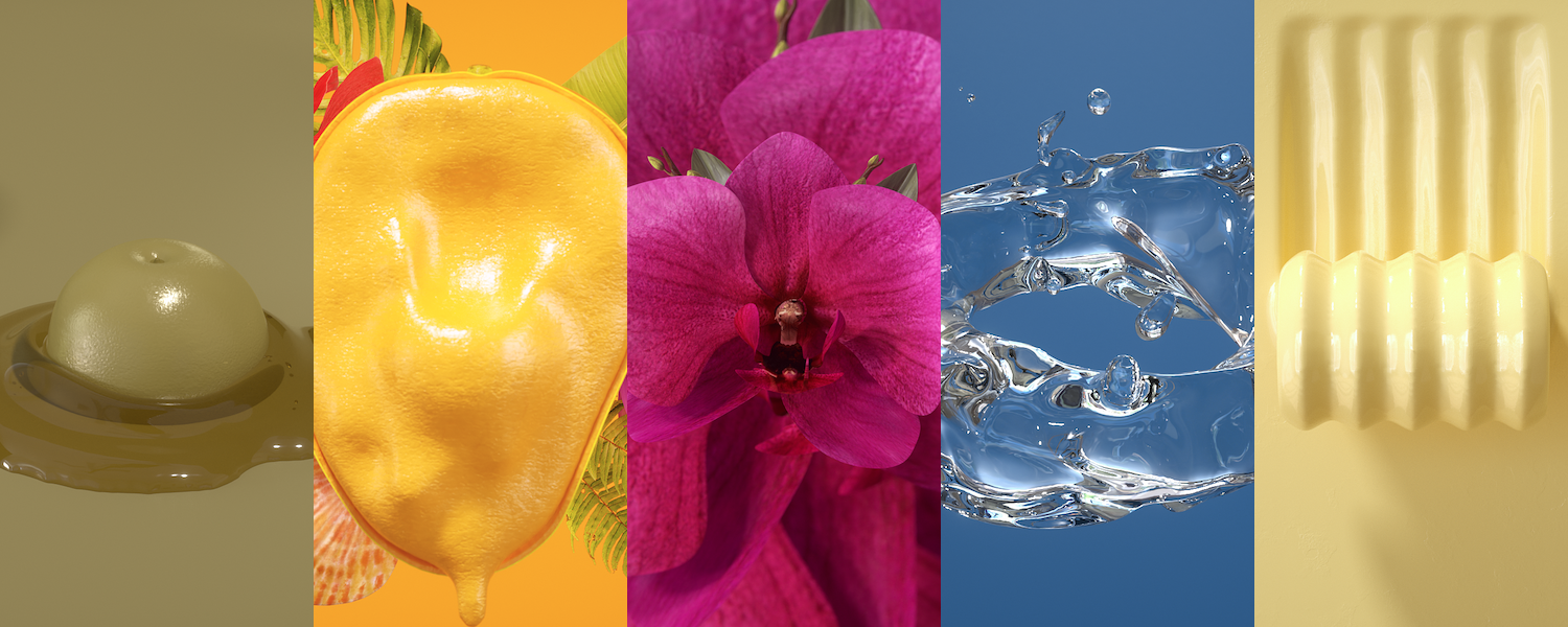
The Pantone Fashion Color Trend Report Spring/Summer 2022 forecast is out! So, what colors are trending?
Now that we’re emerging from the clutches of the COVID-19 pandemic and the future is (finally!) looking brighter, so are the colors that will be trending in 2022. We’ll be seeing these colors take center stage from fashion runways to home interiors.
The Executive Director of Pantone Color Institute, Leatrice Eiseman, commented, “Colors for Spring 2022 bring together our competing desires for comforting familiarity and joyful adventure through a range of soothing and timeless colors, along with joyous hues that celebrate playfulness.”
If you’re looking to elevate your home in the new year, color is an easy yet impactful way to do so. Here’s a closer look at a few of the dazzling colors we can expect to see in interior design in 2022.
Bright and Joyful Yellows
Yellow is the embodiment of a happy and carefree aesthetic. Bright and warm yellow hues speak to feelings of optimism, bliss, and cheer.
Consider introducing yellow tones as a pop of color. Painted furniture is an excellent opportunity for self-expression. For example, a lacquered yellow table can serve as an element of visual interest within a space – adding a touch of energy and pizazz – without completely taking over or changing the aesthetic.
Yellow is also an amazing accent color that delivers a message of playfulness and positivity. Introducing yellow accent pillows or a throw blanket are excellent ways to change the vibe of a room without a major overhaul.
All Things Pink
Pink can be pretty or audacious. Pantone covered both ends of the spectrum with the two shades it included in its 2022 NYCFC color palette: light and powdery Gossamer Pink and in-your-face Innuendo.
Depending on your goals for a space, introducing either of these colors can help you change the vibe and mood of your room. The former is soft and soothing, while the latter is exhilarating and unforgettable.
Airy and Anchoring Blues
Pantone predicted that four blue hues will be big in 2022: Spun Sugar, Skydiver, Glacier Lake, and Harbor Blue. While each of these shades is very different, they do share several things in common.
For starters, they all reflect elements of nature, like the lightest and darkest shades of the sky or sea. And depending on how you use them, they can be sweet or sophisticated.
Playing with finishes can also completely change how a color looks in your space. For example, a glossy dresser in pastel Spun Sugar has a wildly different impact than a matte dresser in serene and calming Skydiver.
Meanwhile, both Glacier Lake and Harbor Blue transport us to the ocean, the latter reflecting “our search for a safe space,” according to Pantone.
Royal Hues
Since the pandemic, many people have been seeking peace and calm wherever they can find it – including home decor! While there’s a time and a place for neutral hues, it’s neither now nor here. Pantone included two especially dramatic and colors in its 2022 palette: Dahlia, a deep and dynamic purple, and Poinciana, a “commanding heated red.”
Again, the effect these colors will have in your space is determined by how you choose to use them. Whether you choose to incorporate them a little or a lot, it’s up to you!
Rich Chocolates
Chocolate brown is rich, reassuring, and affirming. Enter Pantone’s inclusion of spirit-warming Coca Mocha in its 2022 color palette.
This one’s not exactly new. In fact, it’s been on the radar since last year, when the Zoe Report attributed its popularity to its unique ability to be, “neutral while adding a little drama, depending on how you use it.”
Wondering what shades to pair with this beautiful brown? Elle Decor recommends navy blue, pale blue, beige, gold, cream, and lacquered green on its list of complementary colors.
Core Classics
Alongside these hot picks, Pantone also identified five colors as “seasonless classics” that we’re sure to see a lot of in 2002. These include pure and simple Snow White, subtle and sandy-beige Perfectly Pale, “sweet and savory” Basil, tranquil pale gray Northern Droplet, and timeless yet powerful Poppy Seed.
The pandemic underscored the importance of creating spaces that speak to who we are, how we live, and what we love. Not all of these colors will be right for you and your space. So, incorporate the ones that speak to you, and feel free to mix and match while you’re at it.
Eiseman continued, “As we enter this new landscape, one where fashion rules no longer apply, hues for Spring 2022 allow us to mix and marry as we please, encouraging the exploration of new chromatic realities, opening the door for a personalized style and spontaneous color statements.”
The takeaway? Whether you’re doing a bit of redecorating to spruce up your home for spring or you’re planning a complete redesign, consider using these colors as your guide. Just be sure to follow your heart as you go!


