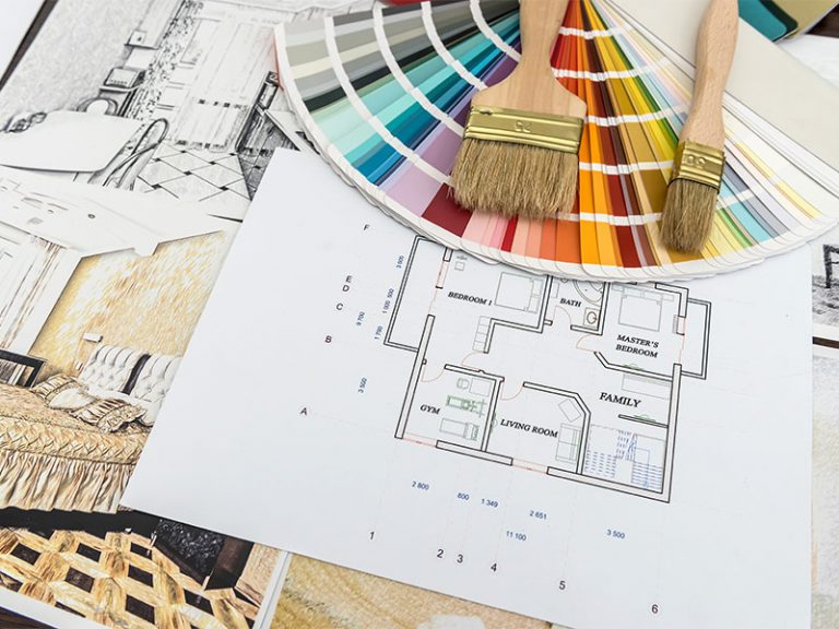
Choosing the perfect paint color for your home can feel like embarking on an artistic adventure, where the palette of options can be both thrilling and overwhelming. But what if you happen to be colorblind? The world of hues and shades might seem inaccessible at first, yet there is a path to creating a lovely space that resonates with your personal style. In this article, we will explore practical strategies and helpful tips that enable anyone, regardless of their color vision, to select the ideal paint color. From understanding the nuances of warm and cool tones to leveraging technology and seeking the guidance of trusted resources,you’ll discover that achieving the perfect ambiance is within your reach. Ready to transform your space into a vibrant reflection of your personality? Let’s dive in!
Understanding Color Theory and Its Impact on Perception
Color theory is a captivating subject that delves into how colors can influence emotions, behaviors, and perceptions. Understanding the relationship between colors can substantially enhance your decision-making process, especially when it comes to choosing paint for your living spaces.for instance, warm colors like reds and <strong/oranges tend to evoke feelings of energy and warmth, while cool colors, such as blues and greens, often promote calm and serenity. It’s essential to consider how these colors will interact with light and the other elements in your home, creating an atmosphere that aligns with your personal preferences and needs.
Even for those who are colorblind, grasping basic color theory concepts can aid in making informed choices. By focusing on elements such as brightness and saturation rather than hue, individuals can select paint colors effectively. Here are some alternative strategies to consider when selecting paint colors:
- Use Samples: Test paint swatches in natural light to see how they appear at different times of day.
- Consider Contrast: Pair colors with varying degrees of brightness to create depth and interest.
- consult Color Grids: Utilize resources that categorize colors based on their emotional impact rather than their hue.

Utilizing Color Tools and Technology for Enhanced Decision-Making
In an era where technology shapes our daily lives,color tools have revolutionized the way we perceive and select paint colors,notably for individuals with color vision deficiencies. Several applications and software designed specifically for color selection are equipped with features that can assist those who are colorblind. Features such as color matching and visual simulation allow users to see how colors will look in different lighting conditions and settings. Using accessible color palettes and customized filters can definitely help pinpoint shades that are more universally discernible, making the decision easier and more enjoyable.
Moreover, advanced color detection tools can assist in identifying and understanding color relationships within a space. By leveraging these technologies, users can create an effective color scheme while avoiding overwhelming combinations that may not suit their preferences. For practical guidance, consider utilizing tools that offer the following:
- Color wheel and Harmony Checkers: helps visualize complementary colors.
- Augmented Reality Apps: See how paint colors look on your walls through your device’s camera.
- Accessible Palette Generators: Provides tailored color options based on user specifications.
| Tool Type | Functionality | best For |
|---|---|---|
| Color Selection Apps | Identifies colors using your camera | colorblind individuals |
| Color Matching tools | Suggests similar colors based on input | Finding alternatives |
| virtual Reality simulators | Immersive visualization of spaces | Understanding layout and focal points |
Exploring the Psychology of Color in Home Design
Color is more than just a visual element; it evokes emotions, influences moods, and shapes perceptions. When selecting paint hues for your home, consider how different colors can affect your feelings and the atmosphere of a room. As an example, warm colors like reds and oranges may induce energy and passion, while cool colors such as blues and greens typically promote calmness and relaxation. Understanding the psychological impact each color can have is essential in creating spaces that not only look aesthetically pleasing but also resonate with your personal well-being.
This journey can be particularly rich for individuals with color vision deficiencies.engaging tools can definitely help translate shades into something more tangible. Analyze your surroundings and choose colors based on concepts rather than hues.Here are some strategies to consider:
- Use texture and material to create contrast and depth.
- Leverage technology such as apps that provide descriptions and suggestions based on light reflection.
- Consult with others to gain insight into how color schemes are perceived by the sighted community.
By doing so, you can enhance your home’s environment without feeling restricted by color vision challenges.
| Color | mood Effect |
|---|---|
| Red | Energy, Passion |
| Blue | Calm, Trust |
| Green | Freshness, Balance |
| Yellow | Joy, Optimism |
Tips for Communicating Color Preferences with Others
When it comes to conveying your color preferences to others, clarity and specificity are key. Rather of simply saying “I like blue,” try to express your preferences in more detail. as a notable example, you might describe a shade as “a soft, light blue reminiscent of a clear sky,” or “a deep navy, similar to the ocean at dusk.” Utilizing analogies to common objects or experiences can help others visualize what you have in mind. Additionally, incorporating materials like color swatches or online paint samples can give people a tangible reference point to better understand your vision.
Another effective strategy is to engage in a collaborative conversation about colors. Encourage others to share their own interpretations and feelings associated with different shades. This can foster a richer discussion and help align everyone’s expectations. Here are some tactics to consider:
- Use descriptive language: Pick out adjectives that evoke emotion or imagery.
- Show examples: Bring along photos or objects that represent the colors you have in mind.
- Leverage technology: use apps or software that allow you to visualize colors in your space.

Creating a Balanced Palette Through Alternative Methods
Exploring alternative methods to create a balanced palette can be both an enlightening and fulfilling experience. One effective way to navigate color choices is to employ color harmony techniques, which rely more on relationships between colors rather than their individual characteristics.Here are some strategies to consider:
- Analogous Colors: Select colors that sit next to each other on the color wheel. This creates a soothing effect, perfect for spaces meant to relax.
- Complementary Colors: Use colors opposite each other on the wheel. This method can produce striking contrasts, making your palette pop.
- Triadic Colors: Employ a mix of three evenly spaced colors on the wheel for a vibrant, yet balanced look.
In addition, utilizing tools like color swatches and visualizer apps can aid in making your selections more intuitive.Don’t shy away from experimenting with textures and finishes, such as matte versus glossy, which can alter the perception of color significantly. For instance, the same color paint can appear dramatically different when applied to various surfaces. Consider referencing this simple table to observe how different finishes can impact hues:
| Finish Type | Color Perception |
|---|---|
| Matte | Soft, muted tones |
| Satin | Warmth with subtle shine |
| Glossy | Bright, reflective quality |
To Wrap It Up
In the vast world of color, finding the perfect paint hue can feel overwhelmingly daunting—especially for those navigating the challenges of color vision deficiencies. However, as we’ve explored in this guide, choosing the ideal shade for your space can be both accessible and enjoyable with the right strategies and tools. By leveraging textures, utilizing technology, and leaning on trusted resources, the palette of possibilities expands beautifully, regardless of how you perceive color.
Remember, your home should reflect your personality and tell your story, and achieving that is possible for everyone. Embrace the journey of exploration and creation, and let your surroundings echo the comfort and joy you envision. With thoughtful consideration and a bit of experimentation,you’ll not only find a color that captivates your heart but also a space that feels genuinely yours. Happy painting!