Pantone colors have become a game-changer in the world of kitchen design. From classic blues to vibrant corals, incorporating these trendy hues into your kitchen can significantly elevate its aesthetic appeal. But how do you seamlessly infuse these vibrant and bold hues into your kitchen cabinets without overwhelming the overall design?
Whether you’re considering a full-blown color overhaul or seeking the right shade, understanding the historical context of Pantone’s influence on interior design is essential. By tapping into the rich history and evolution of color trends, you can make informed decisions that align with both contemporary styles and timeless elegance.
Key Takeaways
- Incorporate Pantone colors in your kitchen design by using Viva Magenta as an accent, harmonizing countertops with Pantone colors, and adding Pantone flair to kitchen stools.
- Transform your kitchen by choosing cabinet colors that align with Pantone shades and adding a backsplash with Pantone pizzazz for a vibrant look.
- Consider incorporating Pantone-colored appliances and cookware to infuse your kitchen with modern and trendy hues.
- Benefit from Pantone colors in kitchens by creating a visually appealing and stylish space that reflects current color trends and adds a pop of personality to your home.
- Embrace the color Very Peri in your kitchen design to stay on-trend and add a touch of creativity and originality to your living space.
- Add Viva Magenta to your kitchen to create a lively and energetic atmosphere, infusing the space with warmth and vibrancy.
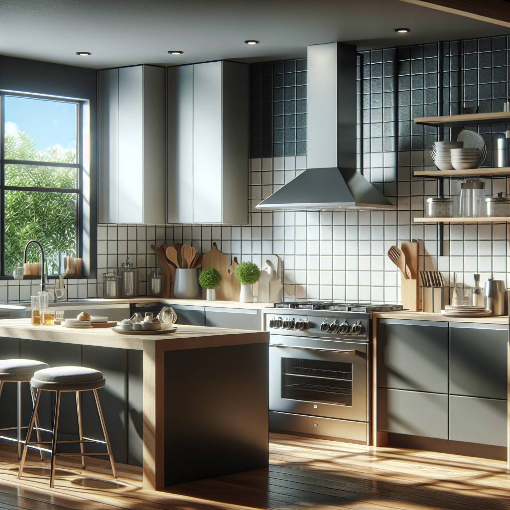
Pantone Colors in Kitchen Design
Understanding Pantone
Pantone is a standardized color matching system used across various industries. It provides a universal language for communicating and selecting colors. Each pantone colour is identified by unique codes, making them easily reproducible. This means that when you choose a specific pantone color for your kitchen design, you can be assured that the exact shade will be replicated consistently.
Color Integration Incorporating pantone colours in kitchen design can create a cohesive and harmonious look. Careful integration of these colors can enhance the overall aesthetic appeal of the kitchen space. For instance, if you select a calming blue as the primary color and complement it with accents in shades like coral or yellow, it brings balance to the overall design.
Balancing different pantone colours within your kitchen can bring depth and dimension to the space. By using lighter tones for larger surfaces such as walls or cabinets and incorporating bolder hues for smaller elements like accessories or backsplashes, you create visual interest without overwhelming the area.
Appetite Stimulation
Certain pantone hues, such as warm reds and oranges, are known to stimulate appetite. Utilizing these hues in your kitchen can evoke a sense of warmth and comfort while also stimulating hunger pangs subtly. For example, painting an accent wall in a rich terracotta hue or incorporating burnt orange bar stools into your kitchen island setup can effectively infuse appetite-stimulating colors into your culinary space.
Strategic use of appetite-stimulating color pantones not only adds vibrancy but also enhances the dining experience for both family members and guests alike.
Focal Points
When strategically placed throughout your kitchen, vibrant colors have an incredible ability to draw attention towards specific areas while adding visual interest and a pop of color simultaneously. For instance, if you opt for classic white cabinetry paired with sleek stainless steel appliances but introduce pops of bold pantones through statement pieces like colorful pendant lights above an island or striking artwork on one wall; this creates dynamic focal points within the room.
Viva Magenta as an Accent
Incorporating Pantone colour on accent walls can instantly transform the ambiance of the kitchen. Bold or contrasting hues on accent walls serve as statement pieces within the overall design. For example, a vibrant hue like Viva Magenta can create a striking focal point in an otherwise neutral-colored kitchen.
Accent walls provide an opportunity to experiment with different Pantone color combinations, allowing homeowners to express their unique style and personality through their choice of vibrant color schemes. By strategically placing accent walls in areas with minimal obstructions, such as behind open shelves or islands, the impact of these vibrant pantone colors is maximized.
Introducing Pantone colors through textiles such as curtains and tablecloths adds soft accents to the kitchen. Textile touches allow for easy incorporation of varying Pantone shades into the design scheme, creating a cohesive and harmonious look throughout the space. For instance, using textiles in complementary shades to Viva Magenta, a Pantone color, can help balance its boldness while infusing warmth and depth into the kitchen’s aesthetic.
Textiles contribute to a layered and inviting atmosphere in the kitchen space by adding visual interest and tactile appeal without overwhelming the overall design. Furthermore, they offer flexibility in changing color palettes seasonally or during special occasions without significant cost or effort.
Small decorative elements in Pantone colors, like vases or artwork, can infuse personality into the kitchen while complementing other design elements. Thoughtfully selected decorative details serve as finishing touches that tie the design together cohesively by echoing key hues found elsewhere in the space, including pantone color.
Decorative details offer opportunities for subtle pops of pantone color throughout the kitchen by incorporating small yet impactful accents strategically placed around various zones such as countertops, shelving units, or dining areas.
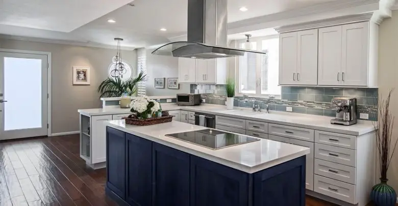
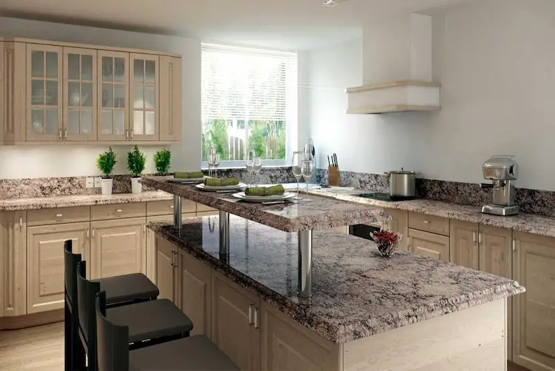
Countertops and Pantone Harmony
Material Selection
Choosing countertops in complementary Pantone colors is essential for achieving a cohesive and unified kitchen design. From quartz to laminate, the material selection plays a crucial role in seamlessly integrating Pantone hues into the kitchen space. For instance, if you opt for Viva Magenta as an accent color, selecting countertops in shades like Pink Salt or Raspberry Sorbet can create a visually appealing and well-coordinated aesthetic.
Materials in Pantone colors contribute significantly to establishing a harmonious atmosphere within the kitchen. When considering countertop materials, it’s important to explore options that not only align with your desired Pantone palette but also offer durability and practicality. By incorporating these materials, including pantone color, thoughtfully, you can achieve a balanced blend of functionality and visual allure within your kitchen.
Color Pairing
Pairing complementary or analogous Pantone colors is key to enhancing the visual appeal and balance of your kitchen space. For example, if you’ve chosen Classic Blue as one of your primary Pantone hues, pairing it with lighter shades such as Baby Blue or Skyway can create a soothing and harmonious ambiance in the kitchen. Skillful color pairing allows for creative expression while ensuring that each hue complements the others seamlessly.
Exploring diverse color pairings offers ample opportunities for customization within your kitchen design. Whether you’re working with quartz countertops or laminate surfaces, experimenting with different combinations of Pantone colors enables you to infuse personality into the heart of your home while maintaining an aesthetically pleasing environment.
Kitchen Stools and Pantone Flair
Style Considerations
Different Pantone colors are suitable for various interior design styles, such as modern or traditional. By considering the desired style, it becomes easier to select Pantone hues that complement the overall design concept. For instance, a modern kitchen might benefit from vibrant and bold Pantone colors, while a traditional kitchen may lean towards more muted and classic tones. These style considerations guide the selection of appropriate color palettes to achieve specific design aesthetics in the kitchen.
For example:
- In a sleek, modern kitchen with minimalist decor, incorporating bright and energetic Pantone colors like Living Coral or Lapis Blue can enhance the contemporary ambiance.
- On the other hand, in a rustic farmhouse-style kitchen, soft and earthy Pantone shades such as Hazelnut or Moss Green can contribute to an inviting and cozy atmosphere.
Color Coordination
Coordinating multiple Pantone colors requires careful consideration of their undertones and intensity levels. Harmonizing diverse Pantone shades ensures a balanced and well-coordinated color scheme in the kitchen. By paying attention to how different colors interact with each other, it’s possible to create visual harmony throughout the space.
For instance:
- Pairing complementary Pantone colors, such as Serenity (light blue) with Rose Quartz (pale pink), can create a soothing and elegant color combination for accents like bar stools or decorative elements in the kitchen.
- Additionally,color coordination contributes significantly to achieving a visually cohesive look across various elements of the kitchen design – from walls to furniture pieces – creating an aesthetically pleasing environment for cooking and dining activities.
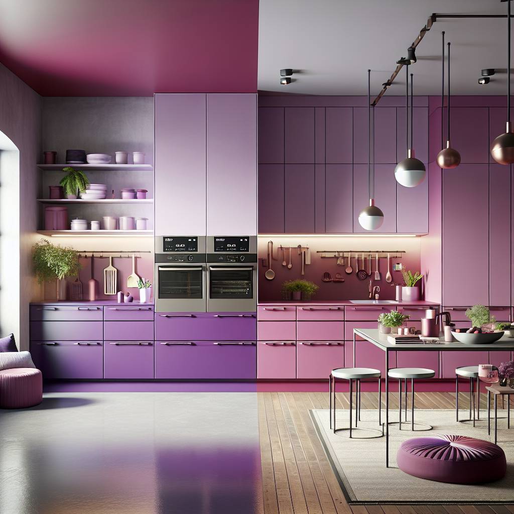
Cabinet Color Transformations
There are several creative approaches that can significantly transform the look and feel of the space by using colour. One effective method is through cabinet color transformations, which can be achieved using various techniques.
Paint Options
Utilizing paint in different Pantone colors offers a versatile way to introduce bursts of vibrancy or subtlety into distinct areas of the kitchen. For instance, painting the cabinet doors with a bold Pantone shade can instantly revitalize the entire space, adding an eye-catching focal point. Employing specific paint finishes and colour allows for achieving desired textures and visual effects within the kitchen, contributing to a unique ambiance.
Furthermore, utilizing paint provides an accessible means of incorporating specific Pantone shades into the overall design scheme. This flexibility enables homeowners to experiment with different color combinations and create personalized looks tailored to their preferences. Whether opting for a striking accent wall or subtly infusing Pantone hues into smaller details like trimmings or shelving units, paint options offer endless possibilities for enhancing the kitchen’s aesthetic appeal with colour.
Hardware Updates
Updating hardware elements such as cabinet handles or faucets with Pantone-colored finishes presents an opportunity to introduce subtle yet impactful changes to the kitchen’s appearance. By coordinating these hardware updates with chosen Pantone colors from swatches like Classic Blue or Illuminating Yellow, homeowners can achieve a cohesive and polished look throughout their kitchen space.
Moreover, implementing hardware updates allows for incorporating small doses of specific Pantone hues into the overall design palette without overwhelming the visual balance of the room. This approach enables individuals to seamlessly integrate trending colors while maintaining a timeless appeal that aligns with their personal style preferences.
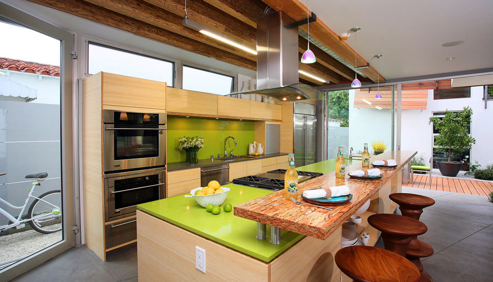
Backsplash with Pantone Pizzazz
Tile Choices
Selecting tiles in diverse Pantone colors allows for creative expression and adds texture to the kitchen. Tiles play a significant role in introducing specific Pantone hues into backsplashes, flooring, or other surfaces within the kitchen. Incorporating tiles in shades of “peach fuzz” can bring warmth and vibrancy to the space by adding color.
Tiles offer versatile options for integrating various Pantone shades into different areas of the kitchen. By using a mix of complementary or contrasting tile colors, homeowners can create visually stunning backsplashes that serve as focal points in their kitchen design.
Pattern Play
Patterns featuring different Pantone colors can be incorporated through wallpapers, fabrics, or backsplashes for added dynamism within the kitchen design. Whether it’s geometric shapes or floral motifs, patterns provide opportunities for artistic expression while incorporating specific Pantone shades into various elements of the kitchen.
Pattern play introduces depth and personality through intricate combinations of diverse Pantone hues within the space. Utilizing a splash of patterned wallpaper and colour behind open shelves can add visual interest without overwhelming the overall design scheme.
Pantone-Colored Appliances and Cookware
Small Appliances
Integrating small appliances in select Pantone shades adds functional yet stylish accents to the kitchen design scheme. For example, a vibrant red toaster or a sleek electric kettle in a calming blue colour can instantly elevate the visual appeal of the kitchen while serving practical purposes. These small appliances offer opportunities for introducing pops of vibrant Pantone tones into the overall kitchen layout, creating an eye-catching focal point within the space.
Carefully selected small appliances in Pantone shades contribute to a unified and well-coordinated look within the kitchen. Imagine incorporating a lime green blender or a sunshine yellow stand mixer into your kitchen decor – these additions not only infuse energy and personality but also create harmony with other elements such as backsplashes adorned with complementary Pantone colors. By strategically placing these small appliances throughout the kitchen, you can achieve balance and cohesiveness in your design aesthetic.
Cookware Selections
Choosing cookware in complementary Pantone shades enhances the visual appeal and cohesiveness of the kitchen by adding color. Picture an array of pots and pans in varying shades of teal or coral neatly displayed on open shelves – this not only introduces color diversity but also serves as functional decor elements that tie together different areas of your culinary space seamlessly.
Cookware selections provide opportunities for incorporating specific Pantoneshades into the daily functionality of the kitchen. Whether it’s a set of cobalt blue non-stick pans or pastel-hued ceramic bakeware, each colour contributes to both form and function within your cooking environment. Coordinating cookware with chosen Pantones colors contributes to a coherent and polished design aesthetic that elevates every aspect of your culinary experience.
Benefits of Pantone Colors in Kitchens
Visual Appeal
Incorporating Pantone colors into kitchen design can significantly enhance the overall visual appeal of the space. By utilizing these shades in various aspects of the kitchen, such as walls, cabinets, or countertops, you can create a dynamic and engaging atmosphere. For example, painting the kitchen walls with a vibrant Pantone color like “Lush Meadow” or “Flame” can instantly transform a dull kitchen into an eye-catching and inviting space.
Strategic use of Pantone shades contributes to an aesthetically pleasing environment within the kitchen. Imagine having sleek stainless-steel appliances complemented by accents of Pantone’s “Rose Quartz” or “Serenity” color. This strategic combination creates an appealing contrast that draws attention and adds depth to the overall design.
Emotional Impact
The emotional impact of specific Pantone shades plays a crucial role in shaping the ambiance of the kitchen. Warm tones like “Butterum” or “Potter’s Clay” colour can evoke feelings of comfort and coziness, making your kitchen feel more welcoming and homely. On the other hand, incorporating cooler hues such as “Island Paradise” or “Aurora Red” can infuse serenity and sophistication into the space.
Incorporating Very Peri into Kitchen Design
Wall Paint and Accents
Incorporating Pantone color like Very Peri can be achieved through strategic use of wall paint and accents. By painting the walls or adding intricate accents in select Pantone shades, you instantly transform the ambiance of your kitchen. Purposeful use of these colors adds layers of texture and visual interest to the overall design, creating a vibrant and dynamic space.
Experimenting with diverse Pantone tonalities across different areas of the kitchen presents an exciting opportunity for customization. For instance, using Very Peri as an accent color on a feature wall can bring a modern and stylish touch to the kitchen, while lighter variations of this shade can be used for a more subtle yet impactful look on other walls or cabinets.
- Transform ambiance instantly
- Add layers of texture and visual interest
- Experiment with diverse Pantone tonalities
Accessory Integration
Integrating accessories in specific Pantone tones is another effective way to infuse color into your kitchen design while adding personal touches. Carefully selected accessories in various shades of Very Peri contribute finishing touches and subtle pops of color that enhance the overall look. From small appliances like stand mixers or coffee makers to decorative items such as vases or artwork, these accessories allow for seamless incorporation of varying Pantone tonalities into the design scheme.
The key lies in balance; by strategically placing these colorful accessories throughout the kitchen, you create cohesion within the space without overwhelming it with too much color. This approach ensures that each element contributes harmoniously to the cohesive aesthetic while injecting personality into your culinary haven.
- Infuse color into kitchen design
- Add personal touches through carefully selected accessories
- Create cohesion within the space
Adding Viva Magenta to Your Kitchen
Bold Statements
Making bold statements with vibrant Pantone tones creates striking visual focal points within the kitchen space. Imagine incorporating a bold Viva Magenta accent wall in an otherwise neutral-toned kitchen. This not only adds a pop of color but also serves as a captivating centerpiece, drawing attention and infusing energy into the room.
By using specific Pantone tonalities in different elements of the kitchen design, you can create unique expressions that reflect your personal style. For instance, consider integrating Viva Magenta bar stools or pendant lights to make a bold and expressive statement amidst an otherwise monochromatic setting. These bold choices add personality and vibrancy to the overall ambiance.
Incorporating bold statements in select Pantone tones adds dramatic flourishes to the overall aesthetic of the kitchen. Picture sleek cabinets painted in Viva Magenta against a backdrop of minimalist white walls; this dynamic contrast elevates the visual impact while creating an unforgettable impression.
Subtle Inclusions
Subtle inclusions of sophisticated Pantone tones add understated elegance to the overall design composition of the kitchen. For example, introducing small appliances like a toaster or kettle in Viva Magenta subtly weaves cohesive pops of color throughout the space without overwhelming it.
Incorporating subtle inclusions provides nuanced touches of specially selected Pantone tonalities across different aspects of the kitchen design. From dish towels and table linens to decorative accents such as vases or artwork featuring Viva Magenta hues, these subtle additions contribute to a coherent and sophisticated look while infusing distinctive pops-of-color throughout the kitchen space.
Summary
You’ve learned how to infuse Pantone colors into your kitchen design, from incorporating Viva Magenta as an accent to utilizing Very Peri in your kitchen space. Whether it’s through cabinet color transformations, adding Pantone-colored appliances, or integrating Pantone pizzazz into your backsplash, these vibrant hues can bring life and energy into your cooking area. The benefits of using Pantone colors in kitchens are undeniable, and by following these tips, you can create a kitchen that exudes style and personality.
Now it’s time to roll up your sleeves and get creative! Experiment with different Pantone colors and see how they can transform your kitchen into a dynamic and inviting space. Don’t be afraid to play with bold shades or subtle accents – let your imagination run wild as you incorporate Pantone colors into your kitchen design.
Frequently Asked Questions
How can I incorporate Pantone colors into my kitchen design?
You can incorporate Pantone colors in your kitchen design by using them for accent walls, cabinet colors, countertops, backsplashes, and even through colored appliances and cookware. Consider integrating Pantone shades like Viva Magenta or Very Peri to add flair and vibrancy to your kitchen space.
What are the benefits of using Pantone colors in kitchens?
Incorporating Pantone colors into your kitchen design can bring vibrancy, energy, and a sense of modernity to the space. These colors can also evoke specific emotions and moods based on color psychology. They allow you to personalize your kitchen’s aesthetic while staying on-trend with contemporary color palettes.
How should I choose the right Pantone color for my kitchen?
When choosing a Pantone color for your kitchen, consider factors such as the existing decor style, natural light exposure in the space, personal preferences for certain hues or tones, and how you want the color to make you feel when spending time in the kitchen. It’s essential that the chosen shade complements other elements within the room.
Can I use multiple Pantone colors in my kitchen design?
Yes! You can absolutely use multiple Pantone colors in your kitchen design. However, it’s important to ensure that these hues harmonize well together without overwhelming the space. Utilize a primary color as a base and then introduce complementary or contrasting shades strategically throughout various elements of your kitchen.
What are some creative ways to add pops of Pantone colors to my kitchen?
You can creatively infuse pops of Pantone colors into your kitchen through accessories like vibrant stools or cookware items. Consider incorporating colorful backsplashes or utilizing statement pieces such as pendant lights painted with striking pantones – all adding character while maintaining balance within your overall design scheme.