A room,a product,or a painting can feel flat and one-dimensional until light finds something to play off. Glossy and matte finishes do that playing – they’re like conversational partners: one catches the eye with a confident gleam, the other listens and grounds the scene with quiet texture. Together they create a visual rhythm that turns simple surfaces into layered stories.
This pairing works because it engages both light and touch. Gloss redirects and amplifies light, creating highlights and focal points; matte absorbs and softens it, revealing detail and nuance. The contrast establishes depth, clarifies hierarchy, and invites closer inspection, whether in interior design, product packaging, or car bodies. Beyond aesthetics, combining finishes can be practical too - hiding wear in low-traffic areas while celebrating features where attention is wanted.
In the sections that follow, we’ll unpack the science of reflection and perception, look at stylistic and functional benefits, and explore practical ways to mix glossy and matte finishes without overdoing it.The goal: understand not just that the duet works, but why it sings.
Understanding the visual chemistry between glossy and matte finishes
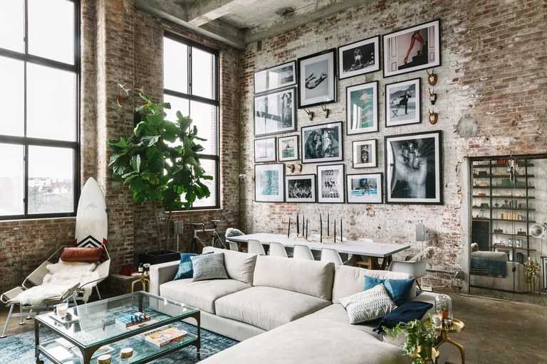
Gloss and flat surfaces speak diffrent visual languages: glossy finishes catch and amplify light, creating pops of attention, while matte surfaces absorb and mellow reflections, offering a calm, cohesive backdrop. When placed together they act like a visual duet – one voice accentuates, the other stabilizes – so your eye has both a focal point and a place to rest. Designers use this interplay to sculpt perceived depth, mask imperfections, and guide movement across a surface without changing color or pattern.
- Contrast for focus – gloss directs attention to key details.
- Texture for touch – matte invites closer inspection and feel.
- Balance for scale – mixing finishes adjusts perceived size and proportion.
A simple way to plan combinations is to assign roles: let glossy elements act as punctuation marks and matte areas carry the narrative.The tiny table below outlines a rapid shorthand you can use when sketching ideas or specifying finishes for a project.
| Finish | Visual Role |
|---|---|
| Glossy | Highlight,focal pop |
| matte | Grounding,texture field |

Choosing the right sheen balance for different rooms and surfaces
Think of finishes the way a composer thinks of instruments: one sets the mood, the other adds the sparkle. For practical decisions, match sheen to function – choose durability where you need it and softness where you want comfort. Use gloss sparingly to draw light and attention, and matte expanses to let textures and color read true. Quick, room-by-room cues you can lean on:
- Ceilings: flat or matte keeps rooms cozy and conceals imperfections.
- Walls (living/dining): eggshell or satin for a soft,washable finish that doesn’t shout.
- Kitchens & bathrooms: semi-gloss for moisture resistance and easy cleaning.
- Trim & doors: gloss for crisp edges and visual contrast.
| Room | Suggested Sheen | Why |
|---|---|---|
| Living room | Eggshell | Subtle, forgiving texture |
| Bathroom | Semi-gloss | Moisture + scrubbability |
| Trim | gloss | Sharp definition |
| Cabinets | Satin | Durable with gentle sheen |
When you mix sheens, aim for intentional contrast: let a glossy door or a lacquered table act as a highlight against matte walls so the eye has a place to rest. For surfaces like wood or metal,match sheen to the material’s character – use higher sheen to read grain and polish,lower sheen to hide flaws and create depth. The most compelling rooms use sheen like punctuation: a few bright marks in a quiet sentence make the meaning clear.
Material specific recommendations: wood, metal, glass and painted walls
Lean into the natural personality of each surface: for wood, let the grain wear the quiet role by choosing a matte or satin finish on larger planes while reserving glossy highlights for trim, legs and inset panels. For painted walls, think of the wall as the stage and moldings as the spotlight – a chalky matte field provides depth and hides flaws, while a touch of gloss on door frames or picture rails adds crisp definition and an unexpected gleam. Tips to try:
- Warm woods: matte body + high-gloss trim for contrast without flashiness.
- Dark painted walls: matte to absorb light, gloss to reflect and outline.
Metals and glass crave contrast to reveal their best angles: brushed or micro-textured metals read more complex when paired with polished or mirrored accents, and glass becomes sculptural when frosted panes sit beside glossy edges or hardware. Use finish contrast to choreograph how light moves through a room – a glossy pinstripe on a matte facade catches the eye, a satin fixture softens a glossy backsplash. Quick reference:
- Metals: brushed/matte body + polished accents for modern balance.
- Glass: frosted panes + glossy frames to control glare and depth.
| Material | Matte role | Glossy accent |
|---|---|---|
| Wood | Floorboards, large panels | Trim, insets |
| Painted walls | Field color | Molding, doors |
| Metal | Brushed bodies | Knobs, rails |
| Glass | Frosted panes | Edges, mirrors |

Application and maintenance strategies to keep contrast crisp and cohesive
Think of glossy and matte as a duet: each finish has a voice that needs careful staging. Start with proper surface prep-clean, sand, and prime so light reads consistently across sheens. Use painter’s tape and a soft-bristle brush to feather transition lines, and keep your roller nap consistent to avoid texture shifts. Quick application checklist to keep contrast intentional, not accidental:
- Prime first – a single, neutral undercoat harmonizes gloss and flat.
- Paint order – lay down the matte field, then add gloss as a controlled accent.
- edge control – thin the first coat of gloss slightly to avoid ridge buildup at seams.
After the curtain goes down, maintenance keeps the interplay crisp: daily dusting, gentle cleaners for gloss, and soft sponges for matte areas to avoid scuffing. Keep a tiny touch-up kit with both sheens and the original tint to refresh high-traffic spots. For easy reference, here’s a short care chart you can pin in a closet or toolbox:
| Surface | Frequency | Recommended Product |
|---|---|---|
| Gloss trim | Weekly wipe | Microfiber + mild soap |
| Matte walls | Monthly spot-clean | Soft sponge, water only |
| High-touch areas | As needed | Touch-up kit (same sheen) |
- Avoid abrasive pads on gloss – they dull the shine.
- Store samples of both finishes for color-matching future repairs.
Wrapping Up
Gloss and matte aren’t opposites so much as collaborators: one catches the light, the other grounds it. Together they create depth, rhythm and a tactile language that guides the eye and invites touch, turning flat surfaces into layered stories.
The key is restraint and intent-let shine highlight focal points while matte areas absorb and balance. Whether you’re designing a room, a product or a piece of art, think in contrasts of scale, color and finish rather than uniformity; small accents of gloss can enliven a muted matte field, while broader matte planes can lend quiet sophistication to glossy highlights.
Mixing finishes is as much about mood as mechanics. Try, observe and refine-soon the interplay of reflection and restraint will feel less like a technique and more like a signature.