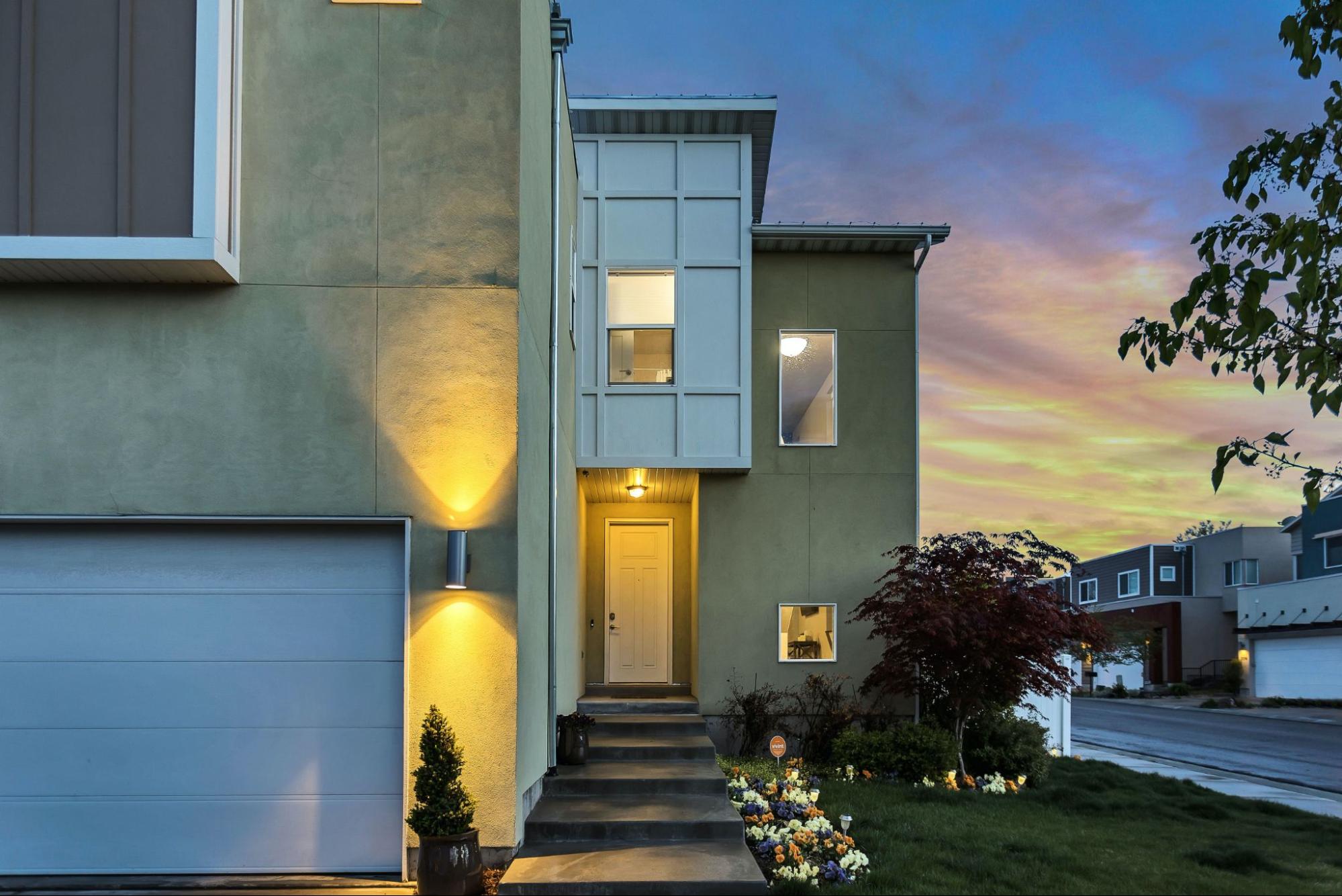
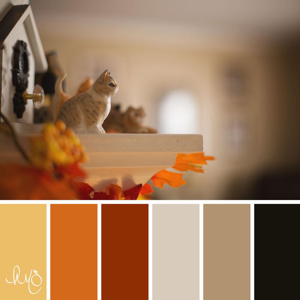
In a world where minimalism has often been synonymous with muted greys and stark whites, a vibrant revolution is taking shape in the realm of modern home design. Gone are the days when a palette limited to shades of gray reigned supreme; homeowners and designers alike are embracing the warmth of inviting hues that breathe life and character into contemporary spaces. From rich terracottas to soft sage greens, warm color palettes are redefining the aesthetics of our living environments, creating havens that radiate comfort and joy. In this exploration, we delve into the transformative power of color, uncovering how these lively tones are shaping not just the look of our homes but also the very essence of modern living. Say goodbye to grey, and join us as we celebrate the welcoming embrace of warmth in home design.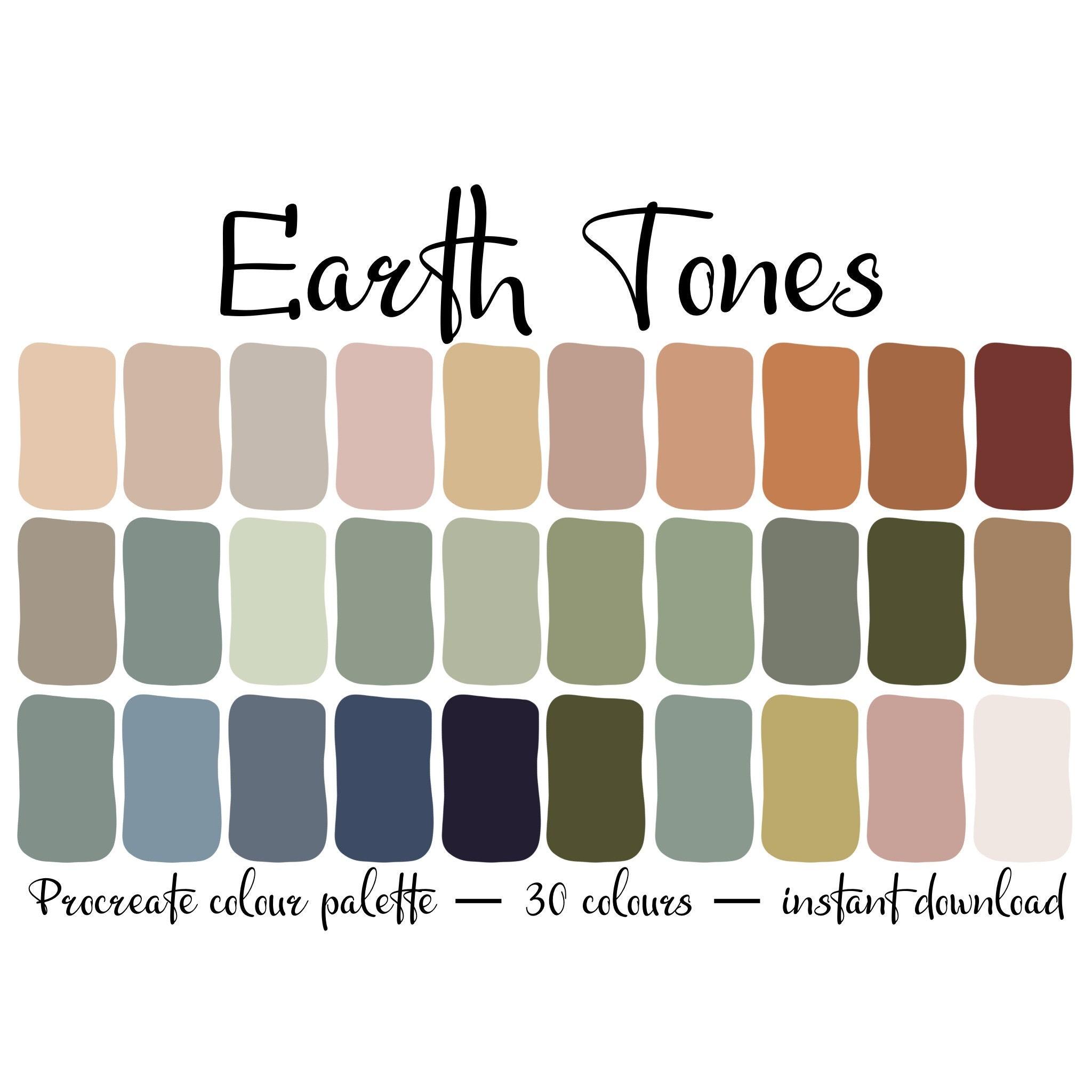
Embracing Warmth: The Allure of Earthy Tones in interior Design
in the evolving landscape of interior design, the shift from cool, sterile shades to warm, earthy tones symbolizes a desire for comfort and connection to nature. rich browns, soft terracottas, and muted greens infuse spaces with an inviting ambiance, evoking feelings of coziness reminiscent of a serene outdoor retreat. These palettes not only foster a sense of tranquility but also serve as a canvas for personal expression. Here are some popular earthy tones currently trending:
- Warm Taupe: Versatile and timeless, a perfect backdrop for various styles.
- Terracotta: Infuses warmth and character, ideal for accent walls or pottery.
- Olive green: Soft and calming, brings a breath of fresh air indoors.
Pairing these colors with natural textures like wood,stone,and woven fabrics enhances the organic feel of yoru space. When choosing furnishings and decor, consider a mix of muted yet inviting shades that complement one another. A strategic combination of earthy tones can create a harmonious flow throughout your home. Below is a simple guide that illustrates how to effectively balance these colors:
| Color | Suggested Pairing | Ideal Space |
|---|---|---|
| Burnt Sienna | Creamy whites | Living room |
| Deep Olive | Soft Beige | Bedroom |
| Rust Red | Muted Gold | Dining Room |
Blending textures and Shades: Creating Depth with Warm Color Combinations
Using warm color combinations in interior design offers an opportunity to create spaces that are visually stimulating and inviting.By blending textures and shades, you can achieve a sense of depth that captivates the eye and enhances the overall warmth of a room. Consider incorporating materials like soft fabrics and rich woods that bring a tactile quality to your design, contrasting beautifully with lighter hues. Shades of burnt orange, sun-kissed yellows, and soft reds can be layered through various elements, from accent walls to upholstery, creating a harmonious yet dynamic atmosphere.
To further elevate the design, focus on the following techniques for integrating warm palettes effectively:
- Contrast with Light: use lighter shades of cream or pale beige to balance bold colors and reflect light.
- Layering Textures: Mix plush throws, woven rugs, and smooth surfaces to create visual interest.
- Accent Details: Incorporate metallic or glass accents in warm tones like gold or copper for added sophistication.
By thoughtfully combining these elements, you’ll transform any room into a vibrant yet cozy haven that radiates warmth and character.
Choosing the Right Hues: A Guide to Selecting the Perfect Warm Palette
When it comes to creating a warm and inviting atmosphere in your home,the right color palette can make all the difference. Begin your journey by considering the emotional impact of colors. warm hues such as red, orange, and yellow evoke feelings of comfort, vitality, and enthusiasm. To expertly blend these shades,focus on a harmonious relationship between bold and subtle tones. Here are some tips to guide your selection:
- Identify your dominant hue: Choose a primary color that resonates with your personal style.
- Incorporate accent colors: Use complementary shades to add depth and character.
- use neutrals: Ground your palette with earthy tones like beige and taupe for balance.
Once you’ve established your core colors, it’s essential to assess how they interact with your space. natural light plays a meaningful role in how colors appear throughout the day. A quick way to visualize your palette is by creating a simple table comparing different color options and their effects:
| Color | Effect | Best Used In |
|---|---|---|
| Terracotta | Warm and inviting | Living rooms, kitchens |
| Sunshine Yellow | Bright and cheerful | Dining areas, playrooms |
| Warm Beige | Calming and grounding | Bedrooms, offices |
By navigating the nuances of color and applying thoughtful combinations, you can transform your interiors into a masterpiece of warmth and comfort. Embrace the beauty of a well-chosen warm palette to redefine your spaces away from the dullness of grey.
Transforming Spaces: Tips for Incorporating Warm Colors into Your Home Decor
Transforming your home with warm colors can create a welcoming atmosphere that invites relaxation and comfort. Consider incorporating shades like terracotta,mustard yellow,and deep burgundy into your space to evoke feelings of coziness. Here are some effective strategies:
- Accent Walls: Paint a single wall in a bold warm color to create a stunning focal point without overwhelming the space.
- Textiles: Use warm-colored throws, cushions, or rugs to add texture and warmth to your furniture—these can easily be changed seasonally for an updated look.
- Artwork: Select pieces that feature warm tones to draw the eye and enhance your room’s mood.
To further integrate these vibrant shades, try balancing them with neutral tones or natural materials. Wooden elements, such as furniture or decorative objects, pair beautifully with warm colors, grounding the space and adding depth. Additionally, you can create a harmonious palette by arranging color samples alongside each other.
| Color | Use | Effect |
|---|---|---|
| Terracotta | Accent Walls | Invokes earthiness |
| Mustard Yellow | Cushions | Adds a cheerful vibe |
| Deep Burgundy | Artwork | Creates sophistication |
Q&A
Q&A: Say Goodbye to Grey: Warm Color Palettes Redefining Modern Homes
Q: Why are warm color palettes becoming popular in modern home design?
A: The shift towards warm color palettes reflects a collective desire for comfort and inviting atmospheres in our living spaces.As people seek to create homes that feel more personal and alive, colors like terracotta, soft yellows, and muted greens offer a refreshing contrast to the cold, sterile aesthetic of grayscale hues.
Q: What are some examples of warm colors that are trending now?
A: Trending warm colors include earthy tones such as rust, ochre, sandy beige, and pastel shades like peach and blush. These colors promote a sense of tranquility and can easily complement various styles, from mid-century modern to rustic chic.
Q: How can homeowners incorporate warm colors into their existing spaces?
A: Homeowners can start small by adding warm-toned accessories, like throw pillows, rugs, or artwork. For a bolder approach, consider repainting an accent wall or adding warm hues to your cabinetry or furniture. Layering different warm shades also adds depth and dimension to a room without overwhelming the senses.
Q: Are there specific rooms where warm colors particularly shine?
A: Absolutely! Warm colors are particularly effective in communal spaces like living rooms and kitchens, where people gather and connect. In bedrooms, soft warm tones can create a cozy sanctuary, encouraging relaxation and rest. Even bathrooms can benefit from warm hues, transforming them into spa-like retreats.
Q: How do warm color palettes influence mood and wellbeing?
A: Color psychology suggests that warm colors can evoke feelings of happiness,comfort,and energy. By incorporating these tones, homeowners can foster a more positive environment, supporting social interactions and enhancing overall wellbeing.
Q: What design styles blend well with warm color palettes?
A: Warm colors lend themselves beautifully to several design styles, including bohemian, farmhouse, and even contemporary designs when paired with modern materials and shapes. Their versatility allows homeowners to express their individuality while still embracing a cohesive look.
Q: Is it possible to mix warm colors with cooler tones successfully?
A: yes! When done thoughtfully, mixing warm and cool tones can create a dynamic and balanced space. Use cooler shades as accents or grounding elements to highlight the warmth, ensuring that the overall design feels harmonious rather than chaotic.
Q: what final tips can you provide for those looking to embrace warm colors in their homes?
A: Start with a color scheme that resonates with you personally, and don’t shy away from experimentation. Whether through large statements or small decorative elements, the key is to create a sense of flow and cohesion throughout your home. Remember, the ultimate goal is to cultivate a space that not only looks good but feels good too.
The Way Forward
As we step into a new era of interior design, the shift from muted greys to warm color palettes symbolizes more than just a trend—it represents a transformation in how we experiance and interact with our living spaces. By embracing shades that evoke warmth, comfort, and vitality, homeowners are not merely stylizing their environments; they are curating a lifestyle that reflects a renewed thankfulness for the essence of home.Whether it’s the sun-kissed tones of terracotta, the earthy depths of ochre, or the serene subtleties of muted pastels, these dynamic hues invite us to reconnect with our surroundings and with each other. As we bid farewell to the chill of grey, we welcome a spectrum of possibilities that breathe life into modern homes, illustrating the idea that color is not just an aesthetic choice but a powerful medium for personal expression and well-being. Let your home be a true reflection of your essence—one warm hue at a time.