Creating a harmonious and inviting home begins long before the first brushstroke hits the wall; it starts with a vision-an artistic tapestry woven from the colors that speak to you. A thoughtfully crafted color palette has the power to transform your living space, reflecting your personality and enhancing your mood. In this guide, we will explore the essential steps to building a cohesive color palette for your entire home. From understanding the emotional impact of colors to considering the flow between rooms, you’ll learn how to curate a symphony of hues that not only ties your home together but also creates an atmosphere that resonates with comfort and style. Whether you’re a seasoned decorator or just beginning your journey, let’s embark on this colorful adventure to bring your dream home to life.
Establishing Your Color Foundation Through Inspiration and Functionality
Creating a cohesive color palette for your home begins with drawing inspiration from various sources that resonate with your personal style and daily life. Visit local art galleries, nature parks, or even explore your favorite fabrics and accessories for a burst of ideas. Look closely at the shades and tones that evoke emotion or create ambiance. Consider collecting images or samples that catch your eye,whether its a stunning sunset,an intricate pattern on a textile,or the soothing hues of a coastal landscape.Some key sources of inspiration include:
- Nature: Observe color combinations in flowers, trees, and landscapes.
- Artwork: Select pieces that showcase colors you’re drawn to.
- Travel: Capture unique color palettes from your journeys.
- Fabric Swatches: Utilize textiles from throw pillows or curtains.
While inspiration offers a creative spark, functionality is essential in shaping your color foundation. When establishing your palette, think about the emotions and atmospheres you want to evoke in each space. As an example, a calming blue may suit a bedroom, while energetic yellows might be perfect for a home office. To ensure cohesion, create a mood board that integrates your chosen shades, allowing you to visualize how they flow together throughout the different rooms. Remember to consider:
| Functionality | Suggested Colors |
|---|---|
| Relaxation | Soft Blues, Greens |
| Creativity | Bold yellows, Oranges |
| Focus | Neutral Grays, Whites |
| Warmth | Earthy Browns, Terracotta |
Understanding Color Theory for Harmonious Home Design
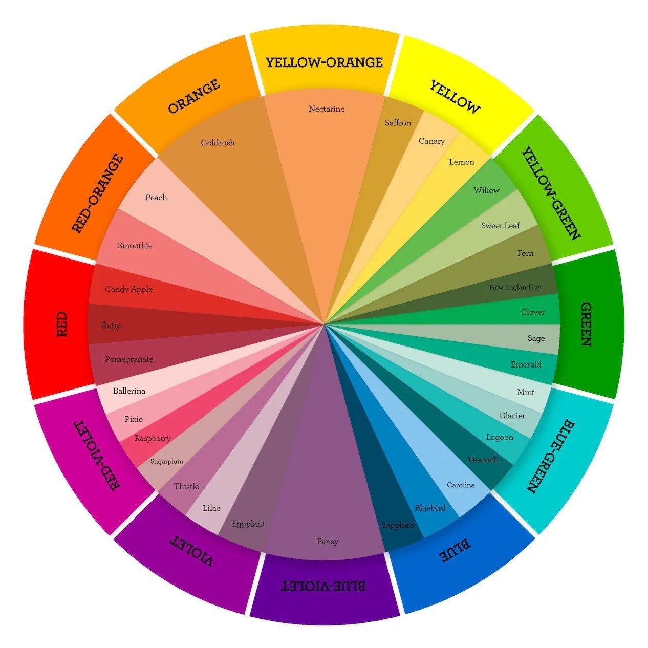
To build a cohesive color palette throughout your home, consider the three main components of color theory: hue, saturation, and brightness. Hue refers to the actual color itself,while saturation describes the intensity or purity of that color. lastly, brightness indicates how light or dark a color appears. Start by selecting a few key hues that resonate with your personal style-these can be inspired by nature, artwork, or existing furniture. Aim for a balance by mixing warm colors like reds and yellows with cool tones such as blues and greens to create a dynamic yet harmonious environment.
After selecting your core hues,it’s essential to think about the 65-30-5 rule in your submission of color throughout the spaces in your home. This guideline suggests using 65% of a dominant color (walls and larger furnishings), 30% of a secondary color (softer accents like rugs or curtains), and 5% for accent colors (such as cushions or decorative elements). Complementary colors can enhance visual interest and create tension in a room, while analogous colors, which sit next to each other on the color wheel, promote unity. Incorporating textures and patterns can also help make your palette feel richer and more inviting. Consider the following color combinations for inspiration:
| Color Pairing | Effect |
|---|---|
| Teal & Gray | Modern and calming |
| Mustard & Olive Green | Warm and earthy |
| Blush Pink & Navy | Chic and complex |
| Coral & Turquoise | Vibrant and playful |
Creating a Cohesive flow with Transition Colors
To effortlessly connect the different spaces in your home, consider using a series of transition colors that create a harmonious flow.These are hues that work well between the more vibrant colors in your main palette. choose two to three key transition colors that can serve as bridges. These might potentially be muted shades of your primary colors, soft neutrals, or gentle pastels that soften the leap from one room’s distinct vibe to another. By utilizing these specific shades in accessories, wall art, or even furniture upholstery, you’ll draw the eye smoothly from one space to the next, fostering a sense of unity throughout your house.
To aid in visualizing your transition colors,you might find it helpful to create a color gradient table that showcases how each transition color flows into your main palette. Consider including these elements in your design strategy:
| Room | main Color | Transition Color |
|---|---|---|
| Living Room | Deep Teal | Soft Aqua |
| Dining Room | Warm Coral | Muted Peach |
| Bedroom | Calming Lavender | Pale Lilac |
By strategically incorporating transition colors, you not only enhance the aesthetic appeal of your home but also evoke a serene atmosphere that feels crafted and cohesive. Whether you’re painting walls or selecting decor pieces, these transitional hues can help you maintain that fluidity, allowing each space to retain its individuality while still feeling part of a larger, harmonious narrative.

Selecting Accent Shades to Add Personality and Interest
Accent shades are a playful way to inject personality into your home while providing visual intrigue. When selecting these hues, consider colors that resonate emotionally and evoke specific atmospheres. Popular choices include vibrant yellows for energy, deep blues for tranquility, or rich greens for a sense of nature. Aim to have a balance between bold and subtle accents, so they enhance your primary palette without overwhelming it. Explore various applications by using accent colors in:
- Throw pillows
- Artwork and frames
- Accent walls
- Rugs
- Curtains
To streamline your selections, create a small board of fabric swatches, paint samples, and images that incorporate your desired accent shades. This tactile visualization can guide your choices and help in maintaining harmony throughout your space. Besides personal resonance, also consider the mood and purpose of each room; softer accents in a bedroom can promote restfulness, while bolder tones in a dining area encourage engagement. Once you’ve identified your favorites, you can document them succinctly as shown in the table below, ensuring a cohesive yet dynamic approach to your home’s color story.
| Room | Accent Color | Emotional Impact |
|---|---|---|
| Living Room | Coral | Inviting and warm |
| Kitchen | Sunshine Yellow | Cheerful and energizing |
| Bedroom | Soft Lavender | calming and serene |
| Home Office | Turquoise | Focused and creative |
Practical Tips for Testing and Implementing Your color Palette
Testing your color palette is essential to ensure it complements the overall aesthetic of your home.Start by creating small sample areas were you can see how your chosen colors interact with each other and with various lighting conditions throughout the day. Tip: Use a large sheet of poster board or paint sample boards to apply your colors, then move them around to see how they work with your furniture and decor. as you test, consider the mood each color invokes-are they calming, energizing, or inviting? It’s also wise to document your tests, perhaps by photographing each arrangement, to review later.
Once you’ve settled on a palette, it’s time to implement it thoughtfully. Divide your space into distinct zones or rooms, and assign a primary color, a secondary color, and an accent color for each area. This approach creates a cohesive flow while allowing each room to have its personality. To help you visualize,consider creating a simple color chart:
| room | Primary Color | Secondary Color | Accent Color |
|---|---|---|---|
| Living Room | Soft Beige | Dusty Blue | Burnt Orange |
| Bedroom | Serene Green | Muted Lavender | Rich Plum |
| Kitchen | Crisp White | Warm Gray | Zesty Lemon |
Wrapping Up
creating a cohesive color palette for your home is not just about aesthetics; it’s about crafting an environment that resonates with your lifestyle and preferences. By thoughtfully selecting colors that evoke emotion and harmonize with your space, you can transform your home into a sanctuary that reflects your unique personality. Remember to consider the natural light, furnishings, and overall atmosphere you wish to cultivate, as these elements will guide your choices.As you embark on this colorful journey, don’t hesitate to experiment and trust your intuition-after all, the best palettes come from a blend of inspiration and personal flair.With a bit of patience and creativity, you’ll find that the right hues can turn your home into a tapestry of style and comfort.So, gather your paint swatches, channel your inner designer, and start building the vibrant, inviting haven you’ve always dreamed of. Happy decorating!