A room rarely fails because it lacks something. More often, it falters because it tries to be everything at once-gallery, lounge, storage, statement, sanctuary-until the eye has nowhere to land and the mind has nowhere to rest. In a world that sells us endless options, interior design can start to feel like an exercise in accumulation: more colors, more patterns, more objects, more “personality.” Yet the strongest spaces don’t shout. They hold a steady note.
That’s where The Rule of One comes in: a quiet strategy with bold results. It’s the decision to let a single idea lead-one dominant material, one hero color, one guiding shape, one anchoring piece-while everything else supports the story instead of competing to rewrite it. Restraint, in this sense, isn’t deprivation; it’s direction. It sharpens contrast, clarifies purpose, and gives even the simplest elements room to matter.
This article explores why choosing less can make a room feel more complete, how one clear focal point can organize an entire space, and what happens when you trade decoration for intention. As sometimes the most powerful design move isn’t adding the final touch-it’s knowing what not to add at all.
Defining the Rule of One Choosing a Single Dominant Idea in Every Room
Every memorable room carries a single message-an anchor idea that the eye understands before the mind starts cataloging details. That dominant idea can be a shape (a strong arch),a material (warm walnut),a color (ink-blue walls),or a gesture (a long,low sofa that makes everything else feel intentional). The point isn’t to make the rest of the room “quiet” so much as to make it supportive: each piece should either echo the anchor or step aside and let it speak. When you choose one hero, you stop designing by accumulation and start designing by sequence-what you notice first, second, and last.
- Pick the lead: one feature that earns the first glance (art, fireplace, statement light, or a singular texture).
- Assign roles: supporting elements repeat the hero’s cues-tone, lines, or finish-without competing.
- Limit the “loud” moves: keep secondary patterns and colors on a shorter leash.
- Use contrast strategically: one crisp counterpoint makes the hero feel sharper, not challenged.
| Dominant Idea | How it Shows Up | Supporting Moves |
|---|---|---|
| Color | Deep olive walls | Brass accents,creamy textiles,simple artwork |
| Texture | Limewashed plaster | Matte ceramics,soft linen,low-contrast rug |
| Form | Curved sofa silhouette | Round coffee table,arched mirror,minimal patterns |
Restraint becomes easier when you test decisions against a single sentence: “This room is about ____.” If an object doesn’t strengthen that statement, it needs a reason to stay-function, comfort, or a quiet kind of beauty. The unexpected benefit is emotional: a room with one dominant idea feels calmer because it doesn’t ask you to admire everything at once. It gives attention a clear path, letting small details-an imperfect vase, a well-worn chair, the grain of a tabletop-feel like choices rather than clutter.
How Restraint Improves Flow Using Negative Space to Clarify Furniture and Circulation
Restraint doesn’t mean deprivation-it means giving the room a clear rhythm to follow. When the eye isn’t forced to hopscotch over a clutter of competing shapes,it settles into the intentional pauses between objects. Those pauses are the negative space that lets furniture read as purposeful instead of accidental. A sofa looks more generous when it has breathing room; a dining table feels more inviting when chairs aren’t wedged into corners; a console becomes an anchor when it’s not buried under “just-in-case” decor. In practice, the strongest layouts treat emptiness as a design material-one that defines edges, clarifies what’s vital, and makes circulation feel like a natural current rather than a maze.
think of negative space as the quiet signage of a home: it explains where to walk, where to pause, and what each piece is meant to do-without saying a word. When you edit down to fewer, better items, movement becomes legible and the room gains a calm momentum. Useful restraint often looks like this:
- One dominant pathway that stays unobstructed, so the body knows where to go.
- One focal cluster (seating, dining, or sleeping) with clear edges instead of scattered mini-zones.
- One “resting margin” of open floor or wall that stabilizes the whole composition.
| Negative Space Move | What It Clarifies | Result |
|---|---|---|
| Leave one wall mostly bare | Where the room “breathes” | Furniture feels intentional |
| Pull seating off the traffic line | Where walking happens | Flow becomes effortless |
| Limit surfaces to one “drop zone” | Where daily items belong | Less visual static |
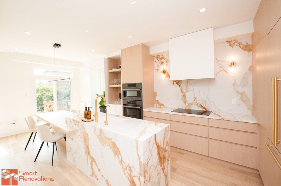
One Hero Element Selecting the Anchor Piece That Sets Scale Color and Mood
Every room wants to speak in one clear sentence, not a paragraph of competing clauses. Choose a single anchor piece-your hero-and let it set the room’s scale, color, and mood the way a lead actor sets the pace of a scene. It might be a velvet sofa that quietly absorbs light, a paneled armoire with the gravity of history, or a bold artwork that acts like a window to another climate.Once that element is chosen, everything else becomes editing: supporting lines, not rival monologues. The hero isn’t necessarily the biggest object; it’s the one with the strongest pull, the piece your eye returns to even when you try to look away.
To keep the rule of one honest, give the anchor a job description and make the rest follow its cues. Use it as a filter for decisions-if a new item doesn’t reinforce the hero, it doesn’t enter the room. A reliable way to test clarity is to define what the hero controls and what the supporting cast is allowed to do:
- Scale: echo its proportions (leg height, thickness, silhouette) without copying it.
- Color: pull two supporting shades from it-one quiet,one crisp.
- Mood: match its texture story (sleek, nubby, glossy, matte).
| Anchor piece | Sets the mood | Supporting moves |
|---|---|---|
| Olive linen sofa | Relaxed, grounded | Oak, warm whites, black accents |
| Oversized abstract art | Energetic, modern | Solid textiles, quiet rug, minimal decor |
| Vintage Persian rug | Layered, storied | Simple upholstery, aged brass, soft lighting |
Tightening the Palette Building Depth with One Hue and Two supporting Neutrals
Choose one hue like you’re choosing a lead actor-then let two neutrals handle the supporting roles with quiet authority. The result isn’t “less color”; it’s a room with a clear point of view. A single hue repeated with intent (trim, textiles, art, even a painted ceiling line) reads as confidence, while neutrals create the pauses that make that color feel deliberate rather of loud. The trick is to treat the neutrals as different textures of silence: one warm, one cool, both steady enough to let the hue do its job.
- The hue sets the temperature of the room’s personality.
- Neutral #1 anchors the architecture (walls, large rugs, casegoods).
- Neutral #2 adds contrast and shadow (metal, stone, darker wood, ink accents).
| Role | What it does | Best places to use it |
|---|---|---|
| One Hue | Creates a repeatable signature | Pillows, art, a single upholstered piece, interior doors |
| Neutral #1 (Soft) | Expands light and calms transitions | Walls, drapery, large rug, sofa |
| Neutral #2 (Deep) | Builds depth; gives the eye somewhere to land | Frames, hardware, side tables, window mullions |
Depth comes from how you stage the values, not how many pigments you invite in. Keep the hue consistent, then manipulate the neutrals through sheen and material-chalky paint against glossy tile, nubby linen beside oiled wood, matte plaster near brushed metal. When every item isn’t competing to be memorable, the room starts to feel composed: the hue reads like intention, the neutrals act like structure, and the whole space gains dimension through contrast, shadow, and rhythm rather than noise.
- Repeat the hue in three places, max-then stop.
- Vary the neutrals by texture (bouclé, oak, stone) rather of introducing new colors.
- Use the deep neutral sparingly but decisively to outline edges and create layers.
Editing with Intent A Practical Checklist for Removing Adding and Replacing
Editing a room isn’t about making it emptier; it’s about making every object earn its place. Treat your space like a sentence: clarity comes from choosing the right words, not adding more. Before you move a single item, decide the room’s one job-reading nook, calm bedroom, gathered dining-and let that purpose act like a filter. Then work in passes, not chaos: first remove what dilutes the message, then add only what supports it, then replace anything that’s trying too hard to be everything at once. Use this quick checklist as a steady hand:
- Remove anything that feels apologetic (“I’ll fix it later”), redundant (“we have three of these”), or invisible (you never notice it until you dust it).
- Add only what strengthens function or comfort: a lamp where your eyes strain, a tray where clutter gathers, a hook where bags pile up.
- Replace the almost-right: swap two mediocre pieces for one that carries the room’s tone-shape, texture, and scale aligned.
- Relocate “good” items that don’t belong: the lovely vase that interrupts the desk’s focus can become the console’s quiet anchor.
- Rest the room for 24 hours, then re-enter like a guest; notice what interrupts the first impression.
| decision | Ask This | What It Creates |
|---|---|---|
| Remove | Does it compete with the room’s main job? | Breathing space |
| Add | Will it solve a daily irritation? | Ease |
| Replace | Is one better version worth more than two “fine” ones? | Authority |
To keep intent visible, choose a single anchor for each zone-a chair with presence, a piece of art with a clear mood, a rug that sets the cadence-and let everything else support it like backing vocals. If you’re unsure, use a simple rule: no surface should host more than one story at a time. A console can be “arrival” (key bowl + mirror) or “gallery” (art + sculptural object), but not both.When you add, add in pairs: function + finish-a lamp that solves light and brings a deliberate silhouette; a lidded box that hides cables and contributes texture. When you replace, trade up in the language of restraint: fewer materials, fewer colors, stronger shapes-so the room reads confidently, not busily.
finishing with Discipline lighting Texture and Repeat Details that Reinforce the Concept
Once the big decisions are made, discipline lives in the small ones. Lighting becomes less about decoration and more about editing the mood-choosing one clear personality and letting everything else fall in line. If the concept is calm, let the glow be calm; if it’s graphic, let the beam be crisp. Keep the fixtures speaking the same language, even when the shapes change, and use repetition like punctuation rather than noise. Consider a tight toolkit:
- One dominant light temperature (warm for softness, neutral for clarity) with only slight variation for task areas.
- One metal finish repeated across fixtures and hardware-brass,black,or nickel-so the room reads as intentional,not assembled.
- One shadow behavior: diffused washes for serenity,or defined pools for drama,but not both competing in the same sightline.
- One rhythm of glow: a consistent spacing of sconces,pendants,or lamps that feels measured rather than accidental.
Texture is where restraint gets tactile. Instead of collecting “fascinating” surfaces, pick a primary texture and let it echo-quietly-across upholstery, drapery, and finishes. Repeat details with the same calm insistence: a rounded edge, a slim reveal, a stitched seam, a vertical line. These micro-choices reinforce the concept more convincingly than any statement piece, as they’re the threads that tie the whole room together.A simple checklist helps keep the final passes honest:
| Detail to repeat | Where It Shows Up | Affect |
|---|---|---|
| Line type | Paneling grooves, rug pattern, shelf brackets | Creates a steady visual tempo |
| Edge profile | Tabletop, mirror frame, cabinet fronts | Makes pieces feel related |
| Textile hand | Sofa weave, pillows, roman shade | Adds depth without clutter |
| Accent color | Art mat, book spines, small ceramics | Reinforces the “one” without shouting |
- Edit the outliers: if a finish, pattern, or texture can’t be repeated at least twice, it’s a guest-decide whether it belongs.
- Let negative space do work: leave a surface intentionally bare so the repeated details can register.
Future Outlook
the Rule of One isn’t about austerity-it’s about clarity. It asks you to choose a single idea and give it the space to speak,to let everything else become support rather than competition. When a room stops trying to be many things at once, it starts to feel like itself.
Restraint doesn’t shrink a space; it sharpens it. One material allowed to carry the mood. One color that sets the temperature. One focal point that gathers the eye and quiets the mind. In that simplicity, the details you keep become louder, the light becomes more intentional, and the everyday rituals inside the room feel easier to inhabit.
So if you’re unsure what to add next, try a different question: what can you remove to reveal what matters? Strength, in interiors as in life, often arrives not through more-but through the courage to choose.