Most rooms are designed from the ground up-floors, furniture, lighting, colour-while the ceiling is left to fade into the background. Yet that “fifth wall” quietly shapes everything: how tall a space feels, how light travels, where your eye rests, and whether the room reads as ordinary or intentional. A subtle shift overhead can add drama, warmth, rhythm, or refinement without changing a single square foot.
In this article, we’ll look up and explore ceiling details that instantly elevate a room-from architectural touches that add structure and character to finishes and lighting choices that transform mood and proportion. Whether you’re working with a compact apartment or a high-ceilinged home, these ideas prove that the fastest way to upgrade a space might be the one direction most people forget to consider.

Architectural Ceiling Lines That Refine Proportions with Beams Coffers and Reveals
When a room feels slightly “off,” it’s often the ceiling that’s missing a disciplined line. Beams, shallow coffers, and crisp reveals act like quiet geometry: they pull the eye where you want it to go, stretching a squat space, settling a long room, or giving an open plan a sense of edited intention. A single central beam can make a wide ceiling read calmer and more ordered; a grid of coffers can add rhythm without adding clutter; and a perimeter shadow reveal can create that floating, gallery-clean edge that makes walls look straighter and proportions feel more intentional.
- Beams frame sightlines and can “lower” an overly tall ceiling with warmth and scale.
- Coffers add architectural cadence-great for making large rooms feel composed, not cavernous.
- Reveals sharpen edges and introduce negative space, ideal for modern interiors or subtle upgrades.
| Detail | Proportion trick | Best used when… |
|---|---|---|
| Single spine beam | Creates a “centerline” that organizes the room | The space feels wide or undefined |
| Shallow coffer grid | Breaks up scale into repeatable modules | The ceiling feels too blank or expansive |
| Perimeter reveal | Visually lifts the ceiling plane off the walls | You want crisp modernity without ornament |
Keep the lines intentional: align beams with window mullions, center coffers on key furniture groupings, and let reveals trace the room’s best angles rather than its compromises. Finish matters too-matte paint softens contrast for a quieter read, while a stained beam or slightly deeper coffer edge adds definition where you need it most. The smartest ceiling details don’t shout; they quietly correct the room’s math, making everything below feel more balanced and more designed.

crown Molding and Trim Pairings That Create a Clean Seam Between Wall and Ceiling
When the wall meets the ceiling, even a tiny waviness can read as “unfinished.” The right trim pairing turns that junction into a deliberate detail-one that looks crisp in daylight and intentional at night. A crown + secondary trim combo is especially effective because it gives the eye two clean lines to follow, disguising minor inconsistencies while adding architectural rhythm.Consider mixing profiles the way you’d mix textures: a confident main piece up top, then a slimmer echo beneath it for a tailored, seam-free finish.
- Traditional pairing: 3-5″ crown with a slim bed molding beneath for a layered, gallery-like edge.
- Modern pairing: simple square crown with a tight reveal (shadow line) for a precise, minimal break.
- Transitional pairing: medium crown + panel cap to subtly “frame” taller walls without heaviness.
- Low-ceiling trick: small crown + flat stock painted ceiling-color to visually lift the plane upward.
| Room vibe | Best pairing | Finish Tip |
|---|---|---|
| Classic & warm | Crown + bed molding | Paint trim 5-10% brighter than wall for a clean outline. |
| Crisp & contemporary | Square crown + shadow reveal | Keep caulk lines razor-thin; avoid glossy wall paint near the seam. |
| Softly elevated | Crown + narrow cove | Match ceiling paint on the cove to blur the transition upward. |
Scale and alignment do the heavy lifting.Choose a crown profile that complements your baseboards (not necessarily matches them) and let the second trim “bridge” proportions-especially helpful in older homes where corners aren’t perfectly true. For the cleanest seam, aim for consistent projection around the room, and use inside-corner techniques that stay tight over time, like coped joints where appropriate. Small decisions-matte paint at the ceiling line, consistent caulk tooling, and a disciplined reveal-turn trim from decoration into a sharp, seamless edge that makes the whole room read higher-end.

Paint and Finish choices That Add Depth from Matte Washes to high Gloss Highlights
Paint can turn a ceiling from background to architecture. A matte wash-thinned paint or a soft glaze-sinks into plaster texture and lets light drift across it like fabric, especially over beams, coffers, or subtle medallions. For a room that feels taller without shouting, try shifting the ceiling tone just a shade lighter than the walls, then feather the edges where they meet for a barely-there gradient. Consider these depth-building approaches:
- Chalky matte over decorative moldings for an old-world, velvety shadow line.
- Limewash-style variation to make flat expanses feel hand-finished and alive.
- Tinted primer beneath the topcoat to enrich color without increasing sheen.
- Color-drenching (ceiling + crown + upper wall) for a cocooned,gallery-like envelope.
When you want the details to read from across the room, switch the strategy: keep the field softly muted and use high-gloss highlights like jewellery-controlled, reflective, intentional. A thin band of gloss on crown molding can outline the room like a frame, while a satin ceiling with gloss-only medallion accents makes chandeliers look even more sculptural. Think of sheen as a lighting tool: it catches daylight, bounces lamp glow, and amplifies carved profiles without adding clutter.
| Ceiling Element | Finish Pairing | Depth Effect |
|---|---|---|
| Coffered panels | Matte field + satin coffers | Soft shadow pockets, subtle geometry |
| Crown molding | Eggshell wall + gloss crown | Crisp perimeter line, lifted height |
| Ceiling medallion | Matte ceiling + semi-gloss medallion | Spotlighted center, chandelier drama |
| beams | Wash stain + matte sealer | Grain depth, aged character |

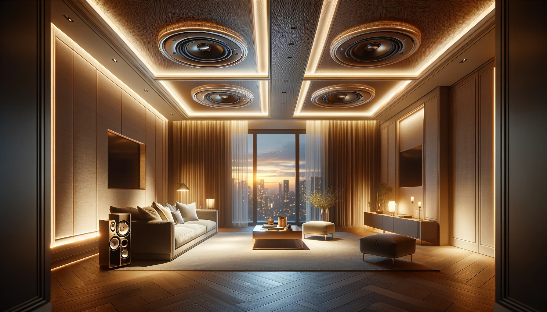
Lighting Layering at the Ceiling with Cove Glow Pendants and Recessed Precision
Think of the ceiling as a stage: a soft perimeter glow sets the mood, while focused points of light deliver clarity. A slim cove wash can lift the room visually,making corners feel lighter and edges feel cleaner-especially when the glow is dimmable and tuned to a warm temperature. Then, suspend pendants like punctuation marks: not just decorative, but intentional anchors over a table, island, or reading nook. The trick is contrast-diffused light for atmosphere paired with controlled beams for task and texture-so the space feels layered rather than overlit.
For a crisp finish,keep recessed fixtures aligned with furniture and circulation lines,and choose trims that disappear into the plane (or make a statement if the ceiling is meant to be graphic). A simple layering plan often boils down to a few repeatable decisions:
- Cove glow along the perimeter to soften shadows and elevate the ceiling plane.
- Pendants for visual rhythm and a warm “pool” of light where people gather.
- Recessed precision to highlight artwork, shelves, or pathways without glare.
| Layer | Placement | Best Effect |
|---|---|---|
| Cove LED | Perimeter ledge or tray edge | Airier corners, quiet ambience |
| Pendant | Centered over key surfaces | focal point, cozy gathering zone |
| recessed spot | In line with art/shelves/walkways | Clean highlights, tailored brightness |
texture and Material Moments with Wood Slats plaster Relief and Metallic Accents
Wood slats bring an instant sense of rhythm overhead-like a tailored suit for your ceiling. Run them in clean, parallel lines to elongate a space, or pivot to a chevron layout when you want movement without visual clutter. Pairing slats with plaster relief creates a quiet tension: the architectural precision of wood against the handmade softness of sculpted plaster. Keep the color story tight-think oat, almond, and warm mineral whites-so the textures do the talking. For a more curated feel, let the slats frame a plaster “panel” that floats above the seating area, turning the ceiling into a gallery wall you can’t hang anything on (and don’t need to).
Metallic accents are the finishing note-small, deliberate flashes that make the whole composition feel intentional rather than just “nice.” A brushed brass trim line, a thin blackened steel reveal, or a champagne-gold medallion can define transitions and sharpen the geometry without overpowering the room. Use these combinations to steer the mood:
- oak slats + matte plaster swirls + aged brass for a warm, boutique-hotel glow
- Walnut slats + linear plaster ribs + blackened steel for a sharper, tailored look
- Ash slats + smooth plaster field + champagne nickel for a quiet, modern finish
| Element | Best Finish | Effect |
|---|---|---|
| Wood slats | Satin clear coat | Highlights grain without glare |
| Plaster relief | mineral matte paint | Amplifies shadows and depth |
| Metallic trim | Brushed brass or steel | Adds crisp edges and polish |
Ceiling Medallions and Rosettes That Frame Statement Fixtures Without feeling Fussy
Think of a ceiling medallion as a quiet stage: it doesn’t compete with your chandelier or pendant-it frames it. The most modern versions aren’t lacy or overly formal; they’re cleaner, flatter, and designed to read like intentional architecture. A wide, simple rosette can make a small fixture feel curated, while a subtly stepped medallion gives a bold statement light a “finished” edge, like a tailored collar. The trick is to keep the profile crisp and the detailing restrained so the ceiling gains dimension without the room tipping into vintage fussiness.
To keep the look elevated and current, lean into proportion and finish rather than ornament. Consider:
- Scale frist: choose a diameter that visually anchors the fixture-too small looks accidental, too large feels theatrical.
- Finish strategy: paint it the same color as the ceiling for quiet polish, or match the trim for a subtle architectural echo.
- Texture control: opt for shallow fluting, soft ridges, or smooth plaster-like forms rather of deep scrollwork.
- Centering magic: a medallion can disguise an off-center junction box when paired with a swag hook or canopy extension.
| Fixture Style | Medallion/Rosette Match | Why it effectively works |
|---|---|---|
| Modern globe pendant | Smooth,flat disc | Reads minimal,adds polish without extra detail |
| Linear chandelier | Wide,shallow stepped ring | Gives visual “baseboard” for the ceiling |
| Vintage-inspired lantern | Simple beaded edge (low relief) | Nods classic while staying clean-lined |
Closing Remarks
Look up one last time before you move on.The ceiling might potentially be the quietest surface in the room,but it has a remarkable way of setting the mood-framing light,sharpening proportions,and giving even simple spaces a sense of intention. Whether you’re drawn to subtle trim, a bold paint treatment, sculptural textures, or statement lighting, the best ceiling details don’t just decorate-they complete the story your room is trying to tell.
As you plan your next update, consider starting from the top down. A thoughtful ceiling choice can be the small shift that makes everything else feel more cohesive, more considered, and unmistakably elevated.