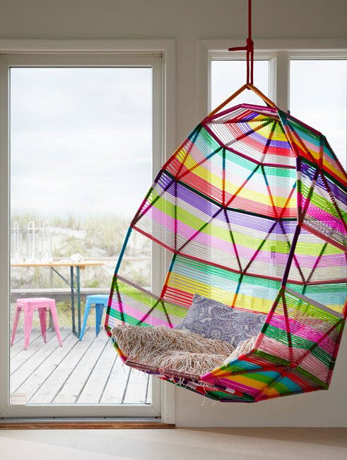
Rainbows get a bad rap for being childish or overly colorful. However, they are universally very pleasing to the eye and can be utilized without being overbearingly bright or tacky. In order to truly get the most out of this concept, the base rooms should be neutral, as it would be very easy to clash.
Did you know that incorporating rainbows into your interior can boost mood and creativity? Tastefully utilizing rainbows in your living spaces can create a vibrant and joyful atmosphere, elevating the overall aesthetic appeal. From subtle accents to bold statements, integrating rainbow hues can bring a sense of fun and playfulness to any room. By strategically infusing these colorful elements, you can transform your home into a unique and visually stimulating sanctuary that reflects your personality. Discover how to tastefully incorporate rainbows into your interior design and unleash the power of color in an unexpected yet delightful way.
Key Takeaways
-
Understand Color Psychology: Utilize the emotional impact of different colors to create the desired atmosphere in each room.
-
Incorporate Rainbow Elements Thoughtfully: Integrate rainbow elements in your interior design with balance and harmony to avoid overwhelming the space.
-
Kitchen Focus: Add rainbow accents in the kitchen through small appliances, utensils, or backsplash for a pop of color.
-
Bathroom Bliss: Enhance your bathroom decor with rainbow-colored towels, mats, or shower curtains for a vibrant and refreshing look.
-
Seamless Living Space: Blend rainbow hues into your living area by incorporating colorful throw pillows, rugs, or artwork for a cohesive and inviting space.
-
Bedroom Serenity: Infuse rainbows into your bedroom with soft furnishings like bedding, cushions, or curtains to create a relaxing and cozy ambiance.


Incorporate the colors out of order, omit a color or two, change the shapes, or choose muted or alternate colors. The reason making at least one of these changes is important is because pure red, orange, yellow, green, blue, and violet in that order brings on memories of classrooms or childrens’ shows. It is also too ‘on the nose’ and easy, making it tacky. The rugs above are excellent examples of using one or more of these concepts.


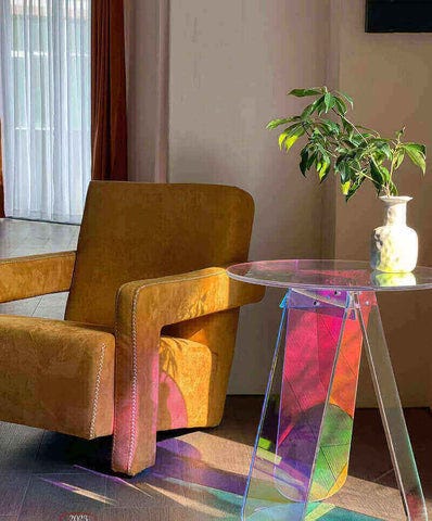
The wall art pieces above are excellent examples of rainbow statement products that give rainbows a place in your your home without touching any cliches. Also as they are meant to be pops of creativity, art is an easy place to put colors or patterns that may seem risky on furniture or wall paint.


Color Psychology
Evoking Emotions
Using rainbow colors can instantly create a joyful and vibrant atmosphere in your living spaces. By incorporating different shades of the rainbow, you can evoke specific emotions like happiness and positivity. Experimenting with various color combinations allows you to set the desired mood in each room.
Mood Enhancements
To enhance the overall mood and energy of a space, consider utilizing rainbows throughout your interior design. Combining bright rainbow hues with neutral tones creates a balanced and uplifting ambiance. Adjusting the intensity of rainbow colors according to each area’s purpose helps match the desired mood effectively.
Color Meanings
It is essential to understand the symbolism behind each color in the rainbow spectrum when incorporating them into your interior design. Choosing colors based on their meanings enables you to reflect specific emotions or characteristics within your decor. Explore how different cultures interpret rainbow colors, integrating these diverse meanings into your overall design concept.
Rainbow Elements Basics
Accent Pieces
Select rainbow-colored accent pieces like vases, cushions, or sculptures for vibrant pops of color. Mix various textures and materials in rainbow shades to create visual interest. Place these accent pieces strategically to highlight key areas within a room.
Textiles Use
Integrate rainbow textiles such as curtains, throws, or rugs to infuse your space with color. Opt for high-quality fabrics featuring rainbow patterns for a touch of luxury. Coordinate these textiles with existing furniture and decor for a cohesive and harmonious look.
Wall Art
Display colorful rainbow-themed art pieces or prints as focal points on your walls. Experiment with different sizes and arrangements of wall art to achieve maximum visual impact. Consider engaging in DIY rainbow art projects to add a personalized touch to your interior design.
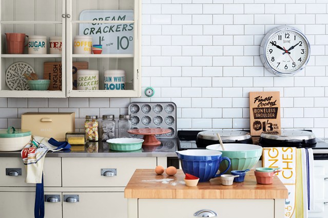
Kitchen Rainbow Design
Colorful Backsplashes
Install a vibrant rainbow-colored backsplash in your kitchen or bathroom to make a striking statement. Choose mosaic tiles in rainbow hues for added depth and dimension. Coordinate the colors with other elements for a harmonious design.
Accent Lighting
Install colorful lighting fixtures or bulbs to illuminate your space with rainbow hues. Use smart lighting systems to change colors based on the desired ambiance. Position accent lights strategically to highlight specific areas or architectural features.
Bathroom Decor Rainbow
Vibrant Towels
Brighten up your bathroom with vibrant towels in all the colors of the rainbow. Opt for towels in shades of red, orange, yellow, green, blue, indigo, and violet. These colorful additions can instantly add a pop of color to your bathroom space.
Add a touch of fun and playfulness by arranging the towels in a gradient pattern from one end to another. This simple yet effective technique not only brings visual interest but also showcases your creativity in decorating with rainbow-themed items.
Consider hanging these towels on stylish hooks or bars that complement their hues. The contrast between the bright colors and sleek metallic finishes can create a visually appealing look that ties together your bathroom decor seamlessly.
Colorful Rugs
Introduce an element of whimsy into your bathroom with colorful rugs featuring rainbow patterns or multicolored designs. These rugs can serve as focal points that tie together the various hues present in your bathroom’s decor.
Choose rugs made from soft and absorbent materials to ensure both comfort underfoot and practicality in moisture-prone areas like bathrooms. Look for options that are easy to clean and maintain while still adding a touch of personality to the space.
Incorporate smaller accent rugs near the sink or bathtub area to bring cohesion to different sections of the bathroom. Mixing and matching rug sizes can create visual interest while highlighting specific areas within the room.
Living Space Integration
Furniture Choices
Opt for pieces that are versatile. Look for items like multicolored sofas or brightly painted coffee tables to add a pop of color without overwhelming the room.
To enhance the rainbow theme, consider selecting furniture with subtle rainbow accents such as colorful throw pillows or rainbow-patterned area rugs. These small touches can tie the room together and create a cohesive look that is both fun and stylish.
Incorporating rainbow elements into your furniture choices allows you to infuse personality and vibrancy into your living space. By strategically placing these colorful pieces, you can create a visually appealing environment that reflects your unique style preferences.
Decorative Accents
Think beyond traditional wall art and sculptures. Consider incorporating unique elements like rainbow-hued curtains, colorful vases, or even multicolored lighting fixtures to elevate the overall aesthetic of your living space.
By strategically placing decorative accents throughout the room, you can create a cohesive design scheme that showcases your love for rainbows in a tasteful manner. Mix and match different textures and patterns to add depth and visual interest to the space.
For a more subtle approach, consider integrating smaller decorative items such as rainbow-themed coasters, cushions with colorful embroidery, or even vibrant floral arrangements in rainbow hues. These details can instantly brighten up any room while adding a touch of whimsy.
Bedroom Infusion Ideas
Bedding Varieties
Consider incorporating rainbow-themed duvet covers or throw pillows for a pop of color. Opt for pastel shades to create a soothing and cheerful ambiance in your bedroom. Mix and match different textures like cotton, silk, or velvet for added visual interest.
Enhance the rainbow theme by choosing bedding sets with subtle rainbow patterns or motifs. A simple yet effective way to infuse rainbows into your interior design is through the bedding choices you make. Experiment with different combinations to find what suits your style best.
Wall Colors
For wall colors, explore painting one accent wall in a soft rainbow gradient to add a playful touch without overwhelming the space. Consider using removable wallpaper with colorful stripes or geometric patterns inspired by rainbows for a temporary yet impactful design element.
Incorporate framed artwork featuring rainbow hues on the walls to tie in the color scheme throughout the room effortlessly. Remember thatSubtlety can be key in achieving a tasteful and visually appealing look for your bedroom.
Dining Room Decoration
Table Setting
When setting the dining table, consider using a colorful tablecloth to introduce a pop of color. Opt for bright and cheerful dinnerware to complement the rainbow theme.
Create a vibrant centerpiece using fresh flowers in various hues, enhancing the rainbow effect. Incorporate colorful napkins or napkin rings to tie the look together seamlessly.
For an added touch, place rainbow-colored candles on the table for an ambient glow during meals. Consider adding subtle rainbow accents, such as colorful glassware or placemats, for a cohesive look.
Chair Selection
Choose dining chairs that either match the colors of the rainbow subtly or provide a stark contrast. Opt for chairs with upholstery in different colors to represent each color of the rainbow.
Consider mixing and matching chair styles while ensuring they all tie back to the overall theme harmoniously. Select chairs with metallic legs in gold or silver tones to add a touch of sophistication to the vibrant setting.
To further enhance your dining room’s aesthetic, incorporate cushions or throws in varying colors that align with your chosen color scheme. Ensure that each element contributes positively to creating a visually appealing and cohesive space.
Creative Color Techniques
Floor Rugs
Floor rugs are an excellent way to add a pop of color to your interior design effortlessly. Opt for rugs with bright rainbow hues to create a vibrant and cheerful atmosphere in any room. Mix and match different colors to enhance the visual appeal of your space.
Consider placing a rainbow-colored rug in the living room or bedroom to inject personality into the area. These rugs are versatile and can complement various decor styles, from modern to bohemian. The soft textures of these rugs not only add color but also provide comfort underfoot.
- Easy way to introduce color
- Versatile for different decor styles
- Adds comfort and warmth to the room
Wall Painting
Consider using bold and vivid colors inspired by rainbows. Create an accent wall with stripes of different colors or opt for a mural featuring a colorful spectrum. This technique can instantly transform a plain wall into a captivating focal point.
Experiment with geometric patterns or ombre effects using rainbow shades for a unique touch. Don’t shy away from combining contrasting colors on adjacent walls for a striking visual impact. The key is to be bold and creative in your approach when incorporating rainbow-inspired hues into your wall paint.
-
Transform plain walls into focal points
-
Experiment with geometric patterns and ombre effects
-
Be bold and creative with contrasting colors
Modern Design Combinations
Bold Color Mixes
Incorporating bold color mixes into your interior design can create a vibrant and dynamic space. Pairing contrasting colors like navy blue and mustard yellow can add depth and visual interest to any room. Consider adding a pop of bright red or electric blue to accentuate the modern feel.
Embrace the trend of mixing warm tones like terracotta with cool shades such as teal for a balanced and contemporary look. Opt for furniture pieces in neutral colors to allow the bold color combinations to stand out. Create visual impact by using geometric patterns in rugs, throw pillows, or wall art to complement the bold color scheme.
Pattern Usage
Experiment with various patterns like chevron, stripes, or floral prints to elevate your interior design style. Mixing different patterns can add texture and dimension to your living space, creating a visually stimulating environment. Try combining large-scale patterns with smaller ones for a harmonious balance in the room’s decor.
Integrate [styles] such as Scandinavian minimalism with bold patterned accents for a modern twist on classic design elements. Utilize patterned wallpaper as a focal point in the room, paired with solid-colored furniture pieces for a cohesive aesthetic.
Final Remarks
You’ve now explored the vibrant world of incorporating rainbows into your interior design. From understanding color psychology to infusing creative techniques in various living spaces, you’re equipped to tastefully integrate these colorful elements into your home. By implementing these ideas, you can create a lively and personalized ambiance that reflects your unique style and personality.
Take the leap and experiment with rainbow-inspired décor in your home today. Whether it’s a subtle touch in the kitchen or a bold statement in the bedroom, let your creativity shine through. Embrace the spectrum of colors and transform your living spaces into vibrant sanctuaries that uplift your mood and inspire creativity. Your rainbow-infused home awaits!
Lastly, accent pieces such as centerpieces, throw pillows, and accent chairs are also safe places to incorporate gorgeous and colorful rainbows without venturing into kindergarten classroom territory. These things are supposed to catch the eye, and rainbows catch eyes like little else! Good luck!
Frequently Asked Questions
How does color psychology influence interior design decisions?
Color psychology plays a crucial role in setting the mood and ambiance of a space. Understanding how colors evoke emotions can help you create a harmonious and balanced interior that aligns with your desired atmosphere.
What are some creative ways to incorporate rainbow elements into a kitchen design?
You can tastefully integrate rainbow elements in your kitchen by using colorful appliances, utensils, or backsplash tiles. Adding pops of vibrant hues through accessories like dishware or curtains can also infuse a playful touch.
Why is it important to consider rainbow decor for bathrooms?
Incorporating rainbow decor in bathrooms can add brightness and cheerfulness to the space, making it feel more inviting and refreshing. The diverse colors of the rainbow can uplift your mood and create a spa-like atmosphere for relaxation.
How can one effectively integrate rainbows into their living space?
Integrating rainbows into your living space involves strategically placing colorful accents such as throw pillows, rugs, artwork, or furniture pieces. Opting for a neutral base palette allows the rainbow hues to stand out while creating an engaging visual impact.
What are some modern design combinations that work well with creative color techniques?
Combining modern design elements like clean lines and minimalist furniture with creative color techniques such as ombre walls or color-blocking can result in a contemporary yet vibrant interior. Experimenting with contrasting tones and textures adds depth and visual interest to the overall aesthetic.