Sage green arrives quietly, more like a soft exhale than a proclamation. Where classic neutrals once relied on beige, gray or white to recede, this muted, gray-tinged green slips easily into teh background while still carrying the slightest suggestion of life. It feels familiar without being expected-an understated nod to the outdoors that calms a room without imposing a look.
This shift toward sage is not simply a color trend; it reflects changing tastes and priorities. Designers and consumers are seeking warmth and balance after years of stark minimalism and saturated accents. Sage’s versatility-it’s ability to warm wood, soften metals, and act as a gentle foil for both bold and pale hues-makes it usable across styles and spaces. simultaneously occurring,its associations with nature,wellness,and sustainability give it a contemporary relevance beyond décor alone.
In the pages ahead we’ll explore how sage green moved from botanical palette to mainstream neutral, the practical reasons it works in interiors and fashion, and the ways it signals broader cultural shifts in taste and values.
Why Sage Green Feels Like the New neutral and How to Leverage Its Calming Power
Sage green settles into a space like a familiar whisper – soft, muted, and endlessly adaptable. Its greyed, earthy undertones make it read more like a neutral than a color that shouts for attention: it calms without disappearing, balances warm and cool accents, and plays beautifully with natural textures. As it echoes plants and stone, it taps into biophilic instincts, lowering visual noise and creating a sense of ease that feels intentional rather than trendy.
To harness that calm, think of sage as a flexible backdrop and a mood-maker.Use it on larger surfaces to ground a room, layer in tactile fabrics and warm woods for depth, and introduce metallics or deep hues as punctuation rather than focal points. Small changes - a painted ceiling, cabinetry, or a sofa in sage – can shift a room’s mood from busy to serene while still allowing bolder accents to shine.
- Backdrop first: Paint one wall or the ceiling to test the light and temperature.
- Texture over pattern: Linen, boucle, and raw wood amplify the calming effect.
- Accent smartly: Brass or matte black for edge; terracotta or soft blush for warmth.
- Scale matters: Large sage elements read neutral; small accessories read green.
- Layer light: Warm lamps and natural daylight enhance sage’s soothing qualities.
| Surface | Pairing |
|---|---|
| Walls | Warm oak + cream textiles |
| Kitchen cabinets | Matte brass hardware + white quartz |
| Living room sofa | Terracotta pillow + black lamp |
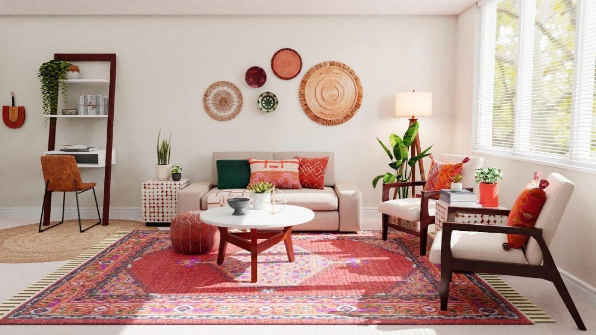
Best Color and Material Pairings for Sage Green to build a Cohesive Palette
Think of sage as a quiet conductor that invites texture and tone to take the stage. Pair it with warm woods to emphasize organic comfort, or with soft neutrals like cream and linen for an airy, Scandinavian calm. For brighter contrast, introduce terracotta or clay accents to add sunbaked warmth; for drama and modernity, anchor the palette with deep navy or charcoal. Small metallic touches-brushed brass for a soft glow or matte black for crisp definition-complete the look without overpowering sage’s subtlety.
- Warm oak / walnut: grounds the palette and adds natural depth.
- Cream, taupe, linen: keep spaces light and cohesive.
- Terracotta & clay: introduce comfortable contrast and richness.
- Deep navy / charcoal: provides structure for trims or focal pieces.
- Brushed brass / matte black: fine-tune the style with considered hardware.
Texture is the secret language that makes these pairings sing: think soft linen upholstery, nubby wool throws, honed stone surfaces, and hand-glazed ceramics to create tactile layers. Balance is key-let larger surfaces carry the sage and neutrals, reserve bolder hues for accents, and alternate matte and slightly reflective finishes to catch light without competing. Consider the room’s light and scale; in low light, warmer woods and ceramics will keep sage feeling cozy, while bright rooms welcome slate and cool metallics for a fresh, modern edge.
| Material | Finish | Effect |
|---|---|---|
| Linen | Soft weave | Airy, lived-in |
| Reclaimed wood | matte grain | warmth, character |
| Stone / Ceramic | Honed | Grounding, timeless |

Lighting, Finish and Texture Choices That Keep Sage Green Subtle and Timeless
sage green stays understated when the light is gentle and layered-think soft north-facing daylight, warm LEAD bulbs around 2700-3000K, and dimmers that let the color breathe through the day.Use directional sconces to wash textured walls and pendant clusters over seating to create pockets of calm; avoid single, harsh overhead sources that can flatten the hue. Small choices make a big difference:
- Bulb temperature: 2700K-3000K for cozy warmth, 3000K-3500K to keep it crisp.
- Layered lighting: ambient + task + accent to modulate depth.
- Natural diffusion: sheer curtains or frosted glass to soften direct sun.
Pair finishes and textures that whisper rather than shout-matte paints, plaster walls, and soft linens preserve sage’s timeless quality while tactile contrasts add interest. Matte metal finishes like brushed brass or aged nickel warm the palette; natural fibers such as linen, wool, and jute keep interiors grounded. A swift reference:
| finish | Effect |
|---|---|
| Matte Paint | Softens light, depth without sheen |
| Brushed Brass | Warms sage, subtle sparkle |
| Raw Linen | Adds breathable texture |
Complement these with accents in warm neutrals and stone to keep the palette rooted-soft textures and muted metals let sage green feel like a classic, ever-adaptable neutral.

Practical Placement and Styling Recommendations for Introducing Sage green Room by Room
Think of sage green as a quiet collaborator rather than a showy star: it nests easily into rooms that need softness and those that need grounding. Use it on one feature wall in the living room to support warm leather sofas, or as cabinet color in the kitchen paired with brass hardware for an elevated, lived-in feel. In bedrooms, introduce sage through linens and a painted headboard to create a tranquil backdrop; in bathrooms, small doses-like a vanity or alcove-make the color feel intentional without overwhelming.Below are quick, room-focused cues to help place sage with purpose:
- Living room: Accent wall or large drapery to balance natural light.
- Kitchen: Lower cabinets or island for cohesive anchoring.
- bedroom: Textiles and headboard for calm layers.
- Bathroom: Vanity or tile niche for subtle spa vibes.
- Home Office: Painted shelving or desk backdrop to reduce visual noise.
layering determines whether sage reads as neutral or as color-pair it with warm woods, soft leathers, and off-white trims for a contemporary neutral feel, or contrast it with deep charcoal and terracotta for more dramatic depth. The quick-reference table below helps match placement to styling intent; keep scale in mind (small rooms benefit from accents, large rooms can take full walls), and always test paint in different light.
| Room | Where to Add Sage | Styling Tip |
|---|---|---|
| Living Room | Feature wall / curtains | Pair with walnut and cream |
| Kitchen | Island or lower cabinets | Use brass hardware |
| Bedroom | Headboard / bedding | Layer with linen textures |
| Bathroom | Vanity / accent tile | Keep fixtures matte black |

Care, Refresh and Accent Strategies to Keep Sage Green Looking Fresh for years
Treat sage green like a living neutral: gentle care and small rituals keep it feeling chic rather than tired. Natural light softens its undertone, but prolonged, direct sun can wash it out-rotate fabrics and use sheers when midday sun is strongest. For painted walls, keep a can of the original tint for touch-ups; for upholstery, blot spills instantly with a gentle cleanser and a soft cloth, and always test in an inconspicuous spot first.
- Vacuum textiles weekly to avoid dust buildup.
- Spot-clean with diluted soap; avoid bleach and harsh solvents.
- Rotate cushions and rugs seasonally to prevent uneven fading.
- Keep matte finishes for longevity-gloss shows wear faster.
Refresh with accents that enhance, not compete: sage glows when paired with warm woods, soft brass, or muted terracotta, and it adapts to both minimal and layered looks.Swap small pieces seasonally-throw pillows, a lampshade, or a rug-to shift the mood without committing to a full repaint. Strategic accents can also distract from everyday scuffs: a well-placed console, a gallery wall, or a textured throw turns practical fixes into design features.
| Accent | Effect |
|---|---|
| warm brass | Adds glow and refinement |
| Terracotta | Creates cozy contrast |
| Raw wood | Anchors and warms |
- refresh seasonally: alternate cool and warm accents to keep the palette lively.
- Use plants to amplify the natural undertones of sage without overwhelming it.
- Change small hardware (knobs, pulls) to update the look in minutes.
The Way Forward
If neutrals were a language,sage green would be a gentle,low-voiced dialect: subtle,versatile and quietly expressive. Its muted warmth bridges indoors and out, classic and contemporary, offering a backdrop that supports rather than competes. Whether in paint, fabric or fashion, sage adapts to context and temperament, suggesting that the future of “neutral” may be less about erasure and more about calm, considered presence. In short, sage green doesn’t insist on attention - it earns it, one understated layer at a time.