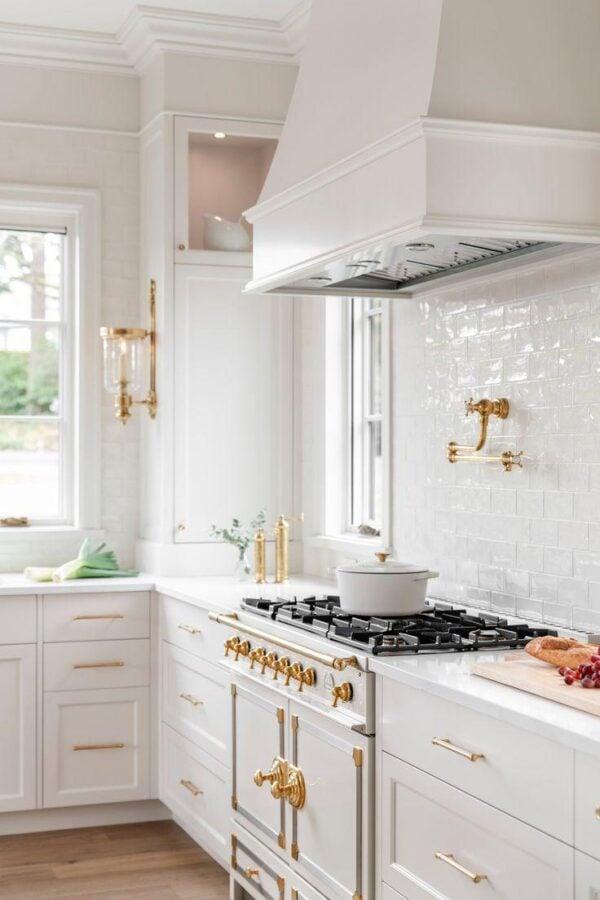
A backsplash can be the unsung hero of a kitchen: small in footprint but powerful in presence, it has the ability to tie together cabinets, countertops and appliances-or to sing its own distinct note. When thoughtfully designed, a backsplash moves beyond function (protecting walls from splashes and stains) and becomes the room’s visual anchor, the first thing the eye returns to when it enters the space.This article explores how to elevate your backsplash from background detail to intentional focal point. You’ll find practical guidance on choosing materials, balancing color and pattern, playing with texture and scale, and integrating lighting and hardware so the backsplash reads as a deliberate design decision rather than an afterthought.We’ll also address real-world considerations-budget, durability, and maintenance-so aesthetics and practicality work hand in hand.
Whether you’re planning a full renovation or a modest refresh, the ideas that follow are meant to spark creativity and help you make choices that reflect your style while enhancing the kitchen’s overall flow.Read on to discover how a well-conceived backsplash can transform the heartbeat of your home.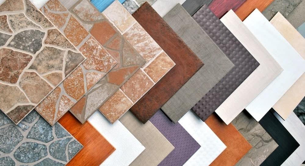
Select tile type and size, such as porcelain for durability, glass for shine, or large format to minimize grout
Think of your backsplash as a piece of jewelry: the material sets the tone. Choose porcelain when you want durability and stain-resistance for busy kitchens; pick glass to bounce light and add shimmer behind open shelving; go with natural stone for warmth and texture, or opt for metal for a modern, industrial edge. Small mosaic tiles bring intricate detail while large formats create calm,uninterrupted planes-each choice changes how the eye moves across the room. To help decide quickly, consider these practical perks:
- Porcelain – tough, low-maintenance, available in many finishes
- Glass – reflective, brightens the space, easy to wipe
- Large-format – fewer grout lines, cleaner look, ideal for minimalist kitchens
- Subway/Small tiles – classic patterns, great for texture and rhythm
Size and layout are your compositional tools: large tiles minimize grout and read as a single plane, while smaller tiles let you create movement, borders, or focal patterns. If you’re tempted to mix types, balance scale and finish-pair a matte large tile with a glossy accent strip, for example. Here’s a simple comparison to visualize choices (styled for WordPress):
| Tile | Best for | Quick tip |
|---|---|---|
| Porcelain | High-traffic cooking zones | Use rectified edges for tight seams |
| Glass | Small or dark kitchens | Choose thicker glass for depth |
| Large format | Minimalist, seamless looks | Plan layout to avoid awkward cuts |
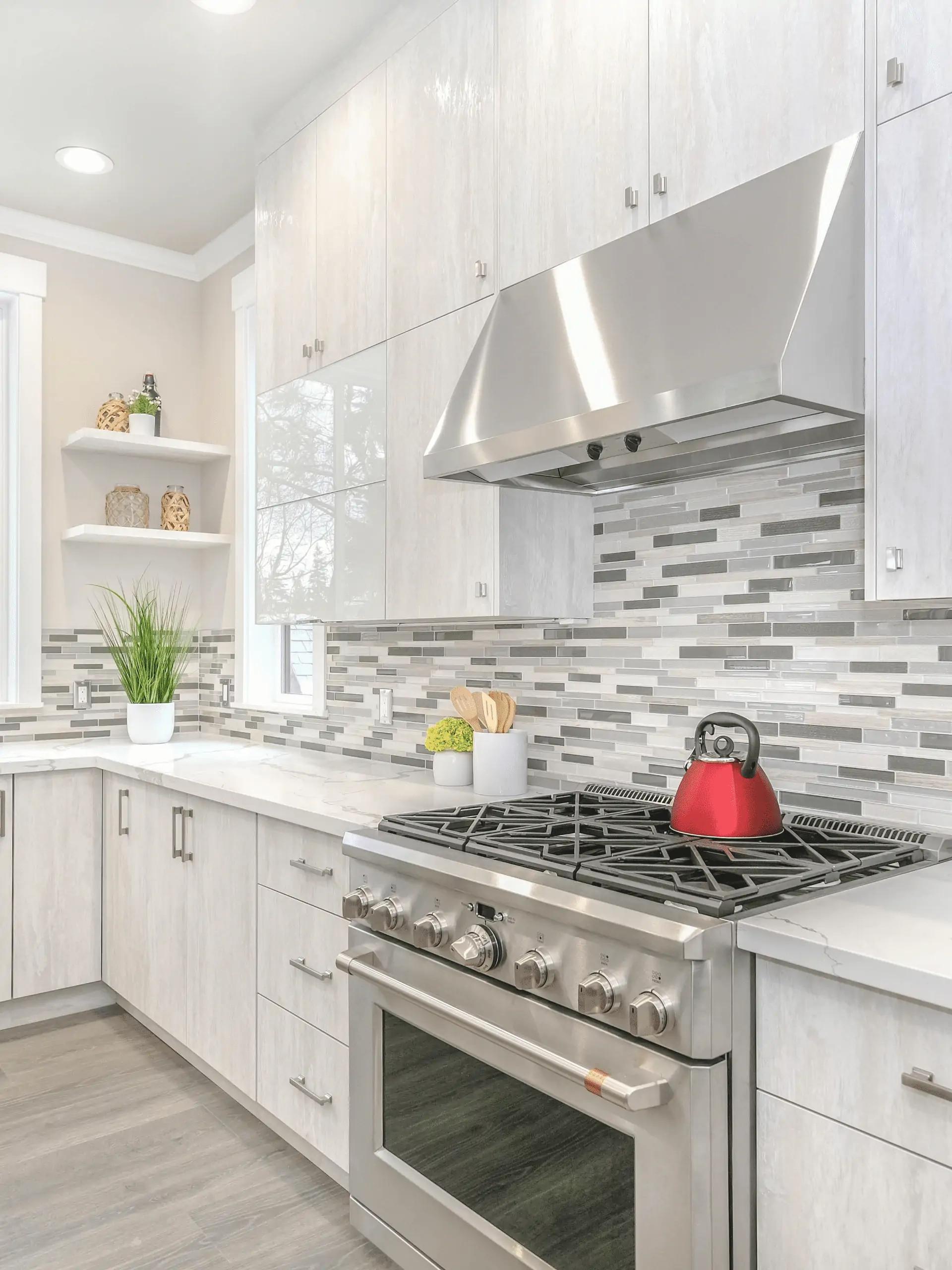
Use color, contrast and pattern to anchor the kitchen, pairing a bold backsplash with neutral cabinets or the reverse
Think of the backsplash as the visual anchor that gives the whole kitchen a mood – a jewel against a quiet backdrop or a calm canvas that lets patterned cabinetry sing.use color to create a hierarchy: a saturated tile band behind the stove draws the eye, while matte, neutral cabinets let texture and silhouette take center stage. To make the pairing feel intentional rather than accidental, focus on three simple moves:
- Limit the palette – pick one dominant hue and two supporting neutrals to avoid visual clutter.
- Mix finishes – glossy tiles next to matte cabinetry give depth without competing for attention.
- Anchor with trim – a thin border or floating shelf in a coordinating color ties backsplash and cabinets together.
Pattern and contrast are your toolkit for turning utility into statement: large-scale geometric tiles can feel architectural with plain cabinets, while intricate mosaics pair best with simple, tonal fronts. think beyond color – grout lines, tile orientation and reflective surfaces all change perceived scale and contrast, so tweak them to emphasize or soften the focal point. Practical considerations to experiment with:
- grout color – matching grout makes patterns read as one surface; contrasting grout highlights geometry.
- Lighting – undercabinet lighting deepens color and reveals texture, enhancing contrast without adding new hues.
- Hardware & accents – choose metal tones that echo undertones in the backsplash to create a cohesive look.
Add texture and a grout strategy, choosing contrasting grout for definition or matching grout for a seamless look and easier upkeep
Think of your backsplash as a tactile canvas: ridged subway tiles, hand-pressed ceramics and pebbled glass can all add depth and movement.Pair those surfaces with a deliberate grout choice to amplify the effect-contrasting grout outlines each tile and turns texture into a graphic statement, while matching grout lets the surface read as one continuous field. small visual cues to consider:
- Glossy tile + dark grout = sharp, modern rhythm
- Matte or handmade tile + matching grout = organic, calm flow
- Thin tile with wide grout lines = pattern-forward, sculptural look
Practicality matters as much as personality. A darker or contrasting grout highlights shapes but can show soap residue along joints; a close-toned grout hides splashes and makes daily upkeep easier. Below is a quick reference to weigh aesthetic impact against care demands-try samples on-site to see how light and cooking habits change the look. Test swatches and sealants can make the final choice both beautiful and resilient.
| Grout Choice | Effect | Maintenance |
|---|---|---|
| Contrasting (dark) | Bold definition | Shows residue; periodic scrubbing |
| Matching (neutral) | Seamless, calm | Hides stains; easier daily upkeep |
| Colored/Epoxy | Durable and vibrant | Long-lasting; slightly pricier |
Illuminate and accessorize to showcase the backsplash, install undercabinet LEDs and coordinate hardware finishes for cohesive impact
Think of lighting as the frame that makes your tile sing: discreet LED strips tucked beneath cabinets create a soft, consistent wash that reveals texture and grout without glare.Use dimmable, color‑tunable fixtures to shift mood from crisp, cool task light to warm, intimate glow; even a narrow halo above the counter can turn the backsplash into a stage.
- Layer the light: combine recessed ceiling lights with under‑cabinet strips for depth.
- Aim and soften: angle fixtures to highlight patterns and avoid hard reflections.
- temperature matters: 2700K-3000K for warmth, 3500K-4000K for modern clarity.
Accessories and hardware act like supporting actors – coordinate finishes and textures so nothing competes with the tile. Small touches, from faucet sheen to drawer pulls, should echo a dominant tone or contrast deliberately (matte black with warm marble, polished chrome with glass mosaics) so the backsplash remains the protagonist.
- warm stone: pair with aged brass or oil‑rubbed bronze.
- Cool glass/metro tile: choose polished chrome or satin nickel.
- Artisan ceramics: consider matte black or brushed copper for a handcrafted vibe.
the Way Forward
A backsplash can do more than protect walls - it can quietly anchor the room, catch the eye, and set the tone for everything around it.Whether you choose bold color,textured tile,a graphic pattern,or a subtle material contrast,the most successful focal points are those that reflect your needs and style while staying in harmony with the rest of the kitchen.Start small if you need to, experiment with samples and layouts, and let function guide your creativity. With thoughtful choices and a few well-placed details, your backsplash can become the deliberate centerpiece you never knew your kitchen needed.