

Tiles have a quiet power: laid in thoughtful pattern, a small square or a repeating motif can shift a room from functional to quietly expressive. For anyone who wants personality without shouting, the right tile arrangement acts like punctuation – a gentle comma or an elegant em dash that shapes the atmosphere without stealing the scene.
Subtle character in tile work comes from proportion, rhythm and restraint. It’s the offset of a herringbone that lengthens a narrow hallway, the restrained repetition of a hex that introduces texture, or a carefully placed band of contrast that gives a floor a whisper of intent. Materials, grout color and scale all play supporting roles, turning a simple surface into a signature detail.
This article explores the best tile patterns for adding that understated charm – from classic layouts that read timeless to contemporary plays on geometry that surprise without overpowering. Whether you’re updating a kitchen backsplash, a bathroom floor, or an entryway, these patterns will help you introduce personality in ways that feel purposeful, calm and enduring.
When Less Speaks Volumes: Choosing Scaled Patterns and Tile Shapes
Think of scaled patterns and tile shapes as a quiet vocabulary: the right proportion lets a surface speak without shouting. Tiny mosaics suggest texture and liveliness when kept in a restrained palette,while larger tiles create a breath of calm across a floor or wall. Use minimal repetition to maintain subtlety and lean on negative space-a measured gap, a single row of contrast, or a shift in grout tone can transform a pattern from busy to beautifully understated.
- Keep contrasts low – similar tones soften pattern boundaries.
- Choose one focal shift – a small area of scale change adds interest without clutter.
- Match tile size to room scale – tiny tiles in large rooms feel deliberate; big tiles in small spaces feel expansive.
Shapes are personality without noise: rectangles lend a relaxed linearity, hexagons an organic geometry, and slim elongated bricks introduce subtle motion. Pair each shape with a scale that complements the room so that the pattern enhances architecture rather than competes with it. Below is a speedy guide to common pairings to help you pick a quiet statement that reads as thoughtful rather than loud.
| Shape | Suggested Scale | Subtle Effect |
|---|---|---|
| Hexagon | Small to medium | Textural warmth |
| Rectangle (subway) | Medium | Linear calm |
| Large square/slab | Large | Minimal, airy backdrop |
Color, Grout and Finish Choices That Temper or Highlight Pattern
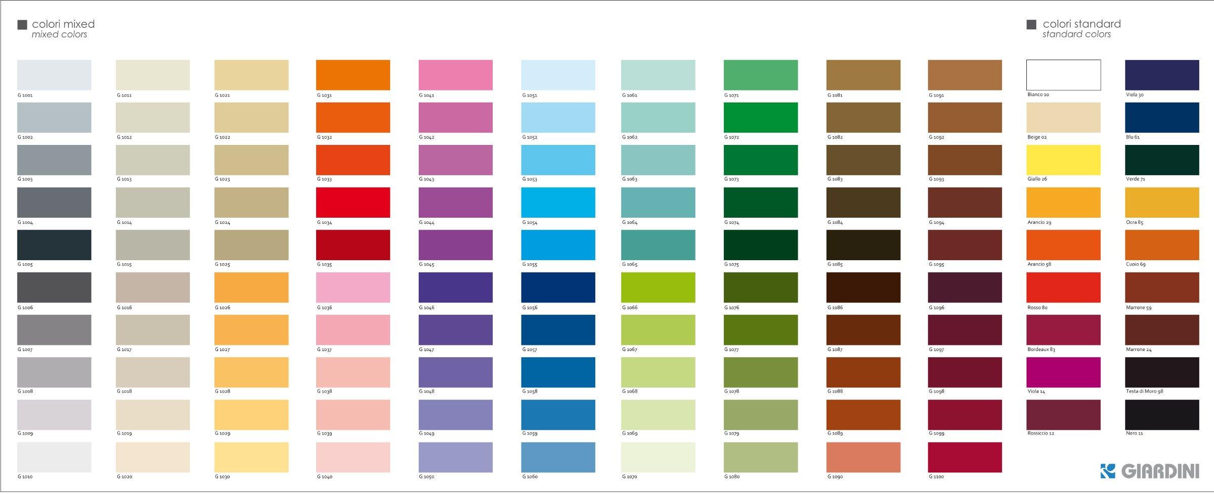
Think of color and grout as the dimmer switch for tile pattern: close tonal families and muted hues will temper busy repeats into a whisper, while high-contrast palettes and pale grout will highlight every geometry and joint. A satin or matte finish softens reflections and blends shapes, creating a more painterly, low-key effect; polished surfaces and glossy glazes intensify color and line work, making patterns read as punctuation rather than background. Small-scale motifs benefit from matching grout and narrow joints to read as a continuous field,whereas bold patterns gain presence with contrasting grout and broader joints that trace the design like pen strokes.
- Match grout to tile: camouflages seams for a seamless backdrop.
- Contrast grout: outlines patterns and amplifies geometry.
- Matte finish: mutes glare and softens busy repeats.
- Gloss finish: sharpens color and increases pattern clarity.
- Texture & scale: rough surfaces and larger tiles quiet intricate motifs; smooth small tiles sharpen them.
Practical choices-like keeping grout tones within one or two steps of the main tile color, reserving metallic or shining-colored grout for accents, and sampling finishes in the room’s light-ensure the final effect matches your intent. If you want subtle character, err toward tone-on-tone palettes, matte finishes, and narrower joints; to make a pattern a focal point, introduce contrast, sheen, and deliberate grout lines that act like graphic framing. Always test a small mock-up: the same tile and grout can whisper in soft afternoon light and sing under a bright ceiling fixture.
Layout Strategies and Placement Tricks for Small and Large Rooms
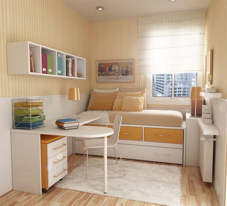
Think of tiles as optical tools, not just surfaces. In tight spaces, small changes in direction and scale transform perception: running elongated subway tiles vertically makes a ceiling feel taller, while laying them diagonally or in a herringbone subtly widens a corridor without shouting for attention. Keep grout lines thin and tones close to your tile to maintain visual calm; add a narrow border or a single accent row to anchor a focal point without cluttering the eye.
- Use larger-format tiles to reduce visual noise.
- opt for diagonal or vertical layouts to stretch dimensions.
- Choose one accent band rather than multiple competing borders.
In generous rooms, embrace patterns that create rooms within rooms. Break open-plan spaces with subtle field patterns-checkerboards at different scales, staggered brick patterns to suggest a pathway, or a floating herringbone island to signal a dining area-while keeping a cohesive palette to avoid fragmentation. Strategic placement of decorative tiles can act like a rug: place intricate mosaics under a table or in front of a fireplace to anchor furniture, and align long rectangular tiles with the primary sightline to guide movement.
- Zone with pattern and scale, not color clashes.
- Use mosaic inserts were you want attention, not everywhere.
- Align long tiles with entryways to lead the eye through the space.

Room by Room Recommendations for Subtle Pattern Pairings in Kitchen, Bath and Living Areas
Kitchen + Bath: Start with a restrained main field – think soft ivory subway or a gentle honed gray – and let pattern act as punctuation rather than the star. Keep finishes matte and grout close in tone to the tile so the eye reads texture first, pattern second:
- Tonal subway + micro-hex floor: a muted wall tile with a tiny geometric floor gives a vintage wink without shouting.
- Thin chevron backsplash + plain counters: introduces motion above countertops while leaving surfaces calm and usable.
- Large-format neutral + patterned niche: use an inset or shower niche with a whisper of motif so pattern feels intentional,not overwhelming.
Living and transition areas: In shared spaces, aim for continuity - repeat a color from the patterned tile elsewhere (textiles, trim, or an accent shelf) so the pattern reads as part of the room’s vocabulary. Layer scale: pair a small, busy floor tile with a large, quiet wall tile, or mirror a subtle tile motif in throw pillows to tie the scheme together.
- Soft geometric rug + plain hearth tile: echoes pattern without competing with architecture.
- Bordered floor tile + neutral field: frames seating areas elegantly while keeping traffic paths simple.
- Monochrome motif + warm wood: adds character but keeps the palette cohesive and serene.
the Conclusion
A well-chosen tile pattern does more than fill a floor or backsplash – it introduces rhythm, scale and personality without shouting for attention. Whether you lean into a timeless herringbone, a quiet staggered brick, or a tiny mosaic accent, the key is restraint: keep color families close, scale the motif to the room, and let grout and texture do some of the talking. Small pattern decisions-orientation, repeat, and contrast-are the quiet cues that steer a space from generic to intentionally lived-in.
Think of pattern as punctuation,not a headline. Test with samples,live with a layout sketch,and let natural light reveal how the surfaces behave across a day. When done thoughtfully, subtle tile patterns give rooms a signature mood that feels effortless - an understated layer of character that grows more satisfying with time.