You know that feeling when a room looks “nice,” yet somehow it doesn’t feel right? The sofa is the right size, the walls are painted, the artwork is framed-but the space still reads like a series of separate decisions instead of one clear story. It’s not that anything is wrong on its own. It’s that the pieces aren’t speaking to each other.
Disconnected decor often happens quietly: a trendy rug bought on impulse, a hand-me-down table that never quite belonged, a bold accent color that didn’t find its supporting cast. Over time,the room becomes a collage of moments rather than a cohesive surroundings-functional,even stunning in parts,but missing that calm sense of flow that makes a space feel finished.
This article explores why that disconnect happens, what it looks like in real homes, and how small, intentional shifts-balance, repetition, proportion, and a stronger point of view-can turn a collection of items into a room that feels like it truly fits together.

The Hidden Story your Room Is Telling Without You
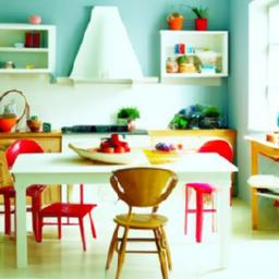
Your room is already narrating-through the quiet agreements and arguments between objects. A velvet chair beside a plastic lamp isn’t just a “mix,” it’s a conversation where no one is listening. That gallery wall shoved behind a door reads like a secret you stopped believing in. The sleek coffee table surrounded by thrifted side pieces can feel less eclectic and more like a cast that never rehearsed together. When decor feels disconnected, it’s often because the space is telling multiple stories at once, each with its own pacing, era, and mood lighting. Look for the lines your room keeps repeating without realizing it:
- Unfinished intentions: a statement piece with no supporting cast.
- competing volumes: one bold pattern shouting over three quiet neutrals.
- Time-travel styling: mid-century meets farmhouse meets “new rental gray” with no bridge.
- Floating furniture: pieces that don’t anchor to a rug,a wall,or each other.
- Orphaned color: one random teal pillow with no echo anywhere else.
The good news: your room doesn’t need a new identity; it needs a translator. Small edits can turn scattered clues into one coherent plot-by choosing a single “through-line” and letting it show up in more than one form. If you’re not sure what your space is communicating, use this swift read to decode what’s happening and what to adjust:
| What you notice | What it quietly signals | Simple reconnection |
|---|---|---|
| Lots of styles, no calm spot | Restless, undecided mood | Repeat one material (wood, brass, linen) 3x |
| Art feels random | Thoughts without a thread | Unify frames or keep one consistent margin spacing |
| Everything is “nice,” nothing is memorable | Polite but impersonal | Add one bold, meaningful object and give it space |
| Color appears in single hits | Accidental, unfinished styling | Echo the same color in textile + art + small object |
- Choose a main character: one color family, one texture, or one era to lead.
- Build supporting roles: repeat that choice in smaller, quieter ways.
- Edit the extras: if an item can’t join the story, store it-don’t force it.
When Every Piece Shouts Choosing One Clear Style Thread
Your room can feel “off” even when every item is beautiful-because beauty without a shared rhythm becomes noise. When colors compete, eras collide, and textures change mood every two steps, the space starts behaving like a crowded conversation where no one listens. A clear style thread isn’t a strict rulebook; it’s a quiet agreement between pieces. Choose one dominant story (not ten): a mood, a material, a silhouette, or a time period-and let everything else support it, like backup singers instead of lead vocalists.
Pick your thread, then edit with it. Use one anchor idea to decide what stays, what shifts, and what goes. helpful threads include:
- Material: warm oak + matte black, brass + linen, rattan + white paint
- Shape language: rounded edges, clean rectangles, tapered legs, chunky forms
- Palette: soft neutrals with one deep accent, earthy tones, monochrome with texture
- Era influence: mid-century lines, cottage softness, modern minimal, vintage eclectic (but curated)
| style Thread | Keep If It… | swap If It… |
|---|---|---|
| Warm Wood + Black | has clean hardware or dark accents | leans glossy chrome or ornate gold |
| Rounded Forms | echoes curves (arches, circles, soft edges) | is sharp, spiky, or aggressively angular |
| Dusty neutrals | fits muted, chalky, or natural tones | arrives neon, primary, or overly saturated |
Once that thread is chosen, repetition becomes your secret weapon: repeat the same metal finish twice, echo a color in three places, let one texture recur across the room. The result isn’t boring-it’s legible, so each standout piece can shine without shouting.

Color That Doesn’t Converse Building a Palette That Connects
When a room feels like a group chat where no one replies, it’s often because the colors aren’t speaking the same language. That happens when every surface is chosen in isolation: a wall color you loved in a store aisle, a rug you booked online at midnight, a sofa inherited with good intentions. Individually, each choice can be beautiful-together, they can read as parallel monologues. The fix isn’t “more color” or “less color,” but a palette with a clear hierarchy: a lead tone, supporting tones, and a few accents that echo across the space like a repeated lyric. Think in undertones, not names; “white” can be creamy, icy, green-leaning, or pink-leaning, and mismatched undertones are the quiet culprit behind that unfocused, slightly uneasy feeling.
Build connection by assigning roles to your colors and making them recur in small, intentional ways. Use this quick structure to keep the room from fragmenting:
- Anchor: the dominant color that sets the temperature (walls, large rug, or big upholstery).
- Bridge: mid-tones that transition between anchor and accents (curtains, secondary furniture, art mats).
- Spark: small, high-contrast hits that repeat at least three times (pillows, books, ceramics).
- Breathing space: a neutral that isn’t “blank,” just calm (linen, oak, soft stone).
| Palette Role | Where It Shows Up | Repeat Rule |
|---|---|---|
| Anchor | walls or largest textile | 1-2 major surfaces |
| Bridge | Wood tones, drapery, side chairs | 2-4 medium moments |
| Spark | Objects, trim detail, art accent | 3 small echoes |
Scale and Spacing Misfires Letting Furniture Fit the Room and Each Other
Your space can feel oddly “off” even when every piece is beautiful, simply because the room is speaking in mismatched volumes. An oversized sofa can swallow a petite rug like an iceberg drifting off course; a too-small coffee table forces everyone to reach and hover; a towering bookcase beside a low-profile chair makes the corner look like it’s wearing stilts. These are scale misfires-choices that don’t relate to the room’s proportions or to each other. Watch for quiet clues that the sizing isn’t collaborating:
- Floating furniture: the rug is too small, so seating looks detached from the conversation area.
- Top-heavy corners: tall pieces stack on one side while the rest of the room stays visually flat.
- Awkward reach zones: side tables are too low/high, or too far away to be functional.
- miniature moments: tiny art above a large sofa reads like an apology rather of a statement.
Spacing is where connection is either built-or broken. When everything is pushed to the walls, the middle becomes a no-man’s land; when pieces crowd each other, the room loses breath.A good layout feels like a well-edited sentence: pauses where you need them, emphasis where it matters. Use the guide below to keep pathways clear and groupings intentional, so every element feels like it belongs in the same story.
| common Misfire | What It Looks Like | Quick Correction |
|---|---|---|
| Rug too small | Front legs off-rug, seating “floats” | Choose a rug that tucks under the front legs of all main seating |
| Tables out of sync | Leaning, stretching, clutter piles | Match side-table height to the seat/arm height for easy reach |
| Traffic jams | People sidestep around corners | Leave a clear walking lane between key zones (entry, sofa, dining) |
- Pull pieces inward to form a “room within the room,” especially in larger spaces.
- Let furniture converse: align edges, echo heights, and repeat one or two shapes for harmony.
- Give breathing room: a little negative space is what makes your best pieces look intentional.
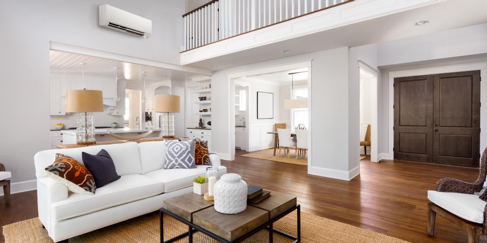
Texture and Finish Gaps Layering Materials That Make the Space Feel Whole
Your room can have the right colors and still feel strangely unfinished if everything lands on the same visual note. Smooth meets smooth, shiny meets shiny, and suddenly the space reads like a flat photo instead of a lived-in place. The fix isn’t “more stuff”-it’s layering materials so the eye has somthing to travel across: matte next to gloss, soft next to structured, raw next to refined. think of textures as the connective tissue between pieces that don’t naturally belong together; they quietly translate one style into another and close the gaps that make decor feel like it arrived in separate boxes.
Start by building a base of grounding surfaces, then sprinkle in contrast like punctuation. If your sofa, rug, and curtains all blur into one plush zone, introduce an anchoring counterpoint-wood grain, woven leather, linen, ceramic, or a metal edge that catches light. Add small “bridges” that repeat a material in diffrent scales (a tiny brass tray echoing a larger brass lamp,or a chunky knit throw repeating the rug’s weave).Useful layers that tend to make a space feel whole include:
- Soft-diffuse: bouclé, brushed cotton, washed linen, wool
- Natural-grain: oak, rattan, cane, cork, seagrass
- Hard-sheen: glass, polished metal, lacquer (used sparingly)
- Earthy-matte: clay, concrete, stone, matte ceramics
- Patterned texture: ribbed vases, carved frames, stitched cushions
| When the room feels… | Add this texture | Quick placement |
|---|---|---|
| Too flat | Ribbed ceramic | Cluster 2-3 vases on a console |
| Too cold | Wool + wood grain | Throw + side table with visible grain |
| Too “matchy” | Woven leather | Stool or tray near the sofa |
| Too busy | Matte stone | Single heavy bowl on the coffee table |

Lighting That Flattens Creating Warmth and Depth With Intentional Glow
When a room feels like a collection of separate purchases instead of a single story, the culprit is often light that’s doing too much-or nothing at all. One harsh ceiling fixture can bleach your colors, flatten texture, and leave furniture looking like it’s waiting for instructions. The fix isn’t “more lamps,” it’s more intention: a layered glow that creates gentle shadows and highlights, letting the eye travel naturally from one zone to the next. Think of light as the quiet editor of your decor-softening the cuts between styles, deepening materials, and giving even mismatched pieces a shared atmosphere.
- Anchor the room with a warm ambient source (dimmer-pleasant whenever possible).
- Shape corners and negative space with floor lamps to prevent the “floating furniture” effect.
- Direct attention using task lighting where hands actually work-reading chairs, side tables, desks.
- add depth with accent light that kisses texture: woven shades, art, plants, or a brick wall.
| Layer | What It fixes | Easy Move |
|---|---|---|
| Ambient | Harsh, flat “one-note” rooms | Swap overhead bulb to a softer warm option + add a dimmer |
| Task | Random luminous spots, awkward shadows | Place a shaded lamp at elbow height by seating |
| Accent | Disconnected decor pieces | Use a picture light or small uplight to spotlight one texture |
Warmth isn’t only color temperature-it’s also where the glow lands.Lighting that hits the floor, grazes a wall, or pools on a tabletop makes a space feel inhabited, not staged. Replace “bright everywhere” with “bright where it matters,” and suddenly your rug looks richer, your shelves feel curated, and your artwork stops competing with the sofa. To make the whole room read as one, repeat the same kind of glow in a few places-matching shade materials, keeping bulbs in a similar warm range, and spacing lights so shadow and highlight alternate like a rhythm.
- Use warm bulbs consistently so wood, brass, and textiles don’t clash.
- Hide the source when possible (behind a shade, under a shelf) to avoid glare.
- Mix heights: one low lamp, one mid-level, one higher point of light for visual layering.
- Create “islands” of light that map to how you live-conversation, reading, dining, unwinding.
Concluding Remarks
A home doesn’t fall out of sync overnight-it drifts. A chair you loved in one apartment, a rug that arrived on sale, a lamp inherited and unachievable to part with.Over time, the rooms begin to read like separate chapters that never quite meet in the middle.
The good news is that “disconnected” isn’t a dead end; it’s a clue. It points to what’s missing-an anchor color, a repeated material, a clearer mood, a stronger focal point, or simply a story that ties the pieces together.When you start noticing the gaps, you’re already on your way to closing them.
So before you replace everything, pause and listen to the space. Decide what you want it to say, then let each choice echo that message-one texture, one tone, one intentional detail at a time. Cohesion isn’t about perfection; it’s about resonance. And with a few thoughtful edits, your decor can stop competing for attention and start speaking in the same language.