In a world where minimalism often reigns supreme, the vibrant allure of color can sometimes fade into the background, particularly in small spaces. though, the essence of bold design doesn’t belong solely to expansive square footage. Instead, it can thrive in the coziest of corners, transforming even the tiniest rooms into stunning showcases of personality and style. “Bold and Stunning: Small Spaces That Pack a Color Punch” invites you to explore innovative approaches to infusing life and energy into compact areas. From daring paint choices to playful decor, we’ll unveil how to maximize every inch with hues that inspire and invigorate. Join us as we celebrate the power of color in small spaces, proving that size doesn’t dictate the impact of your design choices.Prepare to be inspired by a journey where charm meets vibrancy, and every nook tells a story.
Vibrant Hues that Transform Tiny Rooms into Eye-Catching Retreats
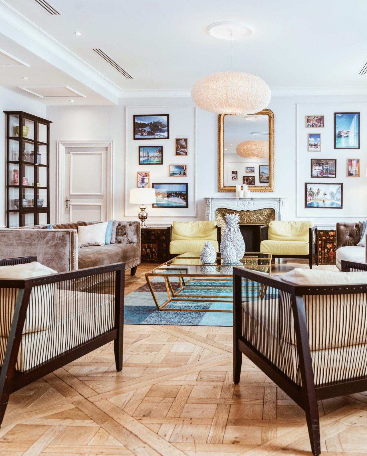
The artistry of color can turn even the coziest rooms into vibrant havens. By infusing small spaces with bold shades, you can create an atmosphere that feels both inviting and expansive. Here are some color strategies to elevate your tiny retreats:
- Accent Walls: Choose a striking hue for one wall to add depth and drama.
- Color-blocking: Use two or more contrasting colors to define areas and create visual interest.
- Pops of Color: Integrate vibrant accessories like cushions or artwork with a neutral base to keep the space refreshed.
Consider the psychological effects of colors and their ability to transform the mood of your space. Warm colors, such as reds and yellows, invoke energy and creativity, while cooler tones like blues and greens promote calm and tranquility.Here’s a quick glance at how different colors can enhance your small area:
| color | Emotion/Mood | Space Effect |
|---|---|---|
| Red | Passion,Energy | Inviting warmth |
| Blue | Serenity,Calm | expands the room visually |
| Yellow | Cheerfulness,Optimism | Brightens and energizes |
| Green | Harmony,Balance | Brings nature indoors |

Maximizing Impact: Strategic Color Placement for Small Spaces
In small spaces, every choice counts, especially when it comes to color. To create an inviting atmosphere, consider strategic accent walls. A single wall painted in a bold hue can act as a captivating focal point,drawing the eye and giving the illusion of depth. For instance, deep teal can create a serene backdrop for a cozy reading nook, while a vibrant coral can energize a small kitchen. Portable furniture in neutral tones allows the color to shine without overwhelming the space. Additionally, using shades of the same color family for accents can harmonize the surroundings, making it feel larger and more cohesive.
Another effective tactic is the use of colorful accessories to punctuate smaller areas without consuming visual space. Incorporate items like throw pillows, rugs, and artwork to introduce fun splashes of color. Consider these tips to maximize impact:
- Layering textures: Combine different materials to create depth within your color scheme.
- Vertical Stripes: Use striped wallpaper or decor to elongate walls and enhance height.
- Mirrors: Reflective surfaces can amplify light and color, giving the illusion of a larger space.
When selecting colors, keep in mind that lighting plays a crucial role. Soft, warm tones can enhance coziness, while cool shades can evoke calmness. To visualize your color choices,utilize the table below to outline potential palettes:
| Color | Vibe | Best For |
|---|---|---|
| Teal | Serene | Reading Corners |
| Coral | Energetic | Small Kitchens |
| Mustard Yellow | Cheerful | Entryways |
These strategic approaches to color placement can effortlessly elevate the charm of even the tiniest of spaces. Whether through bold features or subtle accents, colorful decisions can make small areas feel open, inviting, and brimming with personality.

The Power of Accents: Using Accessories to Elevate Your Color Palette
when it comes to enhancing color palettes in small spaces,accessories are your best friends. Thay allow homeowners to introduce striking hues and textures without overwhelming the room. Think of vibrant throw pillows nestled on a neutral sofa or an eye-catching area rug that ties everything together. These elements not only bring personality but also create subtle focal points that can transform the atmosphere of a tiny room. By carefully selecting items in contrasting or complementary colors, you can create a visual narrative that captivates and delights anyone who steps inside.
Consider incorporating accessory layers to further energize your design. Here are some elements to play with:
- Art and framed Prints: Use bold artwork to inject a burst of color.
- Curtains and Drapes: Radiant curtains can frame a small window and make the space feel larger.
- Accent Furniture: A colorful chair or side table can serve as a statement piece.
- Decorative Trays and Bowls: These can hold smaller items while adding dimension and interest.
To illustrate how various colors can interact, consider the following table featuring popular accent colors paired with corresponding neutrals:
| Accent Color | Complementary Neutral |
|---|---|
| Coral | Soft Gray |
| Turquoise | Ivory |
| Mustard Yellow | Charcoal |
| Emerald Green | Beige |
By thoughtfully curating accessories that amplify your primary color scheme, you can effortlessly elevate even the smallest of spaces into a bold expression of personal style.
Creating Cohesion: Blending Colors for a Harmonious Small Space Design
In small spaces,the right blend of colors can create an inviting atmosphere that feels expansive rather than cramped.By strategically choosing hues that complement each other, you can craft a cohesive look. Consider using a monochromatic color scheme, where various shades of a single color add depth without overwhelming the senses. Alternatively, you might opt for an analogous palette that includes colors adjacent to each other on the color wheel—think blues and greens—for a subtle yet engaging visual narrative.
When mixing colors, balance is key. Use bold colors as accents to draw attention to specific features while keeping the larger areas softer. Here’s a quick reference guide to effective color combinations:
| Bold Color | Complementary Shades |
|---|---|
| Royal Blue | Soft Gray, White |
| Vibrant Coral | Muted Peach, Light Beige |
| Sunny Yellow | Cool Teal, Warm Gray |
Incorporating these combinations thoughtfully can lead to a space that feels both dynamic and harmonious. Be sure to keep furniture and décor in tune with your chosen palette; as an example, a bold red chair can stand out beautifully against walls painted in softer shades of pink and cream. This clever interplay not only showcases your style but also maximizes the perceived size of your room, creating a chic yet cozy environment.
Q&A
Q&A: Bold and Beatiful - Small Spaces That Pack a Color Punch
Q: What inspired the theme of this article?
A: The theme “Bold and Beautiful: Small Spaces That Pack a Color Punch” was inspired by the idea that color can transform even the tiniest of spaces into vibrant, energizing havens. In a world where minimalism often takes center stage, we wanted to celebrate the opposite—the power of bold colors to create impactful statements within limited square footage.
Q: Why is color particularly vital in small spaces?
A: Color plays a crucial role in shaping the mood and perception of a space. In small areas, clever use of color can make the environment feel larger, more inviting, and more dynamic. It can also reflect the personality of the occupant, making small spaces uniquely expressive and lively.
Q: What are some effective color strategies for small rooms?
A: There are several effective color strategies, including:
- Accent Walls: Painting a single wall in a bold hue can create visual interest without overwhelming the space.
- Color Blocking: Using two or more colors in a deliberate pattern adds depth and can trick the eye into perceiving the space as larger.
- Ceiling Colors: Painting the ceiling a bold color can create an unexpected surprise and draw the eye upward, adding height to the room.
- Layering Textures: Combining different textures with color can enhance the vibrancy of the space without adding clutter.
Q: Can you share examples of colors that work well in small spaces?
A: Absolutely! Some great choices include:
- Deep Teal or Sapphire Blue: These rich colors can add sophistication and a hint of drama.
- Sunny Yellow or Cheerful Coral: Bright, warm tones infuse energy and warmth.
- Earthy Terracotta or Olive Green: These colors evoke a sense of grounding and bring a touch of nature indoors.
- Bold Black or Charcoal Gray: These shades create an elegant contrast and can serve as a strong background for colorful decor.
Q: How can one balance bold colors with functionality in small spaces?
A: Balancing bold colors with functionality is all about mindful design choices. Consider multi-functional furniture that complements the color palette while serving practical purposes. For instance, a vibrant ottoman can become additional seating while doubling as a table. Also, use color strategically in areas that might otherwise feel cluttered, like organizing shelves in a way that enhances, rather than distracts from, the color scheme.
Q: Are there any common pitfalls to avoid when using bold colors in small spaces?
A: Yes, a few common pitfalls include:
- Overdoing It: Too many bold colors can overwhelm. stick to a cohesive palette of a few key colors.
- Neglecting Lighting: Light affects how colors appear; always consider natural and artificial light sources when choosing shades.
- Ignoring Scale: Be mindful of how the size of color patterns or accessories can affect perception; larger prints can feel more expansive than busy, small ones.
Q: What overall message do you hope readers take away from this article?
A: we hope readers feel inspired to embrace color as a powerful tool in redefining their small spaces.Bold choices need not be intimidating; they can evoke joy, creativity, and a sense of personal style, making any small room not just livable but truly vibrant and alive!
To Wrap It Up
As we conclude our journey through vibrant small spaces that defy the limitations of their size, it’s clear that bold choices in color can transform a compact area into a dynamic haven. These spaces remind us that creativity knows no bounds, and with the right palette, even the tiniest rooms can radiate personality and warmth. Whether it’s a daring accent wall or a playful mix of hues, the magic lies in the ability to infuse life and character into every corner. so, let your creativity run wild, embrace the unexpected, and remember that in the world of design, it’s not just about the space you have—but how you choose to fill it. Happy decorating!