The Versatility of Neutral Colors
Neutral colors have long been a staple in the world of design, often associated with calmness, simplicity, and sophistication. While beige has dominated the neutral palette for years, there is a growing trend towards exploring a wider spectrum of neutral shades that can enrich our spaces without overwhelming them. In this article, we will delve into the various neutral colors beyond beige and how they can be effectively utilized in design.
Why Choose Non-Beige Neutrals?
Opting for neutrals that aren’t beige allows for greater creativity and individuality in design. Colors like greys, taupes, whites, and even muted pastels can provide a fresh take on neutrality. These colors can evoke different moods and atmospheres, making them suitable for various spaces, from serene bedrooms to dynamic offices.
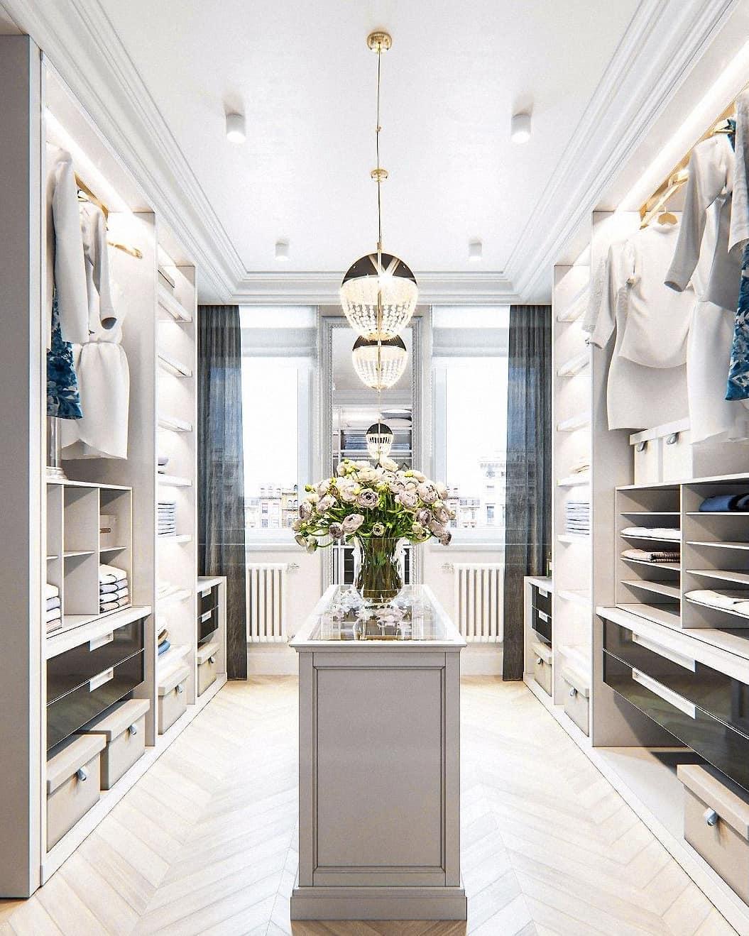
Exploring Grey
Grey, often dubbed the new beige, is incredibly versatile. It ranges from light shades that can brighten a space to darker tones that add depth and drama. Light greys can serve as an excellent backdrop for vibrant art or furniture, while charcoal greys can create a cozy, intimate atmosphere. Pairing grey with warm woods or metallics can further enhance its appeal.
Soft Whites
Contrary to popular belief, white is not just white. Soft whites with undertones of cream or pale grey can bring warmth to a space. These shades create a clean, airy feel while maintaining a sense of comfort. They are perfect for smaller rooms, as they can make spaces appear larger and more open. Accentuating soft whites with colorful accessories can create a dynamic contrast that invigorates the room.
Incorporating Taupe
Taupe is a unique neutral that combines brown and grey, offering a warm yet sophisticated tone. It works beautifully in both traditional and contemporary settings. Using taupe in upholstery or wall paint can create a rich backdrop for various decor styles. Additionally, taupe pairs well with a range of colors, including jewel tones and muted pastels, making it an excellent choice for accent pieces.
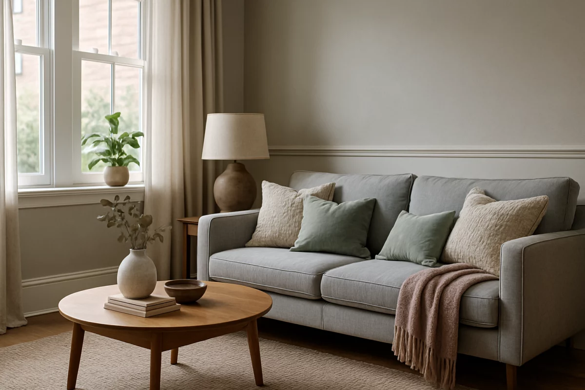
Muted Pastels as Neutrals
Muted pastels, such as soft blush, sage green, and powder blue, are becoming increasingly popular as neutrals. These hues offer a fresh and modern feel while maintaining the subtlety typical of neutral colors. They can soften a space and introduce a hint of color without overwhelming the overall design. For instance, a muted blush sofa can serve as a neutral statement piece, allowing surrounding decor to shine.
Creating Balance with Non-Beige Neutrals
When designing with non-beige neutrals, it’s essential to consider balance. Layering different shades of the same color can create depth and interest. For example, a room designed in various shades of grey can appear sophisticated and cohesive. Adding textures, such as wool throws or velvet cushions, can enhance the visual appeal and create a warmer environment.
Accent Colors and Accessories
To prevent a neutral palette from appearing flat, introduce accent colors through accessories. Bold colors like teal, mustard yellow, or burnt orange can enliven a neutral space. Consider using these accents in decorative pillows, artwork, or even a statement piece of furniture. This approach allows for a flexible design that can adapt to changing trends and personal tastes.
Case Studies: Successful Neutral Designs
Many designers have successfully embraced non-beige neutrals in their projects. For instance, a contemporary home featuring a palette of soft greys and whites can evoke a serene atmosphere, perfect for relaxation. In contrast, a rustic cabin with taupe walls and muted pastel furnishings can create a warm, inviting space that feels cozy and lived-in.
Personal Spaces
In personal spaces like bedrooms, using non-beige neutrals can significantly impact the overall feel. A bedroom painted in soft sage green with white accents can promote tranquility and restful sleep. Similarly, a home office utilizing shades of grey accented with bold decor can foster creativity and productivity.
Conclusion
Incorporating neutrals that aren’t beige into your design scheme not only enhances aesthetic appeal but also allows for greater expression of personal style. By exploring a broader palette of neutral colors, designers and homeowners alike can create spaces that are both inviting and unique. Embracing the versatility of these colors can lead to stunning results, making any space feel fresh, modern, and undeniably stylish.