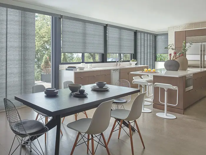
How to Add a Pop of Color with Window Treatments
In the world of interior design, the right window treatments can transform a room from ordinary to extraordinary. These functional elements do more than just control light and privacy; they also offer a unique possibility to infuse personality and vibrancy into your space. Whether you’re looking to create a cozy reading nook or a lively living room, adding a pop of color through curtains, blinds, or shades can set the tone for your entire decor. In this article, we will explore innovative ways to incorporate striking hues into your window treatments, helping you breathe new life into your interiors and reflect your personal style. Get ready to unlock the transformative power of color and discover how a simple shift can enhance your home’s ambiance!
Choosing the Right Fabrics for Vibrant Window Treatments
When selecting fabrics for window treatments that make a statement, the right choice can transform your space.Consider fabrics that boast a wide range of colors and patterns, which can elevate the visual appeal of any room. Popular options include:
- Linen: Lightweight and breathable, perfect for a relaxed look.
- Silk: Adds elegance with its rich texture and sheen.
- Canvas: Durable and great for vibrant prints.
- Velvet: Luxurious and perfect for adding depth with rich, bold colors.
Additionally, the finish of your chosen fabric can significantly impact the overall feel of your window treatments. Fabrics with special treatments or coatings can offer advantages such as:
| Finish Type | Benefits |
|---|---|
| Blackout | Reduces light and enhances privacy. |
| Water-Resistant | Ideal for humid environments, preventing mold and mildew. |
| UV-Protection | prevents fading of furniture and flooring. |
exploring Bold Patterns and Designs to Transform your Space
Transforming your space with window treatments offers an exciting opportunity to introduce bold patterns and vibrant colors.By selecting fabrics with geometric prints, botanical motifs, or abstract designs, you can create a statement that draws the eye and sparks conversation.Consider the following elements when choosing your window coverings:
- Contrasting Colors: Opt for shades that stand out against your walls, making your windows the focal point of the room.
- Layering: Combine patterned curtains with solid sheers to add depth while maintaining a sense of elegance.
- Hardware Choice: Bold curtain rods or unique finials can further enhance the overall aesthetic and complete the look.
To effectively integrate these eye-catching designs, think about the scale and balance of patterns in your decor. Large prints can make a big impact, but pairing them with complementary accessories will ensure they don’t overwhelm the space. A well-coordinated scheme might include a table showcasing various fabric options:
| Fabric Type | Pattern Style | Best Use |
|---|---|---|
| Silk | Floral | Living Room |
| Cotton | Geometric | Kitchen |
| Linen | Abstract | Bedroom |
This approach not only highlights your windows but also refreshes your entire room, creating a vibrant and inviting atmosphere.

Layering Techniques for Depth and Dimension in Color
When it comes to transforming a space,using layering techniques with color in your window treatments can create depth and dimension. Begin by selecting a base color that sets the tone for the room,then build upon this foundation using complementary hues. Layer sheer curtains beneath thicker, more textured drapes, allowing light to filter in while adding richness to the overall appearance. By mixing different fabrics, such as soft linens or luxurious velvets, you can achieve a stunning interplay of textures that enhances visual interest.
Consider incorporating decorative elements that further amplify the layered effect. Accessories like valances or cornices can act as a frame,drawing the eye upward and making ceilings appear higher. Adding contrasting tiebacks can provide a pop of color while maintaining a cohesive look. Using accessories in various patterns and tones not only brings out the existing color scheme but also invites a playful element to your decor. Below is a simple table showcasing some effective color combinations:
| Base Color | Layered Color | Texture Idea |
|---|---|---|
| Soft Gray | Mustard Yellow | Linen |
| Deep Blue | Copper | velvet |
| Pale Pink | Charcoal | Sheer |

Accessorizing Window Treatments to Enhance Color Impact
To truly elevate the visual impact of your window treatments, consider integrating accessories that complement and enhance your chosen colors. Items such as decorative tiebacks, pelmets, or valances can serve as a canvas for your color theme. For a cohesive look, opt for accessories that either harmonize with the fabric or introduce a contrasting hue that still resonates with the overall palette of your space. Additionally, curtain rods and brackets can be selected in finishes that either stand out or blend in, allowing your window treatments to capture attention without overwhelming your decor.
Another creative approach is to play with layering.Mixing different types of window treatments can create depth while providing opportunities to introduce additional colors. Consider pairing sheer curtains with heavier drapes; select a bold shade for the drapes while opting for lighter, airy colors with the sheers. This not only adds visual interest but also enhances the flow of natural light. To visualize your options, here’s a speedy reference guide:
| Accessory Type | Color Selection Tips |
|---|---|
| Tiebacks | Choose colors that contrast or complement the drapery. |
| Pelmets/valances | Use patterned fabrics that feature your accent colors. |
| Hardware | Opt for metallic finishes that match your room’s decor style. |
Q&A
Q&A: How to Add a Pop of color with Window Treatments
Q1: Why should I consider adding color with window treatments?
A1: Adding color through window treatments is a fantastic way to infuse personality into your space. It can transform a room’s ambiance and create visual interest without the commitment of painting walls or changing furniture.A splash of color can make a bold statement or serve as a subtle nod to your overall decor theme.
Q2: what types of window treatments work best for adding color?
A2: There are several options! Curtains and drapes offer a vast array of colors, patterns, and textures. roman shades are another stylish choice, available in chic prints. Blinds can also be colorful,especially those made from choice materials like faux wood or fabric. Don’t forget about valances or swags—these can add a pop of color at the top of your windows, creating a stylish frame.
Q3: How do I choose the right color for my window treatments?
A3: Start by considering your existing color palette. Think about complementary or contrasting colors that will enhance your space.Use a color wheel as a guide: colors opposite each other (like blue and orange) create vibrant contrast, while those next to each other (like blue and green) provide a more harmonious feel. Don’t hesitate to pull inspiration from other decor elements in the room, like cushions or artwork.
Q4: Should I opt for patterns or solid colors?
A4: It depends on the effect you want to achieve! Solid colors can create a clean, modern look and are versatile enough to work with various styles. Patterns, conversely, can act as a focal point and add depth. Stripes, florals, or geometric designs can bring energy to your space. If you’re unsure, consider mixing solid colors with patterned window treatments for a balanced approach.
Q5: How can I maintain a cohesive look with colorful window treatments?
A5: Cohesion can be achieved by ensuring your window treatments complement other design elements in the room. Use colors seen in your furnishings or decor to guide your choice. You can also tie everything together with accessories—matching cushions, art pieces, or rugs that incorporate the same color can create a unified aesthetic.
Q6: Are there any practical considerations when adding colorful window treatments?
A6: Absolutely! Consider the amount of natural light you want in your space.Lighter colors reflect light and can make a room feel airier, while dark colors can absorb light, creating a cozy atmosphere. Additionally,think about the type of fabric you choose—it should be functional for your needs,whether that’s blocking out light or providing privacy.
Q7: What are some quick tips for experimenting with window treatment colors?
A7: Start with smaller windows or rooms that require less commitment, like a bathroom or laundry room. You could also use curtains in a bold hue or printed valances to test the waters. If you want to be even more adventurous, consider removable wallpaper or fabric tape around your windows for a temporary pop of color. An eclectic approach can lead to delightful surprises!
Q8: How can I incorporate seasonal changes with my window treatments?
A8: Consider using interchangeable window treatments that allow for seasonal updates. Light, breezy fabrics in spring and summer can be swapped for richer, warmer colors in autumn and winter. Accessories like clips, ties, or decorative hooks can also help you adjust the look throughout the year without a complete overhaul.
Adding a vibrant touch through window treatments can entirely transform your space—enhance your creativity, let your personality shine, and make your home a little brighter, one window at a time!
The Way Forward
infusing a burst of color into your living space through window treatments is a delightful and impactful way to refresh your home’s aesthetic. Whether you opt for vibrant curtains, striking blinds, or playful shades, the right choice can transform not only your windows but the entire atmosphere of your rooms. Remember, it’s about finding the perfect balance between style and function, allowing your personality to shine through while still maintaining the serenity of your space. As you embark on your decorating journey, let the colors you choose reflect your unique taste and elevate your home’s character.Embrace the power of color, and watch as your windows become a canvas for creativity and joy. Happy decorating!