Stone carries an old, quiet authority: the memory of cliffs and riverbeds, the slow work of time etched into grain and vein. Yet that same permanence can be lightened, bent, and repurposed-moved from the obvious floor or façade into corners that surprise. When stone textures show up where you don’t expect them,they reframe a space,shift a mood,and invite a closer look.
This article explores ways to introduce stone’s tactile depth into unlikely places-shelving backs, cabinetry panels, soft furnishings, lighting fixtures, even digital interfaces-without overwhelming the design. You’ll find approaches that range from subtle suggestions, like a marble-veined wallpaper that reads as shadow and sheen, to bolder gestures, such as a stone-clad ceiling that inverts the room’s gravity. Practical considerations-scale, pattern, finish, and pairing with color and materials-will help translate inspiration into something that feels both deliberate and effortless.
Whether you’re a homeowner rethinking a hallway, a designer seeking a fresh palette, or someone curious about material storytelling, these ideas aim to broaden how stone can work for you. Think of this as a gentle invitation to blur the expected lines between hard and soft, ancient and contemporary, solid and surprising.
Choosing the Right Stone Texture for Small Spaces and vertical Surfaces
Think of stone the way you would a piece of sculpture – in small spaces, let scale do the talking. Choose stones with fine veining or a honed finish to keep surfaces calm and light; polished faces can bounce light into corners, while overly rugged textures risk making a niche feel cluttered. For vertical planes, aim for stones that emphasize vertical movement (tall, thin tiles or linear veining) so the eye is drawn upward, creating a sense of height without visual weight. pay attention to grout width and color: subtle, narrow joints keep the surface reading as continuous, whereas contrasting grout turns every seam into a design element.
Practical choices often come down to pairing texture with purpose – durability for shower walls, slim profiles for stair risers, and gentle sheen for vestibules – and a few quick rules can guide you:
- Smaller grain + lighter tone = perceived spaciousness.
- Matte/honed finishes reduce glare in compact rooms.
- Linear or stacked patterns lengthen vertical sightlines.
| Texture | Best Use | Effect |
|---|---|---|
| Honed Marble | Bath walls | Soft, reflective |
| Thin slate Veneer | Accent columns | Subtle depth |
| Stacked Limestone | Entryway | Vertical drama |
Selecting thoughtfully will let stone enhance rather than overpower compact or upright surfaces, turning constraints into character.

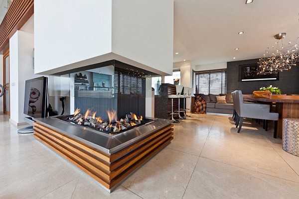
layering stone with Soft Textiles and Warm Metals to Soften Cold Surfaces
Stone’s austere presence becomes inviting when you counterbalance it with soft, tactile layers and the gentle glow of warm metals. Think plush throws over a cold hearth, a boucle armchair cradling a raw basalt side table, or a hammered brass lamp perched on travertine-each addition negotiates the temperature of the space so the stone feels intentional rather than forbidding. Simple pairings to try immediately:
- Bouclé + Limestone
- Velvet + slate
- Wool + Concrete
- Brushed Brass accents to warm any cool slab
Use scale and repetition to keep the look cohesive: one oversized textile, a trio of small metallic objects, and a recurring stone tone will read as curated rather than accidental. below is a quick reference to balance vibe and texture that you can pin to your mood board or pass to a stylist:
| Stone | Textile | Effect |
|---|---|---|
| Marble | Silk throw | elevated warmth |
| Slate | Velvet pouf | Soft contrast |
| Concrete | Wool rug | Tactile grounding |

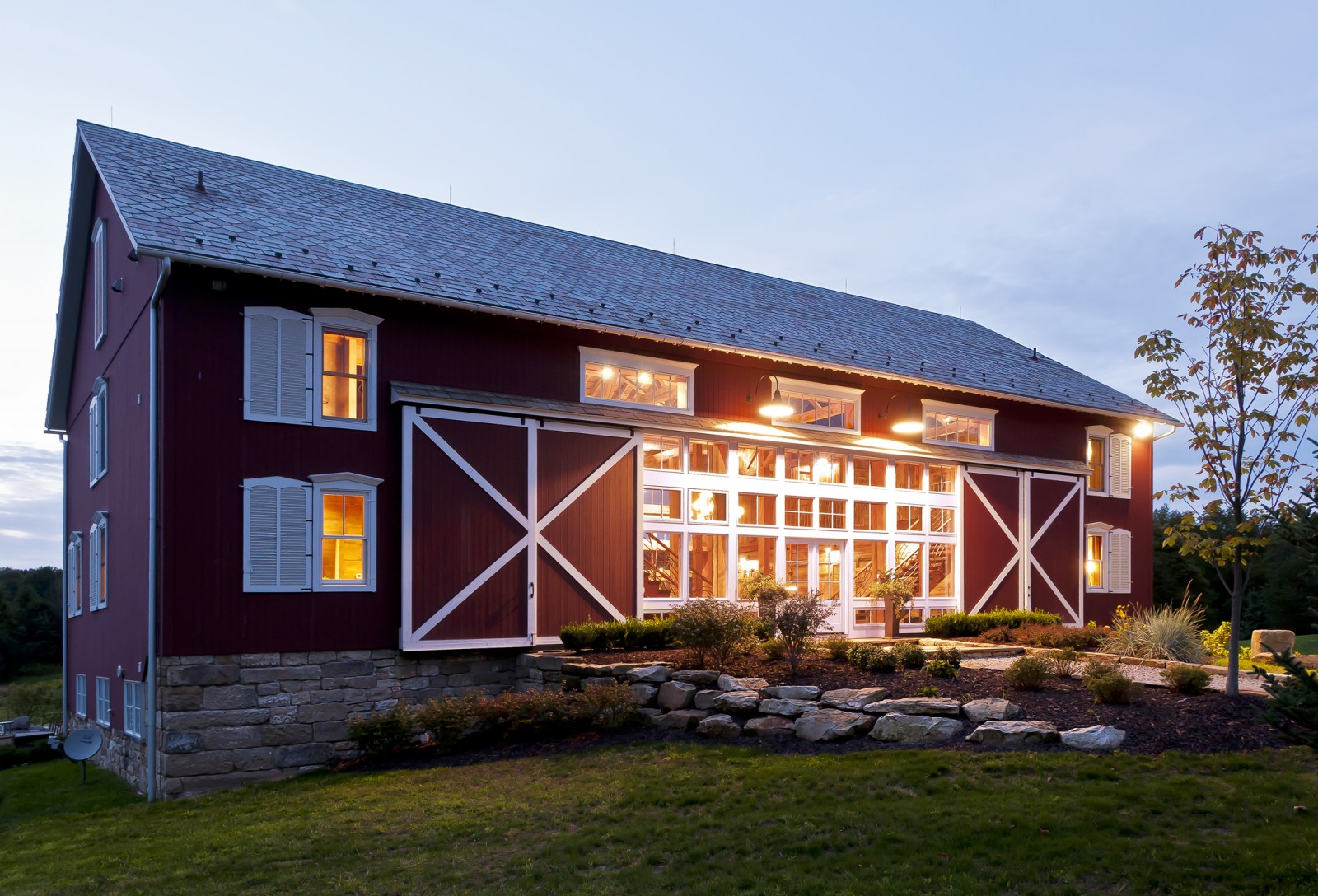
unexpected Applications That Work: Ceilings, Cabinet Interiors and bathroom Nooks
Stone textures can flip expectations when rolled overhead or tucked into tight spaces-imagine a gently veined surface drawing the eye upward or a textured backsplash that peeks out of an open cupboard like a secret landscape.Embrace contrasts: pair a soft plaster ceiling with a bold stone motif to create visual depth without weight, or line cabinet interiors with thin stone veneer to turn shelving into a display stage. Try these small, high-impact moves that read luxury at a glance yet stay surprisingly practical:
- Acoustic charm: textured stone ceilings can mute echoes in lofty rooms;
- Hidden elegance: stone-lined cabinet backs elevate everyday objects;
- Micro-retreats: a stone nook in the bathroom becomes a spa-like pause.
Choose lightweight, engineered, or porcelain stone tiles for overhead and confined installs to keep structure and costs manageable, and use warm or cool tones depending on the mood you want to create. The quick reference below helps match material to effect when planning these offbeat applications:
| Placement | Material | Result |
|---|---|---|
| ceiling | Light porcelain stone | Airy drama |
| Cabinet interior | Thin slate veneer | Depth & contrast |
| bathroom nook | Marble-look porcelain | Spa warmth |

Practical Installation Tips and Easy Faux Stone Alternatives for Tight Budgets
Treat the project like a small-scale masonry job and plan for the little things that save time and look professional: surface prep is non-negotiable, and a flat, clean wall makes even faux materials read as authentic.Measure twice, mark once, and dry-lay pieces or panels before you glue so seams and patterns fall where they flatter the eye. When working with real or heavy veneer, use a slurry bond or polymer-modified thinset and remember to seal porous stone immediately after installation to prevent staining. Small practical moves-like using tile spacers to keep grout consistent, cutting with the right blade rather than forcing a piece, and working in short, manageable sections-turn a weekend DIY into a lasting finish.
- Prime & level surfaces to improve adhesion.
- Stagger seams for a natural look and structural integrity.
- use the right adhesive for your substrate-mortar for stone, contact cement for foam panels.
- Protect adjacent areas with drop cloths and painter’s tape.
If your budget is tight, you don’t need to skimp on style-strategic choices create the illusion of real stone without the cost. Consider peel-and-stick veneer for backsplashes, high-density foam panels for dramatic interior features, or a layered approach using texture paint and glazes to mimic depth. Focus on accents (a fireplace surround,a single feature wall,or kitchen backsplash) rather than entire rooms to stretch your dollars further; mixing a few genuine stone pieces with faux elements sells authenticity. Below is a quick, practical comparison to help pick your route.
| Option | Avg cost | Best for |
|---|---|---|
| Peel-and-stick veneer | $8-15 / sq ft | Backsplashes & feature strips |
| Foam panels | $6-12 / sq ft | Accent walls & lightweight installs |
| Texture paint/glaze | $1-5 / sq ft | Budget-kind texture and subtle effects |
Maintaining Stone Finishes and using Lighting to Highlight Texture Without Overwhelming the Room
Stone needs a little choreography to stay lovely-think gentle moves rather than heavy-handed scrubbing. Regular dusting with a microfiber cloth and a soft brush for joints prevents grit from abrading the finish; for spills use a pH-neutral cleaner and blot rather than rub. Sealants are your quiet ally: reseal porous surfaces on a schedule (test every 1-3 years) and always spot-test new products on an inconspicuous patch.
- Daily: dry dust or vacuum with a soft attachment
- Weekly: mild soap and water for high-touch zones
- Quarterly: inspect grout, joints, and seal integrity
- Avoid: acidic cleaners, steel wool, and bleach
Lighting should celebrate texture without competing with the room’s balance-use direction, warmth, and restraint to dramatize stone while keeping the space livable. Grazing light placed low and angled across the plane (usually 10-30°) amplifies relief; pair that with a softer,diffused ambient layer and dimmable control to scale the effect by mood.
- Grazers: adjustable wall washers or recessed slats to emphasize veins and chisel marks
- Accents: small LED spots for focal details, kept to one wall or corner
- Temperature: choose warm-to-neutral LEDs (2700-3500K) to preserve stone’s natural tones
- Balance: use concealed strips or sconces to soften transitions and avoid high-contrast glare
Key Takeaways
Stone textures have a way of anchoring a space while still surprising the eye. Whether you tuck them into a bookshelf back, drag them across a ceiling beam, or whisper them into upholstery accents, the trick is less about fidelity to the quarry and more about intention: scale, contrast, and restraint.
Before committing,test samples,observe how light and movement change the surface,and think about touch as much as sight. Pair rough with smooth, old with new, and let the stone’s presence be a punctuation-sometimes a bold period, sometimes a quiet comma.
Used thoughtfully, stone textures expand the vocabulary of a room, offering tactile memory and a hint of landscape where you least expect it. So experiment, edit, and repeat: the most captivating spaces are the ones that tell subtle, unexpected stories.