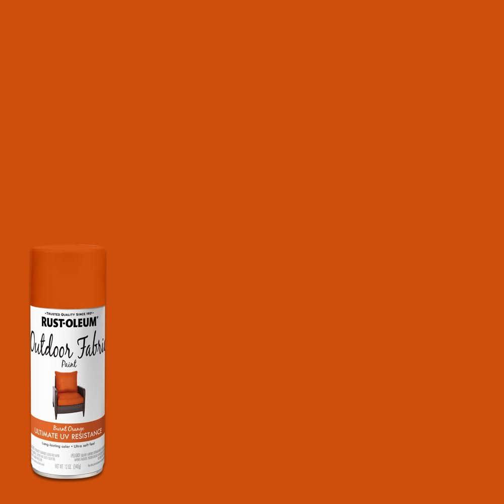
It arrives like a memory – not the loud neon of summer nor the hushed pastels of spring, but a color that feels collected, weathered and ready: burnt orange. Somewhere between ember and clay, it carries the warmth of a late-afternoon sun and the grit of vintage leather, a hue that can anchor a room as easily as it can command a runway.
This season, burnt orange has slipped into wardrobes, interiors and branding with a quiet insistence. Its boldness isn’t about volume so much as presence: a chromatic confidence that contrasts cleanly with cool neutrals, deepens layered textures and reads as both retro and utterly contemporary.
In the pages that follow we’ll trace why designers, stylists and makers are turning to burnt orange now – from its psychological impact and cultural echoes to practical ways its being used across fashion, home and product design. The result is a study of a color that feels familiar and newly daring at the same time.
Why Burnt Orange Is the boldest Color on Runways and Streets
Burnt orange arrives like a sun-warmed secret – equal parts heat and restraint – turning every silhouette into a statement without shouting.On catwalks it reads as couture confidence, on city streets it reads as lived-in luxury: the color’s smoky depth flatters a wide range of skin tones and pairs effortlessly with textures from polished leather to brushed wool. Its power comes from contrast – a hue simultaneously earthy and electric – which is why designers and style-makers lean into it season after season. A few reasons it keeps stealing the spotlight:
- Visibility: commands attention in crowded spaces without neon harshness.
- Versatility: reads polished on suiting, relaxed on knitwear, and bold on outerwear.
- Emotion: evokes warmth, nostalgia and modernity in one stroke.
- Longevity: transcends trend cycles by feeling both seasonal and timeless.
Styling burnt orange is an exercise in balance – anchor it with cool neutrals or amplify it with unexpected metallics. Textures amplify the mood (suede softens, satin sharpens) and accessories let you dial intensity up or down. Use the table below as a rapid pairing cheat-sheet to experiment with looks that work from runway edits to everyday commutes.
| Pairing | Effect |
|---|---|
| Navy | Grounding contrast that reads refined |
| Camel & beige | Warm monochrome sophistication |
| Gunmetal or gold | Modern edge with a luxe finish |
What Burnt Orange Says About Mood and Modern Confidence
Burnt orange speaks in tones that feel handcrafted – warmth, resilience, and a little soft rebellion rolled into one. It reads as simultaneous comfort and clarity: an easy smile that still holds eye contact. Imagine late-afternoon light distilled into color; that amber edge gives outfits and interiors a sense of lived-in confidence rather than performative flash. Within that mood you’ll find a palette of subtle signals:
- Energetic calm – movement without chaos
- Nostalgic optimism – modern with memory
- Approachable authority - presence that invites, not intimidates
Applied to the modern wardrobe or a minimalist apartment, burnt orange becomes a strategy for quiet risk-taking: a bold choice that doesn’t need louder colors to prove itself. It amplifies confidence by anchoring style in texture and tone - suede jackets,matte ceramics,a single accent wall – creating a sense of coherence that reads as intentional rather than loud. Use it where you want to feel both seen and steady: meetings, evenings out, or a small corner of your home that reminds you of possibility.
| Mood | placement | Effect |
|---|---|---|
| Warmth | Throw pillow | Instant coziness |
| Resilience | Outerwear | Quiet authority |
| Optimism | Accent wall | Inviting energy |

Choosing Fabrics, Cuts, and Textures to Let Burnt Orange Shine
When letting burnt orange dominate an outfit, choose fabrics that sing rather than shout – think silk for a warm sheen, wool for autumnal depth, and suede or leather for tactile drama. Lightweight linens and crisp cotton give the hue a sun-faded, editorial feel, while knitwear and cashmere wrap it in approachable luxury. Consider pairing one bold burnt-orange piece with subtler textures to maintain balance; a satin blouse in burnt orange reads elegant, whereas a boucle blazer turns the same tone into a textured statement.
- Silk: luminous, dressy
- Wool: structured, seasonal
- Suede/Leather: tactile, modern
- Knits: cozy, wearable
Cut and texture decide whether burnt orange appears refined or rebellious: a sharp, tailored silhouette offers polish, while oversized shapes make the color feel effortless and avant-garde. Use contrast-matte fabrics soften high-shine accessories, and glossy finishes can lift heavier knits-so the color reads intentionally. The quick reference below helps match cuts to textures for distinct moods without overwhelming the eye.
| Cut | Why it works | Texture pairing |
|---|---|---|
| Tailored | Sharp, modern | Satin or fine wool |
| Oversized | Casual statement | Bouclé or chunky knit |
| Fitted | Clean, warm | Suede or ribbed cotton |
Proven Color Pairings and Outfit Formulas that Balance Boldness
Think of burnt orange as a magnetic centerpiece – loud enough to command attention, subtle enough to play well with restraint. Use proven formulas to keep the color intentional:
- Navy anchor: a burnt-orange sweater with a navy coat for instant polish.
- Earth-tone mono: shades of tan and camel layered for a warm, refined monochrome.
- High-contrast pop: pair with teal or olive to make each color sing without clashing.
- Edge & polish: burnt orange top + black leather jacket balances boldness with attitude.
These are not rules but templates – swap fabrics and proportions to suit day or night.
Balance comes from texture, scale and a disciplined palette: keep other pieces muted, add a reflective or metallic accent, and limit prints to one focal piece.
| look | Key piece | Why it balances |
|---|---|---|
| Casual weekend | Burnt-orange sweater | Soft knit dials down intensity while color stays central. |
| Office smart | Navy blazer | Structured silhouette contains the warmth. |
| Evening | Metallic clutch | A small shine piece keeps the look refined. |
- scale tip: large blocks of burnt orange + small neutral accessories.
- Texture tip: pair suede or wool with sleek leather for depth.
- Accessory tip: one metallic or patterned item neutralizes bravado.

Where to Invest and How to Shop Burnt Orange Pieces for Longevity
Think of your wardrobe like a gallery: invest where a single shade can anchor an outfit for years. prioritize quality silhouettes that age gracefully – a statement coat, a fine-gauge knit, or a leather accessory - and let them do the heavy lifting. Key pieces to consider:
- Tailored outerwear – structured coats hold color and shape season after season.
- Natural-fiber knits – merino or cashmere resist pilling and keep hues vibrant.
- Leather or suede accents – belts,bags,and boots add texture that deepens with wear.
Choose classic cuts in rich, saturated tones rather than trendy shapes; that way the color reads timeless, not temporary.
When shopping, make longevity your filter: inspect construction, ask about dye stability, and favor pieces that can be repaired or reimagined. Follow these practical rules to shop smarter:
- Check seams & hardware - reinforced stitching and solid zips mean fewer trips to the tailor.
- Prefer washable or professional-care labels – some pigments require gentle handling to avoid fading.
- Buy from brands with repair/resale programs – circular options extend life and protect your investment.
With a little scrutiny at purchase and basic maintenance after, a single bold hue can become the most enduring element in your rotation.
Insights and Conclusions
Like a slow-burning ember that refuses to fade, burnt orange reclaims the spotlight this season-warm without being sweet, striking without being loud. It bridges past and future, pairing with neutrals as naturally as it revives muted palettes, and it translates from runways to living rooms with equal ease. Whether you adopt it in a single accent or make it the anchor of a look or space, burnt orange asks only that you notice it – and then lets you decide what to do next. If this season has a color with both presence and restraint,it’s this one.