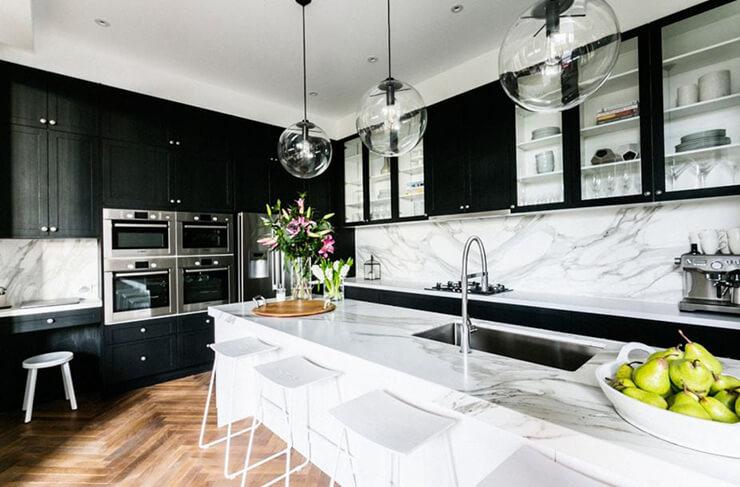
White, black, grey – a kitchen rendered in a single note can feel like a study in restraint: clean lines, pared-back surfaces, and a sense of visual calm. For many, the word “monochrome” conjures minimalism at its most clinical, a space where personality is surrendered to palette. Yet look closer and the story changes: monochrome doesn’t have to mean austere. It can be intimate, layered, and quietly inviting.This article explores how a limited color range becomes a backdrop for warmth rather than a barrier. Through subtle shifts in tone, texture, and material, designers coax softness out of starkness; light sculpts surfaces, wood and metal introduce tactile depth, and carefully chosen accents provide human scale.Rather than adding more colors,the effect is achieved by varying the language within one – a nuanced approach that lets a monochrome kitchen feel personal without abandoning its disciplined aesthetic.
We’ll unpack the principles that make warmth possible in a single-hue kitchen, look at the elements that matter most, and consider practical ways to apply them so a pared-down palette reads as cozy rather than cold.
Soft textures and tactile layers to warm a monochrome kitchen with material choices and placement tips
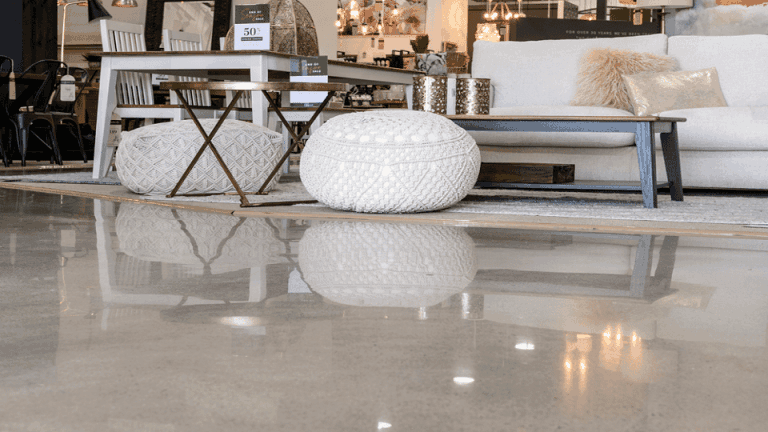
Think of touch before color: a monochrome kitchen becomes inviting the moment you start layering materials that beg to be handled. Introduce wool runners, linen napkins, and hand-thrown ceramics as foreground elements and let matte wood and soft leather act as warm counterpoints. Practical accents double as texture makers – a stacked cluster of wooden cutting boards, a bowl of stoneware fruit, or a linen-clad bread basket read as both useful and tactile.
- Wool runner – narrows and softens hard flooring
- linen – light, breathable folds on open shelves
- Leather – stool seats and handles for aged warmth
- Ceramics & matte glazes – visual depth with a soft hand
Placement is everything: emphasize touchpoints where people naturally pause and interact. Anchor texture at work and gathering zones – under stools, beside the sink, and on open shelving - so every reach offers a tactile surprise. Keep finishes layered but not cluttered: rotate soft textiles seasonally and group like-with-like to create calm contrasts.
- Underfoot: place a runner that extends beyond the island for continuity
- at hand: fold linens neatly on middle shelves within easy reach
- On surfaces: stagger wooden boards and ceramics to catch light and fingers
- On seating: add a hide or woven cushion for instant comfort
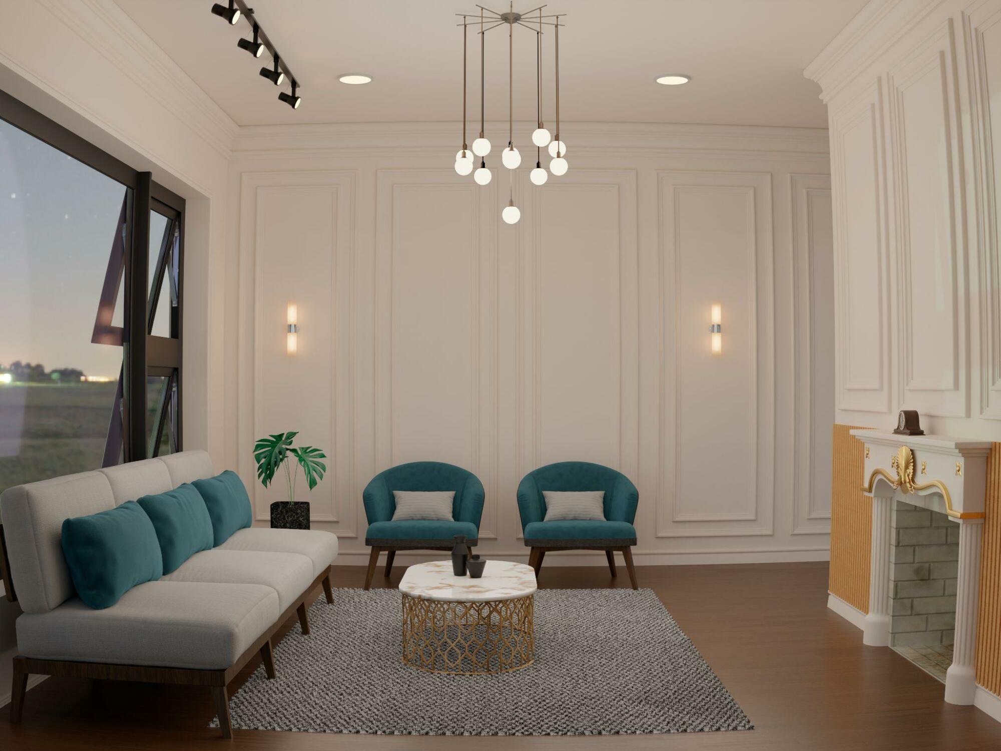
Layered lighting and reflective strategies to create cozy depth without adding color
Think of light as the sculptor of a monochrome kitchen: when layered thoughtfully it carves out warmth and dimension where color is absent. Start with a soft ambient wash from recessed fixtures or a dimmable pendant, add focused task illumination under cabinets or over the sink, and finish with small accent points that catch the eye.Simple tactics that change the room’s mood include:
- Warm LEAD temperature (2700-3000K) to prevent a sterile feel
- Multiple heights-pendants, recessed cans, and strip lights-to create shadows and depth
- Dimmer control so intensity, not hue, becomes the primary tool
- Diffused fixtures to soften highlights and avoid harsh glare
These layers work together so that countertops glow, corners recede pleasantly, and a single-hued palette reads as rich rather than flat.
Reflective surfaces then join the choreography, amplifying warmth and hinting at depth without introducing new colors. Strategically placed glossy backsplashes,satin metals,and a well-positioned mirror can multiply light and suggest space; textured mattes nearby temper the shine for a cozy contrast. Small decisions yield big results:
| Surface | Reflective Effect |
|---|---|
| High-gloss cabinetry | Bounces ambient light for a brighter, layered look |
| Polished tile backsplash | Creates subtle reflections that add depth |
| Stainless or brass fixtures | Catch accents and warm the palette through metallic gleam |
Combine reflection with controlled diffusion-frosted glass, matte textiles, and soft rugs-to keep shimmer pleasant and the room feeling intimate rather than clinical.
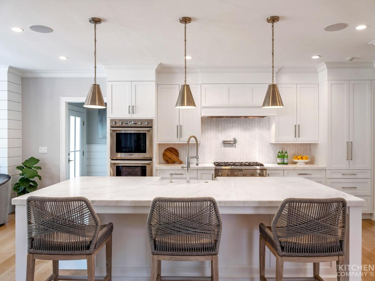
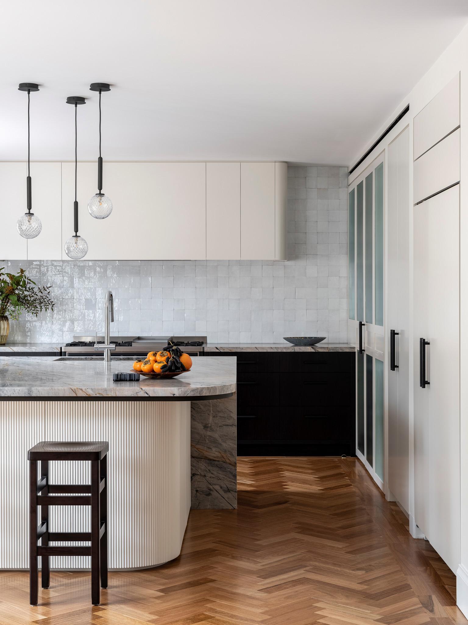
Warm metals and natural accents that introduce richness while preserving a unified palette
introduce subtle gleams and organic textures to a single-color scheme to create depth without breaking the visual calm. Think gold-toned pulls, aged copper sinks, and soft leather barstools set against charcoal or dove-gray cabinetry – each piece acts like a small storyteller, adding warmth and history. Use contrasts of finish and grain rather than color shifts: a matte black backsplash paired with satin brass fixtures reads richer than two different paint hues. Practical pairings to try include:
- Brass hardware + oiled walnut trim
- Copper pendant lights + honed limestone counters
- Bronze faucet + raw-edge wooden shelving
| Metal | Natural Accent | Feeling |
|---|---|---|
| Brass | Walnut | Classic warmth |
| Copper | Limestone | Earthy glow |
| Bronze | reclaimed oak | Textured comfort |
Keep the edit deliberate: choose one dominant metal and echo it in small doses so the room reads cohesive rather than cluttered. Layer tactile fabrics,woven baskets,and a handful of potted herbs to soften hard edges and introduce subtle color from nature without disrupting the monochrome story. For a balanced result, remember that texture trumps hue – a satin metal finish next to a hand-sawn shelf will read far warmer than mismatched colors. quick ways to implement:
- Match cabinet knobs to light fixtures for continuity
- Add an open wood shelf to break up expanses of flat veneer
- Use stone or leather accessories to ground the palette
Pattern, scale and focal points that add visual warmth through subtle contrast and practical examples
A monochrome kitchen feels warmer when you introduce subtle contrasts through pattern, scale and intentional focal points that read as calm rather than chaotic. Small repeats-like a soft chevron on a runner or a tone-on-tone hex tile-create movement without breaking the palette, while changes in scale (a large pendant above delicate subway tiles) add depth. Consider these gentle strategies to enrich the visual temperature:
- Texture: matte cabinetry against a slightly glossy backsplash
- Scale: oversized pendant paired with slim, linear hardware
- Focal points: a warm wood cutting board, a cluster of clay pots, or a brass faucet
Practical examples show how easily this comes together: swap one plain cabinet door for a wood veneer to create a resting eye point, introduce a patterned runner that echoes the cabinet tone, or group three contrasting but related objects (ceramic, metal, wood) on an open shelf to anchor the space. Use repeat, restraint and a single accent material to unify the room-small, deliberate contrasts feel intentional and inviting in a streamlined, monochrome scheme.
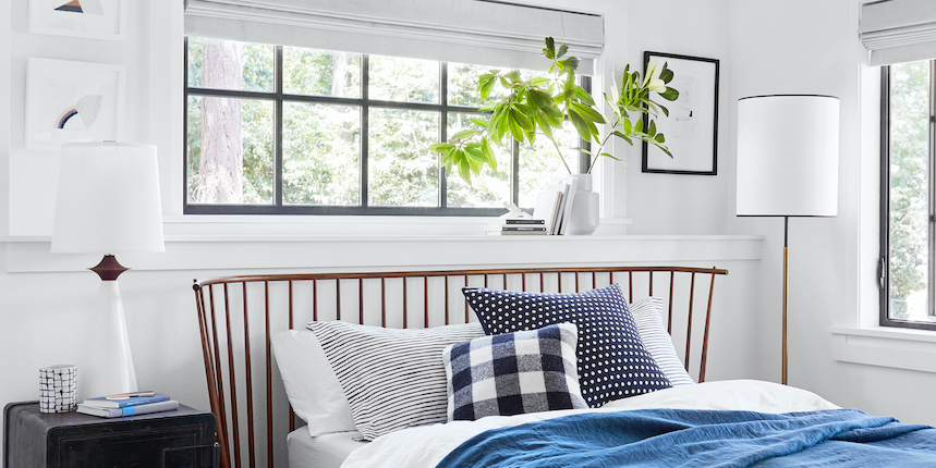
Human touches and scent design to make a monochrome kitchen feel lived in with easy styling rituals
The easiest way to humanise a monochrome kitchen is to embrace small, tactile rituals that make the space feel used rather than staged. Place linen tea towels over a hook, leave a wooden cutting board leaning against the backsplash, or keep a jar of frequently reached-for utensils on the counter – these are quiet signals that someone lives here. Try a few simple styling habits you can do in 30 seconds:
- Rotate a small vase of foraged sprigs or seasonal blooms
- Keep one cookbook open to a current favourite recipe
- stack mismatched mugs on display rather than inside a cupboard
- Scatter a folded cloth napkin and a pair of everyday scissors on the worktop
These repeated gestures create a lived-in warmth that softens stark lines without adding color-texture and story replace paint.
Scent design is the invisible layer that makes a monochrome kitchen feel intimate and inhabited: the right aromas act as memory anchors and give the room an instant personality. Establish a few easy scent rituals and rotate them by time of day or season to keep the kitchen feeling fresh:
- Morning: freshly ground coffee or lemon water simmering
- Afternoon: a small beeswax candle or herb bundle on the stove
- Evening: orange peel and cinnamon simmer for cosy depth
| Moment | Quick scent | Method |
|---|---|---|
| morning | Citrus & Mint | Simmer peels + sprigs |
| Afternoon | Herbal Bright | fresh jar of basil on counter |
| Evening | Warm Spice | Slice orange + cinnamon stick |
Use low-maintenance scent anchors – a simmer pot, a favourite candle, or a simple bowl of citrus - to make the kitchen feel consistently lived in without fuss.
Future Outlook
In a space where color steps back, texture, light and detail step forward – and that’s where the warmth lives. A monochrome kitchen strips distractions so the grain of wood, the matte of stone, the glow of a pendant and the weight of a cast-iron pan become the story. It’s a restrained warmth,one built from deliberate choices rather than loud palettes: layered materials,varied finishes and carefully placed accents that invite you in without shouting. If you think of warmth as feeling rather than hue, a monochrome scheme becomes less a limitation and more a quiet, intentional canvas for daily life.