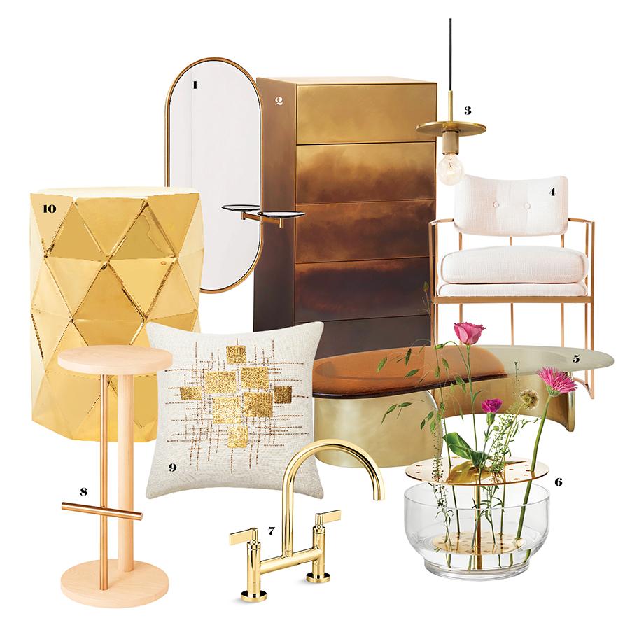
Brass has a way of catching the light - a quiet wink of warmth that can lift a room from flat to intentionally styled. Whether it’s a single sculptural lamp or a set of gleaming cabinet pulls, those golden notes add personality and a sense of craftsmanship that other metals struggle to match.
But like any strong accent, brass can quickly overwhelm. Too many fixtures, the wrong finish, or mismatched scale can turn a carefully curated space into something that feels loud or dated. The challenge is not simply to add brass, but to temper it: to let it accentuate rather than dominate.
This article explores how to incorporate brass accents with restraint and purpose. You’ll find practical guidance on choosing finishes and proportions, placing pieces for subtle impact, mixing metals thoughtfully, and caring for brass so it ages gracefully-small decisions that together create a balanced, inviting interior.
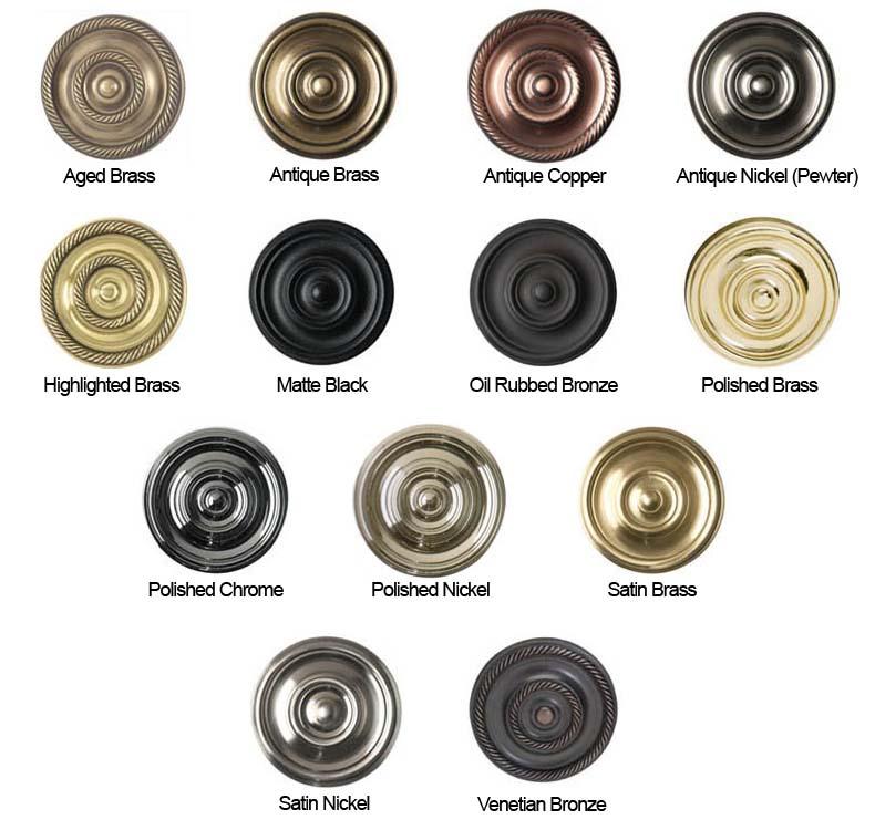
Understand Brass Basics: Warmth, Finish and When to Use Each
Brass reads like warm light in a room-a subtle glow that shifts with finish and scale. Choose polished brass when you want a radiant, reflective accent that energizes kitchens and entryways; opt for satin or brushed brass to keep things understated and modern; pick aged or patinated brass for a cozy, collected feel that complements wood and leather. Small doses feel intentional: a pair of cabinet pulls, a lamp base, or a mirror frame will read like purposeful punctuation rather than visual noise. Consider these quick pairings to guide placement:
- Polished: mirrors, fixtures that catch light
- Satin: cabinet hardware, faucets, lighting bodies
- Aged/Patina: statement pieces, bathroom accents, mixed-metal vignettes
Use finishes to set the mood, not dominate it-scale and contrast are your allies. Match the brass warmth to the room’s palette (cool grays pair well with satin finishes; deep greens love aged brass), and limit major brass elements to one focal plane-think a row of pendant lights or a single appliance trim.For a fast reference,this tiny table helps pair finish,vibe and ideal placement:
| Finish | Vibe | Best Use |
|---|---|---|
| Polished | Bright, modern | Entry mirrors, pendants |
| Satin/Brushed | Soft, contemporary | cabinet hardware, faucets |
| Aged/Patina | Warm, vintage | Accent furniture, fixtures |
- Rule of thumb: choose one dominant brass finish and one complementary metal maximum.
- Tip: test a sample in natural and artificial light before committing.
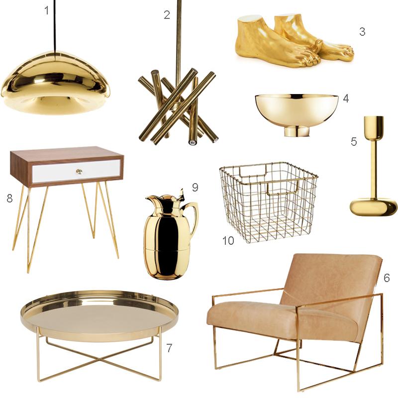
Start Small with High impact Pieces That Anchor a room Without Overpowering
Treat brass like a single, confident sentence in a quiet paragraph – it should add meaning, not shout.Choose one or two pieces that feel deliberate: a round bedside lamp, a slim console mirror, or a sculptural candlestick can visually anchor a vignette without dominating the room. Pay attention to scale (pick smaller shapes in compact rooms), finish (satin or brushed brass reads subtler than high-polish), and placement (keep metallics clustered rather than scattered). Restraint is the trick: let texture, matte surfaces, and soft fabrics do the heavy lifting while brass provides warm punctuation.
Consider these high-impact, low-volume choices that anchor a space gracefully:
- brass mirror – hangs above a console or mantel to reflect light and create a focal point.
- Table lamp - picks up on other warm accents and defines a bedside or reading nook.
- Tray or bowl – corrals small objects on a coffee table and reads intentional,not accidental.
- Hardware swaps – knobs and pulls on a dresser or kitchen cabinets for subtle continuity.
- Small sculptural object - a single artful piece on a shelf to anchor a vignette without clutter.
| Piece | Impact | Best Spot |
|---|---|---|
| Round mirror | Light + focus | Entry console |
| Satin lamp | Warmth + scale | Side table |
| Brass tray | organizes + anchors | coffee table |
Pair Brass with Complementary Materials and a limited Color Palette for Balance
Think of brass as a warm punctuation mark in a room rather than the whole sentence: pair it with natural woods to amplify warmth, with matte black for crisp contrast, or with cool stones like marble to keep the feel grounded. Small doses of textured fabrics and glass help the metal breathe rather than shout. Use a restrained set of companions to build cohesion-mixing too many surfaces makes brass look accidental rather of intentional:
- Warm wood (walnut, oak)
- Matte black or charcoal metals
- Cool stone (marble, honed granite)
- Neutral textiles (linen, cotton, soft wools)
- Clear or smoked glass
Work within a limited color palette so the eye rests: pick two neutrals and one accent, then let brass be that accent’s metallic echo. Keep these quick rules in your design toolbox-repeat finishes selectively,mind the scale,and always leave visual rest so the brass can shine without overwhelming the composition.
- One statement brass piece per sightline
- Repeat finish in no more than three spots
- Favor matte or brushed brass for subtlety
- Counter with negative space and soft textures
Placement Scale and Lighting Tricks to Make Brass Shine Without Competing
Think of brass as a punctuation mark in a sentence: it should emphasize, not shout. Place larger brass pieces - a mirror frame or pendant – where they can act as an anchor, and sprinkle smaller accents like knobs or candleholders so they read as intentional, not accidental. Keep scale in mind: let one ample brass element lead the eye, and let others echo it at a smaller scale. less is more-leave breathing room around metallics so their finish can register against matte, natural textures.
- Anchor with neutrals (stone, linen, wood)
- one statement brass + two smaller echoes
- Vary scale, avoid a metallic chorus
Lighting makes the metal sing without competing with artwork or textiles: aim warm, directional light to coax out depth and patina rather than harsh reflection. Use layered lighting-a dimmable pendant, a nearby recessed spot, and soft ambient glow-to control when and how brass glints.Position fixtures so highlights fall along curves and edges; side-lit pieces reveal texture, while gentle backlighting creates a halo without glare.Small changes-lower bulbs to 2700K, add a linen shade, or angle a track light a few degrees-can turn brass from a shout into a subtle, luxurious note in the room.
Closing Remarks
Like any finishing touch, brass works best when it feels intentional rather than accidental. Think of it as a whisper of warm metal - meant to catch the eye,punctuate a mood,and tie a scheme together without shouting. Keep scale, placement, and material harmony in mind: a single polished lamp, a pair of knobs, or a strip of trim can do the heavy lifting.If you’re unsure, start small and live with it. Swap in one or two brass pieces, observe how they interact with light and texture, then adjust. Over time you’ll learn the rhythm of restraint that makes brass feel effortless rather than forced.
ultimately, prosperous use of brass is about balance and confidence.With a few considered choices and an eye for proportion,your space can gain warmth,depth,and character-without ever feeling overdone.