Imagine a room that feels like a calm landscape-where walls, textiles and furniture echo the colors of clay, sand, moss and stone. Styling entirely in earth tones is less about matching every item to a single hue and more about composing a layered, tactile surroundings that reads as cohesive and quietly intentional. The result can be warm and restorative, complex and grounded, or minimal and meditative depending on proportion, texture and light.This article walks through how to build that balance: choosing a versatile palette, mixing materials and finishes to avoid flatness, arranging furniture to emphasize depth and flow, and introducing accents that add interest without breaking the natural mood. Whether you seek a rustic refuge, a modern neutral, or a bohemian sanctuary, the steps ahead will help you shape a space that feels rooted-both visually and sensorially-without feeling monotonous.
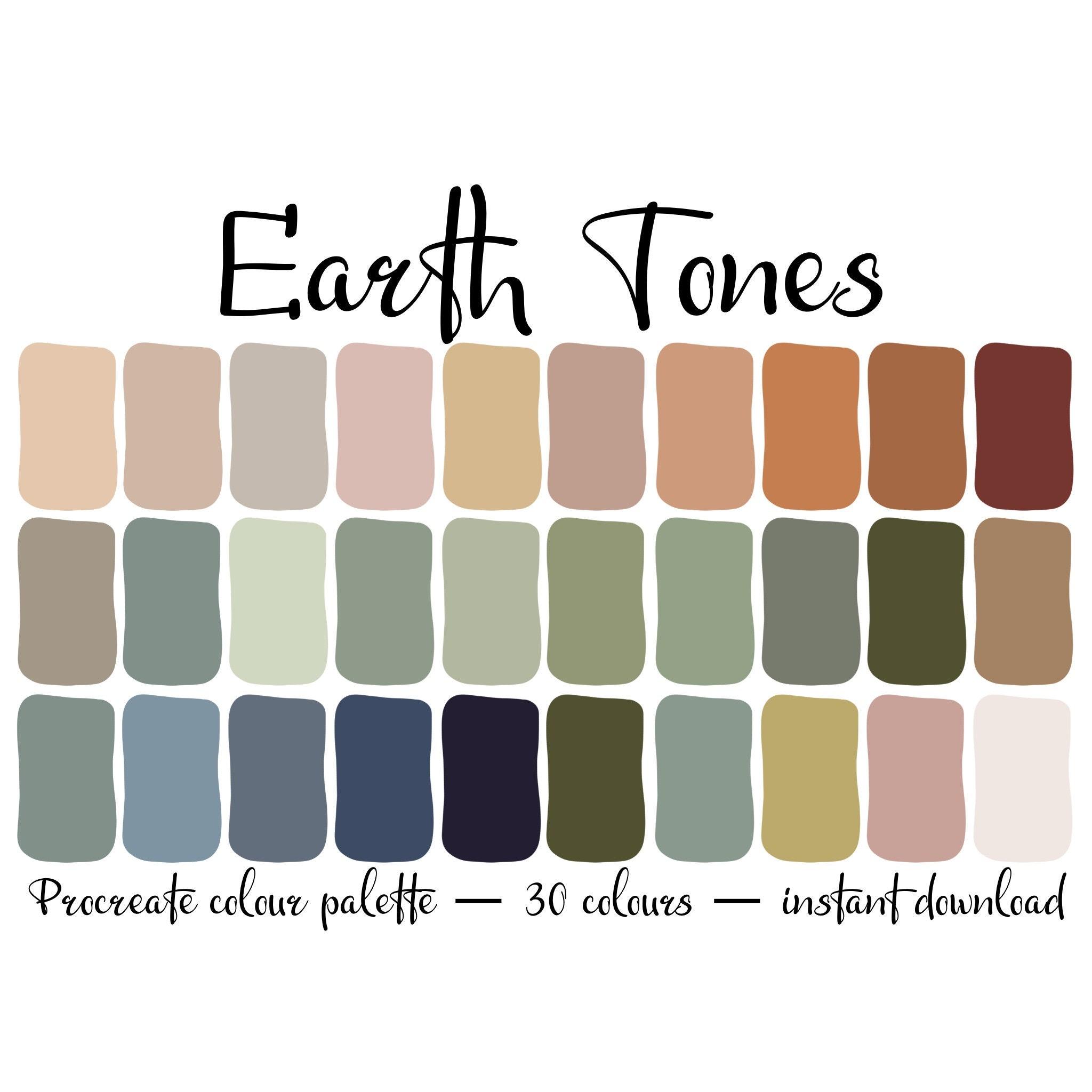
Selecting a Cohesive earth Tone Palette with Terracotta, Moss Green, Ochre, and Slate Gray
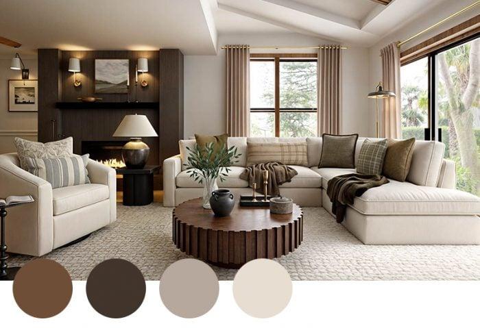
Think of the scheme as a landscape in miniature: terracotta provides the sun-warmed anchor, moss green brings the breath of life, ochre offers bright, earthen punctuation, and slate gray tethers everything with quiet structure. Use warm matte paints and slightly textured finishes so each hue reads differently under natural light – terracotta in clay or matte plaster, moss green in velvet or woven textiles, ochre as lamp shades or thrown cushions, and slate gray for larger architectural elements like built-ins or flooring.Below is a quick reference for balancing weight and finish that works well in most rooms:
| Element | Suggested Coverage | Finish |
|---|---|---|
| Walls / Large Surfaces | slate gray 40-50% | Matte / eggshell |
| Anchor pieces (sofas, rugs) | Terracotta 20-30% | Textured / woven |
| Accents & accessories | Ochre & moss green 20-30% | Velvet, linen, ceramic |
- Start with one dominant tone - usually slate gray for permanence – then introduce terracotta as the warm counterpoint.
- Layer textures like raw clay, nubby wool, and brushed metal so the palette reads dynamic, not flat.
- Use ochre sparingly to highlight sightlines and draw the eye to architectural details or art.
- Anchor with plants and natural fibers to amplify the mossy greens and keep the scheme feeling alive.
Building Depth with Texture and Layering Using Clay, Stone, Wood, and linen
Create a tactile story by pairing the dense, cool weight of stone and clay with the warm grain of wood and the soft whisper of linen. Think of clay as the hand-crafted punctuation – bowls, planters and matte finishes that capture light differently than polished stone – while stone gives architectural depth with varied veining and texture. Reclaimed wood introduces history through knots and saw marks, and washed linen adds breathability and movement; together these materials form layers that read as calm and intentional rather than flat. Anchor larger pieces in similar tonal families and let texture, not color contrast, define the focal points, so a monochrome palette still reads as richly composed.
- Clay: matte vessels, unglazed terracotta for warmth
- Stone: honed surfaces, pebbled accents for contrast
- Wood: raw edges, varied finishes to add rhythm
- Linen: slubby throws and loose-weave curtains for softness
Layer deliberately: start with an earthy foundation (stone floors or plastered walls), add structural wood furniture as the mid-layer, then drape textiles and arrange clay objects as the final tactile notes. Use repetition – a single clay tone echoed in multiple objects, or a wood grain repeated across shelving and frames – to create visual cohesion. Below is a simple reference to balance material, placement and effect so you can compose depth without introducing new hues.
| Layer | Material | Effect |
|---|---|---|
| foundation | Stone or plaster | Grounded, cool depth |
| Mid | Reclaimed wood furniture | Warmth, structure |
| Surface | Linen & clay accents | Softness, tactility |
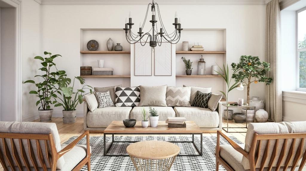
Choosing Furniture and Focal Pieces in Natural Materials to Anchor the Space
Start with one commanding piece-a sofa, table or sideboard crafted from honest materials-to set the mood and scale for the room. Look for warm-grained woods, hand-woven rattan, honed stone or soft, undyed linens that read as both luxurious and lived-in. Let that single focal item dictate the palette: its tone, weight and texture become the anchor you build around, so keep complementary items subdued in silhouette but rich in tactile detail. Aim for contrast in form rather than color-rounded clay vases beside a rectilinear walnut console,or a low stone coffee table paired with a generous linen sofa-so the eye rests on the materials themselves.
- Reclaimed wood table – earthy center, years of character
- Linen-upholstered sofa – soft, breathable base for layered cushions
- Rattan armchair – light texture that adds air and pattern
- Honed stone coffee table – cool counterpoint and visual weight
- Leather pouf – functional accent with warm patina
| Material | Best use | Effect |
|---|---|---|
| Walnut | Dining table | Grounding warmth |
| Rattan | Accent chair | Light texture |
| Linen | Upholstery | Soft, natural drape |
Onc your anchor pieces are chosen, play with scale and repetition to create cohesion-repeat a material in small doses (a candlestick, a tray, a picture frame) to tie the room together without monotony. Layer textiles in neighboring tones-a raw-jute rug underfoot, a boucle throw, and cushions in ochre or clay-to deepen the earth-tone story through texture rather than saturation. Finish by situating focal pieces to encourage circulation and sightlines; you want the natural materials to invite touch and movement, so leave breathing room around them and let light reveal their grain, weave and patina.
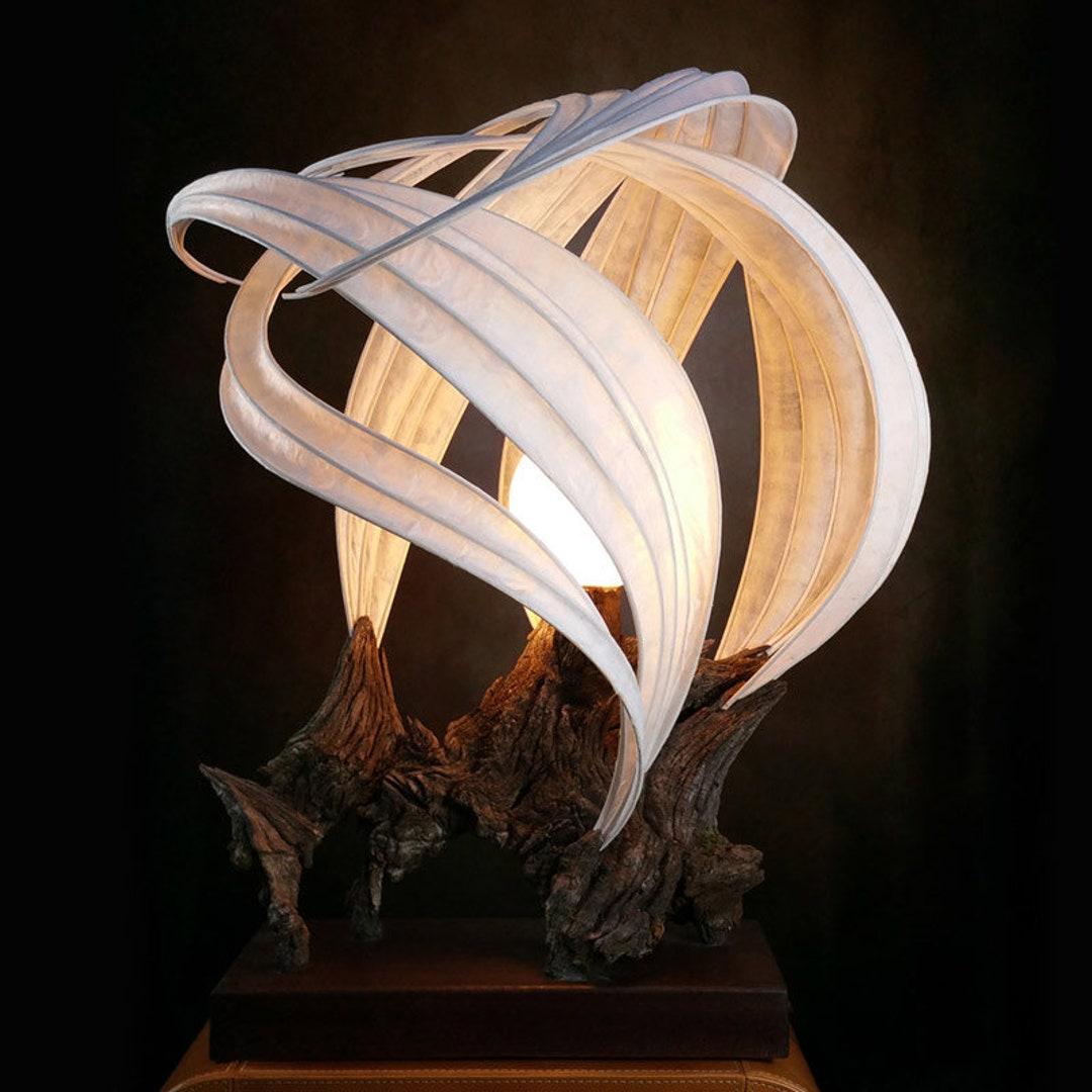
Sculpting Light and Metallic Accents to Amplify Warmth without Distracting from Earth Hues
Think of illumination as a sculptor’s tool: soft, directional light carves out warmth and depth without competing with the earthy palette you’ve chosen. Use a mix of ambient, task and accent lighting to create pockets of glow – prefer warm white LEDs (2700-3000K) and dimmers so light can shift with the day. Place indirect sources behind shelving, under cabinets, or within alcoves to make clay, wood and textile tones feel richer; pendant fixtures and floor lamps with linen or woven shades cast a diffuse, cozy radiance that flatters natural pigments.
- Layer: overhead + task + accent for depth
- Control: dimmers and smart scenes to tune warmth
- Diffuse: fabric shades and frosted glass soften highlights
Metallic accents should read as a whisper of luxury-subdued, textured and strategically placed so they amplify warmth rather than steal the show. Choose finishes with patina-aged brass, antique bronze, burnished copper-that echo the complexity of earth hues; matte or brushed applications reduce glare while reflecting color back into the room. Use metals as connectors: a thin brass band on a coffee table, copper planters, or iron lamp bases that catch light and scatter it gently.
- Tone-match: metals with warm undertones (golds, coppers)
- Texture: hammered or satin finishes over polished to avoid glare
- Scale: use small, repeated metallic details rather than one oversized piece
Final Styling and Care Tips to Preserve an Authentic earth Tone Ambience
Layer with intention: anchor seating with a deep clay rug, add warm wood tones through frames and side tables, and let textiles whisper rather than shout-think raw linen throws and nubby wool cushions. Keep a short checklist handy to finish the look so the room stays cohesive:
- Texture balance – mix smooth leather, rough linen, and soft wool.
- Accent restraint – limit bold patterns to one or two small pieces.
- Green punctuation – a single sculptural plant or dried grass arrangement.
These final styling moves create a lived-in, layered atmosphere that reads as intentional rather than contrived.
Preserve the mood with simple, regular care that respects natural materials: dust woven surfaces with a soft brush, air out linens, and avoid harsh detergents on dyed fabrics. For quick reference, follow this maintenance guide to keep earth tones rich and authentic:
| Item | Frequency | Why |
|---|---|---|
| Rugs (natural fiber) | Monthly | Remove grit, preserve color |
| Linen & cotton | seasonally | Refresh texture, prevent yellowing |
| Leather & wood | Biannually | Condition and seal for longevity |
A few mindful rituals-rotate cushions, keep sunlight filtered, and choose pH-neutral cleaners-will keep your earth-tone sanctuary feeling timeless and true.
In Retrospect
earth tones do more than color a room; they set a mood – one of quiet cohesion,tactile warmth and subtle depth.By thinking in layers (pigment, texture, light and scale) you can build a space that feels both intentional and lived-in, whether you favor sandy beiges, clay reds, mossy greens or deep umber.
Take the practical rules – balance warm and cool neutrals, introduce texture and natural materials, use contrast to keep the palette lively – and treat them as a starting point rather than a checklist. Let plants,art and personal objects provide the small notes that make the scheme yours. Over time, small changes in light and use will reveal the palette’s richness in new ways.
styling a room in earth tones is an exercise in restraint and revelation: trust the quiet language of nature, layer with curiosity, and allow the space to settle into its own rhythm. The result should feel grounded, flexible and unmistakably yours.