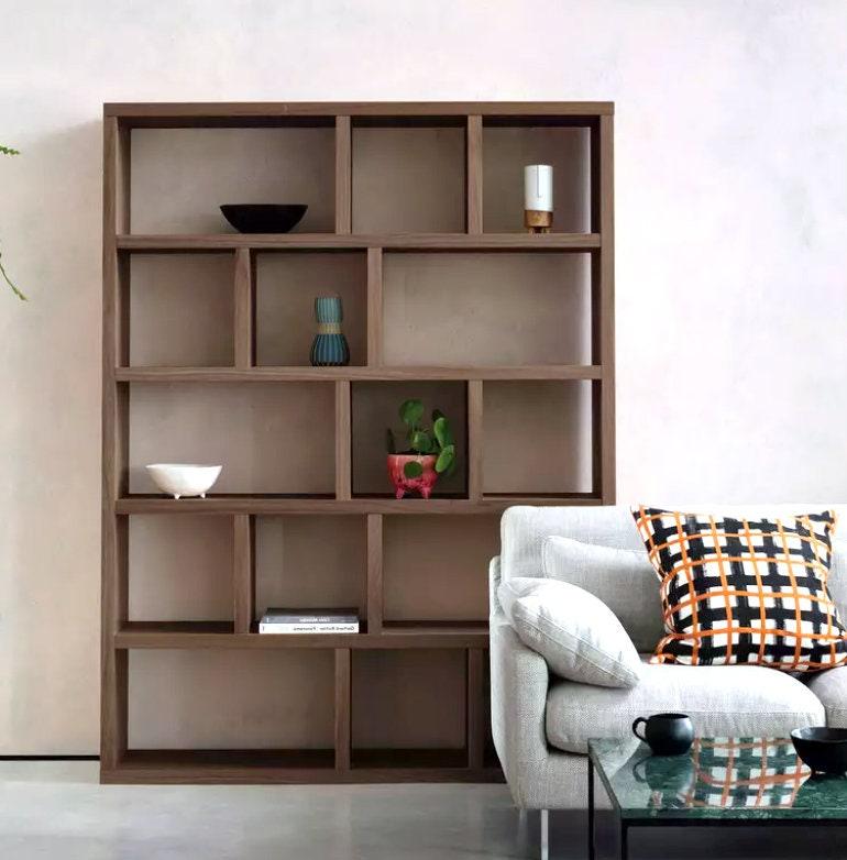
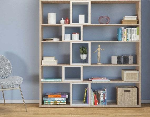
A shelf need not be a line. asymmetrical shelving units slip out of that expectation, arranging space like a sentence that pauses and surprises – staggered planes, varied depths and offsets that make storage feel less like a chore and more like composition. Their visual imbalance can read as intentional choreography rather than neglect,giving rooms a sense of movement and personality without shouting for attention.
The appeal of asymmetry is at once aesthetic and practical. By breaking the uniform grid, these units create niches for books, art, and objects of different sizes, encouraging a mix of display and function. They can stretch across a wall like a modern mural,anchor a corner with casuality,or respond to awkward architectural features where standard shelves would look forced.
This article explores why designers and homeowners are drawn to asymmetric shelving: how form and function intersect, the effects of scale and material, and simple strategies for styling and installation. Whether your goal is to soften a rigid room plan, highlight a favorite piece, or simply make better use of vertical space, understanding the qualities of asymmetrical shelving helps turn storage into deliberate design. balance visual weight in your space”>
Why asymmetry draws the eye and how to balance visual weight in your space
Irregular arrangements grab attention because they introduce tension and a hint of narrative-your eye wants to resolve the imbalance.When shelving deviates from perfect symmetry, it suggests movement and invites exploration: a tall vase on one side, a stack of books leaning on the other, a sudden pop of color-each element becomes a visual cue. The brain rewards novelty, so a thoughtfully uneven composition can create a lasting focal point without feeling chaotic.
- Anchor a heavy object low on one end to ground the composition.
- Layer textures and heights to spread weight without mirror-matching.
- Repeat a color or shape elsewhere to create subtle balance.
- Leave breathing room – negative space is as notable as objects.
To achieve harmony, think of balance as a conversation rather than a formula: counterpoints, repetitions and empty space negotiate visual weight. Use clusters of small items to offset one large piece,echo a color across shelves,or stagger object heights so your eye travels naturally across the display. With a few deliberate choices-scale, color accents and negative space-you can keep the energy of the unexpected while making the whole composition feel intentional and calm.
Materials, finishes and scale: choosing the right asymmetrical shelving for your room
Choose materials that sing the same language as your room: reclaimed wood brings warmth and an organic, lived-in feel; powder-coated metal reads modern and crisp; tempered glass injects lightness without stealing visual floor space. Think in terms of texture and durability as much as color – a matte lacquer hides fingerprints but a natural oil finish highlights grain and ages beautifully. Below are quick cues to help decide at a glance:
- Wood: cozy,tactile,best for living rooms and bedrooms.
- Metal: slim profiles, industrial or minimal interiors.
- Glass: airy, ideal for small spaces and display.
- MDF/laminate: budget-friendly, comes in many finishes.
Scale is the silent negotiator – a sprawling, offset composition can anchor a wall but will overwhelm a compact alcove; conversely, a delicate, staggered arrangement risks looking lost on a feature wall. Balance is about negative space and rhythm: alternate dense groupings of objects with airy ledges, align a dominant vertical element with nearby furniture, and use the largest shelf as your visual fulcrum. When in doubt,mock up proportions with paper templates so you can refine finish choices and placement before committing to hardware or paint.
Styling strategies for asymmetrical shelves: arranging books, art and objects for harmony
Think of an asymmetrical shelf as a miniature landscape where scale, color and pause determine the view. Start by creating an anchor – a tall plant, a stack of art books, or a sculptural object – then balance that anchor with lighter groupings across the compartments. • Group books by height or hue to create visual blocks
• Mix horizontal stacks with vertical rows to add rhythm
• Use one or two statement pieces to avoid visual clutter
Editing is the secret to harmony: remove until each zone breathes. Keep repetition in mind – a recurring material or color ties disparate shelves together – and respect negative space as deliberately as you place objects. Odd-numbered arrangements and varying depths will make compositions feel intentional rather than forced. • Leave gaps for the eye to rest
• Layer small framed art in front of books for depth
• Rotate pieces seasonally to refresh the balance
Practical considerations and installation tips to ensure stability and longevity
- Find studs with a reliable detector.
- Choose anchors based on wall type.
- Place heavy items on lower, wider shelves.
- use anti‑tip hardware for tall units.
- Recheck levels after tightening fasteners.
| Task | frequency | Tool |
|---|---|---|
| Retighten fasteners | 6 months | Hex key / screwdriver |
| Dust & inspect joints | monthly | Microfiber cloth |
| Refinish exposed wood | annually | Oil/varnish |
Small, regular care keeps an asymmetrical design both striking and steadfast for years.

mixing function with personality: when to use asymmetrical shelving in living rooms, kitchens and home offices
Think of asymmetrical shelving as a design handshake between function and personality: it gives you practical storage while sketching a lively, unexpected silhouette on the wall. in living areas it becomes a stage for layered art, books and sculptural objects; in kitchens it turns everyday jars and cookbooks into a curated display that softens cabinetry; in home offices it separates zones-work, reference, and display-without building walls. Use it when you want to stagger attention (a TV or fireplace can be counterbalanced with a floating stack), when wall space is irregular, or when a plain room needs an instant signature that still stores things purposefully.
- Living room: place asymmetry around focal points to create tension and warmth.
- kitchen: alternate open runs and closed cupboards to mix display with practicality.
- Home office: stagger shelf depths to hold files,plants and a little whimsy.
Practical choices make the look feel intentional: respect scale so shelves don’t overpower the room, leave breathing room between clusters to avoid clutter, and combine materials (wood, metal, glass) for tactility and contrast. Anchor heavier sections to studs, introduce at least one closed compartment to hide chaos, and balance visual weight with grouped objects of varying heights-books, ceramics, a low lamp or trailing plant will do the job. Small, thoughtful details let asymmetry read as curated, not random.
| Element | Why it helps |
|---|---|
| Negative space | Keeps displays airy |
| Mixed heights | Adds visual rhythm |
| Closed storage | Hides daily clutter |
To Conclude
Asymmetrical shelving units remind us that order does not require uniformity. Their staggered lines and varied depths introduce a quiet choreography to a room, where each shelf becomes a pause, a punctuation or a stage for objects that tell a story. They balance utility and surprise,turning storage into an intentional composition rather than an afterthought.
Practical considerations-weight distribution, mounting, and coherence with the surrounding decor-keep the concept rooted. When approached thoughtfully, asymmetry becomes a flexible tool: it adapts to collections, defines zones within open spaces, and invites continuous rearrangement as tastes change.
Whether you seek a bold focal point or a subtle way to break monotony, asymmetrical shelving offers possibilities that are equal parts pragmatic and poetic.their appeal lies in the permission they grant to curate a lived-in landscape-one shelf at a time.