Dive straight into the heart of your living room, where colors hold the power to sway emotions and set a dynamic stage for daily life. Warm hues like reds and oranges infuse spaces with coziness and vitality, while cool tones such as blues and greens cast a calm, serene spell. Grasping this color temperature spectrum is crucial in interior design; it’s not just about splashing walls with random shades but orchestrating an atmosphere that resonates with your personal style. The strategic use of warm vs. cool colors can dramatically alter your living room’s vibe, transforming it from merely functional to a statement of elegance or a haven of comfort.
Defining Warm and Cool Color Palettes
Warm Colors
Warm colors often evoke feelings of comfort, warmth, and coziness. They are reminiscent of sunlight and fire’s glow. In a living room setting, these hues can create an inviting atmosphere. Reds, oranges, yellows, and combinations thereof define warm colors in interior design.
Using warm colors can make large rooms feel cozier. For instance, a spacious living room with red or orange accents may seem more welcoming. These shades also work well in north-facing rooms that get less direct sunlight to add visual warmth.
Cool Colors
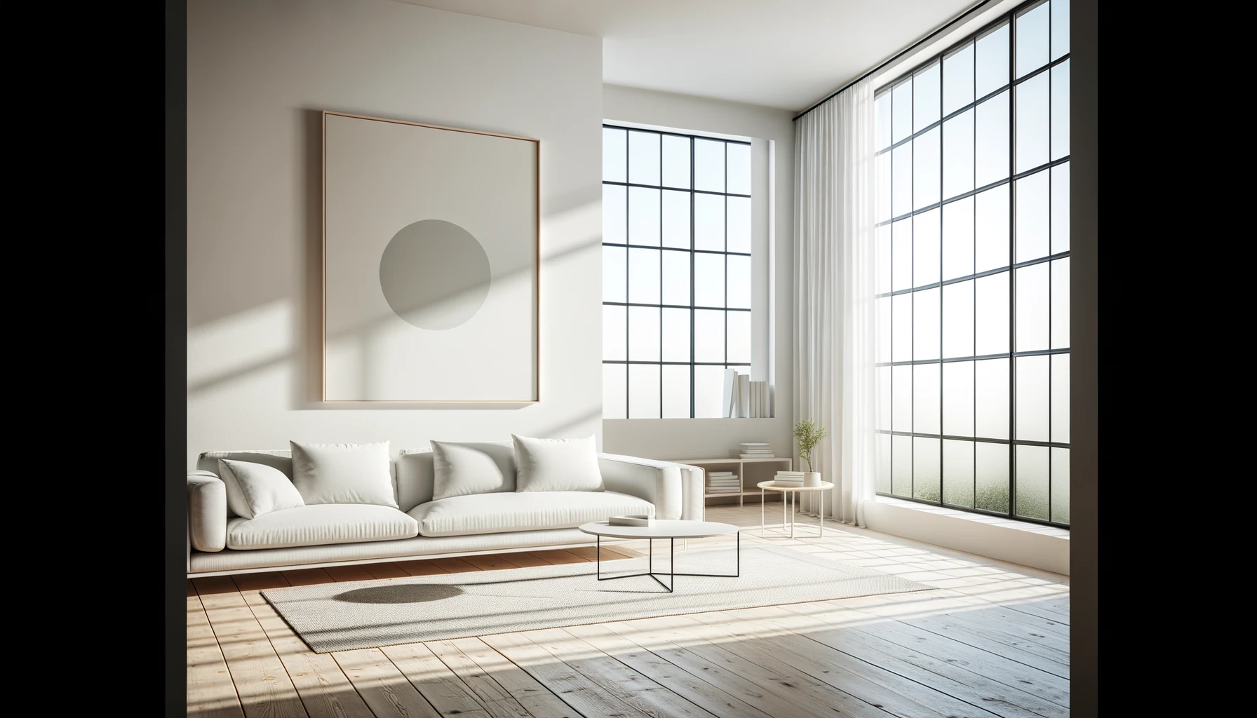
Cool colors bring to mind the calmness of water and sky. Blues, greens, purples – these are typical cool tones that suggest tranquility and serenity. In a living room context, cool color palettes offer an airy feeling of space.
They’re perfect for smaller spaces as they tend to recede visually—making the walls appear further away than they really are. A small living room painted light blue might feel larger and more open because of this effect.
Palette Differences
The main difference between warm and cool palettes lies in their psychological impact on people’s moods within a space.
Warm colors:
- Stimulate conversation.
- Encourage gatherings.
- Make large rooms feel intimate.
Cool colors:
- Promote relaxation.
- Create peaceful environments.
- Enhance concentration.
When choosing between them for your living room design consider both the size of your space as well as the ambiance you aim to achieve.
The Psychology Behind Warm and Cool Hues
Emotional Impact
Warm colors, like reds, oranges, and yellows, often evoke feelings of happiness and energy. They can stimulate conversation and even increase appetite. Imagine a living room with terracotta walls—it might feel cozy and inviting. This is because warm hues are associated with things like sunlight and fire which make us think of comfort.
Cool colors such as blues, greens, and purples tend to have a calming effect. They remind us of elements like water or the sky. A living room painted in soft blue shades might feel tranquil or serene. It could be the perfect setting for relaxing after a long day.
Mood Setting
The psychological effects of color go beyond initial reactions—they can influence our mood over time too. Warm tones in your living room may create an atmosphere that’s lively and social while cool tones could promote relaxation.
For example, if you paint your walls a vibrant orange it could boost energy levels during gatherings with friends or family gatherings. On the other hand, choosing a muted green might help reduce stress when you’re unwinding alone or with loved ones.
Interior Design Influence
Color psychology plays a big role in interior design decisions because it affects how we perceive space around us.
A well-chosen palette can make rooms appear more spacious or cozy depending on what you’re aiming for.
Bright warm colors can pull walls inward making large spaces feel snugger whereas cool hues recede visually expanding smaller rooms.
Designers use this knowledge to create desired effects within different areas of homes including living rooms where much time is spent.
Interior Paint Choices for Living Rooms
Color Considerations
Paint choices can transform a living room. Color plays a key role in setting the mood. Warm colors often create a cozy and welcoming atmosphere. Think of shades like terracotta or soft peach. Cool colors, on the other hand, have a calming effect. They make spaces seem larger too.
When selecting paint, consider the room’s size and lighting. Bright light pairs well with cool tones like sky blue or mint green. These hues reflect more light, enhancing openness and airiness.
Finish Effects
The finish of paint affects color perception significantly. A matte finish gives off an elegant vibe but doesn’t reflect much light. This can make warm colors appear deeper and richer.
Glossy finishes bounce light around the room which can amplify cool colors’ vibrancy.
They’re also easier to clean—a bonus for high-traffic areas.
Popular Picks
Let’s look at some popular color choices for living rooms:
Warm Colors:
- Cream: Offers warmth without overwhelming.
- Rust: Adds depth and character to large spaces.
Cool Colors:
- Pale Blue: Evokes tranquility; great for relaxation zones.
- Sage Green: Provides a touch of nature; soothing to the eye.
Remember that personal preference matters most in your space!
Balancing Warm and Cool Tones with Neutral Colors
Color Harmony
Neutral colors play a key role in creating a harmonious space. They act as a canvas, allowing warm or cool tones to stand out without overwhelming the room. Neutrals like beige, gray, and white can bridge the gap between opposing temperatures.
By introducing neutrals, you mitigate clashes between vibrant oranges and calming blues. Imagine a living room with soft gray walls—a perfect backdrop for both a fiery red sofa and an ice-blue armchair. This blend fosters balance while maintaining visual interest.
Undertone Awareness
Understanding undertones is crucial when selecting neutral colors. Every neutral shade has either a warm or cool undertone that affects the overall mood of your living room design.
Choosing neutrals with cool undertones sets up relaxation zones against busier sections of warm hues. Conversely, creamy neutrals with warm undertones complement cooler elements by adding coziness to the setting.
Harmonizing Color Schemes in Living Room Spaces
Complementary Techniques
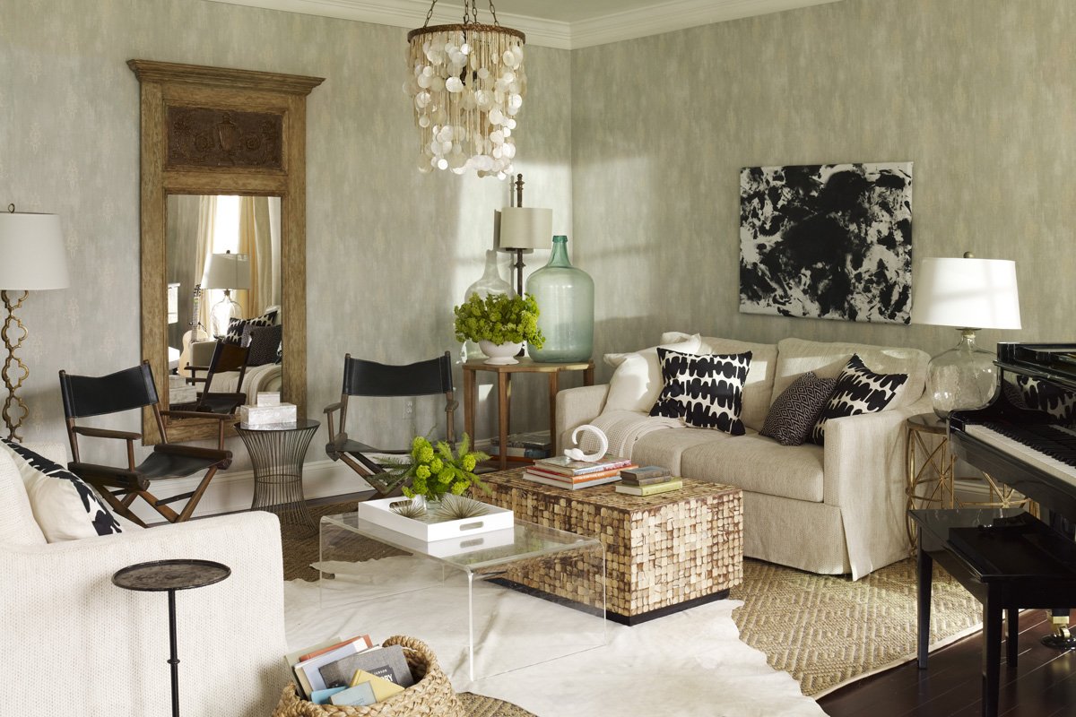
Color harmony is key to a visually appealing living room. Complementary color schemes are one technique to achieve this. They pair colors opposite each other on the color wheel, like blue and orange. This mix balances warm and cool tones perfectly.
For instance, an orange sofa can pop against a cool blue wall. Add neutral shades such as white or gray for balance. The result is a space that feels both energetic and restful.
Impact of Lighting on Color Perception
Natural Light
Natural light can change how colors look in your living room. During the day, sunlight can make warm colors like reds and oranges appear more vibrant. Cool colors such as blues and greens might seem more refreshing under this light.
In rooms with lots of windows, consider these changes throughout the day. Morning light is often soft and warm, giving a cozy feel to the room. By afternoon, sunlight is brighter and may cause cool colors to stand out more.
To use natural light well:
- Choose sheer curtains for gentle diffusion.
- Place mirrors to reflect daylight into darker spaces.
- Think about where the sun rises and sets when arranging furniture.
Artificial Lighting
Different bulbs affect color perception too. LED lights come in various tones from warm yellow to cool blue-white hues that can enhance or mute your living room’s palette.
Soft white bulbs create a comfy atmosphere that works well with warm shades. They add a glow similar to sunset lighting. On the other hand, bright white or daylight bulbs sharpen cool colors making them pop against neutrals.
When picking artificial lighting:
- Test different bulb types before deciding.
- Use dimmer switches for adjustable ambiance.
- Combine task lighting with ambient lights for balance.
Enhancing Colors
The right mix of natural and artificial light brings out the best in your chosen scheme from “Harmonizing Color Schemes in Living Room Spaces.”
Warm-colored rooms benefit from golden-hour rays but need good evening lights so they don’t look dull at night. Meanwhile, rooms designed around cool palettes should maximize daylight without becoming too stark under electric lights at dusk.
For enhancing color through lighting:
- Layer multiple sources: lamps, overhead fixtures, accent spots.
- Adjust bulb intensity based on time of day or mood desired.
Remember, it’s not just about choosing between warm vs. cool colors but also understanding how lighting will interact with those choices over time.
Tips for Choosing the Right Paint Color
Test Samples
Before you pick a paint color, test samples on your walls. This step is crucial. It lets you see how colors look in your space with its unique lighting and surroundings. Buy small sample pots of paint, or get sample swatches if available.
Paint large patches of each color on different walls. Observe them at various times of day to see how they change with the light. For example, a warm peach might glow beautifully in morning light but look dull on an overcast day.
Room Factors
Consider the size and function of your room when choosing colors. Small rooms can feel larger with light, cool hues like sky blue or soft green. Large spaces may become cozier using darker shades such as navy or charcoal.
Think about what happens in the room too. A living room used for relaxation suits calming blues and greens while energetic reds could work well in a dining area that hosts lively dinners.
Natural light also plays a part here; south-facing rooms get more sunlight so they can handle cooler colors without feeling cold.
Avoid Mistakes
To avoid common mistakes when selecting paint colors, keep these tips in mind:
- Don’t rely solely on paint chips from stores; they can be misleading.
- Avoid choosing colors under store lighting which differs greatly from home lighting.
- Consider existing furniture and decor unless you plan to replace them.
For instance, picking a bright yellow without considering your dark wood furniture might create an unwanted stark contrast.
Infusing Warmth into Cool-Colored Living Rooms
Texture Integration
Textures play a crucial role in softening the feel of a room. For living rooms with cool color schemes, incorporating different textures can add layers of warmth. Think about adding fluffy rugs or soft throw blankets to your space. These elements introduce a tactile dimension that contrasts with cooler tones.
Mixing materials is another effective strategy. Combine metals like copper or gold with wood and fabric for an eclectic, warm touch. Imagine walking into a room where sleek blue walls meet plush velvet cushions and glossy metallic accents — the variety stimulates your senses and makes the area more inviting.
Pattern Play
Patterns infuse energy into any space, making it feel more dynamic and cozier. In cool-colored living rooms, patterns can break up monotony and inject life into the design. Consider geometric prints on curtains or floral designs on pillows; they draw the eye in and create focal points that radiate warmth.
A balance between large- and small-scale patterns ensures harmony without overwhelming the senses. A striped armchair paired with polka dot accent pieces provides just enough contrast to enliven a predominantly grey-toned room without causing visual chaos.
Material Matters
The choice of materials has a significant impact on how warm or cool a room feels. Natural materials such as wood have inherent warmth due to their earthy colors and textures — think wooden floorboards or furniture pieces as foundational elements for adding coziness.
Fabrics also help soften spaces dominated by cool hues. Opt for rich textiles like wool, cotton, or linen in throws, drapes, or upholstery to make even starkly modern rooms feel homier.
Design Examples
To see these strategies in action, look at successful designs where designers have masterfully combined coolness with comfort:
- A minimalist living room featuring slate-gray walls becomes welcoming when adorned with oak shelving filled with books.
- An industrial-style apartment uses exposed brickwork alongside steel-blue furnishings softened by oversized knit throws.
- In Scandinavian-inspired decor known for its clean lines and muted palette: vibrant reds are used sparingly through artwork which adds bursts of passion while maintaining overall serenity.
Using these examples as inspiration can guide you towards creating balanced areas within your own home that both refreshes due to their coolness yet feels inherently warm.
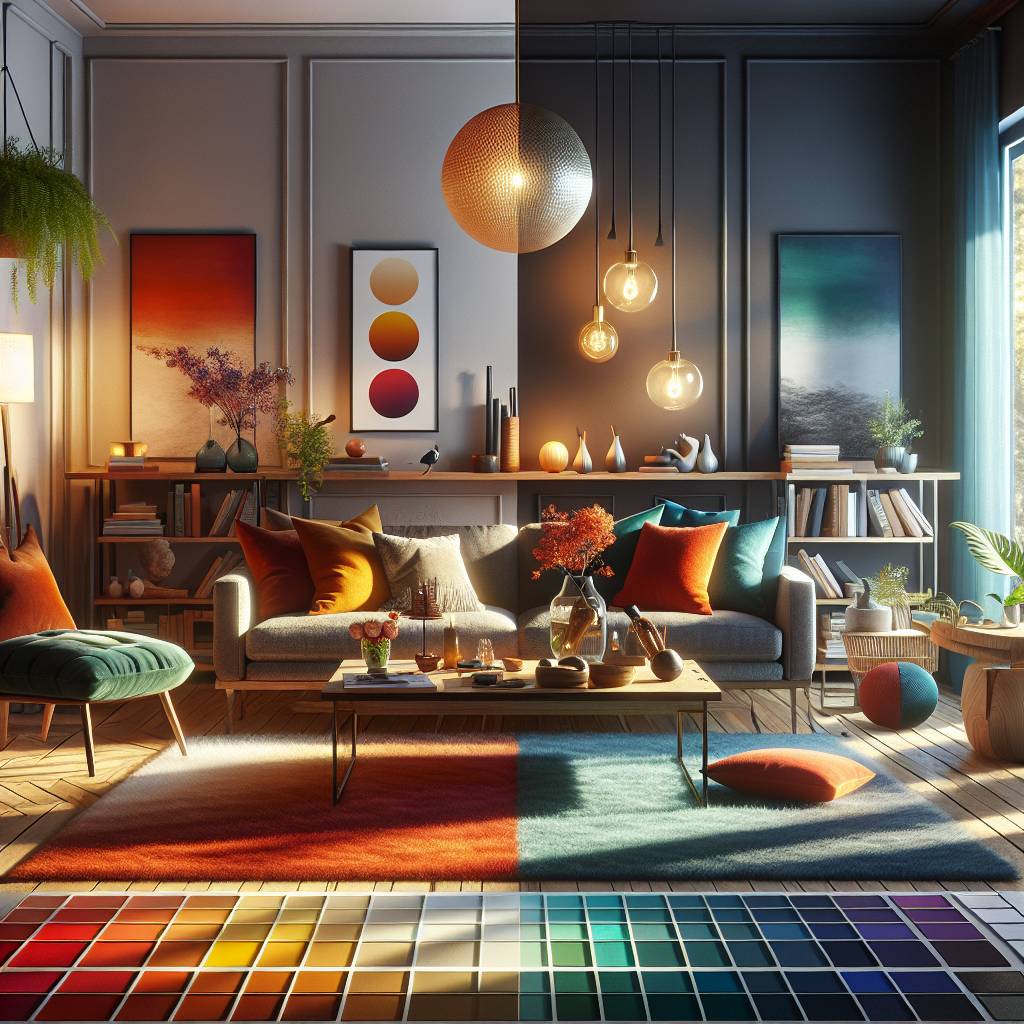
Combining Warm and Cool Colors for Dynamic Interiors
Mixing Techniques
Designers often use a balance of warm and cool colors to create dynamic spaces. A key technique is the 60-30-10 rule, where 60% of the room features a dominant color, 30% a secondary color, and 10% an accent color. This method ensures that neither warm nor cool tones overwhelm the other.
For example, imagine a living room with soft beige walls (warm) taking up most of the visual space. Navy blue sofas (cool) could serve as secondary elements while vibrant orange cushions (warm) add pops of warmth. Here’s how designers mix these hues:
- Choose one predominant color theme.
- Select complementary shades for furniture or accents.
- Use neutral colors to balance extremes.
By following these steps, you can blend warm and cool tones without clashing.
Another approach involves layering textures alongside colors to enhance contrast further. A woolen throw on a leather chair mixes not just temperature in hues but also tactile sensations.
Conclusion on Enhancing Living Room Design with Color
The heart of your home, the living room, thrives on the colors you choose. Warm hues invite coziness, sparking conversations and comfort. Cool colors, on the other hand, bring calmness and a clear-headed vibe. It’s all about balance—finding that sweet spot where fiery reds meet serene blues to create a space that’s uniquely yours. Think of your living room as a canvas; with every stroke of warm or cool paint, you’re not just decorating, you’re setting the stage for daily life.
Ready to transform your living room? Grab some color swatches and play around. Mix amber with azure or coral with cerulean. Light up the room to see how shadows dance across these hues. Remember, it’s your space—make it a reflection of you. Now, dive in and paint your world vibrant!
Frequently Asked Questions
What are warm colors and how do they affect living room design?
Warm colors, like reds, oranges, and yellows, can make a living room feel cozy and inviting. They’re great for creating a welcoming atmosphere.
Can cool colors work well in a living room setting?
Absolutely! Cool colors such as blues and greens bring calmness to a space. They’re perfect for a serene and relaxing living room vibe.
How can I balance warm and cool tones in my living room?
Introduce neutral shades like whites or greys to harmonize the space. This creates equilibrium between warmth and tranquility in your design.
Does lighting really impact how colors look in my living room?
Yes, it does. Natural light can make colors appear brighter, while artificial light may change their hue slightly. Always consider your lighting situation when choosing paint.
Any tips for picking the right paint color for my living area?
Sure thing – test out samples on your walls first! Observe them at different times of day to see how they look with changing light conditions before making your final decision.
How can I add warmth to a cool-colored living space?
Incorporate elements like wood textures or soft lighting fixtures that emit warmer tones; these will help offset cooler shades effectively.
Is it okay to mix warm with cool hues in my interior design?
Definitely! Mixing them adds depth and interest to your interiors—think of it as the yin-yang of home decor where opposites complement each other beautifully.