For decades, the humble subway tile has supplied interiors with a reliable sense of order: a simple rectangle, clean grout lines, and a look that quietly reads as timeless. Its ubiquity-kitchens, baths, backsplashes, cafés-made it an easy default for designers and homeowners seeking a neutral backdrop that still reads as intentional. But design trends move in cycles, and a different kind of geometry is stepping into the spotlight.
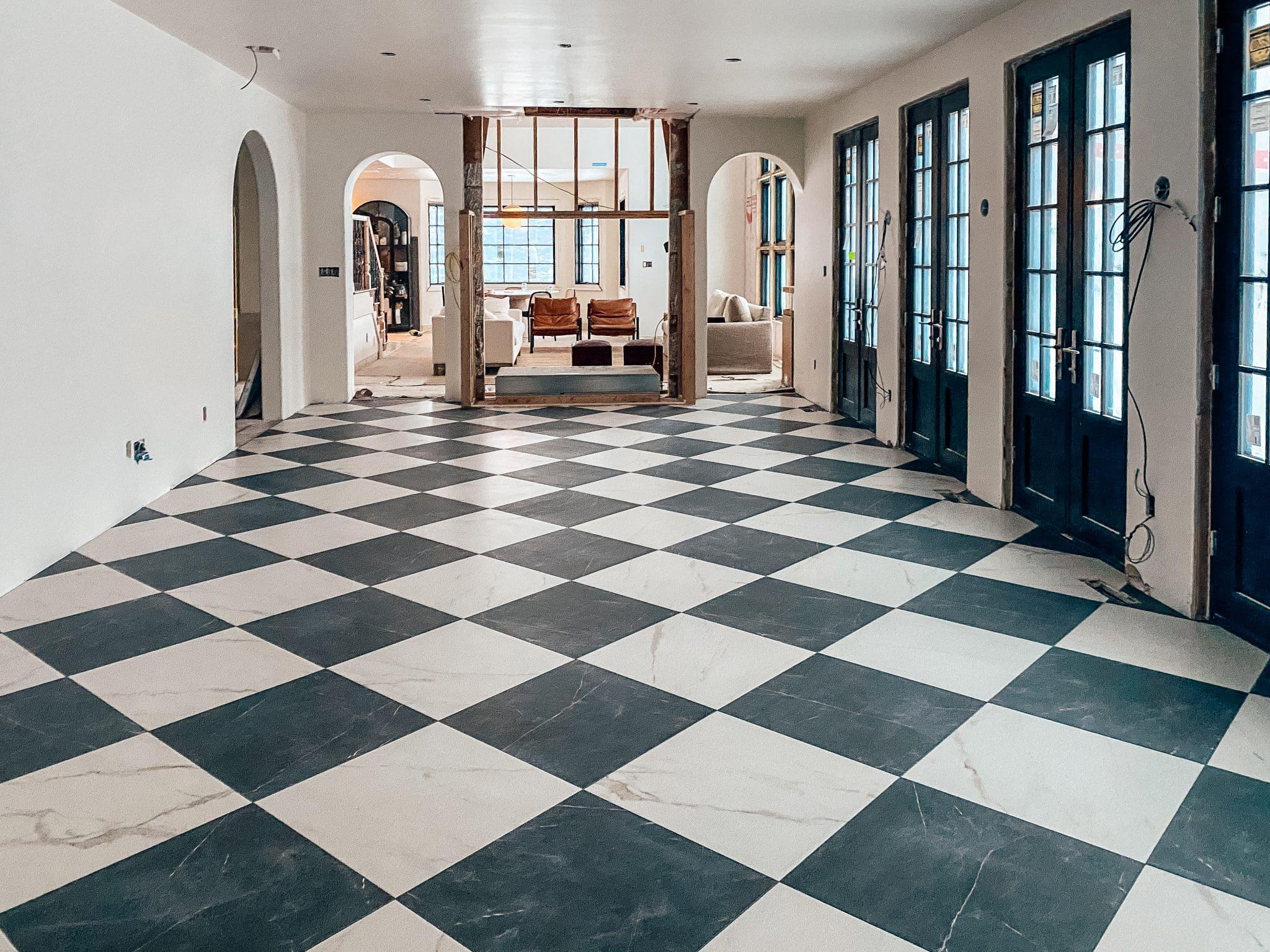
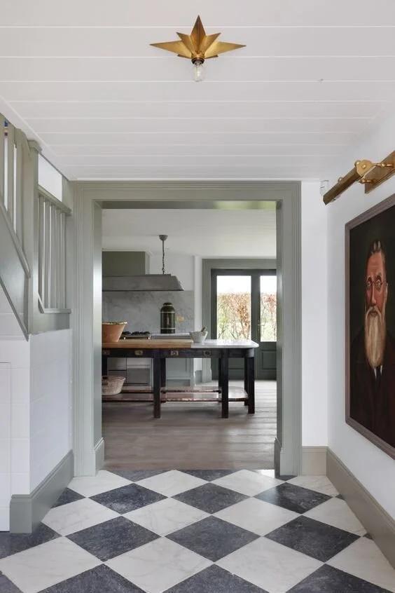
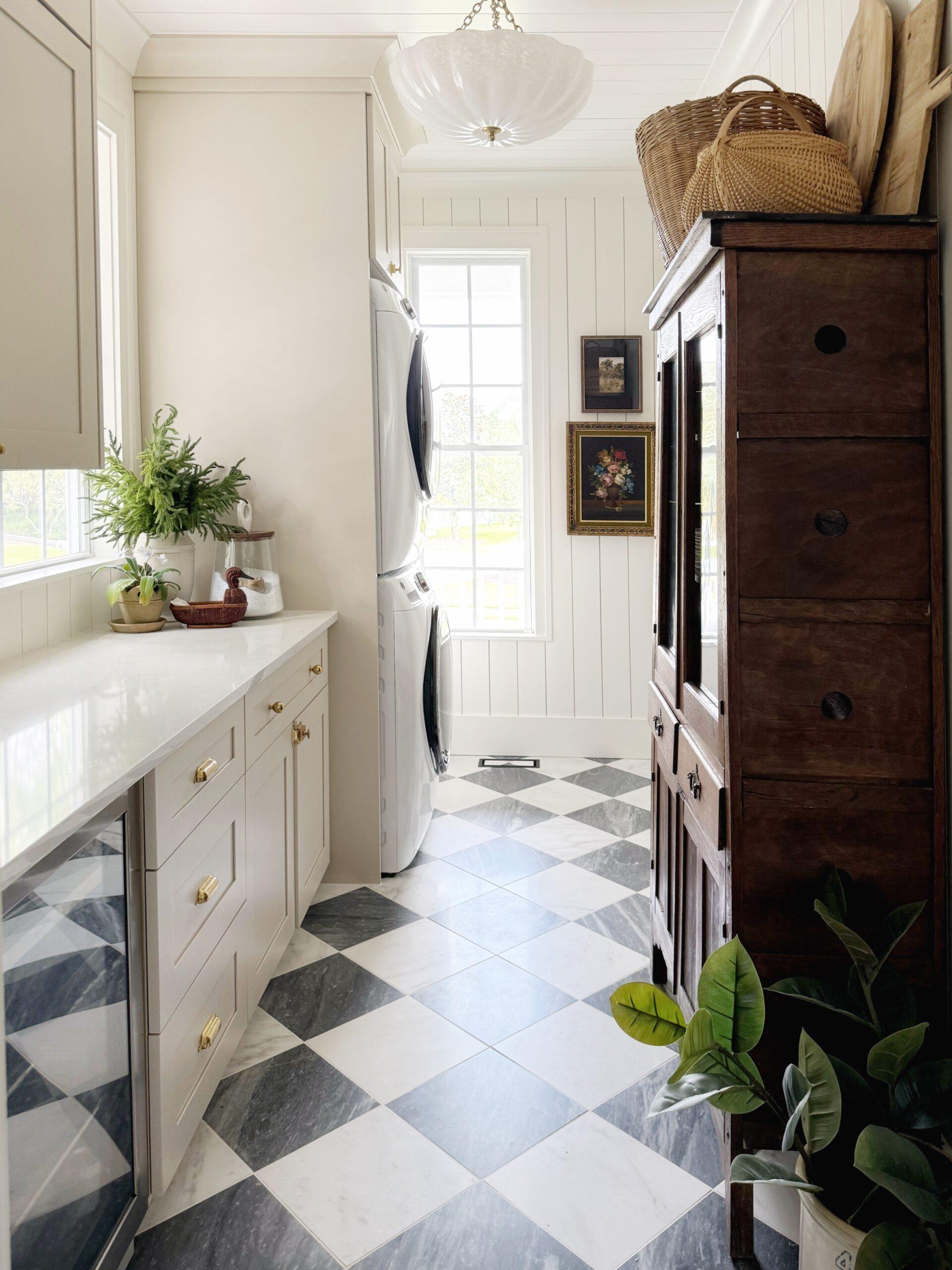
Checkerboard tile carries a bolder kind of neutrality. Its two-tone grid reads together historic and modern: a nod to tiled diner floors and stately foyers, but also a graphic motif easily updated through scale, color, and material. Where subway tile suggests restraint, checkerboard introduces rhythm-anchoring a room while creating movement across floor and wall planes.
This article explores why checkerboard is positioned to become the next ubiquitous choice: the practical and aesthetic reasons behind its comeback, how designers are reinterpreting the pattern for contemporary interiors, and the small decisions-tile size, grout, color palette-that let checkerboard read classic, playful, or quietly sophisticated.
checkerboard’s Comeback: Why High Contrast Tiles Are the New Neutral
The classic two-tone grid has shed its vintage-only label to become a surprisingly versatile baseline in contemporary interiors: a high-contrast neutral that anchors a room without dictating every choice. Its binary rhythm reads as order in busier schemes and as a graphic punctuation in calmer ones, so whether you choose glossy porcelain, honed stone, or hand-painted encaustic tiles, the pattern becomes the architectural vocabulary rather than a loud accessory. Try pairing it with warm woods, soft linens, or brass hardware to let the checkerboard do the heavy lifting while other elements provide texture and tone.
Practicality meets personality-durability, easy replacement of damaged tiles, and the ability to mask wear make it a smart long-term choice; consider varying scale and grout color to shift the mood from bold to subtle. Use it to define zones, add vintage charm, or create modern contrast.
- Flooring: anchors open plans
- Backsplash: small-scale graphic interest
- accent wall: rhythmic focal point
| Space | why it works |
|---|---|
| Kitchen | crisp backdrop for cabinetry and appliances |
| Bathroom | Balancing vintage fixtures with modern fittings |
| Entry | Instant graphic rhythm that hides foot traffic |
Choosing Scale and Color Balance to Make Checkerboard Work in Small and Large Rooms
Think of the pattern as a language: scale is your voice. In compact bathrooms and kitchens, go small and subtle-micro checks or 2″-4″ tiles keep the rhythm from overpowering the space and let light read through the pattern rather than fight it. In expansive living rooms or open-plan kitchens,amplify with 8″-12″ checks or mixed-scale grids to create drama and visual zoning. Speedy rules to try:
- Small rooms: tighter tiles, lighter contrast, thin grout.
- Large rooms: larger tiles, bolder contrast, playful repeats.
- transitional zones: mix a field of small checks with an island of large checks for movement.
Color balance decides whether the floor whispers or sings.A true black-and-white combo reads crisp and timeless,while muted charcoals,warm ivories,or a soft navy create a modern,softer checker that adapts to textiles and lighting.Use accent tones sparingly-one or two tiles in a complementary hue can anchor furniture or lead the eye across an open plan. Try pairing ideas:
- Classic clarity: black + bright white for high-impact contrast.
- Soft modern: slate + warm white for depth without starkness.
- Eclectic pop: charcoal + muted terracotta for a vintage vibe.
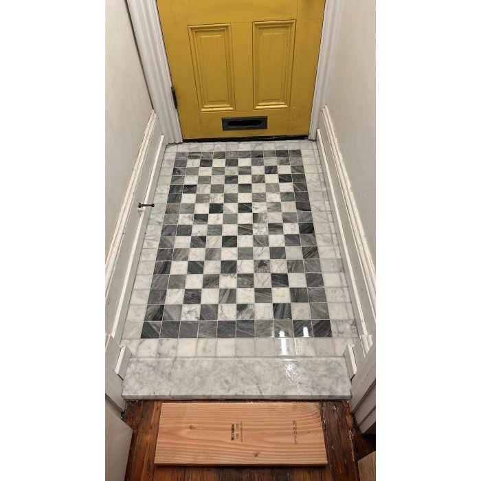
Material and Grout Recommendations for Durable Floors, Water resistant Backsplashes, and Seamless Showers
for high-traffic floors and wet zones, pick tiles that do the heavy lifting: rectified porcelain for floors that resist chipping, glazed ceramic for colorful backsplashes, and honed or sealed natural stone only where you’ll commit to maintenance. A checkerboard layout thrives on crisp edges and consistent thickness,so prioritize tiles with tight dimensional tolerances and a low water absorption rate (PEI 3-5 for floors). Quick tips to keep a pattern pristine:
- Rectified porcelain: minimal grout lines, sharper squares.
- Slip rating: choose R10+ or PTV-rated finishes for wet floors.
- Sealing: seal natural stone before installation and every 1-2 years.
Grout is the silent hero that defines longevity and water resistance: for showers and backsplashes, epoxy grout offers unrivaled stain and moisture protection; for floors, a high-quality cementitious grout with polymer additive balances flexibility and ease of repair. Pay attention to joint width-narrow joints emphasize the checkerboard geometry, wider joints hide irregularities-and always transition to silicone caulk where tile meets glass, metal, or tub.Installation essentials:
- Waterproofing membrane: mandatory behind shower tile.
- Movement joints: locate perimeter and long runs to prevent cracks.
- color selection: choose grout that complements contrast; dark grout hides wear, light grout highlights pattern.
Pairing Checkerboard with Finishes and Furnishings to Avoid Retro Overload
Think of the checkerboard as a loud instrumental in a room’s playlist: it performs best when the rest of the arrangement keeps rhythm, not competition. Pair high-contrast floors or backsplashes with matte, warm metals, soft-grained woods and single-tone upholstery to anchor the pattern; these elements translate the retro energy into something unmistakably contemporary. Keep tones limited and textures layered-rough linen, honed stone and brushed metal will mute nostalgia while celebrating the graphic geometry.
- Matte brass - warms and modernizes
- Satin chrome – adds sleek contrast
- Walnut or oak – grounds the pattern
- Tinted grout (soft gray) – reduces visual punch
- Accent hues (sage, terracotta) – introduce contemporary notes
When choosing furnishings, favor streamlined silhouettes and scale contrast: a low-profile sofa or cantilevered chair offsets the tile’s checkerboard geometry more successfully than ornate, heavily detailed pieces. Use a single patterned textile at a different scale (think a wide-striped rug or a small-scale geometric pillow) and introduce greenery or sculptural lighting as neutralizing focal points-these moves keep the look fresh and intentional rather than stuck in a time capsule.
Installation and care Guidelines to Keep Checkerboard Crisp Without Constant Upkeep
Start with a plan, not a pile of tiles. Measure and dry-lay your pattern so the checkerboard reads balanced from the moment guests step in; a single off-center row ruins the whole effect. For a flawless install, pay attention to substrate flatness, use a quality thinset designed for your tile size, and choose grout color with intent – either match the dark and light squares for a seamless, modern look or use a neutral grout to let the pattern sing. Quick checklist for installers:
- Level substrate to within 1/8″ over 10 ft.
- Use spacers and a chalk line for perfect alignment.
- Apply a penetrating sealer on porous tiles pre-grout.
keep it crisp with small, repeatable habits. A daily sweep and a damp mop with a pH-neutral cleaner prevent grit from dulling contrasts; avoid acidic cleaners on light tiles and abrasive pads on dark ones. Protect high-traffic edges with rugs and use a grout refresher every 12-24 months to maintain that high-contrast look. Practical care notes:
- Spot-clean spills promptly to prevent staining.
- Reseal grout and unglazed tiles annually or biannually.
- Use felt pads on furniture to stop scratching.
For a snapshot guide you can print and stick inside your cleaning closet:
| Task | Cadence |
|---|---|
| sweep / Dust | Daily |
| Damp mop (neutral) | Weekly |
| Reseal Grout | 12-24 months |
The Conclusion
Like any design moment, the checkerboard’s rise is equal parts pattern and possibility. Its graphic pulse – at once familiar and fresh – offers a way to anchor a room without demanding that every other element follow suit. Whether scaled up for maximal drama or tucked into a backsplash for a wink of contrast, checkerboard tiles provide a simple, adaptable language that can speak retro, modern, playful or restrained.
that adaptability is what could lift checkerboard out of the niche and into the mainstream: it’s tile that accommodates color,scale,grout choice and layout,and it responds well to both restraint and bravado. For homeowners and designers alike, the trick is less about committing to a single aesthetic and more about using the pattern as a tool – to frame a sink, to define a threshold, or to stitch together old and new.
Trends will shift, but the appeal of a well-considered floor or wall that reads equally at a glance and up close is enduring. Checkerboard tile may be the next subway tile not because it replaces a classic,but because it offers a new classic - one that invites experimentation while quietly standing the test of time.