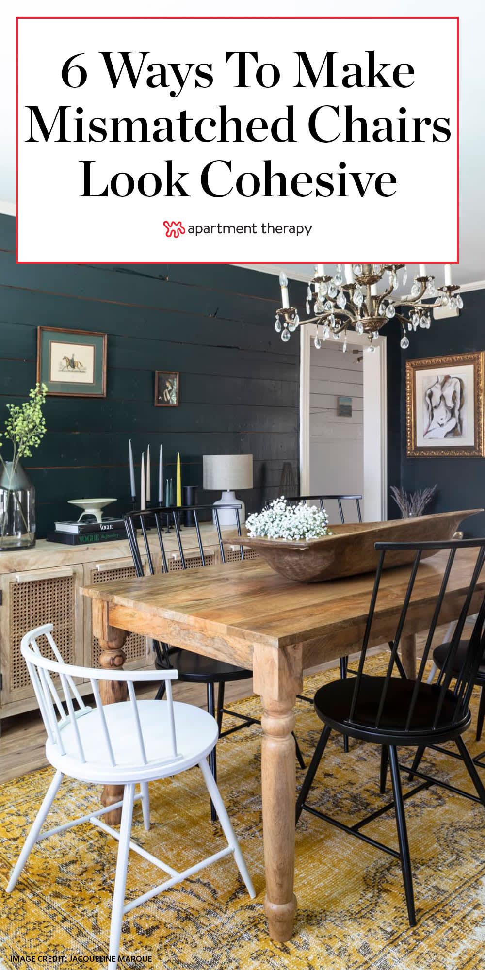
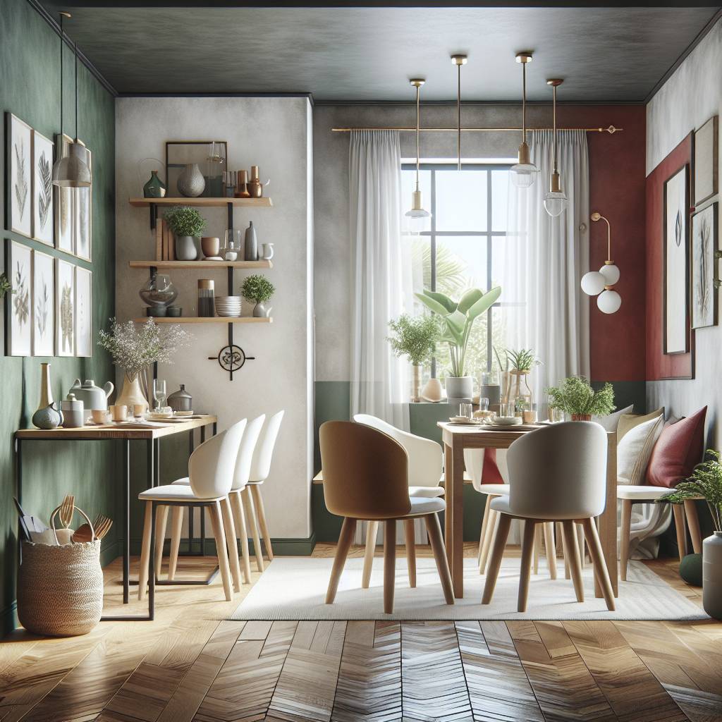
A dining room is a stage for ritual and conversation: plates clink, wine pours, stories are told. Traditionally, that stage has been set with a uniform cast – a tidy row of matching chairs lined up like well-rehearsed actors. lately, however, an alternative aesthetic has emerged: a table ringed by chairs that refuse to be twins.The result can feel less like a showroom and more like a story, intimate and lived-in.
Mismatched chairs disrupt expectations in small, deliberate ways. Differences in silhouette, colour, and material create a rhythm around the table that draws the eye and invites curiosity. Rather than insisting on visual uniformity, a mix-and-match approach emphasizes contrast and balance, turning functional seating into a composition of textures and histories.
This article explores why mismatched dining chairs often look more compelling than perfectly coordinated sets.We’ll look at how variety contributes to visual interest, how proportion and repetition can unify disparate pieces, and why a collected-over-time sensibility resonates in contemporary interiors. The aim is not to declare one rule for all tables, but to consider how intentional contrast can make a room feel more personal, dynamic, and welcoming.
Embrace Contrast in Shape and Scale for Instant Visual Interest
Think of your dining set like a little social scene: when each chair has a different silhouette or scale, the table becomes a stage. A mix of tall, sculptural backs with low, squat stools creates a sense of movement and rhythm; pairing an oval, cushioned seat with a slim, angular frame highlights form without shouting. by intentionally juxtaposing sizes and profiles you invite the eye to travel - the result is an effortless, curated look that reads as deliberate rather than random. Contrast is the shortcut to personality; balance is the trick that keeps it from feeling chaotic.
Start with one visual anchor – a dominant chair that sets a tone – then add supporting characters that differ in height, depth, material or back shape. Practical tips: keep seat heights within a agreeable range, repeat a color or finish to unify, and leave breathing room so each piece can show off its silhouette.
- Do mix eras: modern lines + vintage curves.
- Do repeat one material (wood, metal) to tie things together.
- Don’t cram identical bulky pieces together – contrast needs space.
| Mix | Why it effectively works |
|---|---|
| Tall back + Low stool | Creates vertical drama |
| Round seat + Angular frame | Softens edges, adds tension |
Anchor the Look with a Unifying Material or Color to Keep the Mix intentional
Choose a single material or color as your visual anchor so a handful of mismatched silhouettes feel deliberately collected, not chaotic. A recurring element – a warm oak tone, matte black metal, or woven rattan – acts like a punctuation mark that the eye recognizes across different shapes and styles, creating a quiet throughline. Think of it as a stylistic whisper that says, ”these pieces belong together,” letting each chair’s personality shine without the arrangement reading as random.
- Warm wood stain – ties mid-century and farmhouse seats.
- Matte black legs – unites eclectic designs with a modern edge.
- Rattan or cane – softens metal and upholstered chairs for a relaxed look.
- Brass or gold accents – adds a luxe thread through rustic options.
- Neutral upholstery – calms bold patterns and bright paints.
Practicality matters: pick one anchor and repeat it in at least two other elements in the room – light fixtures,table legs,or even placemats – so the mix reads as intentional.Use contrast sparingly; a single unifying tone gives permission for variety in shape and scale, while strategic repetition (three times is a good rule of thumb) builds rhythm. If you want a swift test,photograph the set from across the room – if your chosen anchor is the first thing your eye finds,you’ve succeeded.
| Anchor | Mixed Pairings |
|---|---|
| matte Black Legs | Windsor, metal tolix, modern molded |
| Warm Oak | Spindle, bentwood, mid-century rocker |
| Rattan Seat | Upholstered armchair, painted ladderback, metal stool |
Play with Texture and Upholstery to Add Comfort and Layered Depth
Mixing chairs becomes an intentional act of hospitality when you lean into fabric and surface contrast: a low-slung velvet armchair beside a spindle-back painted chair invites hands and eyes to linger. Think in tactile chords – soft, nubby, and sleek – and use cushions, braided runners, or a single seat pad color to harmonize the disparate notes. The result reads like a layered still life: comfortable, lived-in, and visually rich without feeling contrived.
- Velvet + Worn Leather – plush warmth with rugged edge
- Linen + Rattan - airy, summer-ready contrast
- Wool + Painted Wood - cozy depth with clean structure
- Patterned Tapestry + Solid Suede – focal interest grounded by calm
| Fabric | Feel | Care |
|---|---|---|
| Velvet | Plush | Spot/dry clean |
| Linen | crisp | Machine wash |
| Leather | Smooth | Wipe & condition |
Practical layering tips keep comfort first: mix scales (slender ladder-backs with chunky upholstered seats), repeat a unifying color or metal finish across chairs, and use removable covers or cushions to adapt seasonally. Small details – a thicker seat pad on the hostess chair, a low lumbar pillow on the bench, or a shared runner that echoes a pattern – amplify the sense of cohesion while celebrating variety.

Balance Eclectic Seating with Table Proportions and Placement Rules
Keep scale and comfort first: Eclectic seating only reads as intentional when every chair feels like it belongs at the table – not just because it looks interesting, but because it functions. Aim for consistent seat heights (within about 2″ or 5 cm), let armchairs float at the ends if they don’t tuck in, and choose one repeating element (finish, cushion color, or leg shape) to anchor the collection visually.Small rules – like leaving 24-30″ per diner and avoiding oversized backs that block sightlines – turn charming mismatch into cohesive design rather than cluttered chaos.
- Match seat height, not style.
- Allow 24-30″ of tabletop per person.
- Keep one unifying material or color.
- Respect leg clearance under the table.
Placement is architecture: stagger chairs so hips and knees have breathing room, rotate every other chair slightly for a casual, lived-in rhythm, and resist crowding a table’s edges with too manny sculptural pieces. Use a simple centerpiece or rug to center the composition and let the variety breathe - asymmetry can feel deliberate when you balance weight and negative space.For a quick reference, the tiny cheat-sheet below helps translate style into measurable placement decisions.
| Element | Quick Rule |
|---|---|
| Seat height | Within 2″ of one another |
| Spacing | 24-30″ per person |
| Anchor | Repeat one color or material |

Curate with Purpose: Choose Focal Chairs and Create a Rhythmic Arrangement
Anchor your table with intention: pick one or two chairs to act as focal points – a sculptural armchair at the head, or a brightly colored piece mid-run – and let the rest whisper in supportive contrast. When you curate with purpose,contrast becomes choreography: a single loud shape or hue reads as deliberate rather than accidental,and repeated subtleties (a shared spindle,a matching cushion,a recurring wood tone) create quiet cohesion that makes the mismatched whole feel curated,not chaotic.
- Choose 1-2 focal chairs, then vary scale and texture around them
- Use a repeating element (color, leg shape, or fabric) to tie seats together
- Alternate heights and silhouettes to build visual rhythm
| Style | Material | Why it pops |
|---|---|---|
| Windsor | Painted wood | Classic silhouette, bold color anchor |
| Parsons | Upholstered | Soft texture, neutral counterpoint |
| Metal Bistro | Brushed steel | Lightness and industrial edge |
Think of the lineup as a visual beat: alternate weight and pattern to create a pleasing cadence across the table. Small, repeated details – a strip of brass on two chairs, a shared cushion fabric, or two chairs with armrests – act like musical motifs that make each seat distinct yet part of the same composition. Balance is not about matching; it’s about rhythm: the eye prefers an intentional pulse of variety over flat uniformity, so arrange with that beat in mind and let the mismatched ensemble sing.
Concluding Remarks
mismatched chairs are less a break from tradition than a quiet reimagining of it: a room that values stories over symmetry and personality over perfection. When different shapes, materials and eras sit together around a table, they create a dynamic balance that is both deliberate and relaxed.
Choosing variety needn’t mean chaos; thoughtful contrasts-repeated colors, complementary proportions, or a unifying material-can give an eclectic arrangement coherence. The result is a dining space that feels lived-in, adaptable and distinctly human.
Whether your goal is to layer history, inject playfulness, or simply make practical use of what you already own, mixing chairs offers a subtle design strategy with noticeable impact. At the table, mismatched pieces invite conversation not just among guests, but between the past and the present, the curated and the accidental.