Choosing the right paint color for dining walls can transform the entire ambiance of your home. The colors you select play a pivotal role in creating an inviting and comfortable space, setting the tone for memorable meals and gatherings. With countless hues to choose from, it’s essential to consider factors such as natural light, room size, and existing decor when making this decision. Whether you prefer bold statements or subtle elegance, finding the perfect wall paint color can be both exciting and daunting.
Color trends have evolved over time; what was popular in previous decades may not resonate with modern tastes. However, classic choices endure while new palettes emerge. Understanding historical context and rich color can provide valuable insight into timeless selections that continue to captivate homeowners today. Embracing this journey of exploration will lead you to discover the ideal shade that resonates with your personal style and enhances your dining experience.
Key Takeaways
- Understanding the dynamics of your dining room, including its size, lighting, and furniture arrangement, is crucial in choosing the right paint color.
- Factors such as natural light, artificial lighting, and the mood you want to create play a significant role in influencing the choice of paint color for your dining room.
- The ideal dining room colors often include warm neutrals, soothing blues, elegant grays, and vibrant accent colors to create a welcoming and stylish space.
- When selecting paint for your dining room, consider washability, durability, and the finish that best suits your lifestyle and aesthetic preferences.
- To pick the perfect paint color, test samples on your walls, take into account the existing decor and furnishings, and consider the atmosphere you want to achieve.
- Refresh your dining room by incorporating top paint colors such as classic white, moody navy, earthy greens, or trendy blush tones for a modern and inviting look.
Understanding Dining Room Dynamics
Color Psychology
Understanding color psychology is crucial. Different colors evoke various emotions, impacting the dining experience. For instance, warm tones like red and orange can stimulate appetite and conversation, making them suitable for lively dinner parties or family gatherings. On the other hand, cooler shades such as blue and green promote relaxation and tranquility, ideal for intimate dinners or quiet evenings.
Consider how each color choice aligns with the desired ambiance of your dining space. If you aim to encourage sociable interactions during meals, opt for inviting hues that energize the room. Conversely, if creating a calming environment is your priority, select soothing colors that foster a peaceful atmosphere.
Room Size Perception
The perception of room size can be influenced by paint color choices in a dining area. Lighter colors have the remarkable ability to visually expand small spaces by reflecting more light throughout the room. This makes them an excellent option for cozy dining areas where you want to create an illusion of spaciousness.
Conversely, darker hues lend themselves well to larger dining rooms as they add warmth and intimacy while minimizing an overly cavernous feel. By using deeper tones on the walls in these settings, you can make large spaces cozier without sacrificing elegance.
Consider how different paint colors will interact with your specific dining space’s dimensions before making a final decision on which one suits best.
Lighting Effects
Lighting plays a pivotal role in how paint colors are perceived within a dining area. Natural light streaming through windows can enhance certain hues while casting shadows on others—altering their appearance throughout the day.
Artificial lighting also has its impact; warm-toned bulbs may complement warmer wall shades better than cool-toned ones do while bright white lights could make cooler-colored walls appear crisper and cleaner.
To ensure that your chosen paint color looks just as appealing under all lighting conditions present in your dining space—whether natural daylight or artificial illumination—it’s essential to test out samples under various lighting scenarios before committing to one shade over another.
Dining Occasions
When selecting paint colors for your dining room walls, consider not only everyday use but also special occasions when friends and family gather around your table. For intimate dinners or romantic meals at home – calm neutral tones like soft greys or muted blues might help set up an inviting ambiance.
Factors Influencing Paint Color Choice
Existing Décor
When choosing the right paint color for dining walls, it’s crucial to consider the existing décor. The wall colors should coordinate with the furniture and other design elements in the room. For instance, if your dining room features predominantly warm-toned wooden furniture, selecting a paint color that complements these tones can enhance the overall aesthetic. On the other hand, opting for contrasting colors might create a bold and striking look. It’s essential to ensure that the chosen wall color harmonizes with all existing design elements in your dining space.
It’s important to remember that complementary or contrasting colors have different effects on a space. For example, using complementary colors can create an inviting and harmonious atmosphere, while contrasting colors can add visual interest and vibrancy to the room. Therefore, understanding how different combinations impact the overall ambiance is key when making this decision.
Furniture Considerations
The choice of wall color should align with and complement your dining furniture. When deciding on a paint color, considering factors like material and finish of your furniture is imperative. If you have sleek modern furniture with metallic finishes, opting for cool-toned wall colors might create a cohesive look. Conversely, if your dining set boasts traditional wooden craftsmanship, warmer hues could be more fitting.
Integrating wall color with dining furniture creates a sense of cohesion within the space – everything feels interconnected instead of disparate pieces placed together haphazardly.
Architectural Features
Strategic use of paint color can highlight architectural features in your dining area effectively. Utilizing accent walls to draw attention to specific architectural elements such as alcoves or interesting molding adds depth and character to the room.
For example: If you have an elegant archway or intricate ceiling details in your dining area, choosing a subtle yet complementary wall color will bring out these features without overpowering them.
Personal Style
When selecting dining room wall colors, it’s essential to reflect personal style through these choices. Your individual preferences and tastes should play a significant role in determining which hues are right for you.
Consider what resonates most with you – whether it’s calming blues or vibrant reds – as this will help establish an environment where you feel comfortable and at ease during meals.
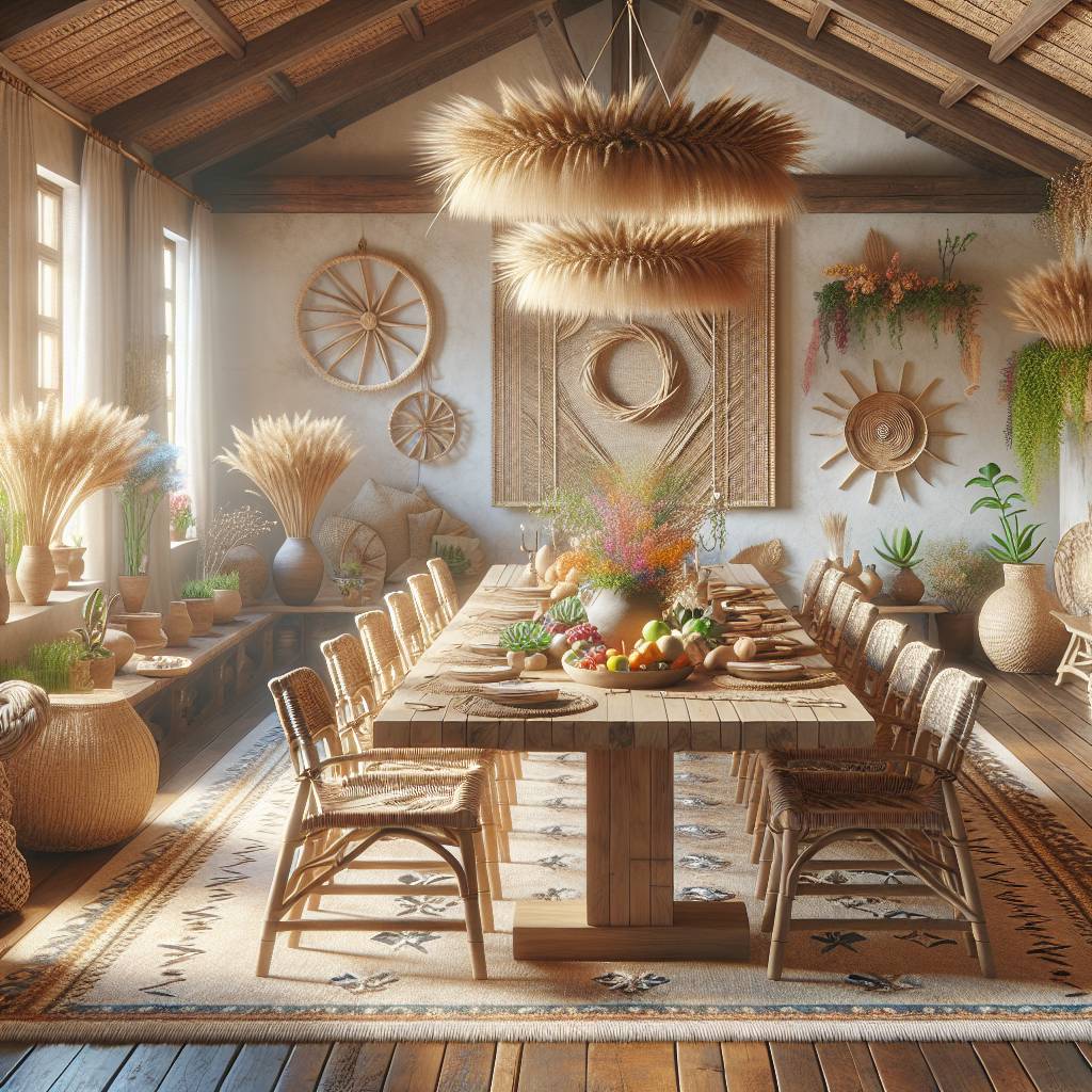
The Palette of Ideal Dining Room Colors
Warm and Inviting
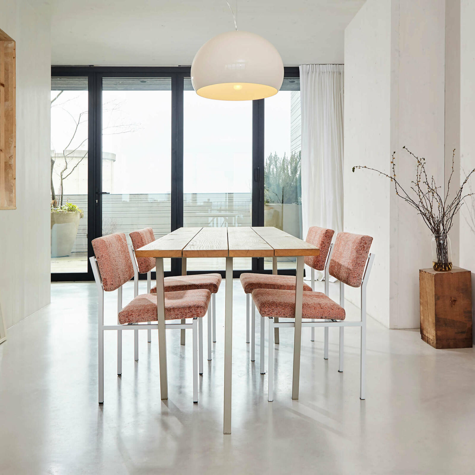
Warm tones like reds and yellows are excellent options. These colors can create a welcoming ambiance, perfect for fostering a cozy and inviting atmosphere in your dining room. Imagine the walls adorned with warm neutrals such as creamy whites, soft beiges, or light terracotta. These hues can make your dining space feel snug and comfortable, encouraging lively conversations among family and guests while stimulating their appetite.
Consider incorporating warm neutrals into your dining area’s color scheme to evoke a sense of intimacy during meal times. With these colors adorning the walls, you’ll find that they provide an ideal backdrop for social gatherings around the dinner table.
Cool and Calming
In addition to warm tones, cool blues and greens also make great choices when selecting paint colors for your dining room walls. These shades have the remarkable ability to promote a serene environment that is conducive to relaxed meals with loved ones. Picture pale blues reminiscent of clear skies or soft sage greens bringing a tranquil vibe into your dining area.
Soft pastel hues within this spectrum can contribute to creating an overall calming effect in the space where you enjoy meals together with family or entertain friends over dinner parties.
Neutral Tones
Neutral tones like beige, gray, and taupe offer versatility in design. These shades serve as timeless backdrops that complement various interior styles seamlessly. By opting for neutral hues on your dining room walls, you allow yourself flexibility in accentuating other design elements such as furniture pieces, artwork, or decorative accents without overwhelming the space with bold wall colors.
Integrating neutral tones into your dining area’s color palette provides an opportunity to experiment with different decor themes while maintaining visual harmony throughout the space.
Vibrant Hues
For those seeking a more energetic ambiance in their dining space through wall paint selection, vibrant hues like bold reds, oranges, or purples may be appealing options. While using these striking colors sparingly is key due to their potential intensity level impact on visual interest within the room.
Selecting the Best Paint for Dining Rooms
When choosing the right paint color for dining walls, considering the finish type is crucial. Matte finishes provide a sophisticated look with minimal glare, perfect for creating an elegant ambiance in your dining room. They are ideal for concealing imperfections on the walls, ensuring a smooth and flawless appearance.
On the other hand, glossy finishes reflect light beautifully and are incredibly easy to clean. This makes them a practical choice for dining rooms where spills and splashes may occur frequently. The reflective nature of glossy finishes also adds a touch of brightness to the space, making it feel more open and inviting.
For those looking for a middle ground between matte and glossy, satin finishes offer a subtle sheen while effectively hiding wall imperfections. This finish type is versatile enough to complement various interior styles while providing an easy-to-clean surface that’s suitable for dining areas.
Consider these options carefully based on your specific requirements when selecting the best paint finish for your dining room walls.
The durability of wall paint is paramount. Opting for durable paint finishes ensures that your walls can withstand frequent cleaning without losing their luster or color integrity over time. Look out specifically for paints labeled as “scrubbable” or “washable,” as they are designed to resist stains and can be easily cleaned without compromising the quality of the paint.
In areas prone to splashes or stains, such as near dining tables or food preparation spaces, choosing washable paints becomes even more critical. These types of paints allow you to wipe away any marks or spills effortlessly, maintaining the pristine appearance of your walls despite everyday use.
Investing in high-quality, durable paints ultimately guarantees long-lasting beauty in your dining room while minimizing maintenance efforts.
Selecting low-maintenance paint options can significantly ease care responsibilities associated with maintaining vibrant wall colors in your dining area. By opting for easy-care wall paints, you reduce the need for frequent touch-ups or repainting due to wear and tear caused by daily activities within this space.
Look out specifically for products labeled as “low-VOC” (volatile organic compounds) which not only contribute positively towards indoor air quality but also require less maintenance overall.
Exploring different color schemes opens up numerous possibilities when deciding on the right paint color schemeforyourdiningroomwalls.
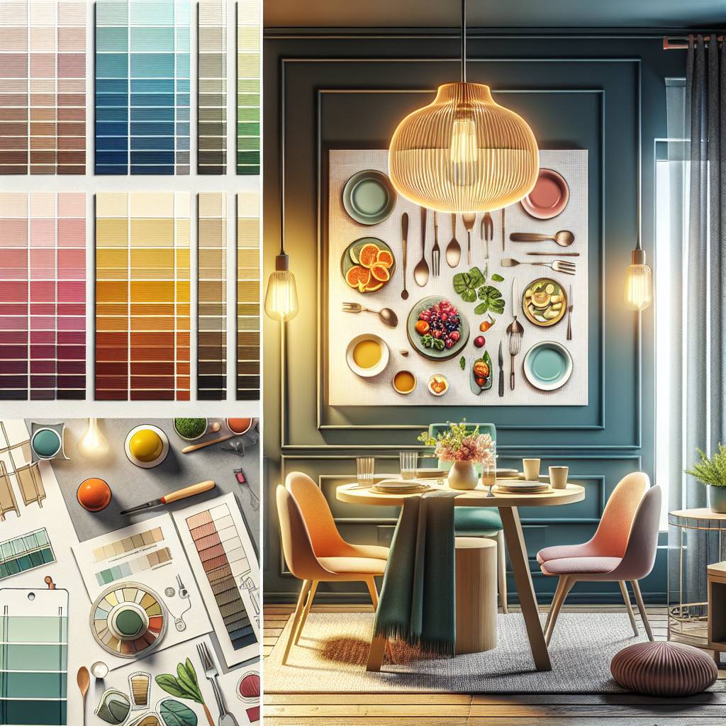
How to Pick the Perfect Paint Color
Color Schemes
When choosing the right paint color for your dining room walls, consider different color schemes. Think about the mood you want to create in the space. Warm colors like reds, yellows, and oranges can stimulate conversation and appetite. On the other hand, cool colors such as blues and greens can create a calming and relaxing atmosphere. Neutral tones like beige or gray offer versatility and can complement various decor styles.
To illustrate, if you prefer a cozy and inviting ambiance for family gatherings in your dining area, opt for warm-toned hues like terracotta or mustard yellow. However, if you desire a more formal setting for dinner parties, elegant shades of navy blue or emerald green could be ideal choices.
Consider creating an inspiration board with magazine clippings or digital images that reflect your preferred color scheme. This visual aid will help you envision how different hues will work together in your dining space.
Test Samples
Before committing to a particular paint color, it’s crucial to test samples on your walls. Purchase small sample pots of the colors you’re considering and apply them directly onto the wall surface. Observe how these samples look during different times of day as natural light changes throughout the room.
By testing out multiple paint colors, you’ll get a better sense of how they interact with your existing furniture pieces, flooring, and lighting fixtures in the dining area. It’s important to note that certain shades may appear differently under artificial lighting compared to natural daylight.
Once you’ve narrowed down your options based on their appearance at various times of day, evaluate how each hue complements or clashes with other elements in the room such as curtains or artwork.
Color Tools
Utilize helpful color tools available online or at home improvement stores when deciding on a suitable paint color for your dining room walls. Many websites offer virtual room painting tools where you can upload photos of your actual space and digitally experiment with different paint colors before making any purchases.
Some hardware stores provide handheld devices that allow you to scan items such as fabric swatches or decorative accents from within your home environment; these devices then suggest matching paint options from their product lines based on those scanned items’ specific hues.
Engaging these technological aids enables homeowners to make more informed decisions regarding their desired wall color by visually previewing potential choices against existing furnishings without physically applying any paint until they are confident in their selection.
Refresh Your Dining Room with Top Paint Colors
Contemporary Picks
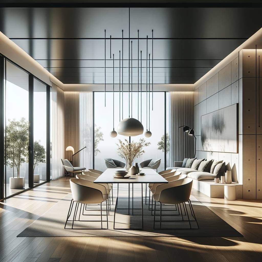
When considering contemporary paint colors for your dining room, think of crisp whites, soft grays, or cool blues. These shades can create a modern and sleek look. For example, a light gray with blue undertones can give your space an airy and sophisticated feel. Another option is to go with a clean white that will make the room appear bright and spacious.
To add depth to the contemporary look, consider using different tones of the same color family. For instance, pair a light gray wall with darker gray accents in the decor or furniture pieces. This creates visual interest while maintaining a cohesive and modern aesthetic.
Rustic Selections
If you’re leaning towards creating a more rustic ambiance in your dining area, earthy tones like warm browns, deep greens, or rich terracottas could be perfect choices. Imagine an inviting environment with walls painted in a warm brown shade reminiscent of natural wood tones.
To enhance the rustic feel further, consider incorporating wooden elements into your dining room decor such as farmhouse-style tables or chairs made from reclaimed wood. This will complement the paint color and contribute to achieving that cozy and charming rustic atmosphere.
Jewel Tones
For those who want to infuse their dining space with opulence and vibrancy, jewel tones are ideal picks. Think emerald green, sapphire blue, or amethyst purple for an elegant touch that exudes luxury. Picture how painting one accent wall in a deep jewel tone can instantly elevate the entire room’s aesthetic.
Pairing these bold colors with metallic accents like gold or brass can amplify their richness even further. Consider adding shimmering chandeliers or gilded frames to complete this lavish look without overwhelming the space.
Bold & Beautiful Dining Room Ideas
Accent Walls
Consider using an accent wall to add a pop of color and create visual interest. An accent wall is a single wall in a room that is painted a different color than the other walls. It can serve as a focal point, drawing attention to architectural features or furniture. For example, if your dining room has a large window or fireplace, painting that wall with a bold color can enhance its prominence.
Accent walls are also an excellent way to experiment with bolder colors without overwhelming the entire space. When selecting a paint color for an accent wall, think about hues that complement the existing decor and furnishings in your dining room. For instance, if your dining table has dark wood tones, consider choosing a warm neutral or earthy tone for the other walls and then opt for a deep navy or emerald green for the accent wall.
Delineating Space
Another crucial aspect when choosing paint colors is delineating space within your dining area. By using different paint colors on various walls, you can visually separate zones within one open space effectively. This technique is especially useful in open-concept homes where there’s no distinct separation between the living and dining areas.
For example, painting one side of the shared wall with soft pastels while opting for deeper shades on another side helps define each area without needing physical barriers like doors or partitions. Utilizing lighter hues near windows can make them appear more expansive while darker shades on adjacent walls create depth and intimacy within the dining space.
Wall Décor Integration
When considering paint colors for your dining room walls, it’s essential to think about how they will integrate with your chosen wall decor. The right background hue can elevate artwork pieces like paintings or photographs by providing contrast against them.
For instance, if you have vibrant art pieces displayed on your dining room walls, opting for neutral tones such as light gray or beige allows these artworks to stand out prominently against their backdrop without clashing visually. Moreover, coordinating paint colors with decorative elements like mirrors or shelves creates cohesion throughout the space while highlighting these design features effectively.
Ensuring Color Flow with Adjacent Spaces
Complementary Colors
Choosing the right paint color for dining walls involves considering how it will flow with the adjacent spaces. One effective technique is using complementary colors. These are hues that are opposite each other on the color wheel, creating a dynamic and visually appealing contrast.
For instance, if your dining room has blue walls, you could consider painting the adjacent living room in a warm shade like orange or yellow to create an inviting and harmonious transition between the two areas. This approach ensures that while each space has its own unique identity, there’s still a sense of cohesion and flow throughout your home.
Complementary colors can be used strategically to guide the eye from one area to another without any jarring visual interruptions. By applying this technique when choosing dining room wall colors, you can achieve a seamless transition between rooms while still allowing each space to stand out individually.
Transition Techniques
Another effective way to ensure color flow between your dining room and adjacent spaces is by utilizing various transition techniques. This may involve incorporating accent pieces or decor elements that feature similar shades found in both areas.
For example, if you have a bold red accent wall in your dining area, you could introduce throw pillows or artwork in coordinating tones into the adjoining space. This helps tie the two areas together visually and creates a smooth transition from one space to another.
Utilizing consistent flooring materials or patterns throughout these connected spaces can also contribute to cohesive color flow. Whether through rugs, tiles, or hardwood floors with similar undertones, maintaining consistency in flooring choices further enhances the overall harmony between rooms.
Dining Room Wall Décor and Art Integration
Artwork Pairing
Consider how it will complement any artwork you plan to display. A neutral wall color, like a soft gray or beige, can provide an ideal backdrop for vibrant art pieces. Conversely, if your artwork features bold colors, opting for a more subdued wall color can help the art stand out without overwhelming the space.
Pairing colorful artwork with dining room walls painted in a neutral shade creates a balanced and harmonious look. On the other hand, choosing a wall color that clashes with your art might create visual discordance in the room. For example, if you have a collection of bright abstract paintings, selecting muted tones like pale blue or light taupe for the walls can allow the artworks to take center stage.
Consider using complementary colors when pairing artwork with dining room walls. If your paintings predominantly feature warm hues such as reds and oranges, cool-toned wall colors like soft greens or grays can create an aesthetically pleasing contrast.
Decorative Accents
In addition to considering artwork when choosing the right paint color for dining walls, factor in decorative accents such as curtains, rugs, and furniture upholstery. These elements play an integral role in enhancing or detracting from your chosen wall color.
For instance, if you’ve selected deep navy as your preferred dining room wall hue but intend to incorporate vibrant patterned curtains into the space’s design scheme, be mindful of how these elements will interact visually. Opting for curtains that feature navy accents against lighter backgrounds can tie together different aspects of the room’s decor while preventing overwhelming visual dominance by any single element.
Similarly, when deciding on accent pieces such as throw pillows or table runners that will adorn furniture within your dining area after painting its walls; ensure they complement rather than clash with your chosen paint color scheme.
Closing Thoughts
Choosing the right paint color for your dining room walls is crucial in creating the desired ambiance. Understanding the dynamics of your dining space, considering factors like natural light and room size, and exploring a palette of ideal colors will guide you in selecting the perfect paint. Remember, it’s not just about picking a color; it’s about setting the tone for memorable gatherings and conversations.
Now armed with insights into color selection and design ideas, it’s time to revitalize your dining room. Experiment with bold and beautiful colors, ensure seamless color flow with adjacent spaces, and integrate wall décor to complete the look. Your dining room is more than just a space for meals; it’s where stories are shared and memories are made. Embrace the power of paint to transform it into a welcoming haven for all who gather.
Frequently Asked Questions
How can I understand the dynamics of my dining room to choose the right paint color?
Understanding your dining room’s dynamics involves considering its size, natural light, and existing decor. A smaller space may benefit from lighter colors, while larger rooms can handle deeper tones. Take inspiration from your furniture and overall ambiance to make an informed decision.
What factors should I consider when choosing a paint color for my dining room?
Factors like lighting (natural and artificial), the mood you want to create, and the style of your home are crucial. Warm tones like reds or yellows can stimulate conversation, while cooler hues like blues or greens promote a calming atmosphere.
What are some ideal colors for painting a dining room?
Neutral shades like soft gray or warm beige offer versatility and complement various decor styles. If you’re feeling bold, deep jewel tones such as emerald green or sapphire blue add an elegant touch. Ultimately, it’s about finding a color that reflects your personal style while harmonizing with the rest of your home.
How do I ensure that the chosen paint color flows well with adjacent spaces?
Consider using variations of the same hue throughout connected areas to maintain cohesion without being monotonous. Incorporating accent elements in adjoining spaces can help tie everything together seamlessly.
What are some creative ideas for integrating wall decor and art into my dining room design?
Wall art adds personality to a space; consider showcasing pieces that evoke emotions or spark conversations during meals. Whether it’s a gallery wall featuring family photos or statement artwork reflecting your taste, integrating visual interest elevates the ambiance of your dining area.