How to Mix Patterns Like a Pro (without the Headache)
In a world bursting with colors and textures, the art of mixing patterns stands tall as one of the most exhilarating yet daunting tasks in fashion and interior design. It’s easy to admire the fearless blend of stripes, florals, and geometric shapes on the pages of a glossy magazine or the vibrant display in a boutique window, but when it comes to translating that vision into your own wardrobe or home, the challenge can feel overwhelming.How do you avoid the chaos of clashing designs while still showcasing your unique style?
Fear not, for mastering the delicate dance of patterns doesn’t have to be reserved for the haute couture elite or seasoned designers. With the right techniques and a sprinkle of creativity, anyone can navigate the world of prints and patterns with confidence and flair. In this article, we will explore essential tips and guidelines that simplify the mixing process, allowing you to experiment boldly and effortlessly. Whether you’re looking to refresh your wardrobe or enhance your living space, prepare to unlock the secrets of pattern pairing without the headache. Let’s dive in and discover how you can become your very own pattern-mixing pro!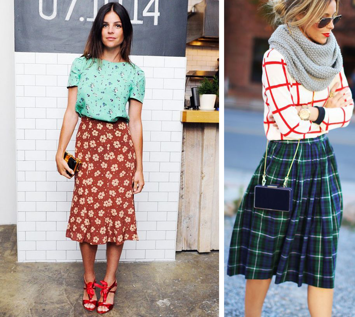
Understanding the Basics of Pattern Mixing
Pattern mixing might seem like a daunting task, but understanding a few key principles can elevate your styling game. First and foremost, scale matters. Incorporating various sizes of patterns into your outfit can create a harmonious visual appeal. For instance, larger patterns like bold florals can be paired with smaller prints, such as pinstripes or polka dots. Additionally, consider color coordination; picking patterns that share at least one common color can help unify the look, making it appear intentional rather than chaotic.
Another essential aspect is theme. Mixing patterns with a similar theme or style, such as floral with geometric or bohemian prints, can add layers to your outfit while maintaining a cohesive feel. Experimenting with texture is also a game changer; combining printed textiles with different fabric types, like pairing a printed silk shirt with denim, can enhance depth and interest. Remember, layering is your friend—unveil different patterns gradually to create an enticing visual story!

Choosing a Color Palette That Harmonizes
One of the keys to successfully mixing patterns is ensuring that your color palette works in harmony.Begin by selecting a base color that will anchor your designs; this can be a neutral or a bold shade depending on your style preference. From there, choose complementary colors that enhance the base without overwhelming it.Aim for a cohesive look by picking shades that share the same undertones, whether they’re warm or cool. Consider using tools like color wheels or online palettes to visualize which colors go together seamlessly.
To further simplify the process, think about using the 60-30-10 rule. This guideline suggests that 60% of your space should be dedicated to a dominant color, 30% to a secondary color, and the final 10% to accent colors. Here’s a quick reference table to illustrate this concept:
| Color Role | Percentage | Example |
|---|---|---|
| Dominant Color | 60% | Soft Beige |
| Secondary Color | 30% | Muted Olive |
| Accent Color | 10% | Burnt Orange |
By adhering to these guidelines,you’ll create a visually appealing space that feels intentional and well-rounded. Remember that the right balance of colors will enhance the patterns you choose, allowing them to shine rather than clash.

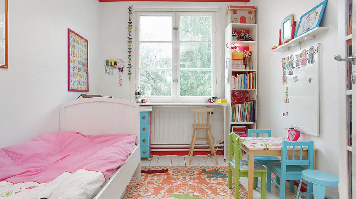
Pairing Patterns with Scale and Proportion
Understanding the relationship between different patterns and their scale is crucial for a balanced look. When mixing designs, consider pairing larger-scale patterns with smaller ones to create visual harmony. As a notable example, a big, bold floral print works beautifully with tiny polka dots or stripes. This layering affect not only adds depth but also brings a sense of organization to your outfit or room decor. To achieve the perfect pairing, try these combinations:
- Large florals with tiny geometrics
- Bold stripes with subtle plaids
- Animal prints next to small-scale abstract designs
In addition to scale, proportion also plays a key role in blending patterns seamlessly. Think about how each pattern’s size interacts within the overall composition. A balanced approach often involves considering the space between design elements; ensuring they don’t visually compete with each other. To illustrate a few proportionate pairings, refer to the table below, which highlights triumphant combinations for different styles:
| Pattern Type | Recommended Pairing |
|---|---|
| Large Graphic | Subtle Textures |
| Medium Checkers | Small Florals |
| Tiny Houndstooth | Bold Polka Dots |

Balancing Bold and Subtle Designs
When it comes to mixing patterns,achieving harmony between bold and subtle designs can elevate your space from ordinary to extraordinary. Bold patterns often serve as focal points, drawing attention and adding character to a room. To balance these striking designs, incorporate subtle patterns that can serve as a backdrop, allowing the bolder elements to shine without overwhelming the senses. Think of using muted tones or lighter shades that echo the colors found in the bold patterns to create cohesion.
- Stripes can complement floral patterns beautifully.
- Polka dots work well with plaids, offering visual interest.
- Geometric shapes can offset organic designs, creating a modern contrast.
To better navigate this mix,consider a simple color scheme that ties the patterns together. A helpful approach is to use a three-pattern rule: one bold pattern, one subtle pattern, and one neutral element. This strategy creates a dynamic yet balanced look. Below is a quick reference table that outlines popular combinations for effective pattern mixing:
| Bold Pattern | Subtle Pattern | Neutral Element |
|---|---|---|
| Large Floral | Pinstripe | Solid Linen |
| Graphic Chevron | Small Dots | Textured Gray |
| Wild Animal Print | Muted Houndstooth | Beige Canvas |
Accessorizing to Enhance Your Patterned Ensembles
Accessorizing is key to elevating your patterned outfits and achieving a harmonious look. The right accessories can tie your ensemble together, allowing the patterns to shine without overwhelming the eye. When choosing accessories, consider the colors and styles present in your patterns.Such as, if your outfit features a bold floral print, select accessories in solid hues that complement the flowers or incorporate smaller prints that echo the main design. Don’t shy away from mixing textures—matte and shiny finishes can create visual interest, making your ensemble knockout.
Additionally, pay attention to the scale of your accessories in relation to your patterns. For larger prints,chunky statement pieces work well,while finer patterns can be paired with delicate jewelry. Here are a few accessory options to consider:
- Statement Earrings: Bright and bold, they draw attention to your face.
- Layered Necklaces: Mix lengths and styles for a boho-chic vibe.
- Belts: an easy way to cinch in a patterned dress and add definition.
- Scarves: A versatile piece that can introduce new textures and patterns.
Using a table can also help illustrate how to blend accessories with patterned outfits:
| Pattern type | Accessory Type | Example |
|---|---|---|
| Floral | Solid belt | Bright coral to match flower hues |
| Stripes | Chunky necklace | Gold geometric shapes |
| Polka Dots | Delicate earrings | Simple studs in coordinating color |
To Conclude
As we wrap up our journey through the colorful world of pattern mixing, remember that the key lies in embracing your unique style while applying the principles we’ve explored.Mixing patterns should be a joyful expression, not a daunting task. Whether you opt for subtle contrasts or bold statements, trust your instincts, and let your creativity shine.
With practice, you’ll find your rhythm, effortlessly blending prints that sing in harmony. So, step out with confidence, armed with your newfound skills. The next time you reach for your wardrobe, think of this as an invitation to play, innovate, and express who you are. Happy mixing!