In the world of interior design, color serves as the silent architect of a space, influencing mood, perception, and even functionality. Among the countless hues available, neutral paint colors stand out as timeless choices, elegantly bridging the gap between bold statements and serene environments. They create a versatile canvas that allows personal style to shine while maintaining an inviting atmosphere. Whether transforming a cozy nook or refreshing an entire home, the right neutral palette can seamlessly enhance the beauty of any room. In this article, we will explore the best neutral paint colors that can harmonize with any décor, providing inspiration and insight for your next home change. Join us as we navigate the spectrum of whites, beiges, grays, and beyond, uncovering the perfect shades that evoke warmth, sophistication, and an unmistakable sense of home.
Exploring the Versatility of Neutral Paints
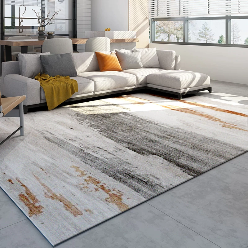
Neutral paints are the unsung heroes of interior design, offering a striking balance between warmth and sophistication. Their versatility allows them to enhance any space,making them perfect for various styles,from modern minimalism to rustic charm. Whether you want to create a serene atmosphere or a bold statement, neutral shades can seamlessly adapt to your vision. Consider the power of beige, taupe, and greige, which can instill a sense of calm while providing a sophisticated backdrop for your furnishings.
Utilizing neutral tones can elevate your home in a myriad of ways. Pair them with vibrant accents for a lively contrast or layer different shades to add depth and interest. Here are some benefits of incorporating neutral paints into your home:
- Timeless Appeal: Neutral colors never go out of style.
- Light Reflection: They can make spaces appear larger and brighter.
- Versatile Pairing: Easily complements a wide array of colors and decor styles.
- Warmth & Comfort: Creates inviting spaces without overwhelming the senses.
The Psychology Behind Choosing the Right Shade
When it comes to selecting a shade for your home, the choices go beyond mere aesthetics—psychology plays a important role. Color can elicit emotional responses and influence our mood, making it vital to pick a shade that resonates with your living space’s purpose. As an example, warm neutrals like beige or taupe can create feelings of comfort and coziness, perfect for living rooms or bedrooms. On the other hand, cooler shades such as greige or soft grey may inspire a sense of calm, suitable for areas intended for relaxation or mindfulness.
Understanding how colors interact with light and space also guides your selection. Natural light exposure can considerably transform a paint color throughout the day, enhancing or muting certain hues. When selecting your neutrals, consider these factors:
- orientation of the Room: North-facing rooms benefit from warmer shades to counteract cool lighting.
- Room Size: Light neutrals can make a small space feel larger, while darker neutrals can add depth to expansive rooms.
- Existing furnishings: Choose shades that harmonize with your furniture and décor for a cohesive look.

Top Recommendations for Different Rooms
Choosing the perfect neutral paint colors can transform any room and create an inviting atmosphere. For your living room, consider shades like greige or soft taupe to establish a warm and cozy environment.This creates an ideal backdrop for your furniture and decor to shine. If you want to add a touch of elegance, opt for a light greige that can seamlessly complement both modern and customary furnishings. For accents, think about cream or bone, which can enhance architectural features and provide a soft contrast against darker elements.
When it comes to the bedroom, a gentle hue like pale blue or soft lavender can evoke tranquility, making it the perfect haven for rest.Pair these with a warm beige for a harmonious feel,allowing flexibility in bedding and decor choices. The bathroom can benefit from a fresh look with cool whites or mint greens, creating an airy and rejuvenating space. To enhance the overall aesthetic across various rooms, you might consider utilizing a color palette that flows; for instance, incorporating a light shade of sage green or powdered grey in the kitchen can tie everything together beautifully.
| Room | Recommended Colors |
|---|---|
| Living Room | Greige, Soft Taupe, Light Greige |
| Bedroom | Pale Blue, Soft Lavender, Warm Beige |
| Bathroom | Cool whites, Mint Greens |
| Kitchen | Sage Green, Powdered Grey |

Tips for Pairing Neutrals with Accent Colors
When it comes to choosing accent colors to complement your neutral palette, flexibility is key. Neutrals provide a versatile backdrop,allowing various accent shades to stand out gracefully. Here are a few tips for creating beautiful arrangements:
- Consider the intensity: Pair softer accents like pastel blues or muted amber with lighter neutrals such as beige or soft gray. Conversely, striking colors like navy or deep forest green work wonders with bold neutrals.
- Balance is essential: Use a mix of different textures and finishes, such as matte, gloss, or metallic, to add depth to your accents. For example, a matte charcoal wall might come to life with vibrant satin gold decor.
| Neutral Color | Recommended Accent Colors |
|---|---|
| Soft Gray | Dusty Rose, Sky Blue |
| Warm Beige | Mustard Yellow, Terracotta |
| Charcoal | Emerald Green, Fuchsia |
| Classic White | Royal Blue, Coral |
besides color, consider how the location of your accents can influence your space. Grouping accent pieces together creates a cohesive look, while strategically placing them throughout a room can draw attention to specific areas. Such as, a vibrant piece of art hung against a soft taupe wall can become a stunning focal point, while colorful throw pillows on a gray sofa can invite warmth and comfort without overwhelming the space. Mixing patterns in your accents also adds liveliness, as long as you keep the general color scheme in mind for a cohesive appearance.
Q&A
Q&A: The Best Neutral Paint colors for Any Home
Q: What defines a neutral paint color?
A: Neutral paint colors are shades that don’t distract from the rest of your decor. Typically, they include grays, taupes, beiges, and whites. These colors serve as a versatile canvas, providing a backdrop that enhances the overall aesthetic without overpowering other elements in your space.
Q: Why shoudl I consider using neutral paint colors in my home?
A: Neutral colors offer several advantages. They create a timeless appeal, making it easier to switch up your decor without having to repaint each time. They also work beautifully with almost any style, from modern to traditional, and can help to make small spaces feel more open and airy.
Q: What are some popular neutral paint colors for living rooms?
A: Some favorites include Soft Gray,Pale taupe,and Warm Beige. These colors can contribute to a welcoming atmosphere and make it easier to incorporate various furniture and decor styles.For a slightly bolder option,consider an off-white with warm undertones,like Creamy Ivory.
Q: Are there specific neutral colors that work best in smaller spaces?
A: Light, airy neutrals like Whisper White or light Sand can help to visually expand smaller areas.A cooler gray can also reflect light, creating an illusion of more space. Just remember to balance these with good lighting to ensure the room feels shining and inviting.
Q: How can I choose the right neutral for my space?
A: Consider the natural light in your rooms. Some neutrals may appear different depending on the light source. Testing paint samples on your walls,observing them at different times of day,and considering the existing colors in your furniture and decor can help you select the perfect shade.
Q: Can I mix different neutral colors in one room?
A: Absolutely! Layering various shades of neutrals can add depth and interest to a room. Pairing a light beige with deeper taupes or softer grays can create a beautiful,cohesive look. Just ensure that the undertones complement each other to maintain a harmonious feel.
Q: What mistakes should I avoid when using neutral paint colors?
A: One common mistake is choosing neutrals that clash due to mismatched undertones. For example, a warm beige may not pair well with a cool gray. Additionally, using too many different neutrals can create a disjointed look rather than a cohesive one. Aim for a balanced palette that invites harmony.
Q: Can I personalize neutral spaces to avoid feeling bland?
A: Definitely! You can add personal touches through accessories and artwork.Textures, patterns, and vibrant colors in your furniture, rugs, pillows, and art can infuse personality into a neutral setting, making it feel uniquely yours while keeping the backdrop serene.
Q: What finishing touches should I consider with neutral paint?
A: Consider your trim color, lighting fixtures, and cabinetry. Bright white trim against a warm beige can add a classic touch, while black or dark gray can offer a modern contrast. Complementing fixtures, such as brass or metallic accents, can also contribute warmth and interest to your neutral palette.
Q: Are there trends in neutral paint colors right now?
A: Yes! While timeless neutrals remain popular, earth tones have made a resurgence.Colors like terracotta, warm whites, and soft greens are being embraced for their calming qualities and connection to nature. These trendier neutrals can bring a fresh twist to traditional favorites.
Q: Where can I find inspiration for my neutral palette?
A: Home decor magazines, online platforms like Pinterest and Instagram, and paint company websites are excellent resources. visiting local home improvement stores can also help you visualize colors in person and see how they look in different lighting conditions.Choosing the perfect neutral palette can be an exciting journey. With the right approach, your home can become a beautiful, harmonious space that reflects your unique style while remaining timeless and inviting.
Insights and Conclusions
in the world of interior design,paint colors can set the stage for your home’s personality and ambiance. As we explored the best neutral paint colors, it became clear that these versatile shades do more than simply coat the walls; they create a backdrop that allows your furnishings and decor to shine. From the warmth of soft taupes to the cool serenity of greys, each hue offers a canvas for creativity and comfort.
As you embark on your painting journey,remember that choosing the right neutral shade should reflect not just trends,but your unique taste and lifestyle. Take the time to sample and visualize how each color interacts with your space’s lighting and furnishings. By doing so, you’ll transform your home into a sanctuary that feels both harmonious and inviting.
So, whether you’re planning a complete makeover or just seeking a refresh, let these neutral tones serve as your guide. Embrace the elegance of simplicity and watch as your home evolves into a beautiful blend of style and serenity.Your perfect backdrop awaits—happy painting!