Ever wondered why some living rooms pop with personality? The secret’s in the accent colors—those bold strokes that bring a space to life. When your lounge feels like it’s missing a spark, picking the right accent hues can transform it from flat to fabulous. But where do you start? With a myriad of shades at your fingertips, choosing accent colors for your living room is about more than just personal taste; it’s about creating harmony and making your decor stand out. It’s crucial to nail this step early on, as these splashes of color will influence every other decorative choice you make. Let’s dive into how you can select accents that not only reflect who you are but also enhance the vibe of your most cherished space.
Understanding the Role of Accent Colors
Mood Enhancement
Accent colors have a powerful impact on the mood of a room. A bright color like yellow can bring energy and cheerfulness, while blue might create a sense of calm. For example, imagine a living room with neutral walls and furniture. Now add some vibrant red throw pillows or an orange vase. These small changes can transform the space from bland to lively.
A study in color psychology reveals that certain shades evoke specific emotions. Green often brings about feelings of tranquility, making it perfect for creating a relaxing atmosphere in your living space.
Feature Highlighting
Using accent colors effectively draws attention to special features within your living room. Have you got an antique clock or unique artwork? Surround it with complementary hues to make it stand out even more.
Consider how a deep purple throw blanket can draw eyes towards a cozy reading nook or how metallic accents could spotlight modern fixtures. It’s all about creating points of interest that guide visitors’ gaze around the room.
Aesthetic Impact
The overall aesthetics of your living room are greatly influenced by the accent colors you choose. They work together with other elements like lighting and texture to set up an inviting environment.
Imagine walking into two different rooms—one where everything is monochromatic and another where there are splashes of teal against gray tones; which one seems more visually appealing? The use of contrast makes design elements pop, giving character to spaces that might otherwise seem flat.
Principles for Choosing the Right Accent Color
Room Size & Lighting
When selecting an accent color, room size and lighting are critical factors. A small room can feel larger with light or bright accents. Conversely, dark colors can make a big space feel cozier.
Consider natural light sources as well. Rooms with ample sunlight have more freedom in color choice. For dim rooms, pick accents that lighten the mood.
Applying Color Theory to Living Room Decor
Warm vs Cool
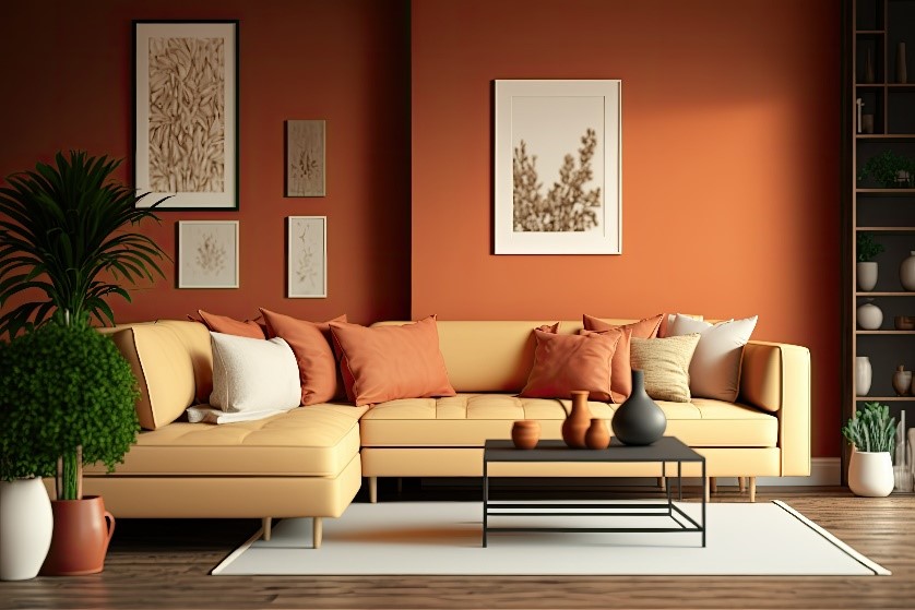
When picking accent colors for your living room, it’s crucial to grasp the difference between warm and cool tones. Warm colors, like reds, oranges, and yellows can energize a space. They’re perfect for areas where you entertain guests or seek lively conversations. In contrast, cool colors such as blues, greens, and purples offer a calming effect. They are ideal in living rooms used for relaxation after long days.
Imagine your living room with a sunny yellow throw pillow on a neutral couch—it adds cheer without overwhelming the space. Or picture soft blue drapes that bring serenity into an area filled with natural light. These examples show how choosing the right temperature in color can influence the atmosphere of your room.
Complementary Colors
Complementary colors sit opposite each other on the color wheel and when paired together they create striking contrasts that can make your decor pop. For example, using violet accents against a yellow wall will draw attention due to their high contrast levels.
However, balance is key—too much contrast might be jarring rather than appealing. Consider smaller accent pieces like vases or artwork in complementary shades to add visual interest without overpowering your space.
Analogous Scheme
Analogous color schemes involve selecting hues that are next to each other on the color wheel—they blend well together and produce harmonious designs. This approach is less contrasting than using complementary colors but still brings vibrancy into your living room decor.
For instance, if you have a green sofa as part of your main furniture set-up; cushions or rugs in shades of lime green or teal could complement it beautifully while maintaining cohesion within the design scheme.
Utilizing The Wheel
The color wheel is an invaluable tool when choosing accent colors for any interior design project including living rooms. It helps identify which combinations will work best based on established rules of color theory.
To use this tool effectively:
- Decide on one dominant base color from either warm or cool categories.
- Look across the wheel for its complementary match—or choose neighbors for an analogous palette.
- Remember lighting plays a significant role—test samples at different times of day before making final decisions.
Creating a Harmonious Accent Color Palette

Rule of Three
The rule of three is a classic approach in designing color palettes. It suggests that colors should be used in odd numbers to create visual appeal. In choosing accent colors for your living room, this rule can guide you towards balance and interest.
Start by selecting three main hues for your palette. These could be a primary color, a secondary color, and an accent or tertiary shade. For instance, imagine picking blue as your dominant hue, yellow as the secondary one, and adding red as the bold accent.
To implement this rule effectively:
- Identify one main wall color.
- Choose two additional shades that complement it.
- Ensure these accents appear in various elements around the room such as pillows, art pieces or rugs.
By sticking to just three key colors you avoid cluttering the space visually while maintaining harmony.
Shades and Tints
Harmony also comes from using different shades and tints within your chosen colors. A monotone scheme lacks depth; varying intensities add dimension.
For example:
- If blue is your base color, consider navy throw blankets alongside sky-blue vases.
- With green as a primary tone, mix olive drapes with lime lampshades for contrast without clashing.
This strategy allows consistency without being monotonous. It gives each piece its moment to shine while contributing to the overall design story of your living room.
Neutral’s Role
Neutral colors play an essential role in creating a harmonious palette. They provide relief between vibrant tones and tie together different elements within the space. Neutrals like beige, gray or white can act as backdrops against which other hues pop out more distinctly.
Incorporate neutrals by:
- Choosing sofas or large furniture items in neutral tones.
- Using neutral-colored walls to allow brighter accents to stand out clearly.
Neutrals are not just fillers but active participants that enhance the liveliness of accent colors without overwhelming them.
Remember that harmony is about blending rather than matching exactly; let variations lead you toward elegance rather than uniformity when choosing accent colors for living rooms.
Suggested Color Combinations for Living Room Harmony
Classic Pairings
When you choose classic color combinations, your living room can feel both timeless and elegant. A popular choice is the blend of navy blue and white. This duo offers a nautical vibe that’s crisp and inviting. Another enduring combo is black and white; it creates a dramatic contrast that never goes out of style.
For those who prefer softer hues, consider pairing beige with pastel accents like soft pink or light blue. This combination brings a gentle warmth to the space, making it cozy and serene.
Trending Mixes
If you’re after something more contemporary, look into trending color mixes. Right now, gray paired with mustard yellow makes for an on-trend yet approachable space. The coolness of gray balances the vibrant energy mustard yellow brings.
Another modern favorite is combining different shades of green with earthy tones like terracotta or burnt orange. It reflects nature’s palette inside your home, creating a fresh but grounded atmosphere.
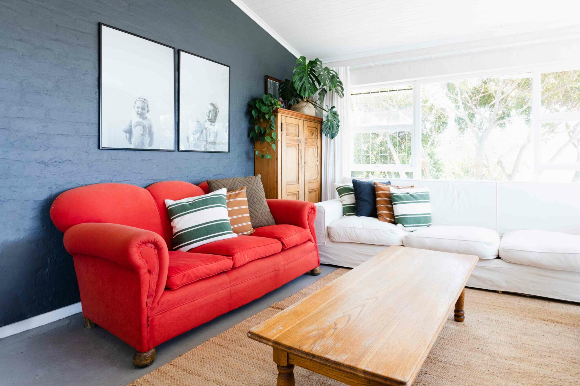
Unique Contrasts
For those daring to be different, unconventional contrasts can create a unique living room space. Think outside the box by pairing deep purple with lime green, or go bold with turquoise against coral pink for an eclectic mix that pops.
You could also play around with textures as well as colors—for instance, adding metallic gold accents to matte charcoal walls can add depth and interest to your living area.
Remember that when choosing accent colors for your living room, it’s not just about aesthetics but also about how these colors make you feel in your own home.
Incorporating Vibrant Accents for Energetic Spaces
Bold Choices
Vibrant colors add energy and personality to a living room. Think of using bold shades like turquoise, magenta, or lime green. These colors draw the eye and inject life into spaces. For instance, a bright yellow throw pillow on a grey sofa creates an immediate focal point.
However, vibrant accents require thoughtfulness. Too many strong colors can overwhelm. A good rule is to choose one primary accent color and use it in several places around the room for cohesion.
Neutral Balances
Neutral tones provide balance against vibrant accents. They create a backdrop that allows pops of color to stand out without clashing with other elements in the space. Imagine soft beige walls behind a vivid red art piece; they complement each other perfectly.
The key is proportion: aim for 60-30-10 distribution between neutral hues, secondary shades, and your chosen accent color respectively.
Energy Impact
The choice of vibrant accents can significantly alter energy levels in your living room. Bright oranges might inspire lively conversations while deep blues could evoke calmness despite their intensity.
Remember that lighting also affects how these colors are perceived—natural light makes them appear more dynamic whereas artificial light can soften their impact.
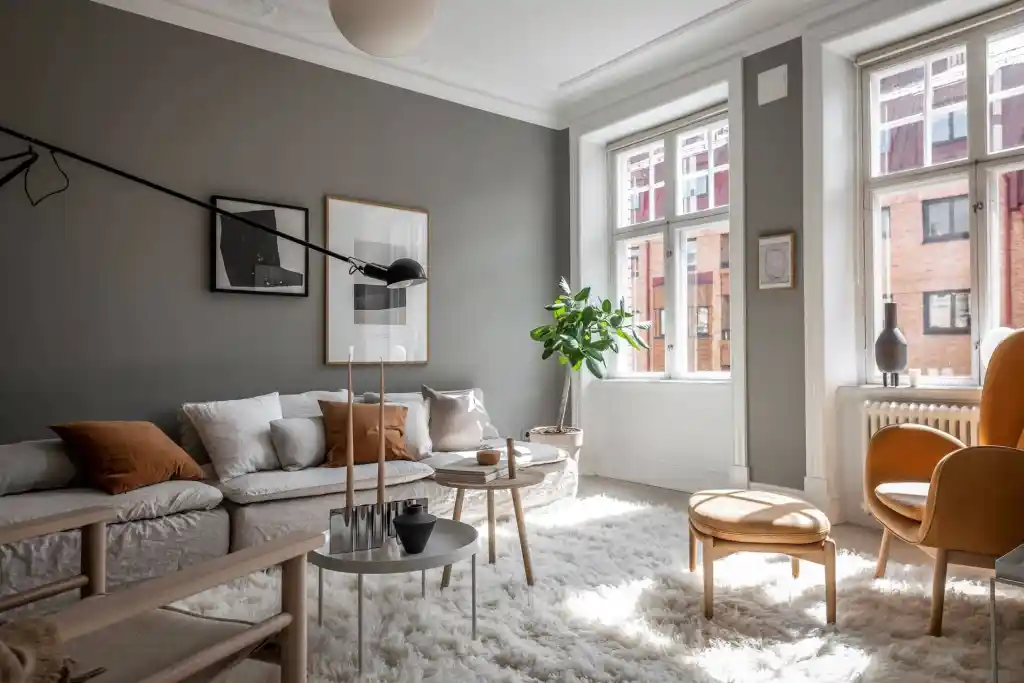
Designing with Neutral Accents for a Subtle Elegance
Elegant Benefits
Neutral accents offer many advantages in home design. They create a calm atmosphere and can make small spaces seem larger. Neutrals also serve as a backdrop, allowing you to highlight other elements of your decor.
Using neutral colors leads to a timeless look. Trends come and go, but neutrals remain stylish year after year. They are versatile too. You can easily switch up accent pieces without having to repaint the entire room. For example, adding colorful pillows or artwork against a neutral wall can refresh your living room instantly.
Neutrals are low maintenance compared to vibrant colors that might require frequent touch-ups due to visible marks or fading.
Shade Depth
Adding depth with shades of neutrals is simple yet effective. Start by choosing two or three related neutral tones for your living room palette.
You could pair a light beige sofa with darker taupe walls for contrast. This creates visual interest without overwhelming the space with color.
Layer textures within the same color family to add richness and dimension—think fluffy throw blankets on linen couches or woven baskets atop sleek wooden floors.
Minimalist Elegance
Minimalistic design emphasizes simplicity and function, which pairs well with neutral accents.
A minimalist approach means less clutter and more open space in your living room—both physically and visually.
Choose furniture with clean lines and little ornamentation; let shape and form stand out against the neutrality of the background colors.
To achieve elegance through minimalism, focus on quality over quantity—a few well-chosen pieces will have greater impact than many average ones.
Consider materials like marble or metal that bring subtle texture into play while maintaining an understated color scheme.
Embracing Traditional Colors for a Classic Look
Popular Hues
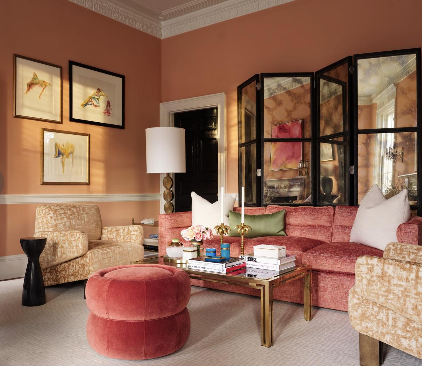
Traditional colors have stood the test of time. They offer warmth and sophistication to any living room. Some popular traditional accent colors include deep red, navy blue, hunter green, and rich burgundy. These hues bring a sense of history and elegance to your space.
When used as accents, these colors create focal points without overwhelming the room. For instance, navy blue pillows on a beige couch draw attention while maintaining harmony. Similarly, curtains in hunter green can frame a window beautifully against neutral walls.
Timeless Elegance
Achieving timeless elegance is all about balance. Traditional hues must complement rather than dominate your living room’s color scheme. To do this effectively:
- Choose one or two traditional colors as accents.
- Use them in small doses like art frames or lampshades.
- Mix textures within your chosen color for added depth.
For example, velvet burgundy cushions contrast nicely with silk throws on a classic leather sofa. This not only adds visual interest but also tactile variety that invites people into the space.
Modern Pairings
Pairing traditional colors with modern elements gives your living room an updated look while retaining its classic appeal. Consider combining clean lines and minimalist designs with those richer accent tones for an engaging contrast.
A sleek white coffee table might be adorned with antique brass candle holders — the old meets new creates intrigue in design choices that feel both fresh and familiar at once.
Designer Tricks for the Perfect Living Room Palette
Test Your Tones
Testing colors in different lights is crucial. The natural light that fills your room during the day can make colors look different than they do under artificial lighting at night. To avoid surprises, apply color swatches on various walls. Watch how they change throughout the day.
A bright yellow might feel energetic with morning sun but could become overwhelming at dusk. Testing helps you find a shade that’s consistently pleasing. Remember, accents should complement your space at all hours.
Visualize Virtually
Today’s technology offers digital tools to help visualize your living room before making changes. Use apps or online platforms where you can upload a photo of your space and play with different colors.
This virtual testing lets you see potential outcomes without any commitment or mess. It’s easy and quick to swap out one accent color for another until it feels just right.
Pattern Play
Incorporating patterns adds depth to your living room palette. Consider using patterned throw pillows or rugs as a way to introduce accent colors subtly.
Patterns shouldn’t clash but rather enhance each other and the overall theme of the room established by traditional colors from the previous section, “Embracing Traditional Colors for a Classic Look”. Stripes, florals, or geometric shapes can add visual interest and tie together various hues within the space.
Texture Tactics
Texture also plays an important role in choosing accent colors for your living room. Textured fabrics and materials create layers of interest beyond color alone.
Imagine plush velvets next to smooth leathers—each texture will reflect light differently and affect how we perceive their color intensity. Combine textures like rough jute against soft cottons while keeping within your chosen palette for an engaging sensory experience.
Conclusion
Crafting the perfect living room is like painting a masterpiece; accent colors are your palette, and your home is the canvas. We’ve explored the spectrum of choices, from vibrant splashes to subtle whispers of hue, equipping you with the know-how to create a space that feels just right. Whether you’re drawn to the bold statements of energetic spaces or prefer the understated elegance of neutrals, remember that your living room is a reflection of your unique style. The principles of color theory and designer tricks we’ve shared are your tools to turn a vision into reality.
Now it’s time to pick up that brush—metaphorically speaking—and start experimenting. Mix and match, play with palettes, and let your living room tell its own colorful story. Share your results with us; we can’t wait to see how you infuse personality into every corner. Ready, set, paint your world in color!
Frequently Asked Questions
What are accent colors in living room decor?
Accent colors add depth and interest to your living room, acting as pops of color that complement the overall design.
How do I choose the right accent color for my living room?
Consider your existing decor, apply basic color theory, and aim for a harmonious palette that reflects your personal style.
Can I use vibrant colors as accents in my living room?
Absolutely! Vibrant accents can energize your space. Just balance them with more subdued hues to avoid overwhelming the room.
Is it okay to use neutral colors as accents?
Definitely. Neutral accents bring subtle elegance and can be layered effectively for a sophisticated look without overpowering the space.
What are some classic accent colors for a traditional living room look?
Traditional spaces often embrace rich tones like burgundy, navy, or forest green for timeless appeal.
Do you have any designer tips for creating the perfect living room palette?
Start with a base color you love and then select one or two accent shades that contrast or complement it beautifully.