Ever wondered how your living room walls can sway your emotions? The subtle power of color psychology taps into our mood like a silent soundtrack, setting the emotional tone as we lounge and live. Choosing the right hues for living room decor isn’t just about aesthetics; it’s an investment in your daily well-being. Delve into how different shades can uplift, soothe, or energize you and why nailing that perfect palette might be more critical than you think.
From serene blues to rejuvenating greens, each color whispers its own story into the heart of our homes. In this exploration, we uncover the invisible yet profound impact living room colors have on our mood and atmosphere.
Understanding the Psychology of Color in Home Decor
Emotional Impact
Colors have a powerful effect on our emotions. Warm colors like red, orange, and yellow can create feelings of warmth and energy. Red might make you feel more passionate or excited. It’s often used to grab attention. On the other hand, cool colors such as blue, green, and purple usually bring about a sense of calmness or relaxation.
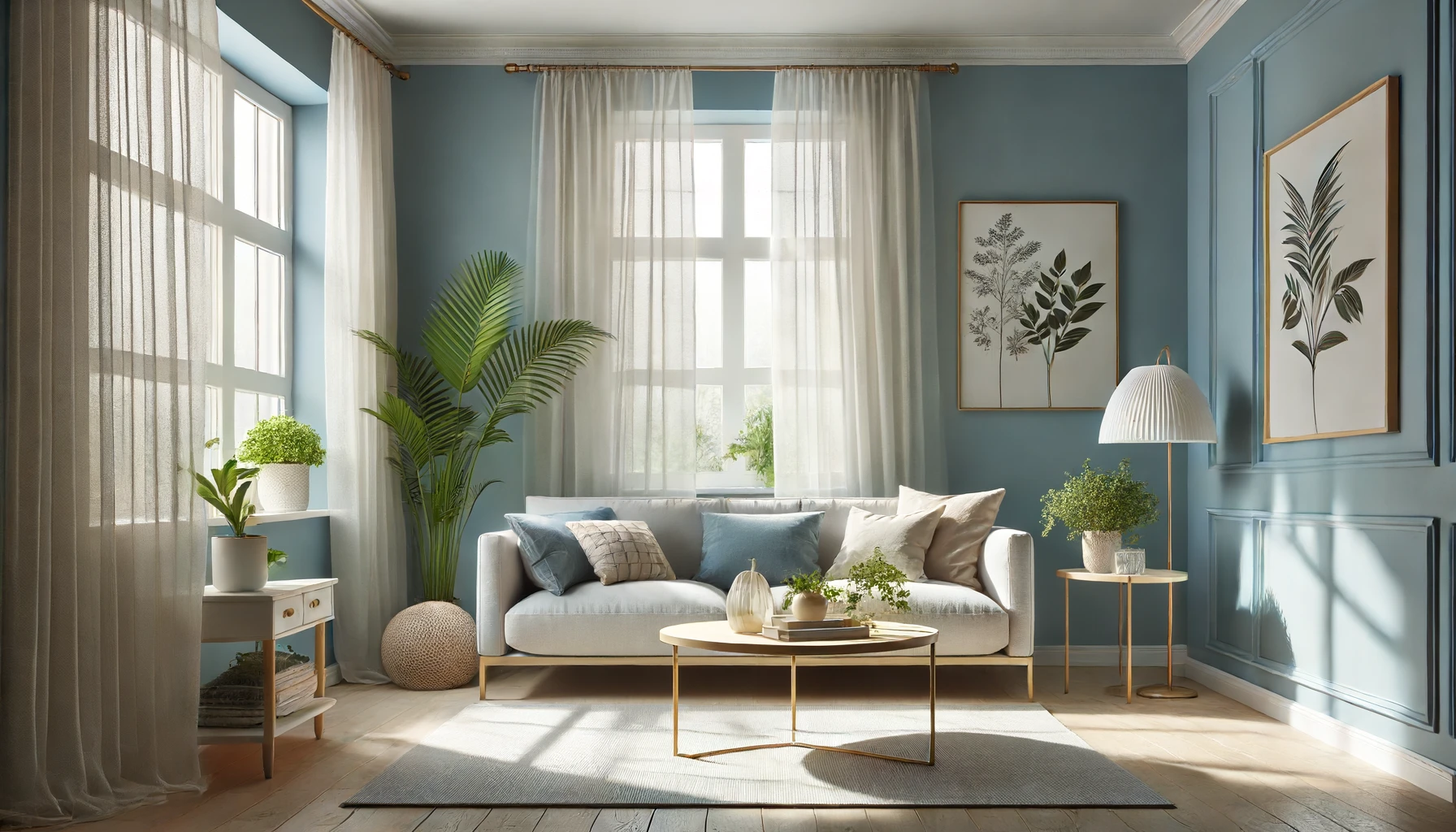
Imagine painting your living room walls with a soft blue hue. You might find that it becomes easier to unwind after a busy day because blue is associated with tranquility and peace.
Cultural Significance
Colors carry different meanings across cultures which can influence how we feel in our homes. For example, white is often seen as pure and clean in Western societies but may represent mourning in some Eastern cultures.
Your personal history plays a role too. If you spent joyful times in a kitchen painted yellow when you were young, yellow might still make you happy today.
Behavioral Effects
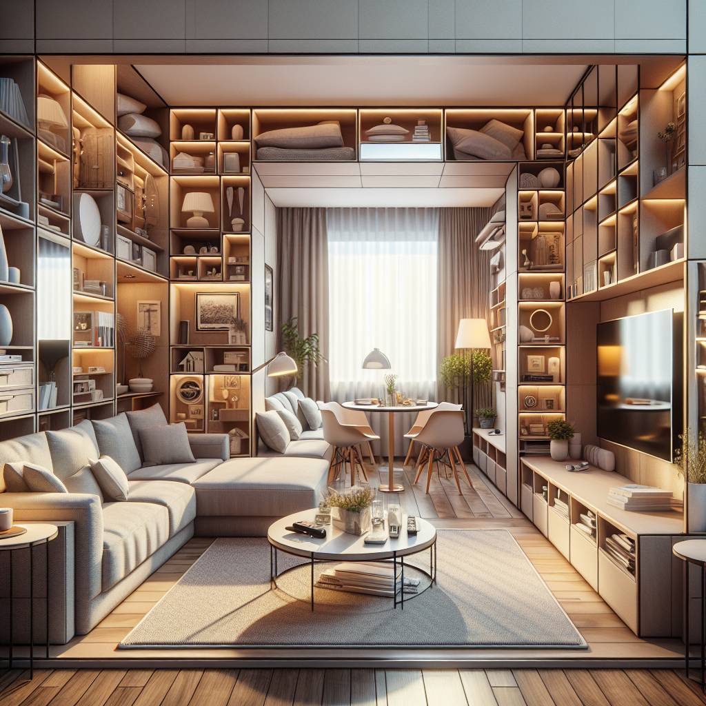
The color of your living room can even change how people behave within it. Lighter shades tend to make spaces seem bigger and more open which could encourage socializing or active play among children.
Conversely, dark tones often create an intimate atmosphere where deep conversations are more likely to happen.
For instance, if your living room has deep green walls, guests might be inclined to settle into longer chats over coffee due to the cozy vibe it gives off.
The Relationship Between Living Room Color and Mood
How Colors Affect Mood
Colors in the living room can significantly impact our emotions and overall mood. Different colors have distinct psychological effects, influencing feelings of calmness, energy, warmth, or relaxation. For instance, warm colors like reds and oranges tend to evoke feelings of excitement and vitality. On the other hand, cool colors such as blues and greens often create a sense of tranquility and peace.
Living room color choices play a crucial role in shaping our emotional responses to our surroundings. For example, vibrant shades like bright yellow can promote optimism and happiness while deep blues may induce a sense of serenity. Understanding these color-mood relationships is essential for creating an environment that aligns with one’s desired emotional state.
Psychological Effects of Various Color Schemes
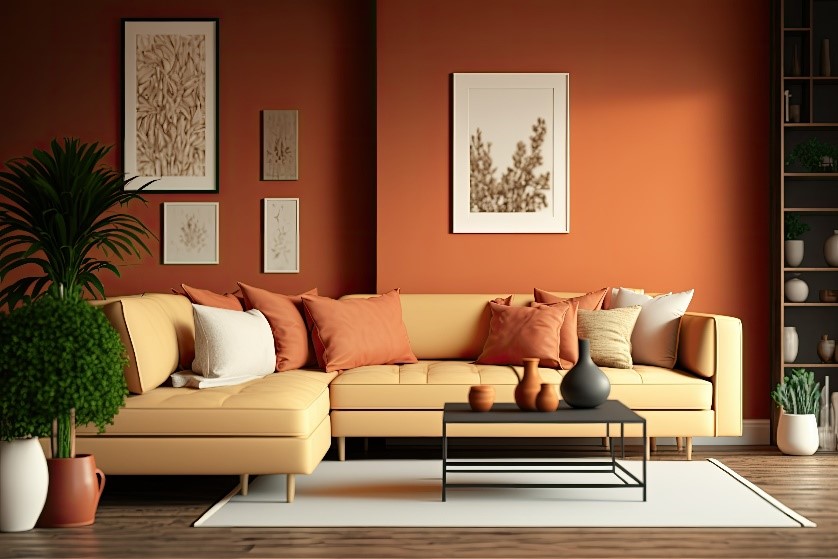
The psychological effects of various color schemes are well-documented. Different hues can elicit specific emotional reactions due to their associations with nature or cultural symbolism. For instance, warm earthy tones like terracotta or sandy beige often convey a sense of comfort and grounding due to their resemblance to natural elements.
Moreover, pastel shades such as soft pinks or mints are known for their calming influence on individuals’ mental states. These gentle hues are frequently used in living rooms to foster relaxation after long days at work or school.
Pros:
- Enhancing mood
- Creating desired ambiance
Cons:
- Overwhelming use leading to discomfort
How Different Paint Colors Affect Emotions
Primary and Secondary Colors
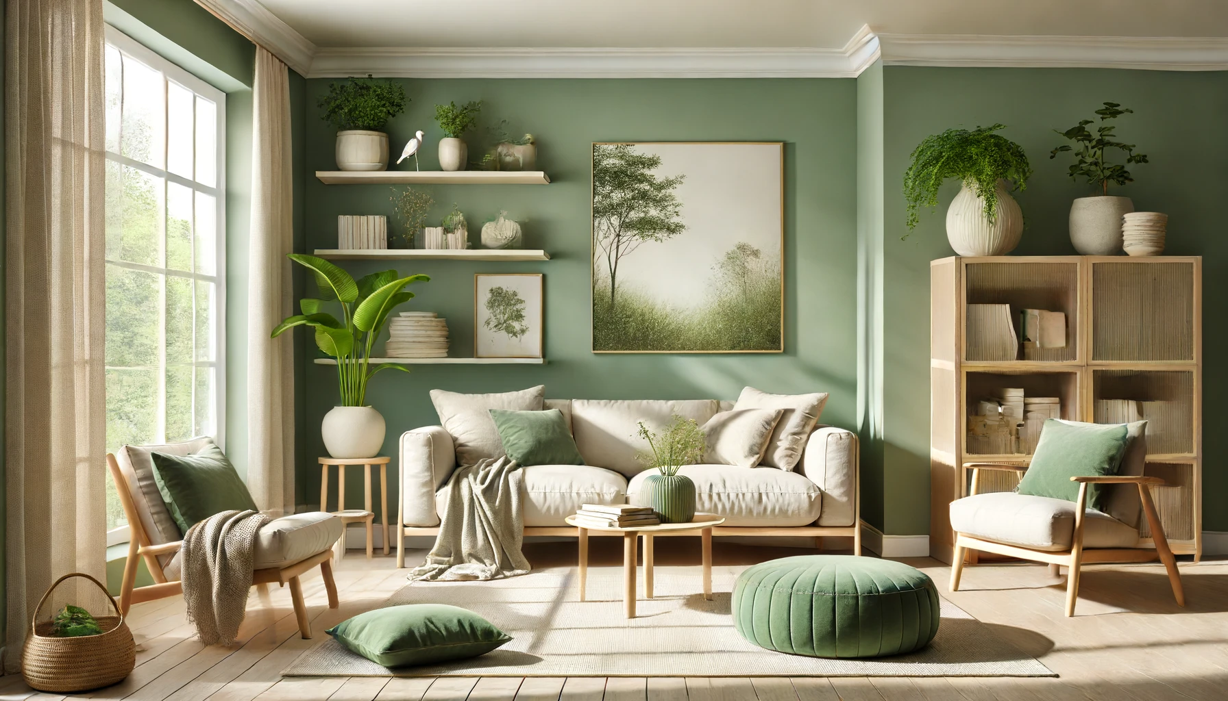
Different paint colors can have a significant impact on our emotions. For instance, red is often associated with energy and passion, while blue is known for its calming effect.. On the other hand, green, which is a secondary color created by combining blue and yellow, is often linked to nature and tranquility.
These emotional responses to colors are not arbitrary; they are deeply ingrained in our psychology. For example, red has been shown to increase heart rate and stimulate appetite, making it an ideal choice for dining rooms or areas where social interaction occurs. In contrast, blue has a calming effect that can help reduce stress levels when used in bedrooms or living rooms.
Warm vs Cool Colors
The distinction between warm and cool colors also plays a crucial role in influencing mood. Warm colors such as red, orange, and yellow tend to create a sense of comfort and coziness. These hues can make large spaces feel more intimate but might be overwhelming if used excessively in smaller rooms.
On the other hand, cool colors like blue, green, and certain shades of purple are known for their ability to promote relaxation and serenity. They are excellent choices for creating an inviting atmosphere in living rooms or lounging areas where people gather after a long day.
Impact of Neutral Shades
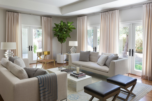
Neutral shades like white, beige, gray, or taupe may not elicit strong emotional reactions compared to bold primary or secondary colors; however they play an essential role in interior design due to their versatility. These tones provide a blank canvas that allows homeowners to introduce pops of color through furniture pieces or decorative elements without overwhelming the space with intense hues.
Choosing the Best Color for Your Living Room’s Atmosphere
Lighting Conditions
When considering the impact of living room color on mood, it’s crucial to take into account the lighting conditions. Natural light can make colors appear differently throughout the day, so it’s essential to test paint samples in various lighting situations. For instance, a warm yellow might look cozy and inviting during the daytime but could feel overwhelming under artificial lighting at night.
Desired Atmosphere
The desired atmosphere plays a pivotal role in choosing the right color for your living room. If you want to create a calm and serene environment, opting for soft blues or greens can be an excellent choice. On the other hand, if you’re aiming for an energetic and vibrant space, consider using bold and bright colors like red or orange.
Creating the Right Mood with Living Room Colors
Creating Specific Moods
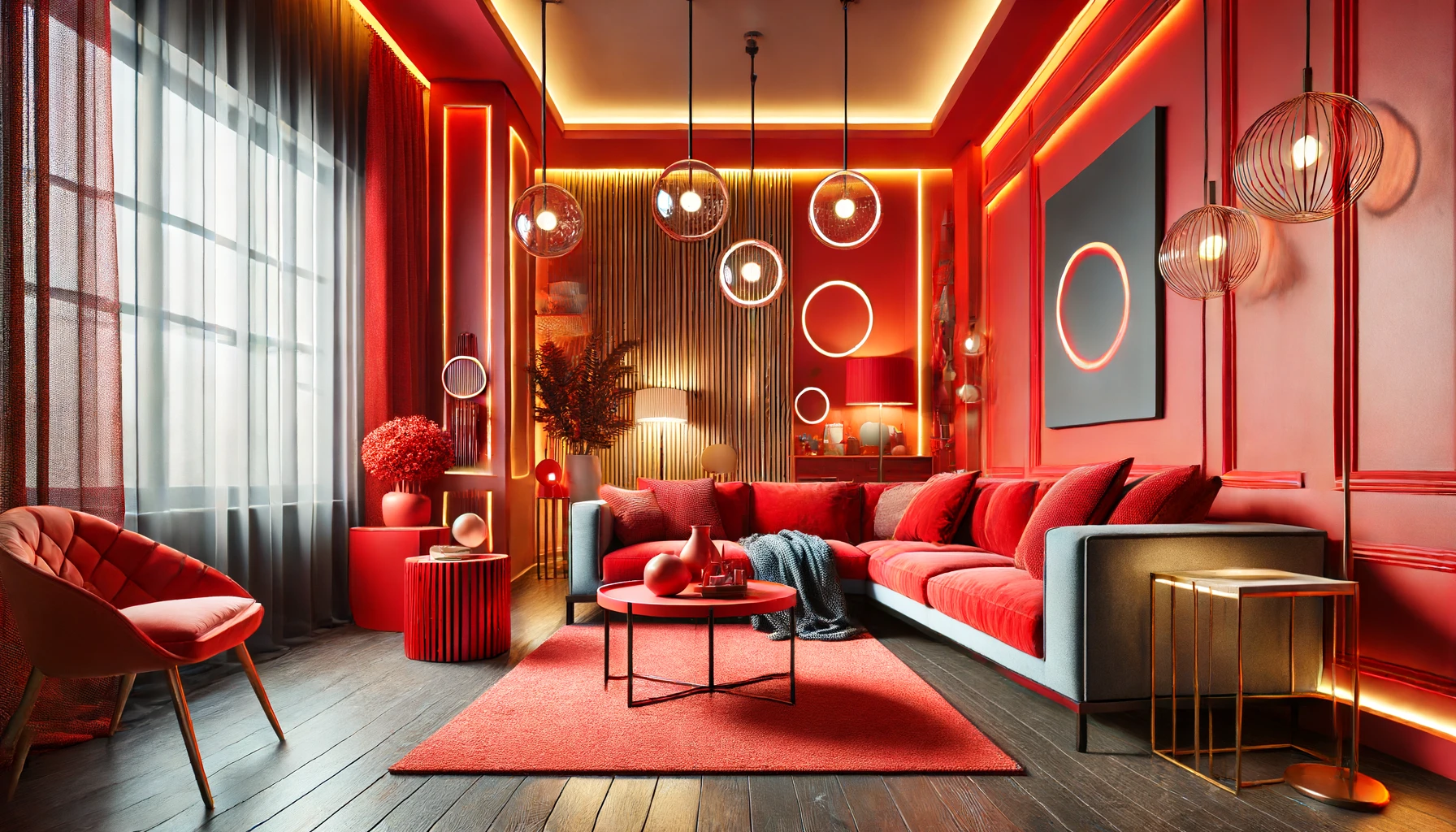
Color schemes play a crucial role. Warm colors like red, orange, and yellow can create an inviting and cozy atmosphere. These colors can make the space feel more intimate and encourage social interaction among family members or guests.
On the other hand, cool colors such as blue, green, and purple tend to evoke a sense of calmness and relaxation. They are ideal for creating a serene environment where you can unwind after a long day or enjoy quiet moments alone. By choosing the right combination of these colors, you can effectively set the desired tone for your living room.
Accent Colors for Enhancement
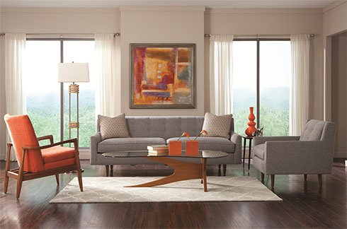
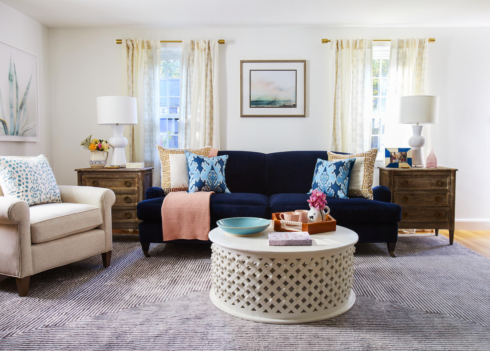
In addition to primary wall colors, accent colors also contribute significantly to the overall mood in your living room. For instance, adding vibrant accent pillows or artwork with bold splashes of color against neutral walls can inject energy into the space. This approach is particularly effective if you want to liven up an otherwise subdued atmosphere.
Conversely, using muted accent colors such as soft pastels or earthy tones can help maintain a sense of tranquility while still adding visual interest. By strategically incorporating accent colors through decorative elements like throw blankets or rugs, you have the flexibility to enhance or balance the prevailing mood in your living room.
Contrasting Colors for Dramatic Effect
Utilizing contrasting colors is an excellent way to introduce drama into your living room’s ambiance. Pairing complementary shades like blue and orange creates an exciting visual impact that immediately draws attention. This technique is perfect for establishing focal points within the space by highlighting specific architectural features or furniture pieces.
Moreover, employing contrasting color combinations allows you to infuse vitality into your living room design without overwhelming its overall aesthetic appeal. Whether it’s through bold curtains against light-colored walls or striking upholstery on seating furniture against dark flooring—contrasting hues add depth and character while influencing emotional responses within the setting.
Pros:
- Different color schemes offer versatile options.
- Accent colors provide flexibility in adjusting mood.
- Contrasting combinations add dynamic visual interest.
Cons:
- Selecting suitable combinations may require experimentation.
- Overusing contrasting hues could lead to sensory overload.
Utilizing Color Theory for Positive Home Environments
Application of Color Theory Principles
Color theory plays a significant role in determining the impact of living room color on mood. Understanding the basic principles of color theory can help create an environment that fosters positive emotions and enhances overall well-being. By leveraging these principles, homeowners can strategically utilize colors to evoke specific moods and feelings within their living spaces.
The three primary components of color theory are hue, saturation, and brightness. Each aspect contributes to the overall emotional response elicited by a particular color. For instance, warm hues such as reds and yellows tend to promote energy and warmth, while cooler tones like blues and greens often evoke calmness and relaxation. By considering these elements, individuals can make informed decisions when selecting colors for their living rooms based on the desired emotional impact.
Utilizing different shades within each hue also allows for further customization based on personal preferences or specific mood-related objectives. Lighter tints may introduce an airy and spacious feel to a room, while darker shades could create a more intimate atmosphere conducive to relaxation.
Creating Harmonious Color Combinations
Incorporating harmonious color combinations is essential for establishing a balanced visual appeal in the living room while positively influencing occupants’ moods. One effective approach involves applying complementary colors – those positioned directly opposite each other on the color wheel – which creates dynamic contrast while maintaining harmony. For example, pairing blue with orange or yellow with purple can produce visually striking yet emotionally balanced settings.
Analogous color schemes offer another method for achieving cohesiveness through subtler transitions between hues. This entails selecting neighboring colors on the wheel (e.g., green paired with yellow-green) to cultivate a sense of unity within the space without overwhelming visual stimulation.
Triadic color schemes involve using three evenly spaced hues around the wheel (e.g., red, yellow, blue) to achieve vibrant yet balanced compositions that infuse energy into the environment without appearing chaotic or discordant.
Selecting Room Colors to Match Desired Emotional Effects
Emotional Influence
Colors in the living room can shape emotions. For example, blue is often linked with calmness. It might be perfect for a space where you want to relax. Green can also create a serene atmosphere and is good for concentration.
Choosing warm colors like red or orange can inject energy into your space. These are ideal if you wish to foster lively conversations in your living room. However, they may not be the best choice if you aim for tranquility.
Enhancing Mood Through Strategic Living Room Color Choices
Color Significance
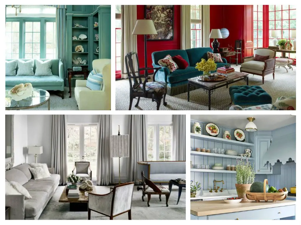
Colors have power. They can soothe or excite, create a sense of harmony or make a bold statement. In the living room, where we entertain and unwind, choosing the right colors is key to setting the mood. Soft blues and greens often bring calmness, while vibrant reds might energize.
A blue-themed room with touches of white can evoke tranquility. Imagine curling up in such a space after a long day’s work; the color seems to wash away stress.
Balance & Proportion
Getting color balance right means knowing how much of each hue to use. Too much of one color could overwhelm, not enough may seem insignificant. A dominant warm color might be balanced by cool accents, creating an inviting atmosphere without overstimulation.
Consider a living room with rich burgundy walls—a cream-colored sofa with teal pillows would add contrast and visual interest without clashing.
Transition Techniques
Creating smooth transitions between colors ensures cohesiveness in your living room design. This doesn’t mean all colors must match perfectly but should flow naturally from one to another for an overall effect that enhances mood.
For instance, transitioning from light peach walls into darker rust-colored curtains adds depth while maintaining warmth throughout the space.
Best Colors for Different Moods in Home Interiors
Calming Hues
Choosing the right colors to create a calming mood is essential. Soft blues and gentle greens are often used to evoke tranquility. These hues mimic elements of nature, like the sky and trees, which can have a soothing effect on your mind.
For instance, imagine a living room painted in pale blue. This color tends to lower blood pressure and slow down heart rate. It’s perfect for spaces where you want to relax after a busy day. Pairing these colors with soft textures enhances the serene atmosphere.
Cheerful Tones
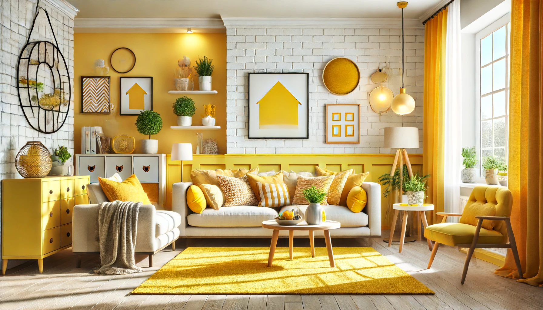
Brighter colors add energy and happiness to a space. Yellows and oranges are excellent choices for creating cheerful environments. They bring sunshine indoors even on cloudy days.
A living room with lemon yellow walls can instantly lift spirits. The color yellow stimulates mental activity and generates muscle energy, making it ideal for lively social gatherings or creative spaces.
However, using these vibrant tones requires balance so they don’t overwhelm the room’s occupants.
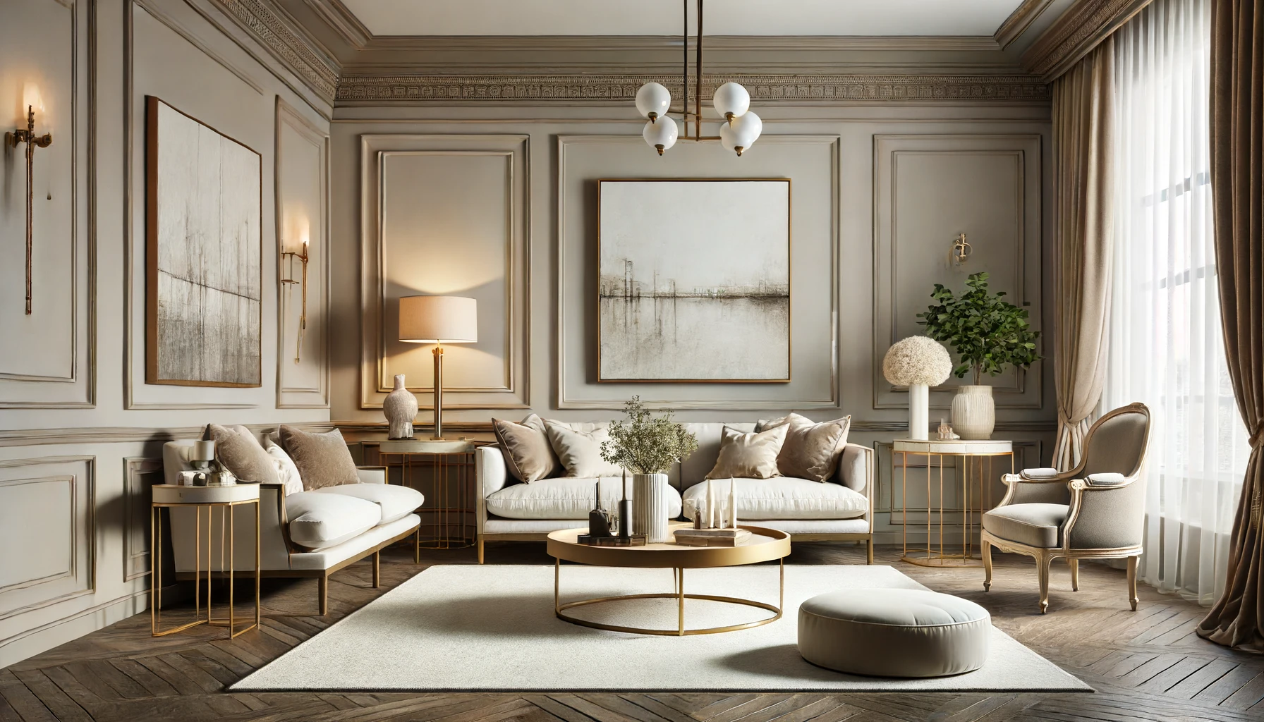
Sophisticated Palettes
Dark colors like deep purples or rich reds convey sophistication and luxury when used correctly in home interiors. These shades create an aura of elegance that can transform any ordinary space into something extraordinary.
Consider adding velvet materials or high-gloss finishes alongside such hues for extra depth and texture that underscore their opulence.
Color Intensity
The intensity of color plays a key role in setting mood as well.
- Subdued pastels offer gentleness,
- whereas bold primaries provide stimulation.
For example, while bright red may be too intense causing agitation, burgundy offers warmth without overstimulation.
It’s important not only what color you choose but also how saturated it is within your design scheme.
Texture Influence
Texture influences how we perceive color too:
- Matte finishes absorb light which softens the impact,
- glossy surfaces reflect light making colors appear more vivid.
Combining different textures with your chosen palette adds complexity to your interior design that affects mood subtly yet significantly.
Incorporating natural wood elements against matte painted walls creates an inviting contrast that both calms and interests viewers simultaneously because of this interplay between texture and tone.
Conclusion on Impact of Living Room Color on Mood
Delving into the hues that surround you, it’s crystal clear that the color of your living room isn’t just about style—it’s a mood-making power player. We’ve unpacked how shades can whisper tranquility or shout vibrancy, creating an emotional backdrop for your daily life. Whether you’re after a chill vibe with cool blues or a burst of energy from zesty oranges, remember, it’s your call. Your living room is a canvas, and you’re the artist. The colors you choose set the stage for your emotions and frame your everyday experiences.
So, what’s next? Grab some paint chips and let your imagination run wild. Think about the mood you’re aiming to capture and make that leap. It’s time to transform your space into a haven that reflects not just your taste but also supports your well-being. Ready to color your world? Dive in and let the transformation begin!
Frequently Asked Questions
How does the color of my living room affect my mood?
Different colors can evoke various emotions. For instance, blues tend to be calming, while reds might energize you. Your living room’s color can subtly influence how you feel.
Can changing my living room color improve my well-being?
Absolutely! A fresh coat in a hue that resonates with your desired mood can uplift your spirits and contribute to overall well-being.
What is the best color for relaxation in a living room?
Soft blues and greens are often recommended for relaxation as they mimic nature’s soothing elements like the sky and foliage.
Which color should I avoid in my living room if I want a calm atmosphere?
Bright reds or vibrant oranges might be too stimulating if you’re aiming for calmness; opt for cooler shades instead.
Does lighting affect how the paint color impacts mood in a living room?
Yes, lighting plays a crucial role. Natural light makes colors appear truer, whereas artificial light can shift how we perceive the shade and its impact on our mood.
Is it better to choose neutral colors if I’m unsure about what mood I want to create?
Neutrals are safe choices because they’re versatile. You can always add colorful accents later to adjust the mood without repainting entirely.
How do I know which paint finish is right for creating a specific atmosphere in my living area?
Satin or eggshell finishes reflect light gently, fostering an inviting space, while matte finishes offer no sheen and could help create a more serene environment.