
Pantone’s 2017 Color of the Year is Greenery. This vibrant green adds a vibrant burst of energy no matter how you use it.
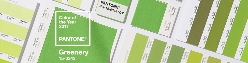
Greenery is a fresh, citrus shade of green. A touch of yellow warms it up and adds vibrancy. Because of the yellow, it has a sunny, tropical vibe. Of course, you can use this color in any room you choose.
Because of the highly saturated pigmentation, it’s a bold color choice. Some decorators use it in small doses to keep the color balanced. On the other hand, some decorators go for it as a whole room application.

Old kitchen cabinets get a breath of new life when they get a makeover in Greenery. Because the walls are gray and the trim is white, the cabinets become a fun focal point in this trendy kitchen.

In addition, Greenery is a popular choice to liven up the bedroom. Because it has that warm yellow undertone, it has cozy appeal.
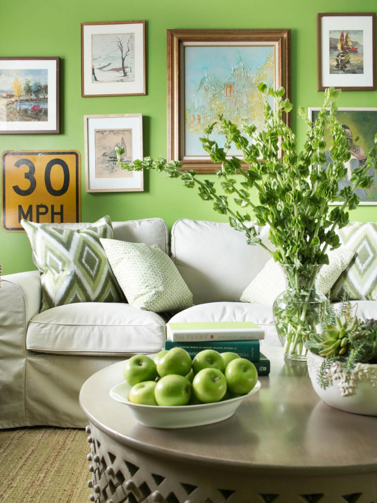
Paint the town green with Greenery! This paint is fun and fresh feeling. Because of the color intensity, stick with neutral textiles. Beige, taupe, white, and gray are all fantastic partners to Pantone’s 2017 Color of the Year.
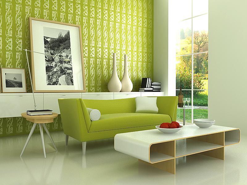
If the thought of a solid wall of green makes you feel…well, green…try wallpaper. Because of the white print pattern in the wallpaper, the green is broken up into smaller bites.

Also, you can add Greenery in accessories like a cozy throw and fresh florals. This color has a bold impact in a bright, airy room.
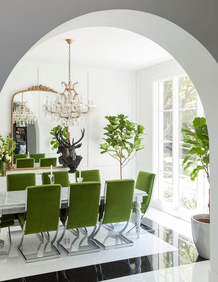

Dining in? Eating at home is fun again. Because Greenery is so on trend, you will impress your dinner guests. Upholster your dining chairs in Greenery. This will give you a pop of color in an otherwise somewhat staid room.
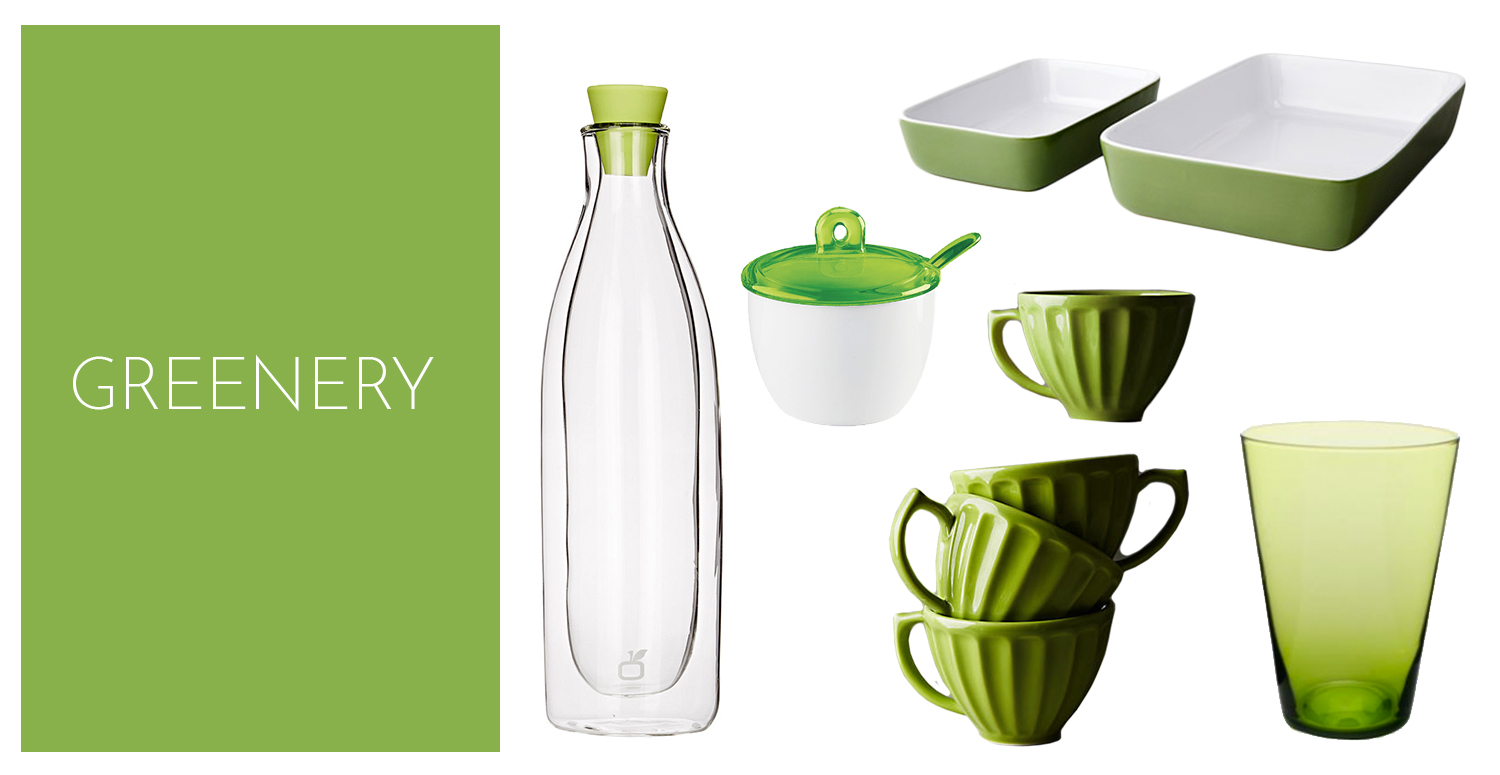
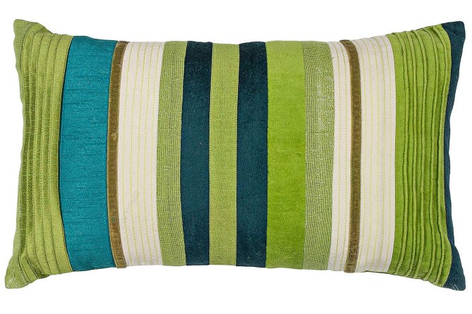
In addition to upholstery, you can use Pantone’s 2017 Color of the Year in other subtle accessories. This means you will have flexibility to quickly re-accessorize when you fall in love with the next hot color trend!

Pantone’s 2017 Color of the Year: Greenery – A Vibrant Burst of Energy
Greenery is Pantone’s Color of the Year for 2017, and it brings with it a vibrant burst of energy that can uplift any space it graces. This fresh, citrus shade of green is uniquely infused with a touch of yellow, giving it a warm and lively demeanor that exudes positivity and rejuvenation.
The Character of Greenery
This highly saturated shade is bold and impactful,making it an excellent choice for those looking to add a pop of color to their surroundings. The infusion of yellow in Greenery lends it a sunny and tropical vibe,evoking feelings of freshness,vitality,and growth.
Versatility in design
One of the remarkable aspects of Greenery is its versatility. Whether used in interior design, fashion, graphic design, or any other creative field, this vibrant hue can instantly breathe life into any project. Its ability to harmonize with both neutral tones and bold colors makes it a versatile choice for various applications.
Bringing Greenery into Your Home
When incorporating Greenery into your home decor, consider using it as an accent color to create a focal point in a room.Whether through throw pillows, artwork, or a statement piece of furniture, this color can add a dynamic element to your living space.
Benefits and Practical Tips
Here are some benefits and practical tips for integrating Greenery into your living space:
- Creates a sense of rejuvenation and vitality
- Enhances mood and promotes positivity
- Pairs well with earthy tones, blues, and neutrals
- Can be used in small doses or as a dominant color for impact
Case Studies: Greenery in Action
Let’s explore a few case studies of Greenery being used effectively in design:
| Space | Request |
|---|---|
| Living Room | Greenery accent wall paired with neutral furnishings |
| Kitchen | Greenery kitchen accessories against a white backdrop |
| office | Greenery desk accessories to boost productivity |
Final Thoughts
Greenery, Pantone’s Color of the Year for 2017, is a vibrant and energizing hue that can transform any space with its lively charm. Whether you choose to introduce it subtly or make a bold statement, this citrus-infused green is sure to infuse your surroundings with a burst of positivity and vitality.
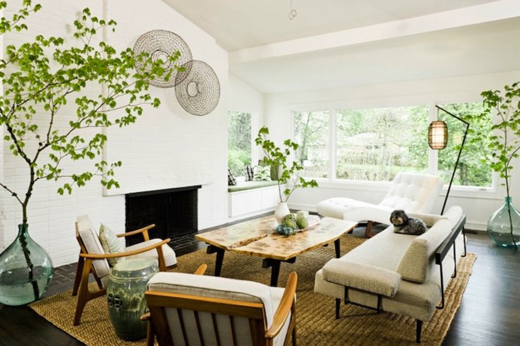
Absolutely love the vibrant energy that Greenery brings! It’s such a refreshing choice and really reflects a desire for rejuvenation and connection to nature. Can’t wait to see how it influences design trends this year!