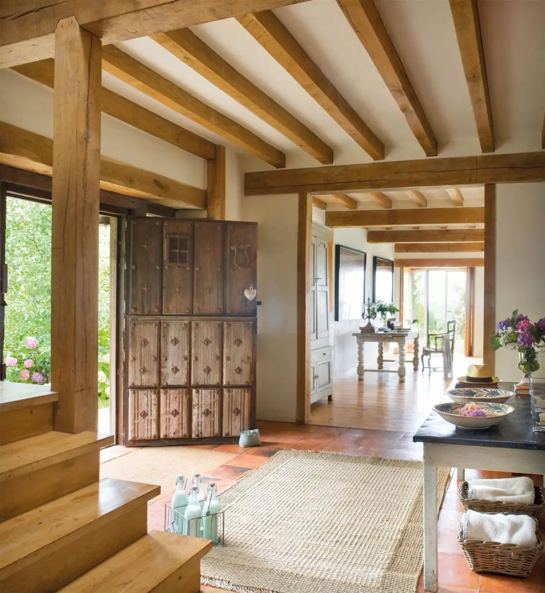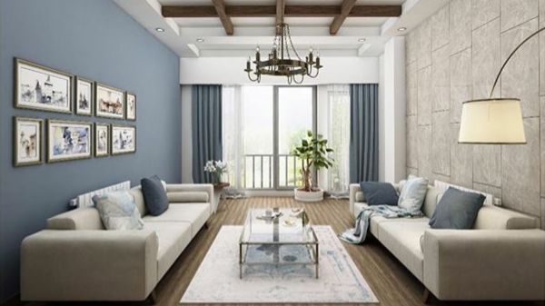
A bare wall can feel like a pause in a conversation – necessary, unobtrusive, and easily overlooked. Yet with a few thoughtful touches, that silent surface can become the room’s first storyteller, hinting at mood, history, or personality without shouting for attention.
This article explores the simplest ways to add character to plain walls: low-effort, budget-amiable approaches that transform flat paint into texture, depth, and visual interest. Whether you prefer subtle shifts or a bold focal point, you’ll find practical ideas that require little time or skill but deliver a noticeable difference. Read on for easy techniques that make walls feel intentional rather than incidental.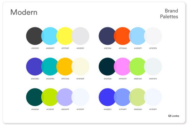
Choose a signature color scheme and use contrast paint techniques to define the space
Start by committing to a palette that feels intentional: one dominant hue, one or two supporting accents, and a contrast tone for trims or architectural details. Choose colors with matching undertones so they sing together under the same light – a warm oak floor will make warm greys and muted terracottas cozy, while cool blues and crisp whites will read brighter in north-facing rooms. Use paint to create architectural rhythm: a deep band at the base to ground furniture, a lighter field to open sightlines, or a saturated vertical stripe to make a low ceiling feel taller. Small moves – a painted alcove, a colored door jamb, or a half-height wall – give the room personality without overwhelming the space.
- Color block: divide a wall horizontally for visual weight.
- Trim contrast: paint baseboards and moldings in a darker tone for definition.
- Focal alcove: coat recessed areas in the accent color to create depth.
- Ombre wash: subtle gradations soften transitions.
| Mood | Main | Accent | Trim |
|---|---|---|---|
| Cozy | Terracotta | Warm Cream | Charcoal |
| Airy | Pale Sky | soft sage | Bright White |
| Modern | Slate | Mustard | Matte Black |
When applying contrast techniques, think like a curator: select what you want to emphasize and keep the rest restrained. Use painter’s tape for crisp edges, choose finish by function (matte hides imperfections; satin is easier to wipe), and test swatches at different times of day to understand shift in tone. Let the contrast direct movement - darker lower walls anchor seating areas, brighter trims draw the eye through doorways, and a painted ceiling can lift the whole composition.Balance is everything: bold color becomes elegant when scaled to the room and repeated in soft furnishings, art, or a single accessory to create cohesion.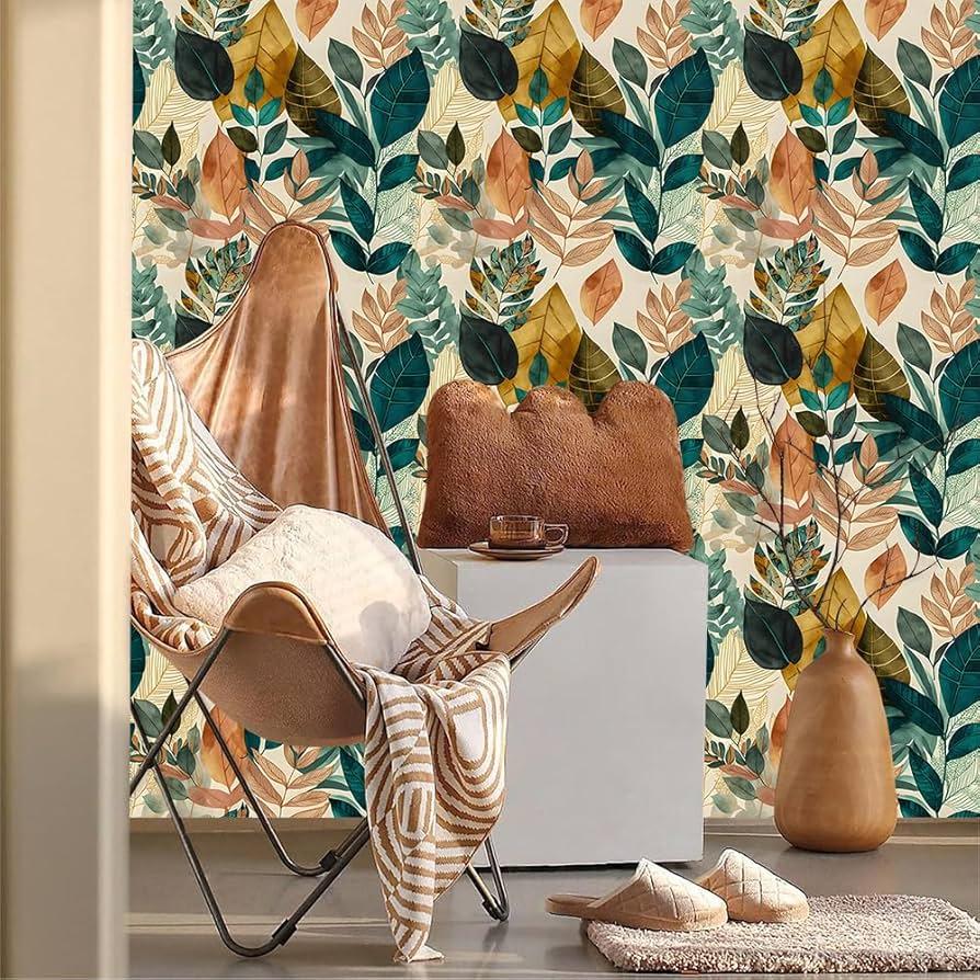
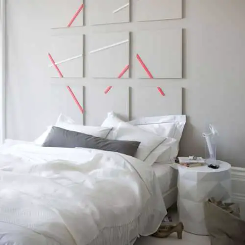
Layer texture with peel and stick wallpaper, fabric panels or decorative molding for instant depth
- Peel-and-stick wallpaper: fast change, low commitment, big pattern impact.
- Fabric panels: softens echoes, adds a couture feel, easy to attach with hidden velcro.
- Decorative molding: low-cost trim creates depth and can be painted to match or contrast.
Balance scale and finish: pair large-scale geometric wallpaper with slim, delicate molding, or counter a busy fabric with broad, matte trim for calm. Keep color contrasts subtle if you want texture to be the star-use tonal layers-or go bold with a painted molding that frames patterned panels for a graphic punch. Below is a rapid reference to match material to mood and effort, so you can pick the right combo for instant character and minimal fuss.
| Material | best Use | Install Time |
|---|---|---|
| Peel-and-stick wallpaper | Feature wall, bold patterns | 1-3 hours |
| Fabric panels | Headboards, acoustic warmth | 2-4 hours |
| Decorative molding | Architectural detail, framing | 2-6 hours |
Design a curated gallery wall using varied frame sizes, floating shelves and consistent spacing
Think of your wall as a living collage: anchor the composition with one or two large frames, then scatter medium and small pieces around them like visual punctuation. Floating shelves act as pauses between clusters-place them at different heights to hold a mix of framed prints, sculptural objects and a leaning frame to soften rigid lines.Keep a consistent gap between items (measured and marked beforehand) so the eye reads the grouping as intentional rather than accidental; a steady rhythm of space turns disparate frames into a cohesive story.
Play with scale and alignment to avoid monotony: try lining up either the centers, tops, or bottoms of a few frames to create subtle order within variety. Use gallery paper templates or kraft paper cutouts taped to the wall to preview arrangements, and choose a single spacing rule (for example, 3-4 inches between frames and 4-6 inches between shelf and art) to maintain balance.Hardware and shelf depth should support your heaviest pieces-test weights and keep fasteners hidden so the focus stays on texture, color and composition, not on the mechanics holding it all together.
- Start point: one anchor frame
- Spacing rule: 3-5 in. between frames
- Shelf tip: mix shallow (4-6 in.) and deep (8-10 in.) shelves
- Preview: paper templates before you hammer
| Frame Size | Suggested Spacing | Shelf Depth |
|---|---|---|
| Small (8×10) | 3 in. | 4 in. |
| Medium (11×14) | 4 in. | 6-8 in. |
| Large (16×20+) | 5 in. | 8-10 in. |

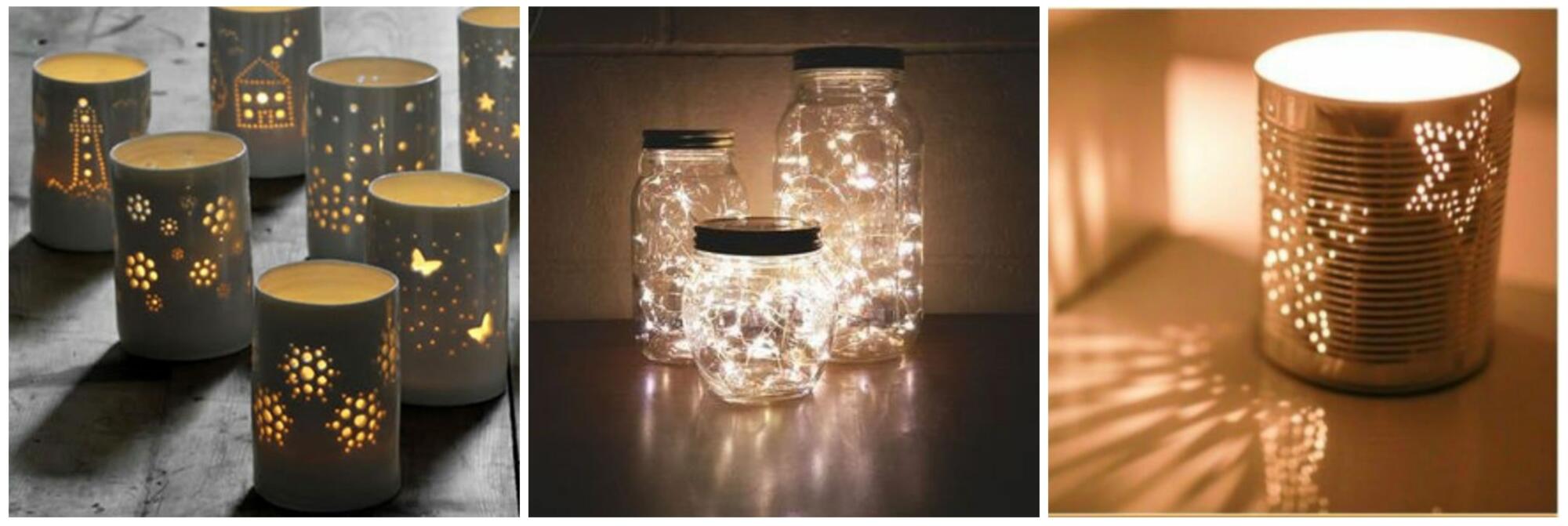
Activate walls with strategic lighting, plants and practical shelving to add life and functionality
Bring character to blank expanses by layering light and life: use warm wall sconces or directional picture lights to carve out cozy pockets, and add living textures with wall-mounted planters or trailing vines. Small LED strips tucked under floating shelves make artwork and ceramics sing, while a cluster of staggered spotlights can create depth without clutter. Try these quick pairings to get started:
- Soft up-light + Moss frame - instant mood and color.
- Picture light + Small ceramic planter – gallery meets greenery.
- LED strip + Row of succulents – clean lines, low maintenance.
Think of shelving as choreography: practical storage that also stages plants and focal lighting. Opt for floating shelves, narrow ledges or inset cubbies to display books, baskets and a few well-placed pots; balance heavier items with trailing plants to soften the silhouette. Use this cheat-sheet to mix-and-match quickly:
| Lighting | Plant | Shelf Style |
|---|---|---|
| Adjustable sconce | Pothos (trailing) | Long floating shelf |
| Warm picture light | Moss frame | Narrow display ledge |
| Discrete LED strip | Small succulents | Staggered cubes |
- Mount securely – anchors and proper brackets prevent sagging.
- Vary heights – play with odd numbers for visual interest.
To Wrap It Up
Think of your plain walls as a quiet canvas waiting for a first line – a single change can set the tone for the whole room. Whether it’s a deliberate splash of color, a curated gallery, or a subtle texture, these small, thoughtful moves add personality without demanding a full makeover. Start simple, live with it, and let the space evolve; character frequently enough arrives incrementally, not overnight. the easiest way to add character is to make a choice, though modest, and allow the room to tell its story.