Eighty percent of people feel their mood is influenced by a room’s color, making the hues you splash across your living room walls more than just background. Living room color psychology isn’t just fluff; it’s the real deal in crafting relaxing spaces where daily stress takes a backseat. Choosing the right shades can turn your lounge into a serene sanctuary, as colors have this ninja-like ability to sway how you feel and act without you even noticing. So if tranquility is what you’re after, understanding which palette whispers ‘chill out’ could be your decor game-changer.
Ditching stark whites for calming blues or trading edgy reds for earthy greens makes all the difference—your living space transforms from high-octane to Zen with just a few brush strokes. Dive into the world of muted tones and discover how they hold the power to mellow down even Monday mornings.
Understanding the Psychology of Relaxing Colors
What Are Relaxing Colors?
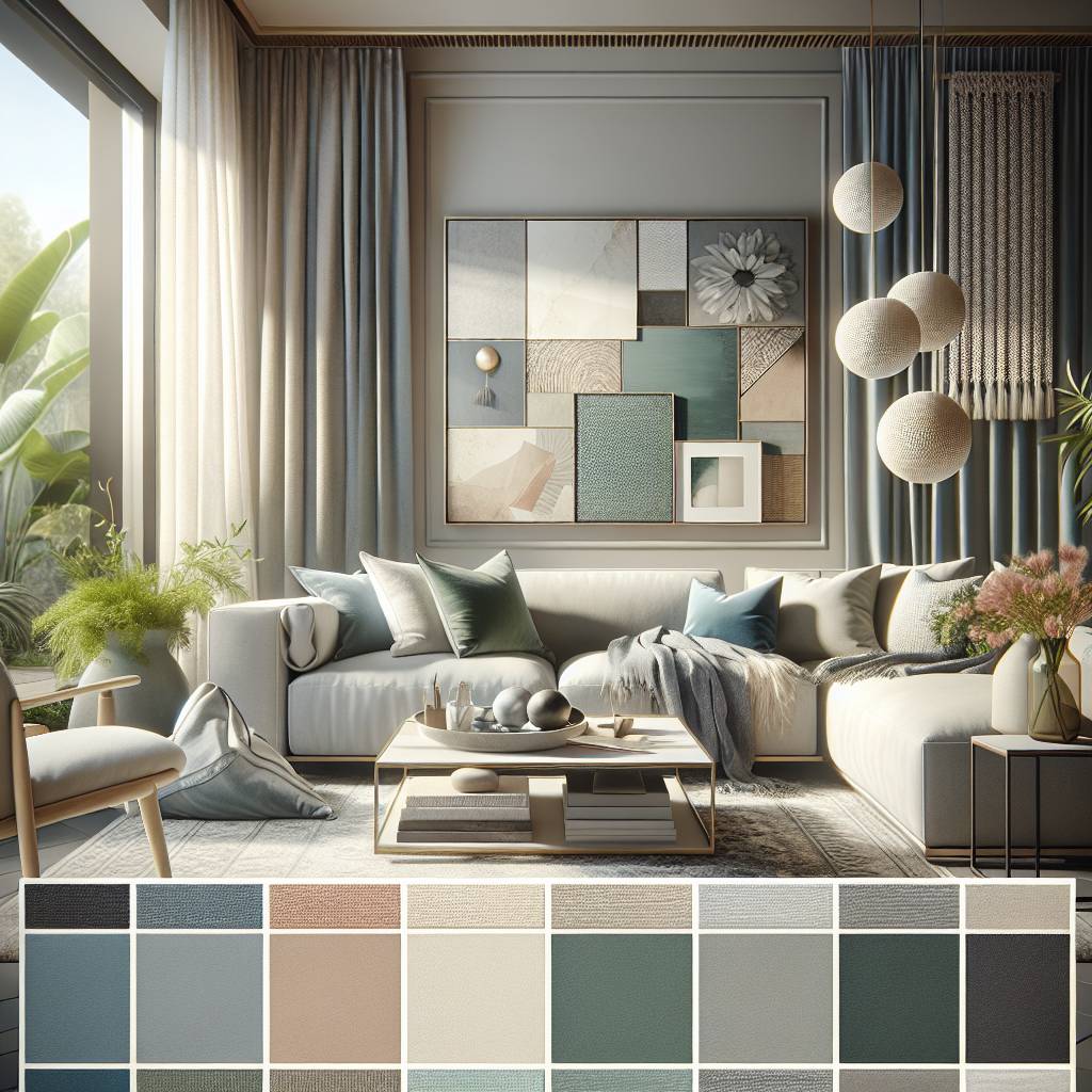
Relaxing colors are hues that evoke a sense of calm, tranquility, and relaxation. These colors typically include soft tones such as pale blue, soft green, lavender, and muted shades of gray. These colors are often associated with nature, like the serene blue sky or the gentle greenery of a forest. They have a soothing effect on our minds and help create an atmosphere conducive to unwinding and de-stressing after a long day.
Relaxing colors also encompass warm neutrals like light beige or pale taupe, which can impart a cozy and comforting ambiance to a space. These hues offer visual warmth without being overly stimulating or intense, making them ideal for promoting relaxation in living spaces.
The Impact of Relaxing Colors on Our Psychological State
The use of relaxing colors in interior design can significantly influence our psychological well-being. When we surround ourselves with calming hues in our living rooms, it helps reduce stress levels and promotes feelings of serenity and peace. For instance, gazing at soft blues or greens can lower blood pressure and heart rate, inducing a state of tranquility.
These tranquil tones stimulate the production of feel-good hormones like serotonin, contributing to an overall sense of contentment within individuals occupying these spaces. This positive impact is particularly beneficial for those seeking refuge from their daily pressures within their homes.
The Science Behind Relaxing Colors
The perception that certain colors induce relaxation is rooted in scientific principles related to human psychology and physiology. Studies have shown that exposure to calming shades triggers specific neurological responses that lead to decreased anxiety levels and improved mood regulation.
For example:
- Research has demonstrated that viewing natural scenes featuring relaxing colors activates areas in the brain associated with emotional processing.
- Psychophysiological experiments have revealed that participants exposed to soothing color palettes exhibited reduced muscle tension compared to those surrounded by vibrant or intense hues.
- Furthermore, color psychology research suggests evolutionary factors play a role; humans instinctively associate tranquil tones with safety due to their prevalence in natural environments such as clear skies or peaceful bodies of water.
Choosing Colors for a Serene Living Room Atmosphere
Light and Space
The impact of light and space on color choices cannot be overstated. Natural light can enhance the calming effect of serene colors, making the living room feel more spacious and tranquil. Opting for lighter shades like soft blues, gentle greens, or muted pastels can amplify the sense of openness in a well-lit living room. On the other hand, in smaller or dimly lit spaces, it’s essential to choose colors that won’t make the area feel cramped or gloomy.
Considering these factors is crucial as they directly influence how serene colors will be perceived in your living room. For instance, if your living room receives ample natural light throughout the day, you might want to consider incorporating a soothing shade like a pale lavender or a subtle seafoam green. These colors not only complement natural light but also contribute to creating an inviting and peaceful ambiance.
Room Functionality
Another important factor when selecting living room color psychology is understanding how different hues can affect the functionality of your space. While serene colors are known for their calming properties, some shades may evoke specific emotions that could impact activities within your living room. Soft blue tones are often associated with tranquility and relaxation, making them ideal for unwinding after a long day; however, they may not be conducive for stimulating conversations during gatherings.
It’s essential to strike a balance between creating a serene environment while ensuring that the chosen color scheme aligns with your lifestyle and daily activities in the living room. For example, if you enjoy hosting social events at home where lively discussions take place frequently, incorporating warm neutrals like soft beige or subtle greiges into your design can promote an inviting atmosphere without compromising on serenity.
Accent Pieces
One effective way to incorporate serene colors into your living room design is through accent pieces such as throw pillows, rugs, curtains, and artwork. By utilizing these elements in calming hues like pale pinks or powdery blues against neutral backdrops like white walls or beige furniture pieces creates visual interest without overwhelming the space with too much color.
Incorporating these accent pieces allows you to experiment with various serene shades while maintaining flexibility; should you decide on changing up your decor down the line.
Impact of Living Room Colors on Mood and Well-being
Influence of Color
The living room color psychology for relaxing spaces is a fascinating topic. The colors in your living room can significantly affect your mood and overall well-being. For instance, warm colors like soft yellows and gentle oranges can create a cozy and welcoming atmosphere, while cool tones such as calming blues or soothing greens promote relaxation.
Scientific studies have shown that specific colors have the power to influence emotions. For example, research suggests that exposure to certain shades of blue can lead to feelings of calmness and tranquility, ultimately reducing stress levels. On the other hand, vibrant reds might evoke excitement or even raise blood pressure in some individuals.
Personal Preferences
While scientific evidence supports the impact of color on mood, it’s essential to acknowledge the role of personal preferences in color-induced mood changes. Your favorite color might bring you joy and comfort regardless of its traditional psychological implications. Therefore, when considering living room colors for relaxation purposes, it’s crucial to strike a balance between general psychological effects and individual preferences.
When choosing colors for your living room with relaxation in mind, consider how each shade makes you feel personally rather than solely relying on broad interpretations from color psychology studies.
Enhancing Stress Management with Calming Colors
Color Psychology
Colors have a profound impact on our emotions. Studies show that certain hues can help reduce stress levels. This is because colors influence how we perceive the environment around us, affecting our mood and mental state.
Light blues and greens are known for their soothing effects. They remind us of nature, like the sky or a tranquil lake, which naturally calms the mind. Soft shades of purple also promote relaxation by invoking a sense of serenity.
To create a relaxing space in your living room, consider painting the walls with these calming shades or incorporating them through decor items like cushions or rugs.
Strategic Placement
It’s not just about choosing calming colors but also where to place them in your living room for maximum effect. The strategic placement can enhance their stress-reducing qualities.
For instance, you might paint one wall in a restful blue as an accent wall while keeping others neutral. This creates a focal point without overwhelming the senses.
Using colored throws or pillows allows for flexibility. You can change them according to seasons or when you need different emotional support from your space.
Personal Preferences
While general guidelines suggest certain colors are more relaxing than others, personal preferences play an essential role too. What feels soothing to one person might not have the same effect on another.
If soft pastels relax you more than cooler tones do, then incorporate those into your living room design instead.
Remember that comfort comes first when creating your peaceful haven at home.
Improving Sleep Quality with Strategic Color Choices
Color and Sleep
The colors we choose for our living room can affect sleep quality. Colors have the power to calm our minds or energize us. For better sleep, calming colors are key.
Soft blues are often recommended for bedrooms because they evoke feelings of tranquility. But in a living room, where we spend time before bed, these hues can also set the stage for restfulness later on. Imagine sitting surrounded by gentle blue walls as you wind down from your day.
Green is another color that promotes relaxation and is linked to nature’s soothing presence. A hint of green in your living space can help create a serene environment conducive to unwinding before bedtime.
Selecting Shades
When choosing relaxing colors for your living room, consider lighter shades over darker ones. Lighter tones tend to be more calming and less stimulating than bold or dark colors.
A pastel lavender has a softness that can ease the mind into a peaceful state, perfect for evenings spent at home before heading off to bed. It’s not just about picking any light color though; it’s about finding one that brings peace and comfort into the space.
Incorporating these hues through wall paint or accents like cushions or throws allows you to introduce calming elements without overwhelming the room’s design.
Living Room Considerations
Your living room serves multiple purposes – it might be where you entertain guests but also where you relax after work. Balancing this dual function means selecting colors carefully.
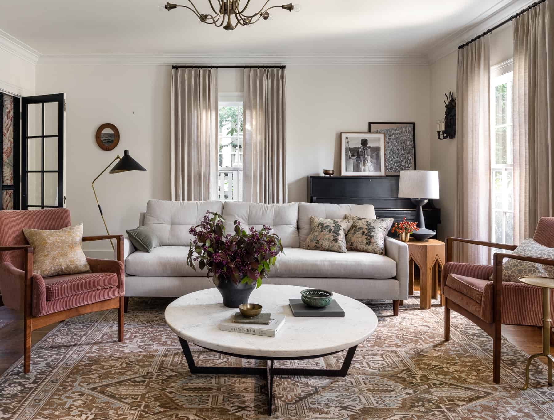
Neutral tones such as beige or soft gray may not seem exciting but are incredibly versatile when creating a relaxed atmosphere while still maintaining an elegant look suitable for guests. These neutrals serve as an excellent backdrop against which pops of more tranquil colors can stand out subtly yet effectively.
To infuse serenity into your social space without compromising on style, pair neutral walls with accessories in those rest-inducing blues or greens mentioned earlier – think throw pillows, vases, or artwork.
By thoughtfully choosing soothing shades for your living area based on color psychology principles:
- You enhance overall well-being.
- Prepare yourself mentally and physically for sleep.
- Create an inviting atmosphere both day and night.
Fostering Relaxation with Green and Blue Hues
Association with Relaxation
Green and blue hues are often associated with relaxation due to their calming and soothing effects on the mind. These colors are reminiscent of nature, evoking feelings of tranquility and peace. The cool tones of blue mimic the sky or water, while green represents lush foliage, both creating a sense of serenity.
These colors have been found to lower heart rates and reduce anxiety levels. They can help create a sense of spaciousness in a room, making it feel more open and airy. By incorporating green and blue into your living space, you can promote a peaceful environment that encourages relaxation.
Benefits of Using Green and Blue Hues
One key benefit of using green is its ability to relieve stress by providing balance and harmony. This color is also known for promoting restfulness as it’s easy on the eyes. On the other hand, blue has been shown to lower blood pressure and slow down respiration – physiological responses that align with relaxation.
Moreover, these hues can complement various interior styles such as modern or traditional decor. They offer versatility in terms of shades – from soft pastels to deep jewel tones – allowing you to tailor the color intensity based on your preference.
Integrating these calming colors into your living room doesn’t necessarily mean painting all walls in green or blue; small touches like throw pillows, area rugs, curtains or artwork featuring these hues can make a significant impact without overwhelming the space.
Practical Tips for Integration
Consider painting an accent wall in a serene shade of green or blue while keeping other walls neutral for balance.
Incorporate natural elements like potted plants or botanical prints which not only bring pops of color but also enhance the relaxing ambiance.
Choose furniture pieces upholstered in soft greens or blues for added comfort.
Opt for lighting fixtures emitting warm white light that complements these cool tones beautifully.
The Emotional Influence of Neutral and Earthy Tones
Emotional Responses
Neutral and earthy tones in the living room can evoke a sense of calmness, warmth, and relaxation. Soft beige or gentle gray walls can create a soothing environment that promotes tranquility. These colors are often associated with natural elements like sand, stone, and wood, which can bring a touch of the outdoors inside.
In addition to this, earthy hues such as terracotta, olive green, or warm browns contribute to a cozy atmosphere. They can instill feelings of security and comfort while also adding depth to the space. Imagine sitting in your living room surrounded by these earthy tones; it’s like being embraced by nature itself.
Advantages
Using neutral and earthy tones in the living room offers various advantages. Firstly, these colors serve as an excellent backdrop for other decorative elements such as artwork or furniture pieces. They provide a versatile canvas for incorporating different textures and patterns into the space without overwhelming the senses.
Moreover, neutral colors have timeless appeal which means they won’t go out of style quickly. This makes them an ideal choice for creating a relaxing space that you won’t tire of easily. Additionally,
earth-inspired palettes are known for their ability to make rooms feel more spacious due to their understated elegance.
Combining with Other Colors
When it comes to combining these calming shades with other color palettes in your living room design,
you might consider pairing them with subtle pastels like soft blues or muted greens.
These combinations can enhance the peaceful ambiance while infusing some delicate pops of color into the setting.
Alternatively,
incorporating touches of warm metallics such as gold or copper accents against neutral backgrounds adds sophistication without disrupting the tranquil vibe.
By integrating small doses of bolder hues like navy blue or deep burgundy into your decor through throw pillows or statement accessories,
you can achieve visual interest without compromising on relaxation.
Adding Energy and Passion with Accents in Living Spaces
Lively Accent Colors
Accents play a crucial role in adding energy and passion to the space. Vibrant accent colors like bold reds, bright oranges, or lively yellows can infuse liveliness into an otherwise serene environment. These colors are known for their stimulating effects on mood and can help create a dynamic atmosphere within the room.
These lively accent colors are ideal for injecting bursts of energy while maintaining an overall relaxing ambiance. For instance, incorporating throw pillows in vibrant red or orange hues can instantly enliven a neutral-toned sofa. Similarly, introducing artwork featuring energetic yellow tones can bring life to the walls without overwhelming the space.
Incorporating Accents Strategically
To maintain a harmonious balance between relaxation and vibrancy, it’s essential to employ strategic methods when incorporating these lively accent colors. One effective strategy is to use these vibrant shades sparingly but purposefully throughout the living room. This could involve integrating pops of color through decorative items such as vases, rugs, or small furniture pieces.
Another approach is to opt for multi-functional elements that serve both aesthetic and practical purposes while introducing these energizing tones. For example, selecting an ottoman in a bold red shade not only adds visual interest but also provides additional seating or serves as a makeshift coffee table when needed.
Conclusion on Selecting the Best Living Room Colors
Importance of Personal Preferences and Lifestyle Needs
When choosing living room colors, it’s crucial to consider your personal preferences and lifestyle needs. Your living room should reflect your personality and cater to your daily activities. For example, if you enjoy a calm and serene environment, soft blues or gentle greens might be ideal. On the other hand, if you’re an energetic individual who loves vibrant spaces, warm yellows or energetic reds could be more suitable.
Consider the activities that take place in your living room. If it’s a space for relaxation and unwinding after a long day, soothing colors like pale lavender or light grays can promote a sense of tranquility. However, if your living room is a hub for social gatherings and lively conversations, bold colors such as rich purples or deep oranges might create an inviting atmosphere.
- Personal preferences play a significant role in determining the ideal living room colors
- Lifestyle needs should guide the color choices to ensure the space aligns with daily activities
- Examples: Soft blues and gentle greens for a calm environment; Warm yellows and energetic reds for vibrant spaces
Creating a Balanced, Relaxing Living Room Space
To achieve a balanced and relaxing living room space through strategic color selection, it’s essential to understand the principles of color psychology. Cool tones like blues, greens, and purples are known for their calming effects, making them perfect choices for creating a serene ambiance. On the other hand, warm tones such as reds, oranges, and yellows can add coziness and energy to the space.
Incorporating neutral hues like whites, creams, and beiges can help balance out the overall color scheme while providing a sense of openness and airiness. By using these neutrals as a base, you can then introduce pops of color through accessories like throw pillows, rugs, or artwork to add visual interest without overwhelming the space.
- Understanding color psychology is crucial in creating a balanced and relaxing living room space
- Cool tones like blues and greens have calming effects, while warm tones like reds and yellows add coziness
- Neutral hues such as whites and creams provide balance and openness to the color scheme
Frequently Asked Questions
What colors are best for a relaxing living room atmosphere?
Soft blues and greens are ideal for creating a serene living room environment. They evoke feelings of tranquility, mimicking the calming presence of nature.
How do neutral tones influence mood in the living room?
Neutral tones, like beige or soft gray, can provide a grounding effect. They create a peaceful backdrop that’s easy on the eyes and promotes mental balance.
Can color choices in my living room impact my well-being?
Absolutely! Colors can significantly affect your mood. Choosing calming shades helps reduce stress levels and enhance overall well-being.
Is it possible to improve sleep quality with living room colors?
Yes, by selecting soothing colors like cool blues or gentle grays for your living space, you encourage relaxation which can positively impact sleep quality when transitioning to bedtime.
How do green and blue hues foster relaxation?
Green and blue hues mirror the outdoors—think tranquil skies and lush landscapes—naturally ushering in a sense of calmness perfect for unwinding after a long day.
Are there benefits to adding earthy tones to my living space?
Earthy tones connect us to nature, offering stability and warmth that make our spaces feel secure and inviting—a key ingredient for relaxation at home.
Can I use vibrant colors without disrupting relaxation?
Certainly! Vibrant accents energize spaces without overwhelming them when used sparingly against a palette of relaxing base colors. It’s all about balance.